Alone in the Dark
Stuff of nightmares.
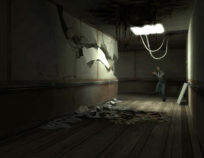
We hear you! We know you want Wii reviews of multiformat games. The problem is that publishers are often unwilling or unable to provide them. That was the case with Alone in the Dark - with Atari's usually helpful staff for once unable to assist us in our search - so in the end we gave up asking and bought it ourselves. We're going to look pretty silly if it turns out you're not interested. Not as silly as Alone in the Dark looks, sounds and feels on the Wii, mind you, despite developer Hydravision's valiant attempts to wrestle Eden Studios' ambitious Xbox 360 design into the constraints of the Wii's relatively underpowered hardware.
Credit to whoever worked on the first-person controls, though, because the combination of nunchuk analogue movement and Wii remote aiming is one of the few highlights. Point to the edge of the screen and the responsive Wiimote controls steer player-character Edward Carnby in that direction with a sensible degree of acceleration. You can only look so far up or down, which is a problem in a game where you spend a lot of time picking things up or examining your surroundings, but it's forgivable, and the way your viewpoint re-centres is intuitive and unintrusive.
Those of you with a working knowledge of the Xbox 360 version will know that first-person is only part of the view, though, because Alone in the Dark is a survival-horror game that switches you between third- and first-person depending on the scenario you face as you fight zombies and solve puzzles to uncover the truth about your past. And actually, the other controls aren't so bad in some respects either.
You open your inventory (the inside of your jacket, lined with pockets) by rotating the nunchuk and Wiimote away from each other as though you're opening a book, and then point to what you want on your body with the Wiimote. Healing involves pointing at a wound with the Wiimote, applying a spray with the nunchuk and then bandaging with the Wiimote. If you think you've already got the right item equipped, you can make a gesture with either hand as though you're reaching inside your coat to quickly equip or un-equip, and most of your environmental interaction is handled by sidling up to objects and hitting A when prompted. Smashing down doors or whacking enemies involves picking up an object and then waving the Wiimote, although this isn't one-to-one replication of your movement. To reload your gun, you twist the Wiimote to the right to check the clip and then hit a button to swap it out.

It might sound like a lot to remember, but gestures come to mind more readily than the complex network of button-presses the 360 expected. Sadly though it's let down by clumsy third-person movement and camerawork, the need to position yourself just so to pick up objects, and the constant back and forth between third- and first-person. Quite how anyone's Gran is supposed to grasp all this is beyond me, although the constant effing and blinding will probably put them off just as quickly. Speaking of which, the mainstream-friendly, DVD-style chapter-navigation system is now gone, replaced by standard checkpoints and save-game files.
For all that though, Alone in the Dark for Wii is actually let down by things that have nothing to do with the game's ambitious design. It's just badly put-together in standard ways. With a more limited repertoire of MacGuyver-esque actions at your disposal than you have on other systems, puzzles are often different, and often solved by a frustrating process of trying everything on everything. You won't realise you can shoot the lock off a door, or that you have to move the analogue stick in the direction of the object flashing an A-button prompt during a Quick Time Event. The gameplay parameters aren't set clearly enough.
Not that this really matters because after a couple of hours you're simply bewildered that the game was released at all. It's as ragged as a tramp's hat. Cut-scenes are video-captured versions of the in-engine sequences from the 360, which breaks the continuity with the lower-resolution character models - but hardly as much as having a completely different-looking heroine and, for some reason, a different (annoyingly garrulous) script and cast of voice actors. Scenes from the other game are dubbed. The story sequences are spliced abruptly into gameplay, where the cracks and seams are just as evident: objects flicker in and out of view, enemies are found running on the spot, there are missing button prompts, fire graphics that don't move with the object that's meant to be on fire, and clipping issues galore.


