The New Xbox Experience
360, redesigned.
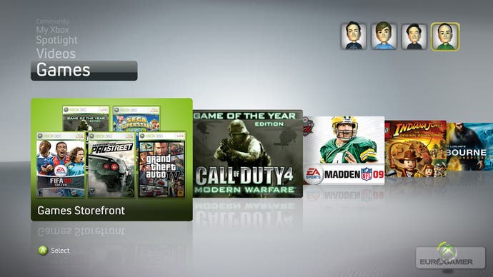
"For the first time ever, a console will be revolutionised through software." That's how Microsoft's Xbox Live, software and services boss John Schappert introduced his segment of the company's E3 press conference. That's how he raised the curtain on Xbox 360's new user interface, due to arrive via a free update to the console on Live and game discs in the autumn ("and not as a beta", one Microsoft representative told us, in a dig at Sony's PlayStation Home).
"Revolutionised through software." It's a very Microsoft thing to say; one of those rare instances when the company has allowed itself, in a statement about its Xbox business, to sound like a maker of computer operating systems. But that, of course, is exactly what has made Microsoft the richest company in the world, and Xbox 360's success certainly has more to do with its software and infrastructure - Xbox Live, in other words - than its capable but fault-prone hardware. If any of the console manufacturers can do this, surely Microsoft can.
As Schappert unveiled the features of the new front-end - 3D player avatars, a fully integrated party system, a live quiz game channel, streamed movies from Netflix in the US - it was easy to be impressed with how slick and comprehensive this revision looked. However, it was also easy to accuse Microsoft of merely reacting to its opponents' moves, of being not much more than a magpie: Nintendo's Miis and Wii Channels, Sony's XMB interface and many of Home's features seem to have been folded in to the redesign.
This, cynics would claim, is another example of Microsoft riding the coat-tails of more talented innovators, as those same cynics claim it has always done with Apple in the field of operating systems. Is the New Xbox Experience, as it's so blandly branded, no more than a desperate attempt to avoid being left behind? Or will it drive Schappert's revolution - take online gaming's greatest platform to the next level, transform a three-year-old machine into a brand new one and expand the Xbox audience into the bargain?
It started with a simple problem of navigation. Having originally expected Xbox Live Marketplace to carry hundreds of items Microsoft found itself hosting tens of thousands, and it was simply getting too hard to find stuff. The old blades system is only efficient if you know what you are seeking; browsing this burgeoning library is a nightmare. So the new interface is designed to highlight what's available and happening on Xbox Live, in the Marketplace and with your friends - as well as in a couple of other new areas - and to invite you to explore rather than head straight to your destination.

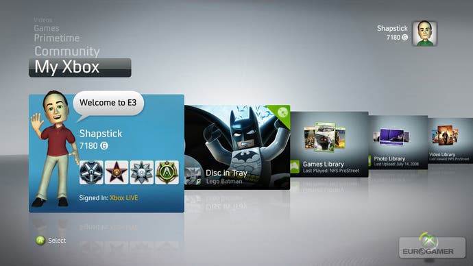
The primary tool for this is the My Xbox 360 channel, the first of the lateral, graphical menus that you're presented with when you turn the machine on. Your gamercard, the disc in the machine's tray, links to your personal game and media libraries, and the settings appear here. The design - a 3D flip-book of large, bold images against a pseudo-3D background - is the result of a final and long-overdue acknowledgement that pictures work better than text on a television, HD or no HD.
Next up on the vertical channel menu, Spotlight is the most blatant attempt to "bubble up content", as Microsoft put it. This will play host to news and advertising highlights for the Xbox service, much as the rolling advertisements for demos on the current interface already do. Of all of the new interface's features, this one seems most custom-designed for Microsoft's partners rather than its audience. But a coherent shop window in once place is still welcome, not least because it will help keep the other channels functional and free of advertisement.
The Community channel is one of the riskiest features in the new interface, and one of the hardest to judge because we weren't actually able to see it working on a networked machine. This will essentially be a heavily graphical representation of your friends list, showing animated Avatars telling you what they're playing, grouped together in their online parties. It's supposed to be lively and engaging and it certainly sounds it, but - perhaps - at the greatest cost to utility and easy-access information.
However, you can also look at the Community channel - and the Avatars and party system that go hand-in-hand with it - from another angle. From one side, it's an extremely elaborate menu. From another it's actually a radically streamlined, and arguably much more useful, version of what Sony is attempting with its ambitious user-interface-cum-virtual-world, Home.

Like Home, the new front-end will grant you an avatar to customise and express yourself with. Like Home, it will allow you to form parties and jump them instantaneously and in their entirety into any game, on Arcade or otherwise, bypassing the game's own lobby and party system completely. Like Home, you'll be able to watch streamed photo and video, including Netflix movies, synched to your entire party. Members of a party (maximum size to be determined, though we hear eight mentioned) can use voice chat together no matter what they're doing, including individual single-player gaming.
Without doubt the social features are completely seamless, cleverly engineered and very powerful. Of course, it hardly constitutes the genuinely massively multiplayer vision of a console's community that Home represents, and it doesn't give players the same "ownership" of virtual space. But in terms of tangible benefits to the console's user, they're almost all in Microsoft's new software, and in a much less cumbersome form that will be more palatable to more people.

