Unreal Tournament III
Frag franchise forever.
The marketing motto for Unreal Tournament III seems to have been something like "simplify and improve", at least if you listen to Epic's bossmen speak their brains. They've told us that they wanted to take the best features from all the previous games and make it faster, tighter and (presumably) more macho. Or maybe that's just fallout from the enormous success of Gears Of War...
Anyway, does this approach work? Is the heaviest of the heavyweight arena shooters still boxing spectacular? And has the actual formula for play really been simplified and improved, or simply dragged from the crypt of yesteryear bolted on to a new graphical superstructure?
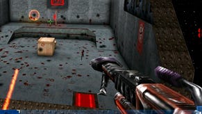
Okay, let's start with something fundamental to shooters: the "feel". Oh, holy crap that's subjective: I could have started with the gametypes, or the number of weapons, but no, I have to go and pick this unreasonably impressionistic topic. The reason why I want to start with that is that no matter what ideas you throw into a game, if the feedback loop of player to controller, to screen and back again isn't satisfactory, then it's not going to be any fun to play. It was this very confluence of input and output that meant I preferred Quake III to Unreal Tournament in the original 2000AD battle for FPS dominance. UT3 seems to have done little to alter the overall acrobatic feeling from previous games, but it doesn't seem much faster than 2004. Does it? It's at this point that I have to go back and playing UT2004 to check... Erm... hmm. Hard to say really - it's very similar. After playing months of Team Fortress 2 and ETQW both games seem fast and responsive. What is obvious is that things like the rockets fly faster, and the pace of the vehicular game has been pumped up enormously. You die a hell of a lot easier in UT3, but at the same time so do your enemies...
In fact what also seems lacking in UT3 is the feedback from damage. I've not always been able to instantly tell where an attack is coming from (perhaps because the visual hints on the screen aren't clear enough, perhaps because it's a new game and I'm not quite tuned into it yet), but also I want the Team Fortress 2 deathcam to appear in pretty much every game now. It's the kind of feedback that really improves your game quickly, rather than through the guesswork and practice we're so used to.
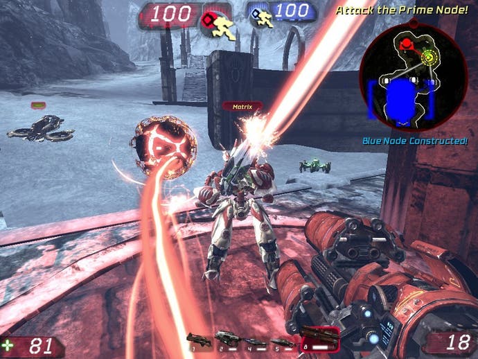
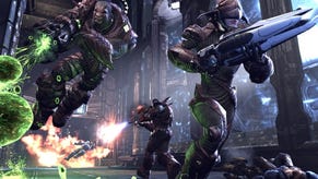
Despite this I've found UT3 incredibly intuitive to control. I mean I play FPS games pretty much every day so I'm not exactly one of those people who run along staring at the floor, but it still feels right every step of the way - the double tap dodges and jumps arrive instinctively, while the maps never get me lost or turned around, despite their visual complexity. The transition from being on foot, to being on a hoverboard, to being in a tank, is all seamless and obvious. I've heard a few people complain that the weapons are all a bit vague: that you can't necessarily tell what does what, and I can partially agree with that. I've always felt that UT's weapons were needlessly ostentatious compared to the minimalist set of Quake III, but here they are nevertheless solid, beefy and quite welcome. It's so similar to UT2004 that it's like the familiar positioning of instruments in a car that you drive on a regular basis. UT3 doesn't take much getting used to: we're motoring from the first moment. The feel, we might therefore conclude, is good. But you knew that from playing the demo, right? And that wasn't all that impressive.
So there's more: secondary to the feel is the particular recipe of features that make up this third Unreal iteration (Epic are calling UT2003 and UT2004 instalments of the same iteration, so they collectively represent Unreal Tournament 2.) The game modes are each classical (if they can be so-called) and instantly comprehensible.
Deathmatch comes with a bunch of exquisite maps, each one delivering the tenets of the old game perfectly: the maps are always circular so that fleeing and chasing never truly lands us at dead ends, while the distribution of items over the environment has been carefully studied. No spawn lands you too far from a decent weapon, and no powerful power-up is placed anywhere that isn't dangerous to get to. This consistency wobbles a bit in the other maps, but generally it's entirely well judged and playtested to the smoothest of rides.
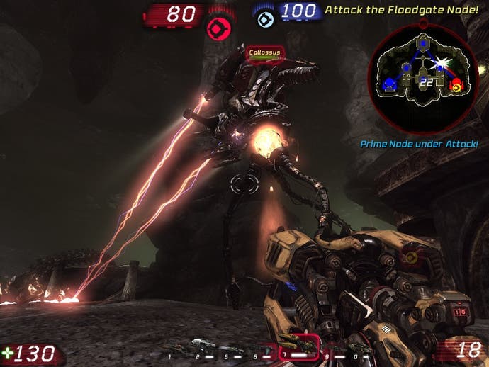
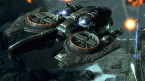
Aside from the assault maps in earlier UT games, Capture The Flag is probably what I've played most of. It's not true this time. Not because I don't enjoy it, or because I've not got on with the maps, but because I've actually found "Vehicle CTF" far more entertaining. Vehicular flag borrowing entertains me more because, well, UT3's vehicles are spectacularly apeshit. While half the automotive repertoire has resurrected from previous games in the form of the Axon vehicles (the original tanks and hovercraft stuff, henceforth to be know as "The Boring Vehicles") the other half boasts the Necris vehicles. With these you get to drive a spider, pilot a snaketank, and ride a rocket-bat missile thing. There's a cloaking tank too. The Necris vehicles are exactly what I wanted from a game like UT. It makes me cackle like a cardboard villain to see my team roll out on tentacle legs. It's as if Epic suddenly realised this was a videogame. Not only can they have insane vehicles, they should have them. They must have them. They're ludicrous and look incredible: you will probably already have seen the walker, which dominates the maps complete with its War Of The Worlds space-cred. This is exactly the kind of spirit of game design we should be encouraging: the more outlandish the better.


