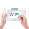
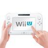
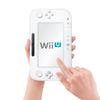
Wii U
Playing with Nintendo's new console.
In 2005, Nintendo unveiled the Wii at the Electronic Entertainment Expo - but it showed the console without its controller.
In 2011, Nintendo has come to Los Angeles and shown a controller, but not a console. Kind of.
After some slightly muddled messaging at today's grand unveiling in the Nokia Theatre, confusion reigned. Was this touch-screen controller a handheld computing device in its own right? A new interface for Wii? Those were Wii remotes people were waving around, and the sports games and Mario Bros. in the promotional video looked awfully familiar.
So let's be clear: Wii U is a new console capable of HD resolutions, and having considerably more graphical power than Wii.
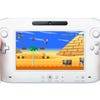
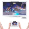
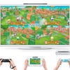
But you'd be forgiven for not picking this up, because in its playable demos, Nintendo has chosen to highlight a few novel interactions and gameplay possibilities of the controller rather than Wii U's grunt. Several demos feature familiar Miis and Mario characters running around simple, colourful environments - albeit in crisp HD.
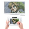
At a preview event immediately after the Nintendo conference, you could just glimpse Wii U's sleek, curved remodelling of the Wii base unit design through glass letterboxes in locked cabinets. (Presumably these were empty shells accompanied by hidden dev kits.) Meanwhile, the only graphically intensive demo, a Legend of Zelda themed 'HD Experience', was interactive but not actually playable. The message was clear: we'll get to this part later.
Today's star, then, is the part of Wii U you can pick up. Good job it's absolutely sensational.
The Controller
"As soon as you pick that controller up, you understand the genius of Nintendo's idea."
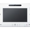
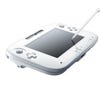
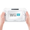
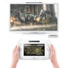
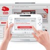
The Wii U controller is Nintendo hardware design at its absolute best. It displays innovation, lateral thinking, supreme ergonomics and a finish that, while not luxurious, makes you happy the instant you pick it up.
It actually has more in common with the DS than the Wii remote, and not just because it presents you with a second gameplay screen. It's rich with unexpected features and offers a subtly different way of relating to games, rather than a single high-concept gimmick.
And with its full suite of physical controls, its touch screen and its impressively sensitive gyroscope, it offers precision and control feedback the Wii remote simply does not. Also, crucially, it ensures Wii U is fully compatible with standard gaming control layouts and interfaces.
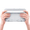
It's big, but very light and extremely comfortable to hold. A pronounced ridge across the back makes it easy to grip and it has that classic Nintendo rugged-plastic feel, with a matte surface. It's friendly rather than slick, and feels reassuringly familiar - the similarity now being with tablet devices, phones and portable consoles rather than a TV remote. The size is perfect for a device that will never leave the home; although we don't know what's inside it, or what its range is, we do know that the controller is useless without the base unit.
Large triggers on the back, bumpers and the twin analogue sliders are all perfectly positioned and pleasingly tactile. The d-pad and face buttons are a little more out of the way. The decision to go for 3DS-style 'circle pad' sliders with a flat profile rather than proper analogue sticks seems odd initially; but it's probably to make them more discreet, and to be fair they don't seem to give away anything in precision.
