Saturday Soapbox: The Majesty of Menus
Let's be honest. Nothing beats spotting a kickass title screen in the wild.
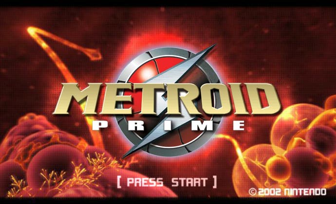
March 21st, 2003. Metroid Prime. Pop the disc from the case. Secure it in the GameCube's open mouth.
Let's go.
Sat in the domestic darkness of my living room, I hear an abrasive, bacterial scratching sound. Then an ominious melody, but still nothing on the TV. It's teasing me.
And then it's not. I see footage of some alien matter under an electron microscope. It's all blood red and future orange. Then, finally, the logo. METROIDⓇ PRIME. Followed by a theremin trill, and a kettledrum like an irregular heartbeat.
"[Press Start]," it offers. The square brackets offering a subtext of: "[Whenever you're ready.]"
It's such a beautiful screen that when you do press start, it feels impatient, somehow. The game punishes for this. It whips the camera backwards, curving it down and around through a jungle of foreign matter, the theremin's melody descending with you. By the time you arrive at the game select screen, you're out of breath. You're spent. You've got your money's worth and should probably go to bed.
Which is no use to Metroid Prime! It can't have you lolling around here, in the limbo between anticipation and adventure. So, with the grace of a knife being slipped between your ribs, the game emits an electric cough, prompting a doomsday baritone choir.
To say Metroid Prime has a fantastic menu is missing the point. Metroid Prime had a menu that didn't just respect the Metroid name - Metroid Prime's menu was Metroid.
I was 18 years old when Metroid Prime came out, meaning I'd been eight for Super Metroid. Retro Studios had to appease the nostalgic memories of people like me, a feat comparable to trying to feed a ghost.
But in constructing this witheringly expensive, overblown main menu, they did just that. Retro Studios tapped into the alien, lonely, bracing emotions that defined Super Metroid not just as a piece of design but as an experience. They suckered you into this world again. And they did it in seconds. With a menu. And in getting you on their side this early, they also made you open-minded to the experimental design of Metroid Prime proper.
Let's get this straight. Main menus have a role besides their functionality. They're the first thing you see in a game, and not only can they set the tone for everything that's to come, they actually have to. Think how vapid an experience it'd be to get a game in the post, the box a totem of years of anticipation, and when you put the disc in you just start... playing. World 1-1. Create your character. "Welcome to the tutorial! Pick up the gun."
No, a menu is needed. The game has to be as excited as you are, even if it's just for a moment. The menu is a runway that guides you into the game's world, sometimes smoothly, sometimes awkwardly, but always with fascinating speed. Pay attention, and you'll never learn more about a developer and their game in less time.
Resident Evil 4's a fun one. A gorgeous logo, some artwork, all of it uniquely static. No movement at all. Then you actually start a game and the menu all but belches "RESIDENT! EVIL! FOUR!" in a voice that no human has ever used before or since. It's a laughable flip-flopping between minimalist and maximalist, but then you actually play the game and find it's more comfortable with both absurdist action and sequences of utter tranquillity than many games are with either.
There are a thousand of these. Far Cry 2's main menu was a mercenary's tattered notebook, broadcasting the developers' desire to bring something, anything, everything, to the FPS genre. And if you think that's nonsense, try and think of an FPS that doesn't have an utterly straightforward menu. Except for Black Ops! Which just reeks of Treyarch trying to prove itself.
More recently, Dragon's Dogma encouraged us to share in its glittering naivety with a menu that showed a dragon in various action poses, accompanied by a rock'n'roll theme song that is never heard again. It's almost as excited with itself as cult brawler Bujingai on the PS2, which first had you run through a tiny level, cutting up robots with your technicolour sword, before you'd seen either a menu or a tutorial.
Unbeknownst to you it would actually record this effort, and only once you were done did it take you to the main menu. A menu with you, fighting, as the background! You, set to J-rock and coupled with cinematic camera angles that made you look amazing, even through you were, inevitably, shite. And you never got the chance to replay this. Every time you turned Bujingai on you'd hear that squealing guitar solo as you saw yourself soaring into walls and swinging your sword psychotically at nothing at all.
More elegantly, you know Kid Icarus on the 3DS is going to be a good time because within its playpen of a menu, selecting the difficulty is more fun than playing most other games.
I love this stuff. And if you do pore over it like some bizarrely specialised future archaeologist, it loves you back. The range and depth of talent packed into Arkham City's menu, where characters are caught mid-fight, in the rain, as the camera pans past them, got me more excited than anything in the game's marketing. There was no risk of disappointment anymore. The game would be a tour de force from start to finish.
Elsewhere, we're through the looking glass. Games with serious multiplayer communities have started to build menus that are defined by what they don't do.
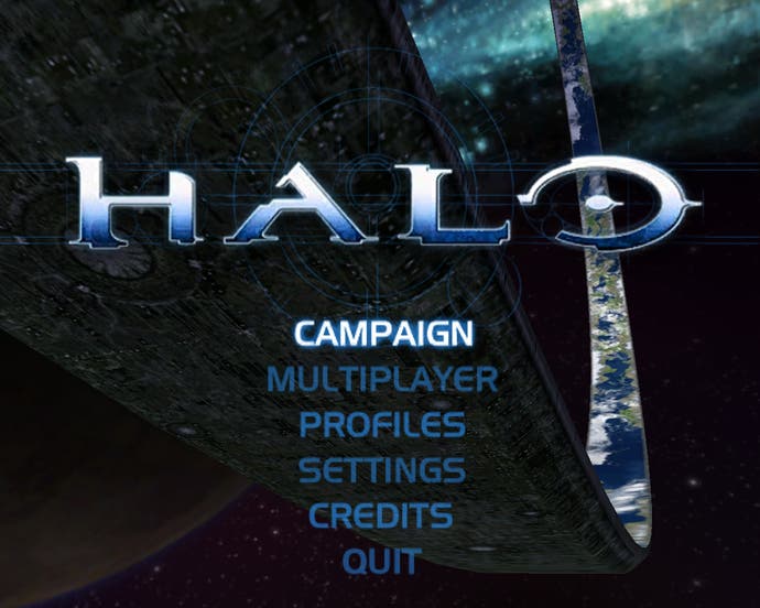
The original Halo's menu is built around the IP's portentous sci-fi. You look at that menu, you feel like you're on a horse. You get the series' most famous piece of music, set to the Halo logo, the Halo itself spinning grandly behind it, all your options done up in the officious garb of block capitals.
And after 35 seconds, the chorus is unexpectedly replaced by those drums that kickstart your heart, those stirring strings (the same song later plays on the beach landing of The Silent Cartographer level). It's almost, almost as if the game is teaching you to wait, in preparation for the thoughtful pace of its combat.
Halo 2's more cocksure. You get the same layout, but the background image is monochrome, almost hidden. The Halo logo's the only thing that matters, and the choral music doesn't go anywhere. You're not being wooed anymore - you're paying your respects to the brand. It's like being in a church.
By Halo 3, we get this new breed of menus where your options are on the left, parallel to the logo, instead of underneath it. The menu is just a Spartan springboard, in both senses, because some extraordinarily wealthy Microsoft employee who probably wears sneakers to work decided that at this point, it'd be better for the Halo brand if it didn't try to sell itself. You turn on Halo 3, you can just start playing. Halo 3 is acting, not unreasonably, as if it's as indispensable as the TV itself.
In downloadable titles, everything I hate about Fez is encapsulated in the fact that you're forced through its lovely yet sluggish main menu twice. Then there's Dota 2, which I'm playing now because I wanted to know if it was as hardcore as everyone said. The answer is that the Dota 2 beta doesn't have a title screen, at present. It drops you into a literal menu of menus.
But there's one thing I can't figure out.
Braid. When Jonathon Blow was making it, he got into a fight with Microsoft about the menu. Specifically, he didn't want one. He wanted you to load the game on the dashboard, and be given control of Tim straight away.
Microsoft said no, on company policy. Every game needed a menu. In time, Blow compromised, and Braid got the minimalist "Press Start" that it has today.
What I don't get is what that says about Braid. I do have a suspicion, though. Braid is, by videogame standards, ferociously autobiographical. In Indie Game: The Movie, Blow talks of the importance of art having a vulnerability. More pertinently, in this profile in The Atlantic, journalist Taylor Clark tells Blow (after spending weeks with him) that he thinks Braid's ultimate message is that the pursuit of knowledge brings alienation. Blow's response?
"Well, I would say that I would not be frustrated at all with that interpretation."
I think Blow didn't want Braid to have a menu because that would have been a characteristically bold first step towards expressing that alienation. It would have left the player unsure of themselves in the game's world, as well as having the implication then whenever the game is turned off, Tim just stands there. Alone.
Just a theory.
There are just too many main menus of note, but I say: let's have a shot at cataloguing them anyway. Name the menus that stick in your mind like hot fudge. Let's show those developers that we were paying attention.
