BioShock Infinite box art intended to entice "uninformed" frat guy types
Levine says there will be alternate box covers to download.
The BioShock Infinite box art was picked to appeal to the "uninformed", the mainstream - the people who don't closely follow games but walk into a shop with money in their pocket and let box art do the talking.
That's what Ken Levine told Wired and he should know, he's the BioShock boss as it were.
Thankfully he also said there will be a "whole set of alternate covers that you can download and print". Irrational will work with the community on that to see what they like.
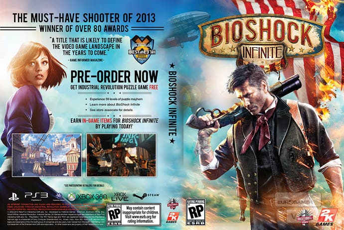
The BioShock Infinite box art was unveiled last week. The most remarkable thing about it certainly wasn't the David Beckham lookalike on the front with a shotgun slung over his shoulder a la Nathan Drake; far more striking was the cosplayer Irrational hired to portray game heroine Elizabeth on the back of the box.
"I understand that some of the fans are disappointed," Levine acknowledged. "We expected it. I know that may be hard to hear but let me explain the thinking."
He said he toured "frathouses" for laddie gamers who don't read gaming websites, and he asked them if they'd heard of BioShock and they said no. He gets that; BioShock's only a relatively successful gaming IP, beloved as it may be - outside of gaming the name doesn't travel that far. It's no Grand Theft Auto or Call of Duty.
Just like Levine uses salad dressing but doesn't follow it as an enthusiast, so he said these people play games but don't dwell on them. And games these days cost so much money those people can't be ignored.
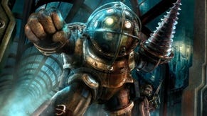
The BioShock 1 box design Levine was "heavily" involved with and features a Big Daddy and Little Sister. Levine said if he was a frat guy he'd think "this is a game about a robot and a little girl", and questioned whether he'd pick that off the shelf.
He even recalled putting System Shock 1 back on the shelf because the box put him off. And he was a gamer. (System Shock 1 would go on to be "incredibly influential" for Levine, too.)
Getting back to BioShock Infinite he said: "I wanted the uninformed, the person who doesn't read IGN, to pick up the box and say, 'Okay this looks kind of cool, let me turn it over: oh, a flying city; look at this girl Elizabeth on the back; look at that creature.' And start to read about it, start to think about it."
To his mind, "the cover is a small price for the hardcore gamer to pay", he said.
"We had to make that trade-off in terms of where we were spending our marketing dollars. By the time you get to the store, or see an ad, the BioShock fan knows about the game. The money we're spending on PR, the conversations with games journalists, that's for the fans. For the people who aren't informed, that's who the box art is for."
