Hands-on with Xbox One
How it looks, caressing the controller, flapping around in front of Kinect 2.0 and hearing about the Skype "vision".
Remember that joke about two GameCubes taped together? Well, to me Xbox One looks like a giant Wii. Sure, it's got more cooling vents than a Deus Ex game (who can blame them after last time?) and size and appointment is more like an expensive amplifier from a mid-80s hi-fi than anything Nintendo's ever made, but that diagonal cut-off at the base of the front bezel gives it a similar profile.
Of course, much of the rest of the Xbox One make-up would be as alien to Nintendo as another famous black monolith once was in Kubrick's Space Odyssey.
Earlier today, in between dashing to interviews and dashing back to have those interviews clarified, I got to spend a decent amount of time gawping through perspex at Microsoft's next-generation console and - thanks to some carefully stage-managed behind-the-scenes tours and "interactive experiences" - I also got to go hands-on with it. I thought you might like to hear about that before I go off to find one of the meals I forgot about in all the commotion.
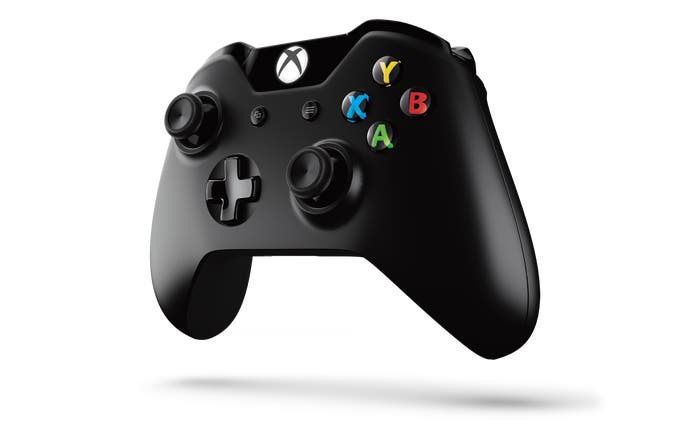
The Xbox One controller
Microsoft says that the Xbox One controller boasts 40 individual improvements over the Xbox 360 controller, which wasn't exactly bad in the first place. Although none of the press in Redmond got to play an actual game, I did get to hold one for 10 minutes or so and try out some dev-kit tech demos to see if I could identify some of those 40 mythical alterations.
The most obvious change to the controller design when you pick it up is the way the battery pack, which used to protrude from the back panel of wireless Xbox 360 pads, is now housed within the unit. A broad rear access panel is recessed into the reverse, giving your fingers a smooth surface to drift across rather than tight valleys of plastic to burrow into. The batteries themselves have been rotated 90 degrees.
I'm not sure whether this extra space behind makes a difference to me - indeed, I may miss the ability to hold up the wireless 360 controller by the battery pack and zoom it around my head making aeroplane noises. However, it's certainly more elegant - as is the way the screw holes that used to be evident have been hidden away. Microsoft's designers have been shaving away at the previously podgy grips, too, in a way they say is more ergonomic. The streamlined contours will fit a wider range of hand sizes more comfortably, they say, and have been tried out on all sorts of people globally.
"The effect of these new [trigger rumble] motors is instantly obvious and very appealing."

The most obvious change to the controller when it's called upon to do something though is the thing the tech demos were designed to highlight: the addition of two new rumble motors into the analogue triggers that work in addition to the two existing motors housed in the grips.
The effect of these new motors is instantly obvious and very appealing. Demos that simulate a heart pounding, a car revving its engine, a helicopter thub-thub-thubbing and - of course - a gun firing speak to your fingertips directly now rather than to the base of your palm. This feels more natural and conveys subtlety more convincingly, because of course your fingertips are much more sensitive than the rest of your hands.
The triggers are also said to be more precise - a previously mechanical linkage is now a magnetic sensor, so developers can register smaller increments of movement. Along with the bumper buttons, which are slightly longer, the triggers feel fine in the hand and your fingers don't easily slide away from them.
Moving on to the face of the controller, the old Guide, Select and Start buttons are updated - the Guide button is in a similar place and presumably works in a similar way, while the icons on the other two buttons hint at multi-tasking and traditional pause menu options respectively.
The analogue sticks are smaller than their 360 equivalents, but remain comfortable to grip. Microsoft says that the texture around the rim is an update that you can cling onto more easily, while twiddling the sticks requires 25 per cent less force than before, which is good news for weak and pathetic players.
I don't get to try any demos that showcase the fidelity of control in the sticks, triggers, d-pad or face buttons, sadly, but apparently the deadzone has been almost totally eradicated. Previously the 360 controller - in common with many pads - had sticks that wouldn't always return to the precise same starting point with 100 per cent precision, hence the existence of deadzones, but Microsoft says the new controller overcomes this limitation almost entirely.
What else? The d-pad is no longer visually reminiscent of a dinner plate jammed onto the front of the pad and about as useful as one; it has a micro-switched feel under the thumb and a few swift quarter-circle motions are comfortable. The proof will be in the eventual fireballs, obviously.
Microsoft also says that the speed of data transmission between the pad and the Xbox One system is faster than ever. We don't get any exact measurements, but a 15-20 per cent increase is mooted. There's also a high-speed data port at the bottom of the middle of the pad, similar to the headset port on the 360 controller and presumably - although this is not confirmed - for similar add-ons.
[Microsoft said this to Joystiq in a statement: "The Wireless Controller will connect to the console using high speed data transfer to enable higher fidelity headset audio and future controller add-on experiences that are not possible with Xbox 360 wireless technology." Xbox 360 controllers and accessories won't work with Xbox One. -Bertie]
Overall the controller feels light but robust and boasts plenty of logical updates. A few minutes of waving it around, thumbing through test menus and playing with the trigger vibration motors suggests only good things, but the acid test will be, you know, games. Perhaps at E3, then.
As we moved on in our tour, I asked if there were plans for a wired version. Not at this time, apparently.
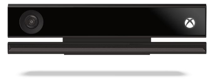
Kinect 2.0
It's not actually called Kinect 2.0 - apparently they just refer to it as "the new Kinect" - but in feature and function terms it certainly feels like it deserves a new moniker. Core gamers who thought the old version was bobbins will probably want to differentiate, if nothing else.
The tech demos I get to see for Kinect are crowd-pleasing, for sure, although the language and rhetoric around its capabilities is suspiciously similar to all the hype we faced down last time around, so forgive me if I want to play something with it before jumping off the fence.
In the meantime, some raw facts and observations.
We get to see three camera views that the brain in Kinect 2.0 has to work from. The first, simple 3D vision, uses "time of flight" - measuring the amount of time it takes for photons fired by the sensor to bounce off you and return - in order to establish a 3D portrait of your movements.
There is negligible lag between the person in front of the screen and their image on it and that image is very detailed - right down to shirt wrinkles and even buttons. Apparently the fidelity is about three times that of Kinect 1.
The colour camera is pretty self-explanatory and - in common with the others - is 1080p over a broader field of view horizontally and vertically, updating 30 times a second. The high definition means that a Skype call can zoom in on someone in the corner of the room and still have a lot of pixels to play with.
In low light conditions or indeed in the absence of light, Kinect reaches for the new Active IR view, which lets it see in the dark. Even better, it can ignore other light sources that might prove confusing, so when a torch is held above a volunteer's head the Active IR view simply sees them without any evidence of torchlight. Seeing this camera view in action is pretty close to magic.
"One of the most impressive demos tracks heart-rate based on - we're told - fluctuations in blood flow in the subject's face."

Skeletal tracking returns, of course, now in high definition. Standing in front of the Kinect sensor, it picks up 25 joints, including subtle movements like a lean in the spine or shrug of the shoulders. It can't see individual fingers but it can tell between your thumb and the four-finger block described as "tip of hand", so on-screen you look a bit like Danny DeVito's Penguin.
Within all this, Kinect 2.0 can also see things like rotational movements of your limbs and it even understands things like forces and muscle activity in the body. We get to see this, too - when a volunteer squats, the thigh muscles of the blobby red tech-demo avatar on-screen thicken as it calculates the torque.
It can also tell how weight shifts from foot to foot or how load is released when you jump. One demo involves the subject throwing air punches of various intensity and Kinect 2.0 throwing up circles of varying size to indicate its understanding of the impact point and impact strength.
This stuff isn't perfect - one volunteer throws a very heavy punch and it doesn't register, although it's not clear if this is because he got too close or the machinery simply didn't realise what happened.
One of the most impressive demos tracks heart-rate based on - we're told - fluctuations in blood flow in the subject's face. We also see how it interprets your expression (happy, neutral, etc) as well as engagement (whether you are looking at the screen), which controller you're holding, and where you are standing relative to another player it is tracking.
All of these tech demos work elegantly enough, but it should probably be noted that they are not faultless. The expression and engagement elements don't always work correctly.
Even so, the implications for things like the heart-rate sensor are very interesting. Fitness games, sure, but what about other genres like shooters or more suspenseful activities?
It's good at telling when you're talking, too. Perhaps fittingly, we're mostly talked through this rather than given a solid live demo, but the theory is impressive if it actually works: Kinect 2.0 professes to cut through the noise of a 5.1 game soundtrack to locate those soft-spoken syllables that make up voice commands. After being shown Microsoft's "$1 million" anechoic chamber, I can believe the Xbox One team has the facilities to go after this, and hope to hear a live demo sometime rather than a recorded one.
The big question with Kinect 2.0, of course, is what kind of space requirements it has and if you can use some of the features even if you haven't the physical room to enjoy all of them. I am a particularly interested observer here, because despite living in a decent-sized flat I have never been able to make it to the end of the Kinect calibration sequence without being told to knock down some walls or buy a new house.
The increased field of view of the camera will allow for Kinect 2.0 to work in smaller spaces, we're told, although the demo room we see it at work in is predictably cavernous. Even to a sceptical eye such as mine, however, it's clear that this claim has merit, because our fairly tall demo leader gets easily within two metres of the camera before he starts disappearing off the top and bottom of the on-screen view.
What's more, speech recognition functions will all work in any case, so you won't be barred from some of Kinect 2.0's treats even if you live in a shoebox.
As with the controller, the tech demos are interesting and very promising, but the proof will be in the games. Roll on E3.
Skype on Xbox One
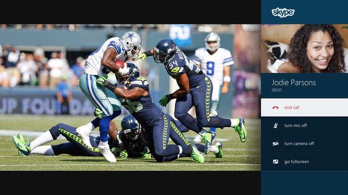
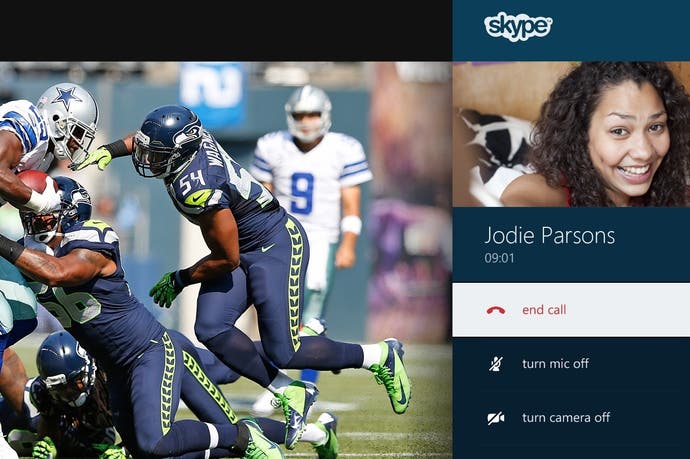
Finally, the least impressive of the demos. The concept is fantastic: you will be able to have 1080p, full-screen calls and thanks to Kinect it can tell who everyone is, the echo cancellation is great, group video is easy peasy, it works nicely with the "snap mode" feature, voice and gesture, etc etc. What's not to like?
"Skype for Xbox One will be a launch feature."

The only problem is that all we get to see is a video simulation of how it's going to look. I asked why and the very pleasant spokesperson for the project explained: "It's just a question of where things happen in the schedule itself. We'll be showing demos in the future, but we really wanted to show at this point the vision of what we're trying to achieve."
OK, but does that mean that the call Yusuf Mehdi supposedly received from his colleague in the press conference was smoke and mirrors? The representatives in the room aren't sure of the answer. I'll update this piece if they are able to get back to me about this later.
One thing they are sure about, however, is that Skype for Xbox One will be a launch feature.
One is the loneliest number
The differences between Sony's approach to a console unveiling back in February and Microsoft's today were many and profound, as we'll doubtless spend the next few months obsessing about, but the latter deserves credit for not just showing the hardware but allowing the press to get so close to it.
It would have been easy to show the slick demos and then leave it there, but no, we got to tour the facilities, probe the people working on it, and even touch and feel some of the hardware and tech demos. With that in mind, I feel like giving them a bit of benefit of the doubt about the various gaps and IOUs in what I did get to play around with and hear about.
Nevertheless, the next time Microsoft shows Xbox One to the world, it will be time to move past all this theory and see how it goes with games and real-world use of the interfaces.
In the meantime, the controller feels good, Kinect is full of promise again, and Skype is a neat concept.
Xbox: I could do with a sandwich.
This article is based on a press trip to Microsoft's campus in Redmond, Washington. Microsoft paid for travel and accommodation.

