Crush review
No more candy for you.
I was listening to the Kermode and Mayo podcast the other day, during which the two were joined by Joss Whedon, who was there to talk about his recently released take on Much Ado About Nothing. Kermode affectionately referred to the film as a palate cleanser, and this description seemed to mildly irritate Whedon.
So I hope Luke Schneider doesn't take offence when I talk of Crush in similar terms. Like Much Ado, it was made in a comparatively short space of time (five weeks rather than 12 days, but that's still pretty brisk for a game of any kind), yet the result is equally refreshing, stylishly presented and engaging.

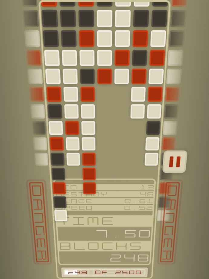
It's a puzzle game with a disarmingly simple hook: a pile of blocks in three different colours appears on the screen, like a half-full Tetris or Lumines session, and your job is to tap groups of connecting tiles to remove them before the screen fills up. The twist? Each time you tap, the pile surges downward.
There are three modes, but all are minor variations on the same theme: the one named Think gives you more time to figure out your next move but the blocks rush further forward, React has shorter swells but the stack moves more quickly, while Crush, unlocked last of all, falls somewhere in the middle ground.
The grid - which can be reorientated according to preference - wraps around, so any blocks near the top or bottom (or left and right, if you're playing in portrait rather than landscape) will remove any same-coloured ones connected on the other side. Those lines are displayed either side of the gulley in slightly faded colours, just enough to make the connections readable without proving too much of a distraction from the central columns.
The screen fills alarmingly quickly - if you survive for two minutes in each mode you're doing well, says Schneider - but power-ups, which are gradually earned over the course of perhaps your first dozen or so games, can help stave off the inevitable for a short time.
You'll need to earn them each time, though, and the more powerful ones require that you destroy a larger number of blocks. Duet, for example, is a godsend, turning the most common colour into the other two, allowing you to demolish the stack with two or three taps. But it takes an age to arrive. Slow, triggered much sooner, briefly halts the rise; it's useless in Think mode but essential in React.
You can't store more than one, so it's tempting to use them immediately, though many are best saved for impending disaster. You can opt to keep one in reserve, to be used automatically when a column reaches the edge of the screen, though it's gone forever if you do. There's an element of randomness to it, but as with all good puzzlers, it tests your crisis management skills - how you react to a tough roll of the dice. In other words, it's surprisingly strategic for such a simple game.
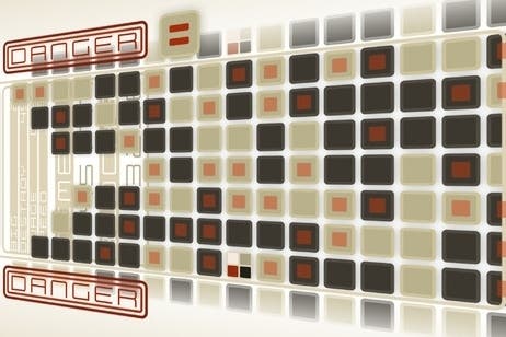
It's surprisingly stylish, too. Schneider has admitted taking cues from Propellerhead's iOS work (if you've not tried said developer's excellent music app Figure, then consider this a recommendation within a recommendation) and it shows, from the minimalist font, to the elegant colour scheme, to the unusual viewing angle. That might sound like a terribly shallow thing to care about in a puzzle game, but looking a bit cooler isn't going to do it any harm. The sound effects are great, too, each tap adding a thumping electronic beat that gets louder the more blocks you remove.
Crush is a palate cleanser in the best possible sense, then: it's light, smooth and leaves a very pleasant aftertaste. And unlike its candy-flavoured namesake, there's not a whiff of cynicism about it.


