The Drowning review
Sink or swim?
Imagine you discovered an amazing new food, and the first thing you tried to do was put it between two slices of white bread. Or what if you were handed a remarkable new musical instrument, and your immediate reaction was to see if you could make it sound like a guitar?
That's the frankly weird impulse behind the ongoing, quixotic quest to make first-person shooters work on touchscreens. A new technology that demands accumulated decades of input dogma be thrown out, inviting completely new ways to play, and some people apparently can't wait to make it do the same thing as every other gaming device. Such is the big selling point of The Drowning, a glossy touchscreen first-person shooter that claims to have come up with the answer to a question that didn't need to be asked.
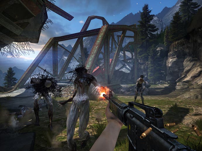
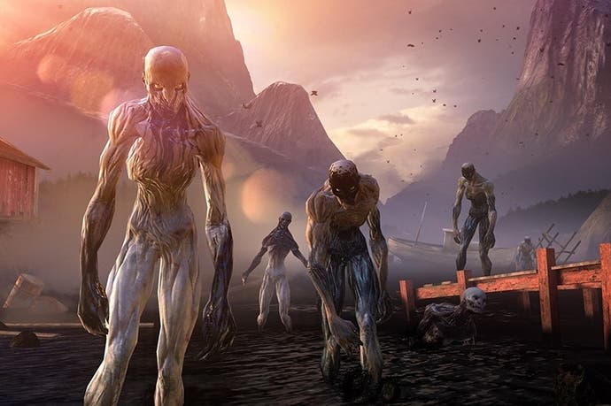
The storyline is thin enough that you can safely skip it. Gloopy zombie-like creatures emerge from an oily sea and lay waste to the Earth. Handful of survivors... last stand.. .blah blah blah. What matters is that you can shoot these monsters in the face, just like you can on the PC or Xbox. Or at least, a little bit like you can on those platforms. The Drowning has to tinker with the guts of the genre to make it work without a joypad or mouse but, credit where it's due, the system that developer Scattered Entertainment has come up with is about as close as we're likely to get to something that works through touch alone.

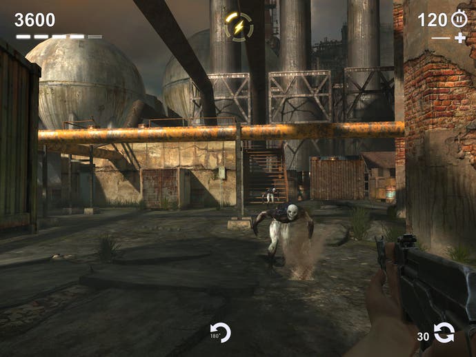
Moving around is simply a matter of tapping where you want to go. You'll head there automatically, moving around obstacles without further input. Swipes left and right rotate your view, and there's a quick turn icon at the bottom of the screen for those desperate moments. Two-finger swipes can be used to strafe, while shooting also uses a two-finger solution. Rather than tapping with one finger to fire, thus obscuring the target with your own meaty digit, you tap with two fingers and the bullet lands in between them. If The Drowning has a moment of ingenuity, it's this, and it works very well.
It just doesn't always work well enough. This is still a clumsy and unnatural way to play an FPS, and while it's more functional and intuitive than many previous touchscreen shooters, it's still inevitably going to be your third choice if keyboard, mouse and joypad are unavailable. Mostly, you'll find yourself running to a distant corner and firing madly at the oncoming horde before running to a different corner and repeating the process. When monsters do get up close, the system creaks and you end up all fingers and thumbs. Yet what's most damaging is how this compromised control impacts the game design itself - an issue compounded by the odious demands of free-to-play.
This isn't a corridor shooter, but more of an arcade arena game. You enter a small, enclosed space and battle away for a few minutes, trying to earn stars which will unlock additional weapons and items for crafting. Most of the maps have two variations - one for attack, where you're on the offensive, another where you have to hold back monsters which try to break through your barricades, as in Call of Duty's Zombies mode.

The tight time limits leave little room for nuanced play, however, and the maps themselves are held back by having to accommodate the semi-automated controls. There are no interesting features, just rudimentary spaces peppered with exploding barrels. The scenery changes as you blast through three islands' worth of encounters, but there's little sense of escalation or much change in tempo, and the game's intrusive in-app purchases ensure that what progress you do make feels like a grind.
The more stars you earn in a skirmish, the more loot you find. Up to three stars will get you common loot, with rarer items restricted to those who score four or five stars. What sort of loot? Well, all sorts of bits and pieces. New weapons are found in a broken state and must be repaired by earning parts. Travel to the next section of the game requires a similarly broken vehicle to be found, fixed and fuelled. You'll be replaying these short but largely senseless battles many times over.
There are several currencies tangled up beneath The Drowning's surface. Black oil is used to grease most transactions and is easily earned. Flare gun rounds are more precious. These can be used to unlock rare items even if you didn't score highly enough. Needless to say, the items needed to build and upgrade your weapons and vehicles fall into this desirable category.
Still, not a problem, right? Just get better at shooting stuff and earn it all the hardcore way. In theory, yes. In practice, no. You start with a feeble pistol, which can take three or four headshots to down a single foe. You'll find plenty of weapons early on, but must rely on this nerfed starter weapon to earn the parts needed to improve the odds.
This is a transaction machine first, a headline-grabbing control scheme second and an actual game a distant third

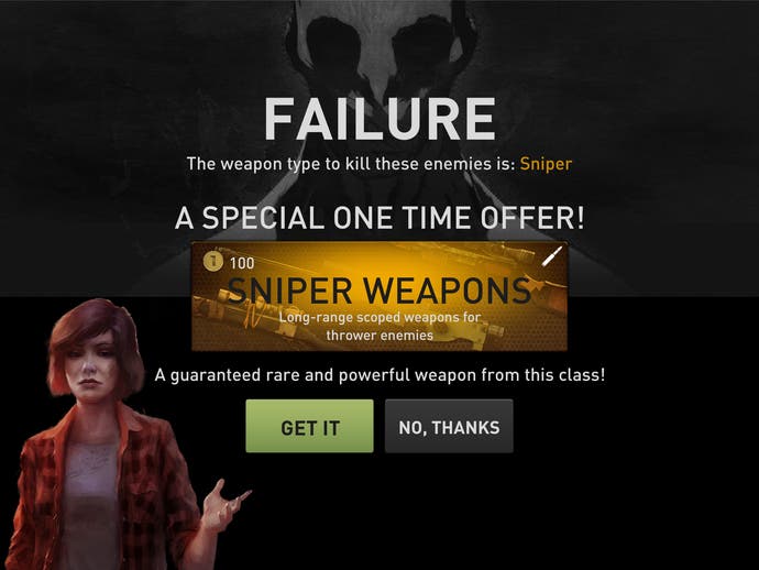
More obnoxiously, the game introduces new enemy types almost immediately, and they're immune to your weak handgun. There's even a level right near the start that is populated entirely by these creatures, meaning there is no way to beat the stage the first time you play it. After you've failed dismally, up pops the prompt reminding you that more useful weapons - weapons that can actually kill the enemies - can be unlocked immediately, should you wish to part with some real money. Naturally, this is the only level where you can earn an item needed to craft the vehicle needed to progress to the next area. Obstinate players can plough onwards, but eventually all roads lead to micropayments.
Yet The Drowning isn't content to merely lock its weapons away behind repetitive grinding and paywalls. There's yet another currency, in the shape of fuel cans. Each level you play uses up this resource, and it refills according to one of those damnable timers that free-to-play games love so much. You can only play for so long before the game tells you to go away and wait, or start paying.
This is a game that cannot wait to start asking you to pay, and has at least four interlocked currencies designed to make you feel like you should. To assume that sort of aggressive monetisation isn't a factor in the game's obstructive, uphill design, which ekes out progress to non-paying players painfully slowly, is to be wilfully blind to how this sort of thing works.
After plugging away at The Drowning for a few days and pumping money into its ravenous maw, it becomes clear that this is a transaction machine first, a headline-grabbing control scheme second and an actual game a distant third. So much of its appeal hinges on the patronising notion of the player being impressed at a "proper" console-style game on a touchscreen, but once you get past that bit of hardcore-pandering razzle-dazzle there's very little here beyond shiny visuals and pay-to-win design. It looks like an FPS, and it even plays a little bit like an FPS, which is apparently a big deal - but over the long haul, The Drowning proves ironically and fatally shallow.

