Chris Donlan on: Gaming's cruellest downgrade
Drawing a line.
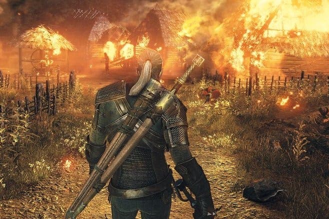
The big news this week is that The Witcher 3 is out. The other big news is that The Witcher 3 no longer looks quite as good as it did back at VGX a few years ago. This narrative - let's call it the downgrade narrative - is something we seem to be hearing quite a lot these days, so much so that something will probably have to be done about it. Vertical slices (these are carefully-prepared portions of a game that offer a sense of the ideal finished product) look amazing, but they apparently look too amazing to be viable as anything other than a vertical slice. The Witcher 3, Watch Dogs, Aliens: Colonial Marines - this list is going to keep getting longer. It's a crying shame, not least because it's easy to understand the bind that developers find themselves in when showing off a game at such an early stage. Even so, the impossible vertical slice leads to an erosion of trust, and to a situation where you approach an exciting new project warily, with a weather eye open for all the ways it will eventually disappoint you.
What is easy to forget, though, is that this downgrade - the tradeshow, big reveal downgrade - is actually the second downgrade that most games receive, and it's probably the milder of the two. The first downgrade takes place in secret, and it must be truly heartbreaking for everyone involved. This is the concept art downgrade, the moment that beautiful 2D visions of a new universe are first translated into code and shaders and 3D models and maps, the moment that an idea starts to inch towards its own implementation.
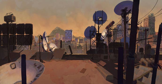
I had a chance to think about this at length this week when Brandon Boyer, one of video games' fairy godmothers, put a link on Facebook to a collection of concept art for Sunset Overdrive along with the line, "i wanna play THAT game." It is hard not to agree with him. I loved Sunset Overdrive - it's that precious, video game love that only grows richer and crazier over time - and part of the reason for that is the compact, primary colour world Insomniac's game plays out in, a ditzy metropolis where cherry blossom floats beneath Jetsons superscrapers and where telephone cables are scribbled across a pure Sega-blue sky.

Look at the initial artwork, though, by the insanely talented Vasili Zorin, and the real game starts to seem like pale fire. Suddenly, here's a souvenir shop turned into a riot of typography and yet rendered wonderfully austere by careful greys and browns. Here are river front apartments, stately and slim before the shimmering water. Here are the rooftop sentinels of the city, a congregation of satellite dishes pointed into the orange evening sky. Here is an industrial district imagined as a teetering shanty, stacked haphazardly on what look like the legs of an oil platform, rusting under a hot summer sun.

i wanna play THAT game. This is true for almost every game, isn't it? No matter how good they eventually look, it is still a wrench to see them back on the drawing board before the death of a thousand cuts has begun. Often this is partly due to the necessary transition from 2D art to 3D models - the simplest way of explaining the intimate violence this can cause is by comparing the 2D Daddy Pig from the Peppa Pig cartoons to the deformed horrors of the toys - but it is also partly down to other things. Budget, practicality, sight lines and the need to create a readable landscape for the player to inhabit that will also operate at a decent frame rate. These are all major concerns, and they're probably joined by more that I am cheerfully ignorant of. And there's another one, too: people.
When a concept artist sketches some cityscapes for a new game, they will be trying to recreate the vision of other members of the team, for sure, but at that precise moment they will be channeling all of that through their own mind, their own pen. You get something singular and coherent and uncompromised, and then it goes out into the world and - I imagine - everybody starts to peck away at it a little bit, often unintentionally. If people can't have the one thing that they specifically love, they will turn a thing that somebody else specifically loves into something that everyone can accept. Sunset Overdrive felt pretty bold at the time, and it still does: the vivid use of colour, the sense of aimless knockabout fun where the city is in jeopardy but really, come on, nothing much is genuinely at stake. Looking at the art, though, I wonder how much bolder it could have been if its fantasy world didn't have to suffer because of the real world.
This kind of problem is not limited to games by any means. All collaborative art has it to some degree, and you see it in places that you would never expect to. Los Angeles, just about my favourite city in the world and one which, if you approach it from the correct angle, has a truly peerless kind of beauty, has had a major downgrade over the years, let me tell you. It's chronicled in one of my favourite books, Never Built Los Angeles, which gathers together a load of blueprints and architectural drawings for a bunch of amazing stuff that was doomed to remain on paper for eternity.
Stuff like a plan for Bunker Hill by Lloyd Wright (the son), which turned the area that now contains the Bonaventure into a kind of Egyptian necropolis: a huge mass of thick oblongs, arranged in fearful symmetry and designed on a truly inhuman scale, with tiers of freeways to separate different types of transport. Stuff like Lorado Taft's Dream Museum, which was conceived to house full-scale replicas of the world's greatest treasures. This is about as LA as it gets, right? The museum's halls would have comfortably contained a copy of the Parthenon, and Taft, a sculptor and, needless to add, eccentric, even got as far as hammering a surveyor's stake into the proposed site on February 9th, 1934. Sadly, he was bonkers, and so was his plan.

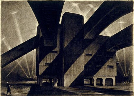
And LA isn't alone. Hugh Ferriss' mesmerising book The Metropolis of Tomorrow posited a future for all big cities in which skyscrapers exist inside shadowy hangars, the air thick with drifting zeppelins. You see a hint of this dream surviving today in the form of that spike on top of the Empire State Building, which was apparently once planned as a mooring mast. Budgets, in-fighting, the great depression and, yes, hydrogen's chirpy powers of combustion put an end to all of that.

It's no wonder, then, that when you examine the gap between what a game developer first promised you and what they delivered, there's already been a much larger gap between what they first imagined and what they were able to make.
At least for games there is a solution of sorts, and that's the rise - or rather the return to - the era of games that are made by a single person. The smaller the team, the more limited the compromise, because there are 400 fewer people to have to convince of every single change you want to implement, and because there is nobody - to use David Braben's wonderful turn of phrase - whose entire working life is composed of simply making the noses on virtual footballers.
Even here, though, there is friction at play. One of the weird things about creativity is that it is a perversely destructive act, and a kind of sadness can kick in once you get closer to completion. As you zero in on all the wonderful things your game or movie or book or song will be, you are simultaneously killing off all the wonderful things it will not be. You are ignoring the vital, exciting, brilliant ideas that exist outside of the frame.
You are closing one eye, so that the other may see a smaller part of the view with greater clarity.

