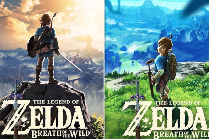
Let's compare and contrast the US and European Legend of Zelda: Breath of the Wild box art
They're quite different.
It turns out Europe's The Legend of Zelda: Breath of the Wild box art is a little different than North America's.
Let's start with the box art for the North American version.
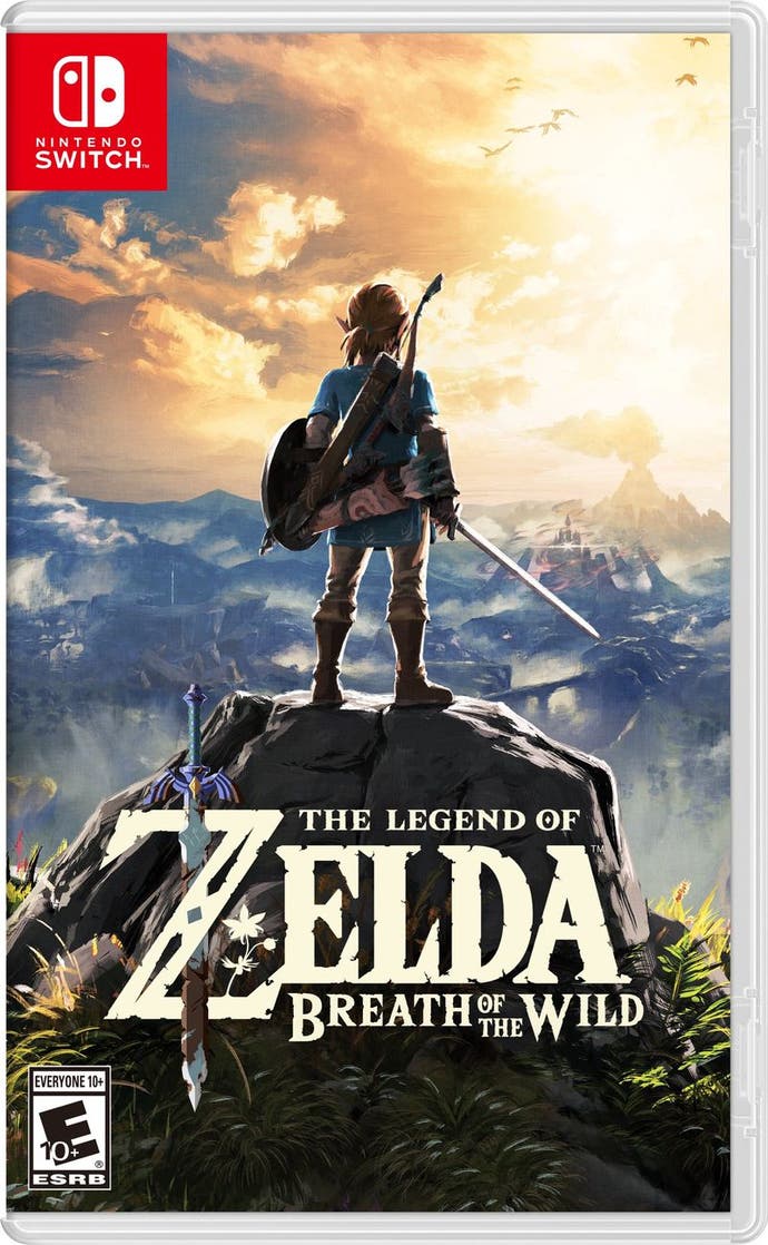
We see series star Link standing on a rock and staring at the horizon. There are mountains in the distance, a shining light from what looks like a castle. Note he is facing away from us. We see his back.
Now, onto the European box art.
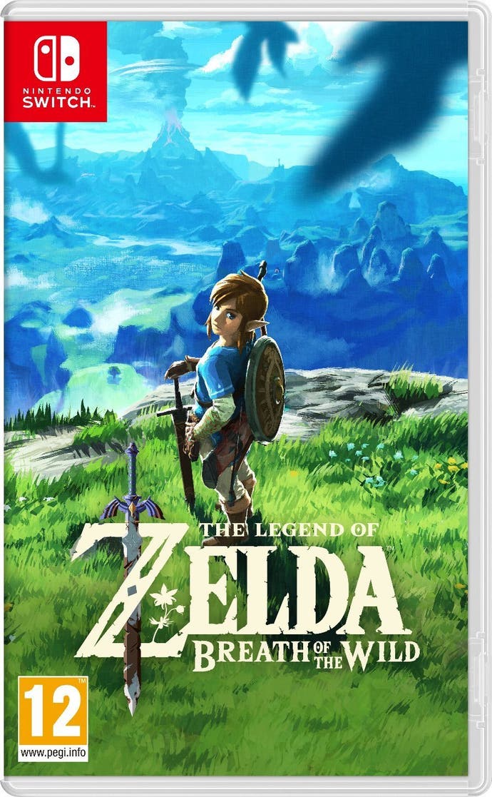
It's a similar scene, except the colour palette is different, the horizon is different and Link is standing on a patch of grass rather than on a rock. Link has turned to face us. He looks at us from an over the shoulder, side on angle.
The US version sees Link with sword and shield at the ready. In our version, Link's shield is resting on his back and his sword is held as if a walking stick.
Here's an odd difference: the US version has some birds in the distance. But our version features birds as if they're flying in front of the camera and as such, are out of focus.
My view is the US version is going for a more traditional open world action role-playing game box art, whereas our version leans more on the sense of adventure and exploration. To me, the US version looks like a movie poster. It's a classic hero shot.
The European version looks like a picture someone took of Link while he was on a nice walk through the highlands. It reminds me of the Hobbits setting out on their journey in The Lord of the Rings. There's even a Mount Doom vibe.
The US image is about power: Link, sword drawn, is going to tame this landscape. The Euro image is far more about the landscape itself. You can see more of it, and Link is more a part of the world than a potential ruler of it. He is made to look small in the face of nature. One's about saving the day and the other's about exploring.
What do you think?
