The making of System Shock 2's best level
Come play with us.
It's one of gaming's most terrifying introductions. You awake in a cryotube on the medical deck of the spaceship Von Braun. Illegal cybernetics have been implanted into your brain, and your memory has been wiped like a hard-drive. You're contacted by Dr. Janice Polito, who summarises the situation. Nearly everyone on the ship is either dead, or infected with a strange organism that mutates them and turns them hostile. There's an explosion, and Polito tells you to get out of cryobay, because soon there'll be another explosion, and then everything in the area will be sucked into space.
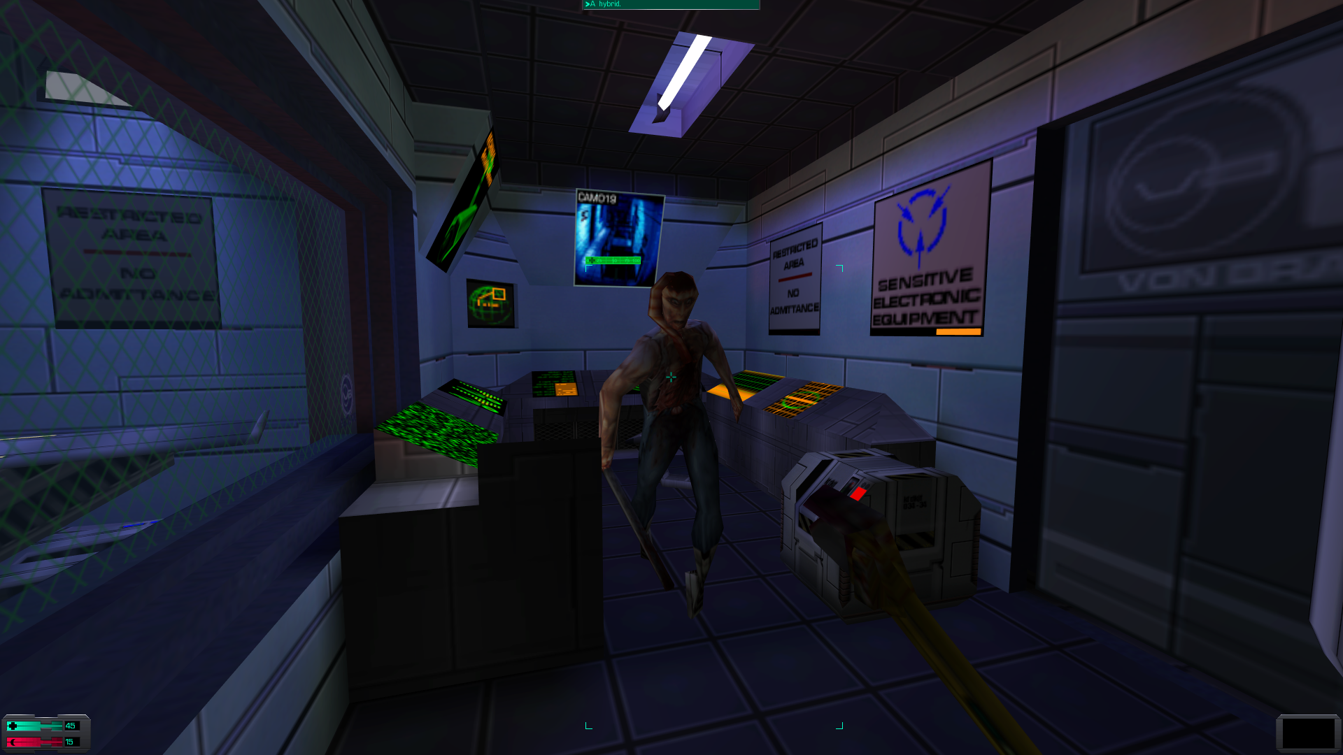
You rush to the airlock, crawling through a hamster run of corridors and access tunnels as you're given a brief rundown of how to play. No sooner have you made it through the airlock when you're attacked by a malformed crewmember, begging you to kill him. All you've got to hand is a wrench. If you're lucky, you'll bludgeon him to death. He'll be the first of many.
Welcome to Med/Sci.
Med/Sci is the opening area of System Shock 2, one of the most influential games of its era. It has directly inspired games like BioShock, Dead Space and this year's Prey, while aspects of its design have found their way into dozens of other titles. But Med/Sci itself substantially influenced how the remainder of System Shock 2 was developed, as it's in this initial area where the ideas and atmosphere of the game are established, and where the player is grounded in its themes and modes of play.
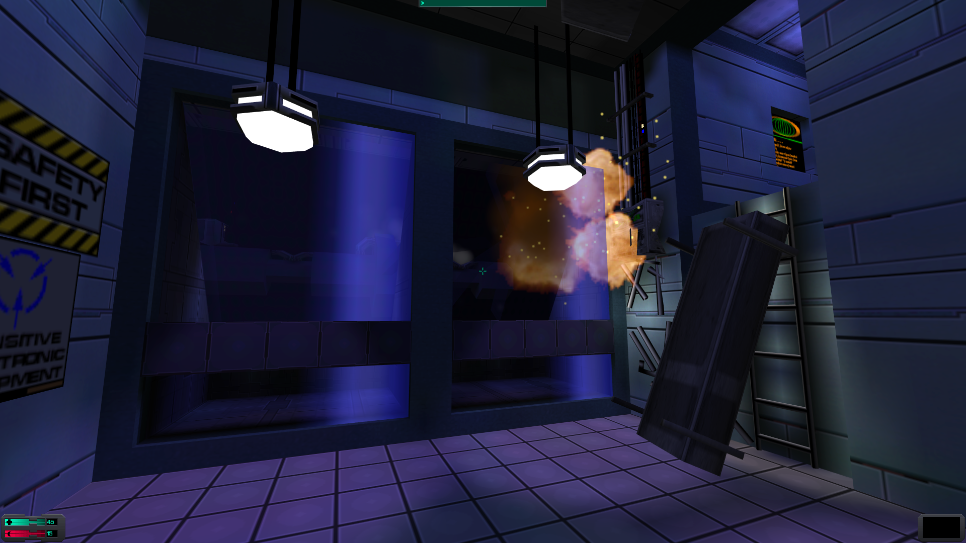
"We had to do a lot In System Shock 2 with the first level," says Ian Vogel, a former level designer at Irrational, and the man who authored Med/Sci. "We're giving you all the world-building, we're giving you all these new notions of who you are, what's going on with the ship, all these new mechanics, new weapons. And on top of that you want that feeling of emergence, of autonomy as a player."
How does a designer juggle all of these different elements when building a level? Vogel boiled it down to a simple objective. "My goal was to get an 88 in PC Gamer. And that was my only goal."
System Shock 2 was the second game Vogel worked on. The first was Thief. Although Vogel enjoyed his time on Looking Glass' seminal stealth game, he says it "was not as customisable as I personally liked". When Looking Glass and Irrational Games joined forced to design a sequel to System Shock, Vogel jumped ship from the former to the latter.
"When I met with Ken [Levine] and John Chey, the guys at Irrational, I got this scrappy, hungry feeling that I wanted to be part of. I got this feeling that these guys wanted to make their mark," Vogel says. "I loved the game design and I loved the theme, and I loved the original System Shock. So I was like, 'I want to make this my own, and I want to leave my imprint on this title.'"
System Shock 2 has a very different layout to Thief, and indeed most immersive sims. From the player's perspective it isn't constructed from individual levels. At least, not explicitly. The spaceship Von Braun does comprise several decks, each with a different form and function and separated by loading screens. But the environment is built through a more holistic approach, with the player required to traverse back and forth through the ship frequently. Indeed, if System Shock 2 did have a sequential structure, then Med/Sci would actually occur smack in the middle of the game.
It's from this perspective that Looking Glass and Irrational began development. "There wasn't a really great plan for Med/Sci at the time because we're all scrabbling to make the entire game at once, right?" says Vogel. "It was basically a flat basement space, and it just didn't feel like a spaceship. It didn't feel interesting. There weren't any nooks and crannies that were either architecturally true to what a ship could be. It just felt flat and kinda lifeless."
In Med/Sci, Vogel saw his chance to make his mark. He stepped forward and asked for creative control over the level. "I just owned it. I was like 'Lemme do this' and I rebuilt the level three or four times," he says. "I just wanted to welcome players and terrify them at the same time."
There were various sources of inspiration for the way Med/Sci introduces the player. From a structural and narrative standpoint, the primary influence was not Thief or the original System Shock, but Half-Life. "That had shipped I think a few months earlier, and I just remember their attention to narrative, their pacing, the mystery that you felt as the hero uncovering this world," Vogel says. "I wanted to use the emotional anchors and prods that Half-Life was looking at." This is particularly evident in the early moments of Med/Sci, when there are several scripted events that demonstrate the deteriorating condition of the ship.
Half-Life offered Vogel a framework for bringing the player into System Shock 2. But the tone and the atmosphere emerged from another source entirely. "We didn't have a clear North Star from a vision standpoint. We knew the game. We knew what we wanted the game to be. But we couldn't easily replicate it even to ourselves. And I was talking to the group one day, I'm like 'You know what this is, we need The Shining in space.'"
The particular nature of the horror in The Shining - a malevolent presence that doesn't simply attack but manipulates and infects over time - was the lynchpin in the atmosphere that Vogel and the team were grasping at. "That was the moment where everything clicked. It wasn't a literal recreation of The Shining. But it was that feeling of isolation, and hallucination and unreliable narrators," Vogel says. "Everything that happened with SHODAN later on, that had nothing to do with The Shining, but that atmosphere had everything to do with The Shining."
Where System Shock 2 diverged from The Shining (Vogel was inspired by both Stephen King's novel and Stanley Kubrick's film, though the two offer famously different approaches) is that there is not one malevolent force working inside the Von Braun, but two. What's more, these two forces are at war with each other, while the player is a pawn caught in the middle. On the one side is the imperious, manipulative AI SHODAN, and on the other, the aggressive, infectious hivemind of the Many. This battle between the synthetic and the organic becomes the defining theme of the game. And it's a theme that coagulates in the corridors of Med/Sci.
Take the basic layout of Med/Sci, which again has two sources of inspiration. The first, as Vogel explains, is Star Trek. "I would spend hours with Star Trek blueprints and I would just think about how a game level might be constructed, and I would look at where they put the toilets and I would look at where they put the research and I would look at how they built the decks relative to each other." Submarines and battleships were also useful references. Vogel wanted to imbue Med/Sci with a "dark and functional" feel and these naval vessels, both real and imagined, provided that cold and logical pragmatism Vogel sought.
But the other strand of inspiration for Med/Sci, as hinted at by the first part of the name, is a hospital. "If I go to a doctor here in Seattle, I'm usually shepherded down to a basement floor somewhere where there's tons of labs and there's signs but I still get lost. And there's 15 intersections along the way and I've already taken a left when I should have gone right, and now all of a sudden I gotta ask a nurse how to get to damn X-Ray and it was right in front of me the whole time," Vogel says. The point is, as Vogel further explains that hospitals aren't always built efficiently. They're vast, bustling and confusing places, almost hive-like in structure.
The resulting layout of Med/Sci is a disorienting blend of order and chaos, where every room and sub-section of the deck has a clearly defined purpose, but it's all connected by a twisting maze of corridors and staircases that's bewildering to anyone who doesn't live and work in it day-to-day. It's a combination of synthetic design and organic necessity, where efficiency and logic collides with the realities of working with the limited space available aboard a transportation vessel.
It would be nice and neat if there was a detailed timeline for how each room and corridor of Med/Sci was laid out. But development didn't work like that. Instead the design resulted from a more high-level process of gradually fleshing out the deck over many iterations. "We'd go a little bit from paper design, where we're figuring out some rough balances with the game, some rough introductions. We'll write design treatments which say, 'In this level, here's the plot, here's the sort of mystery, here's the gameplay mechanics we're going to introduce, here's the enemies we're going to introduce," Vogel explains. "Then, the easiest thing for me to do is just go build it, right? Even if it's ugly and untextured."
That said, Vogel does recall that the first version of Med/Sci was an empty shell, where he defined the layout and figured out what each area of the deck would be used for. From that point, subsequent iterations were about fleshing out that space, adding in storytelling cues, enemy patrols, and weapon placements.
Even in these smaller elements, the theme of synthetic and organic reveals itself. The first enemies the player faces are what Vogel terms the "pipe grunts" - former soldiers who have been brainwashed and mutated by the Many - and psionic monkeys which have escaped their containment in the medical research bay, and attack the player with telekinetic blasts. "Having these grunts that used to be soldiers, having these monkeys that used to be probably just normal animals, Med/Sci was a way to also bring in that sort of cyber-body fusion and create a little palette for it."
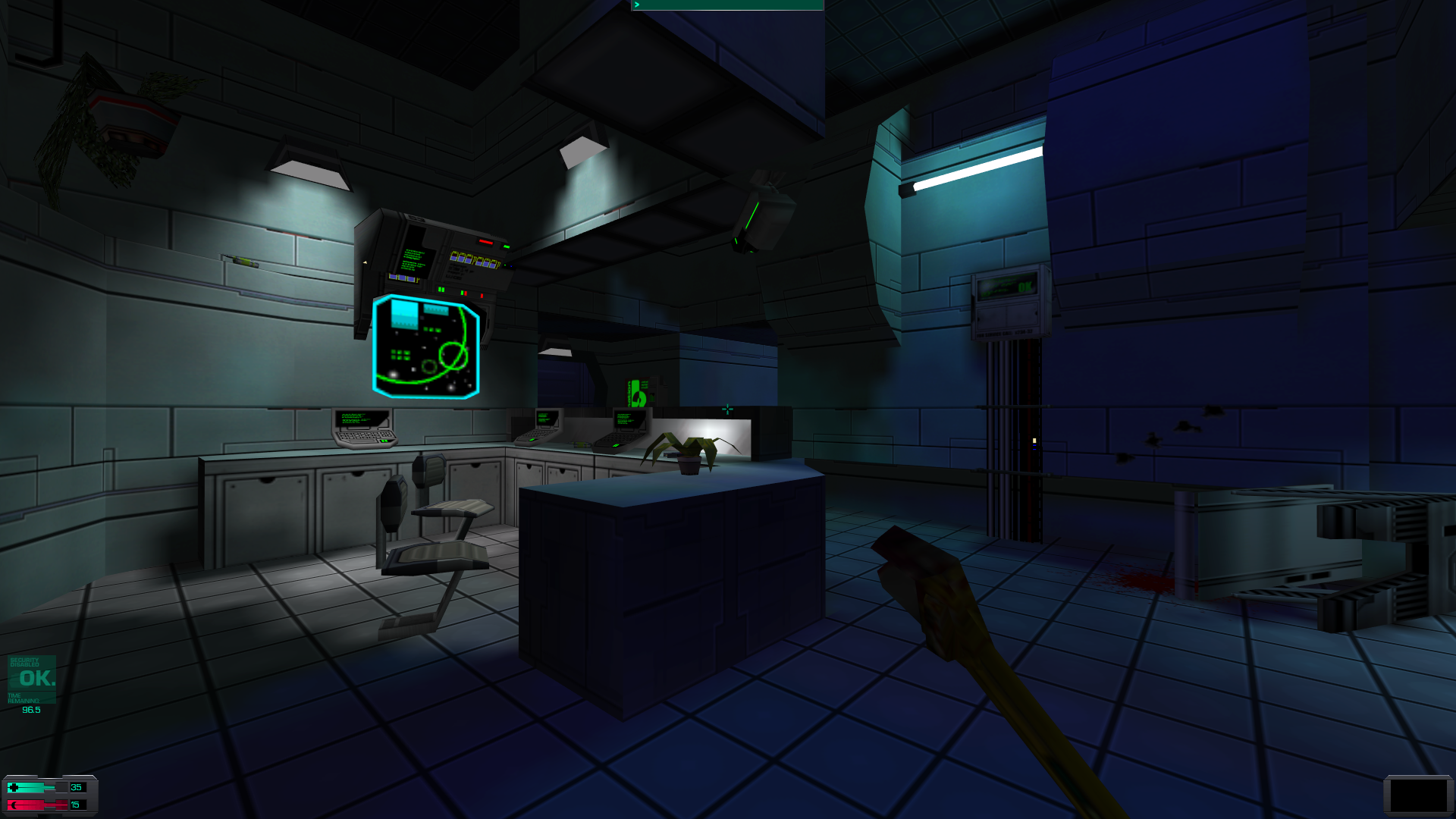
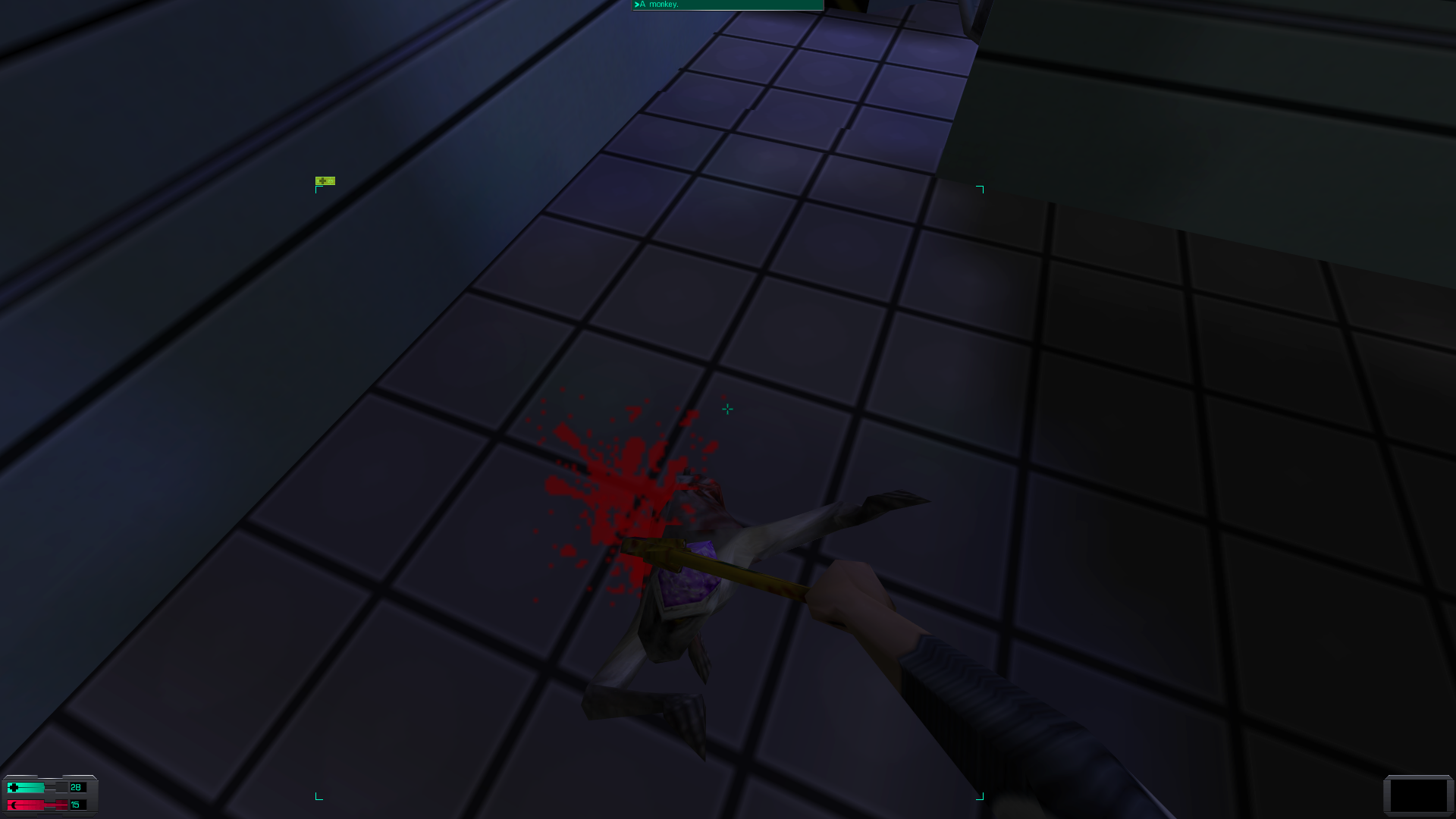
The monkeys were almost cut from System Shock 2, and were only saved by a last-minute intervention from Ken Levine. "I'm gonna confess something. I didn't like the monkeys. At first. We had some extra mo-cap time, and Ken and I were talking very briefly on the phone, and he was like 'I'm gonna do these monkeys, what do you think?'; And I'm like, 'I think they're stupid. Psionic monkeys, are you kidding me?' And he was like 'Why don't we give it a shot? We've got some extra time'". Yet when Vogel saw the monkeys in action, he liked how surprising and unsettling they were. In the end, he stripped out several other enemies from Med/Sci so that they focussed in on the monkeys as a key opponent in this early part of the game.
There were two other vital components to Med/Sci's design. The first was its need to accommodate for the player's various abilities by offering multiple ways to progress through the level. But Vogel didn't want the options to be so broad that the feeling of isolation and claustrophobia were lost. His approach to this problem was what is known as hub and spoke design. "You have a framework for how to gate aspects of the story, or the narrative, or the levelling. We don't want you to get too far ahead of yourself, but we don't want you to feel like you're on a linear rail either," he says. "That's where that hub and spoke comes in line. How you treat each threat. Do you choose to go down that hall or that hall first or second?...But at the end of the day you still gotta get the passcode to get out of the level."
The other important element of Med/Sci's design is that it's the central deck of the Von Braun, and as such you don't pass through it once, but multiple times. Hence, Vogel didn't want the level to feel dead and sterile, but alive and dangerous. Irrational decided that the enemies on the Von Braun should spawn semi-randomly, through a system that is tailored to balance tension and unpredictability with the skills of the player. "We didn't just slap down a bunch of spawners and play it, right?," Vogel says. "We really created the spawning around 'What's the level of intensity? What's the level of fear and exploration? What's that balance with the narrative and combat?'"
Again, here you see System Shock 2's thematic juxtaposition between organic and synthetic, of designing some encounters specifically, while letting others evolve naturally. It's a theme that cuts right down to a coding level, and is visible in almost every facet of the game. Even the name of Med/Sci is an abbreviated introduction to the concept, the treatment of living organisms, and the creation of synthetic materials and compounds, crashing head-on against each-other in a battle for supremacy.
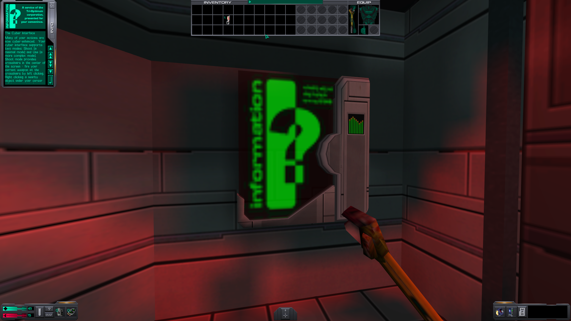
Vogel cites designing Med/Sci as one of the best creative experiences he's had. Nevertheless, there are some parts of the level that, if he could, he would go back and change. His biggest regret is the information kiosks dotted around the level, which basically provide explicit text tutorials on how to play. "We had to create them to explain the game, which was a failure in my view. But they served the purpose at the time."
The design of Med/Sci influenced the remainder of System Shock 2 in several ways. The way it presented the Von Braun as falling apart, and how it seemed to be constantly moving and changing, were not major factors in the game until Med/Sci was finalised. "I remember pretty late into the game, until we did Med/Sci at that level, there was something missing, of movement, of alive-ness. And that includes things going wrong. That includes not just the patrols and the monsters and stuff. But things going wrong, things exploding."
In turn, Med/Sci's influence has spread throughout gaming. BioShock, a game that Vogel also worked on, was famously designed as a spiritual successor to System Shock 2. But then there are games like Dead Space, whose references to System Shock 2 are written in blood on the game's walls. The most recent homage to System Shock 2 is Prey, which Vogel is playing at the moment. "Dude, it's straight-up. I love it," he says. But what Vogel focusses on are not so much these big, earnest love-letters to Irrational and Looking Glass's work, but smaller elements that appear in games you might not think about being associated with System Shock.
"I dunno about you, but I've seen a lot of games with graffiti and blood on the walls, and hacking cameras and, you know, even little things like drinking booze and having a sort-of positive and a sort-of negative effect. Living people showing up behind windows that suggests there's life, but you're really not letting the player interact with it," he says. "It's just wonderful to feel that my original goal to get an 88 in PC Gamer ended up impacting all these wonderful teams and these wonderful games. Honestly, it's humbling."
System Shock 2 launched on August 11, 1999. It received a score of 95 in PC Gamer.
