Combat Mission: Shock Force
Muddle in the Middle East.
The five stages of Combat Mission: Shock Force grief:
Stage 1. DENIAL
What happens when the makers of the incomparable Combat Mission trilogy abandon their old engine, move away from Shermans and StuGs, and strive for even greater realism? Perfection is what happens! Combat Mission: Shock Force is the ultimate tactical simulation, a flawless, bugless, gorgeous masterpiece that places lucky wargamers right in the middle of a highly credible fictional conflict between modern-day American and Syrian forces.
Features new to the series like real-time play (optional) 1-to-1 infantry representation (previously each squad was represented by three visible soldiers) relative spotting (target info isn't instantly shared between friendly forces anymore) deformable terrain (create your own cover with mortar fire!) and semi-scripted AI (more power in the hands of scenario authors) have all been brilliantly implemented. Long-standing CM weaknesses like the lack of campaigns and full game replays are history. Everything is shinier; everything is better. CM:SF is grognard ambrosia. These tears? Tears of joy, my friend. Tears of joy.
Stage 2. ANGER

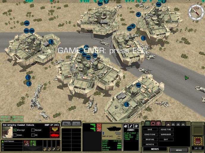
GRAAAAAAAAGH!! BATTLEFRONT, WHAT HAVE YOU DONE TO MY DARLING COMBAT MISSION? How could you let Paradox put what looks suspiciously like beta code on to European shelves? CM:SF version 1.0 is rougher than a dead dog's tongue. Frame-rates are poor, vehicular pathfinding eccentric, LOS/LOF aberrations common. Seven years on from the dazzling triumph that was CM: Beyond Overlord I really didn't expect to be sitting here watching AFVs tangle idiotically on street corners, rocket propelled grenades ghost through concrete walls, and soldiers die in droves because of dodgy TacAI. Wasn't this supposed to be the great leap forward?
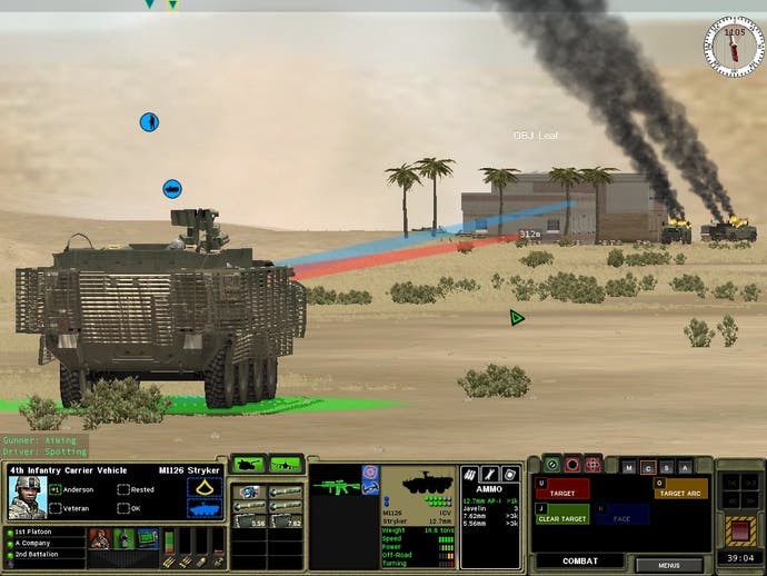
And what's happened to the interface? Where are the universal unit path and targeting lines that used to help me make sense of the mayhem? Why do I have to flip though a multi-pane panel in the corner of the screen or memorise esoteric shortcuts to dish-out orders? Where's the tutorial? Where are the tooltips that explain the plethora of new icons? Blimey, even drag-select isn't working properly.
And how could you leave out the random map generator and the pick-your-own forces? Skirmishes, especially multiplayer ones, just won't be the same without virgin battlefields and customised armies.
On the subject of Quick Battles (now they're fought on prefabricated maps) I played a real doozy this morning. After spending half an hour carefully inching my Bradleys and infantry across a rural map, I eventually found the opposition - a mixture of Syrian army regulars and BTR APCs - lounging lazily in open ground hundreds of metres from the locations they were meant to be defending. When my forces opened fire they just sat there like saps. It was pitiful and completely unreal.
Stage 3. BARGAINING

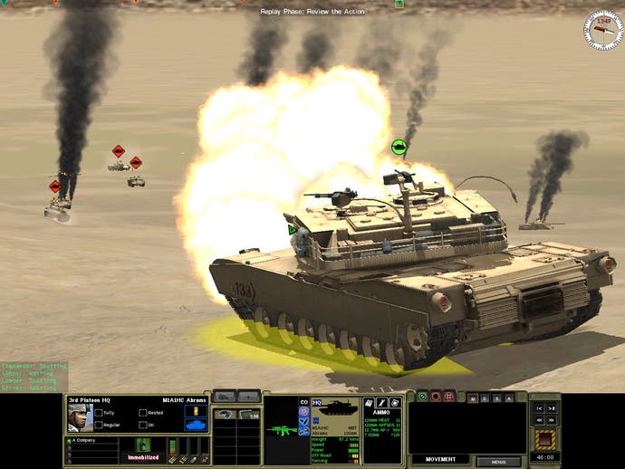
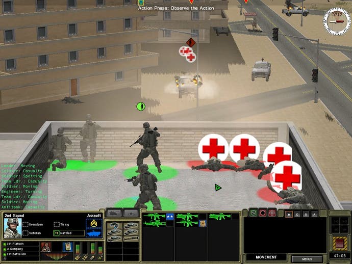
Perhaps if I persevere I'll stop noticing the broken bits eventually. I mean it's not as if CM:SF is a complete write-off. The familiar franchise magic is definitely there behind all the bugs. Carefully plotting a minute's worth of orders then sitting back and watching the results unfold is still a fascinating way to orchestrate a battle. New building elements like balconies, flat roofs, and blown walls definitely add extra spice to urban fighting. The first time one of your vehicles gets knocked-out in an IED or car bomb blast is something you won't forget in a while (even though there's no fancy chassis-flinging physics)
Your first artillery bombardment is almost as memorable. With a few swift clicks you can now choose shell type and spread shape (a line, point, or circular zone) bombardment intensity and duration, even tell the batteries how many spotting rounds to use. No strategy game has ever simulated stonking in such detail.
'Relative spotting' is pretty special too. Amazingly, a unit's perception of the battlefield is now reliant on its communication equipment as well as its spotting ability. The better networked a vehicle or squad, the more data it will receive from allied forces and the more efficient and confident it will be. Mind-bogglingly deep realism.
Stage 4. DEPRESSION

Who am I kidding? Some of the most touted improvements are distinctly underwhelming. The "detailed, story-driven, semi-dynamic campaign" turns out to be a poorly presented, poorly paced string of twenty-odd scenarios offering sod-all in the way of continuity or sense of progress. Flashing up a 'victory' or 'defeat' screen after each engagement then rushing onto the next, isn't exactly involving. Show me an updated map of the frontline, give me a sense of the wider war. Help me care, help me believe.
Asymmetric warfare sounded interesting on paper. In the campaign far too often it boils-down to pulverising trench-cowering Arabs with artillery, aircraft (unseen), and AFV guns. Playing as the 'bad guys' in earlier CMs was always very tempting (Oooh, lovely Panzers!) Now, well, let's just say I don't think players will be queuing-up to command forces of HiLux pickups, suicide bombers, and obsolete Russian tanks.
Real-time play? Maybe it will grow on me, but currently - in the midst of complex battles - I'm finding it plain scary. If I could use RT to advance to contact then switch to comforting turns, I might have found some use for it, but the way it stands... no thank you.
God, I'm so miserable. Maybe an hour or two of Peggle would help.
Stage 5. ACCEPTANCE

Ah, that's better! A little dash of PopCap cheer, and a rummage on the official CM:SF forum has lifted my mood considerably.
It seems Battlefront are already expressing guarded regret about v1.0 - "Its true [it's] not what we wanted it to be." More importantly, they've spent the four or five weeks since the shoddy code went to the pressing plant breathlessly squashing bugs. The first big patch should be available today, together with a demo, and a downloadable version of the game (v1.01) free from some of the worst AI and performance-related glitches.
While there's no excuse for the woeful state of the boxed Paradox version, it's clear Battlefront are not going to walk away. Give it a few months and many of the concerns in this review/howl of anguish/public information broadcast will probably be irrelevant. Will CM:SF ever attract the adoration its WW2 predecessors did? I doubt it, but given time, it should grow into something convincing enough to tempt back most grief-stricken grogs.
