The evolution of Destiny
What Bungie added - and took away - from the game's E3 2013 debut.
From Destiny's E3 2013 reveal at Sony's media briefing to its final PS4 and Xbox One release, Bungie's sci-fi shooter has seen a number of significant changes. After replaying the PS4 version for comparison with footage of its reveal, it's clear there's been a radical review of Old Russia's aesthetic overall, both for better and worse. In the wake of Ubisoft's Watch Dogs, which saw the final game shorn of many of its most impactful rendering features, we wondered whether these changes are technical in nature - perhaps driven by a shifting console spec - or simply the result of refining and improving the visuals over the remainder of the development period?
Using a 1080p feed of last year's Sony E3 conference, we play through Destiny's opening stage on PS4 to match the demonstration areas beat-for-beat. This drops us on the ruined outskirts of Old Russia, with the mission leading us through the dark interiors of the Cosmodrome wall. Bungie's initial showing adds extra elements to up the ante for a public demonstration, of course - such as an Archon Slayer boss fight and extra enemy encounters - but the settings remain broadly the same.
The time of day is conveniently a match by default, with shadow placements identical, and seemingly static as long as we remain on the wall's outskirts. The only discrepancy in matching shots here is the slight compression on the original E3 conference feed, where edge enhancement also affects certain high contrast details.
Nevertheless, the main thrust of Destiny's technical evolution is clear, beginning with an update to textures in the PS4 final build - the most far-reaching change following Destiny's E3 2013 reveal. Normal maps see an update for the positive, with the Cosmodrome entrance itself given a rusted, peeling exterior that replaces the simpler, grime-splattered surface of the original demo. Out go the dust floor textures too, where now we have more defined bump mapping for underfoot cracked soil. Elsewhere, we have textures that are simply a worthy alternative; neither truly better or worse than what came before. One side-effect, however, of exaggerating the area's state of ruin is a toning down of reflections across vehicles. In this case, what might be viewed as a technical downgrade is nothing more than a revision of material properties - rusty vehicles in a post-apocalyptic world probably aren't going to be bright and shiny.
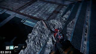
But there is indeed some evidence of a technical downgrade as we compare the final game to its E3 showing. Parallax occlusion mapping (POM) is cut from the final build, as used around the E3 build's Archon Slayer boss fight. It's a computationally costly feature that adds depth to certain surfaces, such as bumps and divots across walls and rubble build-up around puddles. Alas, there's no trace of the effect on PS4 or Xbox One's retail releases, nor any obvious attempt to replace it. Instead we have regular texture maps for debris planted around the same area.
Likewise, shadow quality takes a slight hit during the intervening year of development for PS4 and Xbox One. While up-close outlines hold a solid, unwavering form, distant shadows suffer from more aliasing and temporal flicker as we move past. This is especially noticeable on the Cosmodrome wall supports while outdoors, where gradients of the shadow are rendered as obvious bands rather than a seamless blend of shade tones seen in the E3 build. Shadow rendering is another GPU-intensive task and what's clear from Destiny's final performance profile is a clear determination to sustain the target 30fps.
There are other technical changes too, subtle as they are. Effects such as anisotropic lens flare are also pared back, as sported by the floating Crank enemies and orange glow-sticks littering each room. Actual alpha quality for gunfire remains on an even keel though, and destruction effects are only altered slightly - with physics still in full play for ruined enemies. That said, a chromatic aberration effect is brought in for the final release, mainly flaring up towards the screen's edges.
When we looked at Watch Dogs' debut showing and compared it to the final release, it was all about the downgrades, but in the case of Destiny, there are a slew of pluses for the final PS4 and Xbox One builds. Chief among them is the addition of extra geometry around the world. Including bus stops, power generators, and giant supply crates, each new block not only adds to the density of detail for each area, but also brings out more cover opportunities during shoot-outs. The changes here aren't just about the aesthetics - Bungie retooled and improved its levels in the final year of development, with gameplay firmly in mind.
Existing geometry is cleverly tweaked too. Railings are thrown at lop-sided angles to one another and walkway segments are displaced to drive home the Cosmodrome wall's rickety, unstable state. The outdoor terrain is thoroughly re-sculpted too - extra ferns and rocky outcrops being added at eye-level, and looking upwards, new girders and spires built on the wall's peak. Atmospherics such as dust billows are also worked into Destiny's final build, if mainly for this segment, which were largely absent at E3.


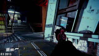
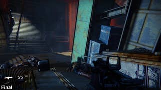


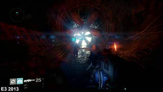

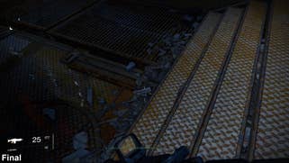
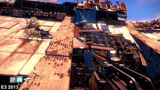

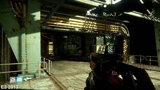
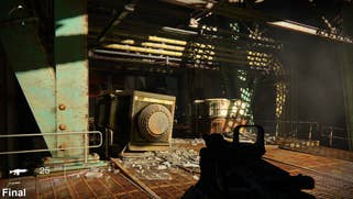


Many of these changes, ultimately, are spurred on by Bungie's artistic sensibilities, rather than an urgency to tweak the engine fundamentals owing to under-powered console hardware. In this sense, world lighting also sees a colossal overhaul for both indoors and out; light sources being added inside the wall's labyrinths to highlight the path ahead. Thankfully the E3 build's harsh, unrealistic contrasts are axed here, instead opting for a more natural lighting scheme in the final build.
Similarly, Bungie's exaggerated use of light-shafts works well for an eye-catching demo, but perhaps not in practice. As shown when walking down a passage towards the wall's exit, the effect is notably missing across the distant fan blades in the retail build. Even so, the PS4 is capable of the effect when peering at the sun through tree branches - pointing to a change in the chosen lighting outside as the likeliest cause as opposed to a technical downgrade.
On balance then, the studio's revisions of its E3 build are well judged - in large part driven by artistic ambition rather than technical imperative. From the switched textures to the tweaked lighting and geometry, at a bare minimum this has given us a variant experience, and at best an upgraded one in terms of overall density of detail, POM apart. Otherwise, it's simply a case of the demo condensing as much action as possible into a small time-frame, where the final build is paced for the long haul.
Outside of the E3 showing's more intense screen-space effects, and the use of parallax occlusion mapping, there's little evidence of Bungie conceding to technical limits - and what we have instead is an interesting contrast with the changes made to Watch Dogs. What both titles have in common is that their respective E3 vs release comparisons demonstrate just how much a game's design is in a state of flux. What looks, on the stage, like a complete vertical slice of gameplay may still very much be a work-in-progress that continues to be changed and refined up to its release. For Destiny, the final delivery on PS4 and Xbox One drags its world into these new artistic quarters - some choices may have been prompted by technical considerations, but in the main, the game's vision is pushed in a worthwhile direction in terms of both aesthetics and gameplay.
