Samsung Galaxy S8 review
To Infinity and beyond.
In terms of PR nightmares, releasing a phone that could potentially explode ranks pretty highly. The fallout from the high-publicised recall of the Samsung Galaxy Note 7 has done a fair amount of damage to the reputation of the South Korean tech giant, but consumers are quick to forgive and despite its woes. Samsung is set to overtake Apple for the first time in terms of profitability - and that's thanks in no small part to its phenomenal success in the smartphone arena. Still, there's no denying that something truly special was required to cleanse the bad taste left by those flaming Note 7 handsets, and the result is the Galaxy S8, Samsung's flagship phone for 2017.
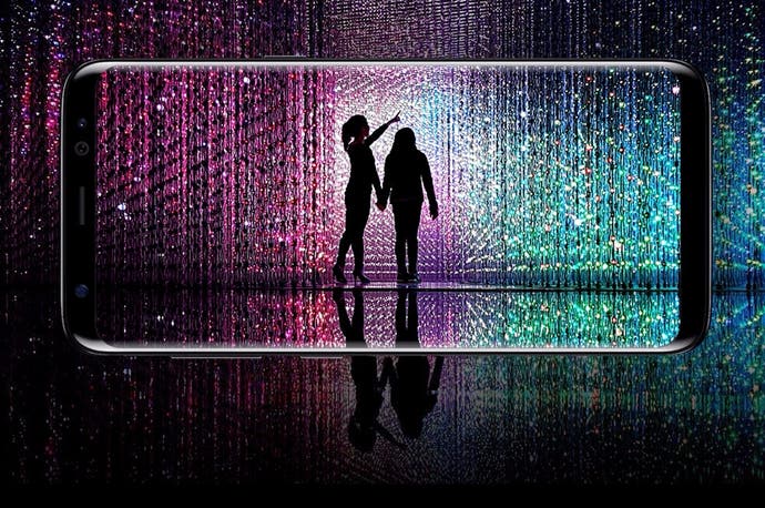
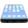
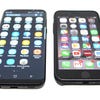
The big news here is the much-hyped Infinity Display, which fills almost the entire front of the device, right the way up to the edges. The upshot of this is that Samsung has crammed a 5.8-inch screen on a phone which, in terms of dimensions, it only slightly bigger than its biggest rival, the iPhone 7 - which has a display which is more than an inch smaller from corner to corner. The 2960x1440 pixel Super AMOLED panel has a rather unique aspect ratio of 18.5:9 but this isn't an issue during typical use, as you're getting a taller image which is handy when scrolling through apps like Gmail and Twitter. However, it does mean that 16:9 content like movies is displayed with black borders down either side.
Samsung has ditched its "Edge" sub-series this year, largely because the standard S8 and larger S8+ have incorporated the features which made those older devices unique. It's possible to have a sub-menu of shortcuts and functions mapped to the extreme edge of the display, which curves ever-so-slightly around the side (but not as noticeably as on Edge phones). One of these allows you to create an animated GIF by selecting and recording any part of the screen, which is one of the most insanely useful features we've yet seen baked into a smartphone's UI - assuming, like us, you're addicted to sending reaction GIFs to people on Twitter. The S8 is currently the only smartphone which carries certification from the UHD Alliance to state that it conforms to the Mobile HDR Premium standard, and it's relatively easy to see why; contrast and brightness of this panel are simply stunning, keeping Samsung at the vanguard of mobile display tech. This is simply the best in the business.
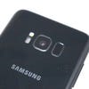
The fact that the S8's screen takes up the majority of the front panel has forced Samsung's designers to rethink the functionality of the iconic home button. You can still return to the home screen by pressing the screen in the same location - a short vibration accompanies the push - but the fingerprint scanner has been relocated to the rear of the device. Bizarrely, Samsung has chosen to place the scanner to the right of the camera module, a decision which will almost certainly lead to many fingerprint-covered camera lenses.
After a while you become accustomed to this change, but we still can't fathom why Samsung didn't put the scanner below the camera, as is the case on many other Android handsets, like the Google Pixel and LG G6 - that's where you finger naturally rests during normal use. This is easily the biggest design fail with the S8, and the placement of the scanner feels like an afterthought; it sits far too high on the back of the phone.
Samsung is perhaps aware of this, because it has made a big song and dance about the ability to unlock your phone using your eyeballs - a feature not entirely dissimilar to Android's native Face Unlock feature, which has been doing the rounds since the days of the Samsung Galaxy Nexus. Iris Unlock means you can bypass the lock screen just by looking at it; the front-facing camera shows your eyes at the top of the screen so you can align them properly, and when the conditions are perfect, it works well enough.
Unfortunately, getting those ideal conditions is easier said than done. Firstly, you have to hold the phone at eye level about 30cm from your face - already an awkward prospect when you're using the phone in a public place, such as a crowded tube carriage - and if you happen to be wearing glasses or contact lenses, then you're out of luck. The setup tutorial states that Iris Unlock doesn't play nice with either visual aid, and even asks you to remove them before using it as if it's the easiest thing in the world for those who wear contact lenses. As was the case with Face Unlock, it's not something we imagine many people will choose to enable.
| Galaxy S8 | Galaxy S7 | Galaxy S6 | Google Pixel | Google Nexus 5X | Google Nexus 6 | Xiaomi Mi5 | iPhone 7 | |
|---|---|---|---|---|---|---|---|---|
| Geekbench Single-Core | 1993 | 1801 | 1233 | 1687 | 1263 | 1053 | 1918 | 3300 |
| Geekbench Multi-Core | 6665 | 5278 | 3964 | 4187 | 3436 | 3081 | 4616 | 5330 |
| 3DMark Graphics | 36271 | 32404 | 22954 | 31766 | 22074 | 24668 | 27463 | 63668 |
| 3DMark Physics | 21912 | 17730 | 17795 | 18641 | 12641 | 17259 | 18913 | 15267 |
| 3DMark IceStorm Unlimited | 31661 | 27370 | 21565 | 27468 | 18934 | 23205 | 24956 | 37352 |
| GFXBench T-Rex | 120.0 | 87.0 | 58.0 | 93.0 | 38.0 | 37.0 | 93.0 | 120.0 |
| GFXBench Manhattan | 64.0 | 29.0 | 25.9 | 49.0 | 16.2 | 18.0 | 49.0 | 62.3 |
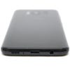
Questionable fingerprint scanner placement aside, in all other regards the Galaxy S8 is a gorgeous-looking device. Granted, it feels tall in the hand thanks to that elongated display, but everything else is bang on the money in terms of pure aesthetics. The rounded edges ensure it feels comfortable, and the way the screen curves with the rest of the body gives it an almost pebble-like quality. The back panel is plastic rather than tempered glass - as has been the case with recent Galaxy S devices - and is a magnet for fingerprints. Around the edges of the phone you'll find the metal framework, which is festooned with buttons and other elements, including the 3.5mm headphone socket, USB Type-C charging port and - on the left-hand side - Samsung's other big innovation this hardware cycle, the Bixby button.
Bixby is Samsung's addition to the virtual assistant sector, joining the likes of Siri and Google Assistant in what is becoming a rather crowded area. Judging Bixby's usefulness at this stage is difficult because the service hasn't gone fully live yet. Tapping the button reveals Bixby Home, which is similar to Google Now on other Android devices. It compiles new stories, weather reports and Twitter posts in one handy stream.
Bixby Voice replaces S Voice, Samsung's previous voice-activated assistant, but at the time of writing it's not available in the UK, so we couldn't test it. Finally, Bixby Vision uses the phone's camera to find data on real-world objects - such as landmarks and products - as well as reading QR codes and the like. You can use it to translate text on the fly, or instantly turn the page of a book into text you can edit. There's a good chance that Bixby will grow into something more impressive and Samsung clearly has big plans for the service (it plans to include it in other products, like fridge freezers) but at this moment in time, it feels malnourished.
Not that it matters when you have an Android phone, of course. Hold down the (virtual) home button and Google Assistant jumps into life, which is a more than adequate replacement for Bixby at the moment. This is but one example of the often maddening duplication of services on your typical Android handset; the Galaxy S8 also has its own unique app store, fitness tracker, web browser and gallery app, all of which compete with Google's home-grown options - which, in almost every case, are markedly superior and boast integration with other elements of Google's ecosystem, like Chrome on your PC.
Thanks to Samsung's deal with Microsoft you'll also find Word, PowerPoint and Excel pre-loaded on the device. While it's possible to deactivate some apps, you can't remove them entirely - another common headache with Android phones. Grumbles aside, the UI skin Samsung has deployed on the Galaxy S8 is perhaps its best yet, purely because the company has abandoned the past extravagances of TouchWiz in order to offer a more restrained and appealing interface. The way some notifications cause a pulse of light to travel around the perimeter of the screen is a particularly nice touch, and the customisable always-on display is leagues ahead of the one seen on the Google Pixel.
From a gaming stance, the Galaxy S8's long screen offers an interesting advantage over other smartphones. Because most games haven't been formatted to make the most of all that display, the two black bars at either end (when playing in landscape mode) provide the perfect place to rest your thumbs then they're not in use, avoiding the problem of obscuring the screen during play. It's possible to force games to use the total length of the screen, but this causes unintentional problems, such as chopping off on-screen buttons and HUD elements.
As time goes by perhaps more developers will code their titles with phones like the Galaxy S8 in mind, filling out every corner of more unconventionally proportioned displays. The excellent image quality, bold colours and remarkable contrast make pretty much anything you choose to play on this device look positively gorgeous, which is another bonus. However, despite the raw power on tap, we did notice a bit of stutter in some titles, like Injustice 2, Breakneck and Iron Blade. As has so often been the case, games seem better optimised on iOS devices, running without any such problems.


As the smartphone arms race rolls on, camera tech is an area in which manufacturers are putting in the most effort in an attempt to out-match their rivals. The iPhone 7 Plus has a dual-lens setup for fancy portrait shots, while the LG G5 had a second, wide-angle lens. Surprisingly, Samsung has decided against including a special imaging configuration and has instead stuck with the 12-megapixel, f/1.7 lens snapper that was seen on last year's Galaxy S7. While the specs haven't changed all that much, Samsung has clearly been busy behind the scenes because image quality is noticeably improved over last year's model.
A new multi-frame image processor takes three shots every single time you snap, eliminating blurry images forever, while enhancements in software result in clearer shots and an improved capture time - which is remarkable when you consider that both the Galaxy S6 and S7 were two of the nippiest shooters on the market. The removal of the home button means the double-press shortcut for the camera is gone though; this is now mapped to the power button, which sadly isn't as intuitive to use.
Finally, the less exciting stuff. Call quality is superb on the Galaxy S8, but the 3000mAh battery - the same capacity as the S7 - is a little on the feeble side, especially if you're a heavy user. Even with modest use you're going to need to charge it every day; it's likely that Samsung's recent woes with exploding Note 7 handsets forced the manufacturer to play it more cautiously with this particular device's power cell.
Quick-charging is included, as is wireless charging, and the device is just as water and dust resistant as last year's offering. USB Type-C has finally been incorporated into Samsung's flagship brand, and it's still possible to add in more memory via MicroSD cards. On the downside, the phone's mono speaker is too easy to muffle with your palm and lacks the aural impact of the iPhone 7's stereo setup.
Samsung Galaxy S8: the Digital Foundry verdict
Samsung needed something pretty special to come back from the fiery debacle that was the canned Note 7, and the Galaxy S8 is indeed a very special phone. It heralds the beginning of a new era in the history of the smartphone, where screens aren't restricted by bezels and your handset becomes even akin to a display in your pocket. The Galaxy S8's sublime Super AMOLED screen is a real show-stopper, not just in terms of how much it fills out the handset's modest proportions, but also in terms of image quality and impact; it's the best screen on any mobile phone at the time of writing.
Sadly, to incorporate this seismic change in design, Samsung has been forced to make one regrettable alteration to its trademark template - the familiar home button with its fingerprint scanner has been stranded on the back of the device, and is awkward to reach even at the best of times. It's a design disaster which almost undermines all the good work done elsewhere, but it's just about possible to live with.
Meanwhile, Samsung has improved its software to the point where it ranks as one of the prettiest and most intuitive UIs in the market, and the camera - while almost identical spec-wise to the one on the S7 - has undergone similar refinement. It's a shame then that the false-start of the Bixby assistant and the rather weak battery take the shine off proceedings; perhaps the most significant thing we'll remember about the S8 is how it changed the way handsets are designed, rather than how it compares to the cream of 2017's smartphone crop.
Samsung Galaxy S8 review unit kindly provided by Mobile Fun.
