How Super Mario Odyssey scales across docked and handheld modes
HDTV gameplay moves up to 900p, mobile hits 720p60.
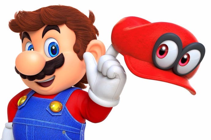
Mario Odyssey is the Switch game we've been waiting for, a key technical showcase from one of Nintendo's most talented development teams. The template of Mario Galaxy's full 3D exploration is in place - and in many ways it feels a direct successor to those two Wii classics - but it goes one step further: Odyssey expands on Galaxy's core mechanics with more exotic, wilder stages that could only be realised on more powerful hardware. Already, we've seen a more realistic New York environment from its E3 2017 reveal. But the latest demo we've had access to offers us the chance to analyse three new levels - the Cappy Kingdom, Luncheon Kingdom and Seaside Kingdom - with some exciting findings.
From a technical perspective, the headline point is this: Mario Odyssey's resolution has increased in Switch's docked mode since we last saw it. On the big screen, it goes from the lacklustre 1280x720 output at the E3 build, to a more satisfying 1600x900 in the latest build. It's only been a few months in between, but this represents an impressive 56 per cent increase in pixels pushed by the Switch. As the shots on this page demonstrate, the result is far more flattering for the docked HDTV experience, and even without any anti-aliasing to speak of, the game looks superb. It breaks some new ground too: at 900p it's the highest resolution 3D Mario title to date, and crucially, that doesn't impact performance.
This follows a curious trend with other first party Nintendo Switch titles in the run-up to release. Earlier builds of Splatoon 2 also ran at 720p while docked, before getting a boost with dynamic resolution scaling added towards the end of development. And it makes sense: 720p is the resolution it uses while in portable mode, the area most in need of tight optimisation. Clearly this is part of Nintendo's development process; using the handheld mode's 720p as a starting point in development, and working upwards for the docked, TV experience nearer release. In Mario Odyssey's case, 900p would be a decent turnout if this is what we end up with.
With that, you get all the bells and whistles while docked, and it's hard to pick much fault with the engine's delivery. Parallels with Mario Galaxy are hard to ignore too. On the beautiful Seaside Kingdom stage, the open-ended design harks back to Mario Galaxy's more free-form levels; a watery playground with quite literal depths to exploration - sporting beautiful shaders for its lava and water. Sure, pop-in on enemies and objects is in full view on Switch - even docked - but it's far-flung enough that it isn't a big distraction. Even with the new Cappy mechanic, letting you take control of enemies, the freedom and multiple objectives make this feel like Mario Galaxy 3.
While a fixed 900p is in place while docked, the presentation for mobile mode is fascinating. Gameplay runs at a native 1280x720, a 1:1 pixel match with the display. However, cut-scenes slice that resolution exactly in half to 640x720, leaving Switch's GPU to contend with only 50 per cent of the pixels, making this an interesting workaround to ensure 60fps in all areas.
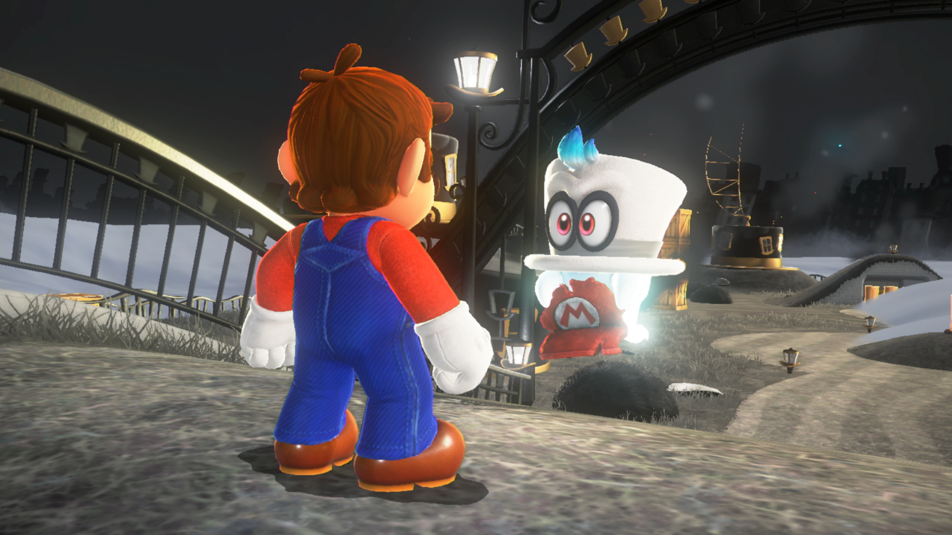
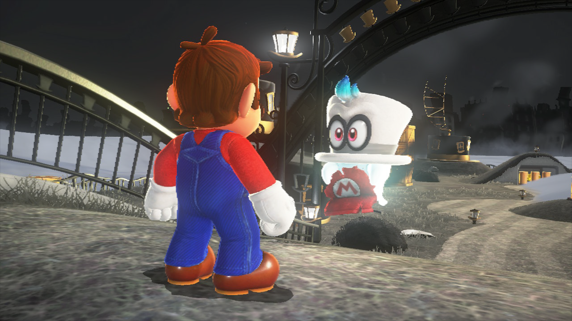
For the preview build we looked at, Nintendo also tweaks the portable mode's graphics settings to ensure consistent performance. Visuals are tweaked in three ways, but it's ultimately hard to spot the changes on the smaller screen. Firstly, besides a drop to 720p for gameplay, there's a lower res lighting buffer, causing more stippling artefacts we noted around the Cappy Kingdom stage. Take the Cappy sidekick for example; the bloom around him shows vertical bands, which are cleared up for docked play. Equally, bloom is restricted by a more aggressive level of detail setting than docked, meaning that the effect is rendered on lamplights further into the distance.
The second trade-off for portable play is also well considered. On the bright, Seaside Kingdom stage, shadows take a hit in resolution while playing on the go. Essentially, it causes blurrier, more aliased shadowing across the floor, but again, it's a fair compromise given the way docked mode operates. Played under a TV while docked, Mario's self-shadow usually runs at a crisp, high resolution setting - while enemies and objects use a slightly lower setting. In portable mode, all shadows take a hit in quality across the board - from Mario to the creatures walking the beaches. Although certain levels highlight select compromises, we suspect that these are global cutbacks that run across the whole game.
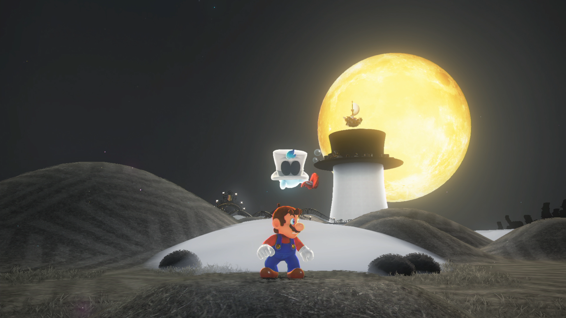
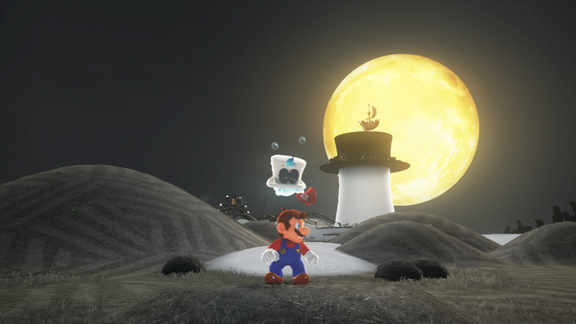
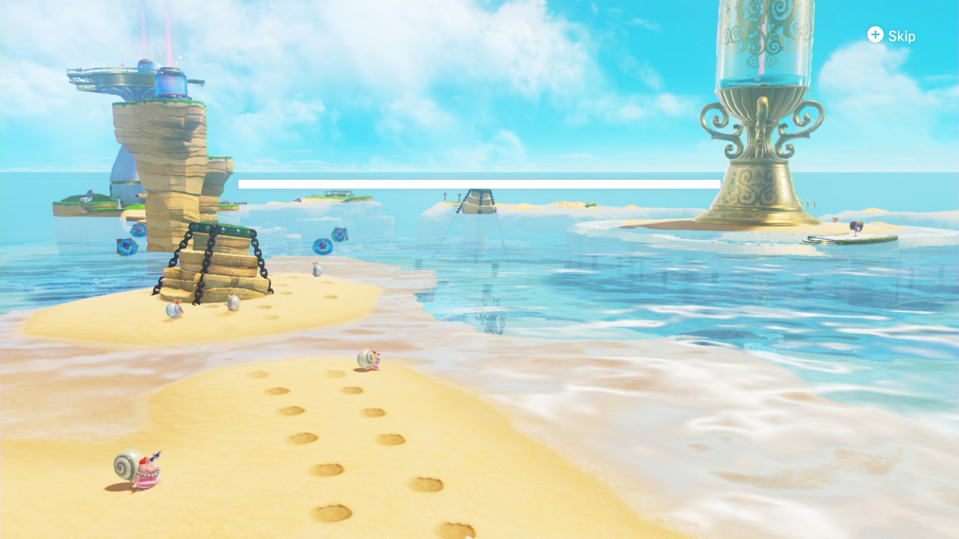
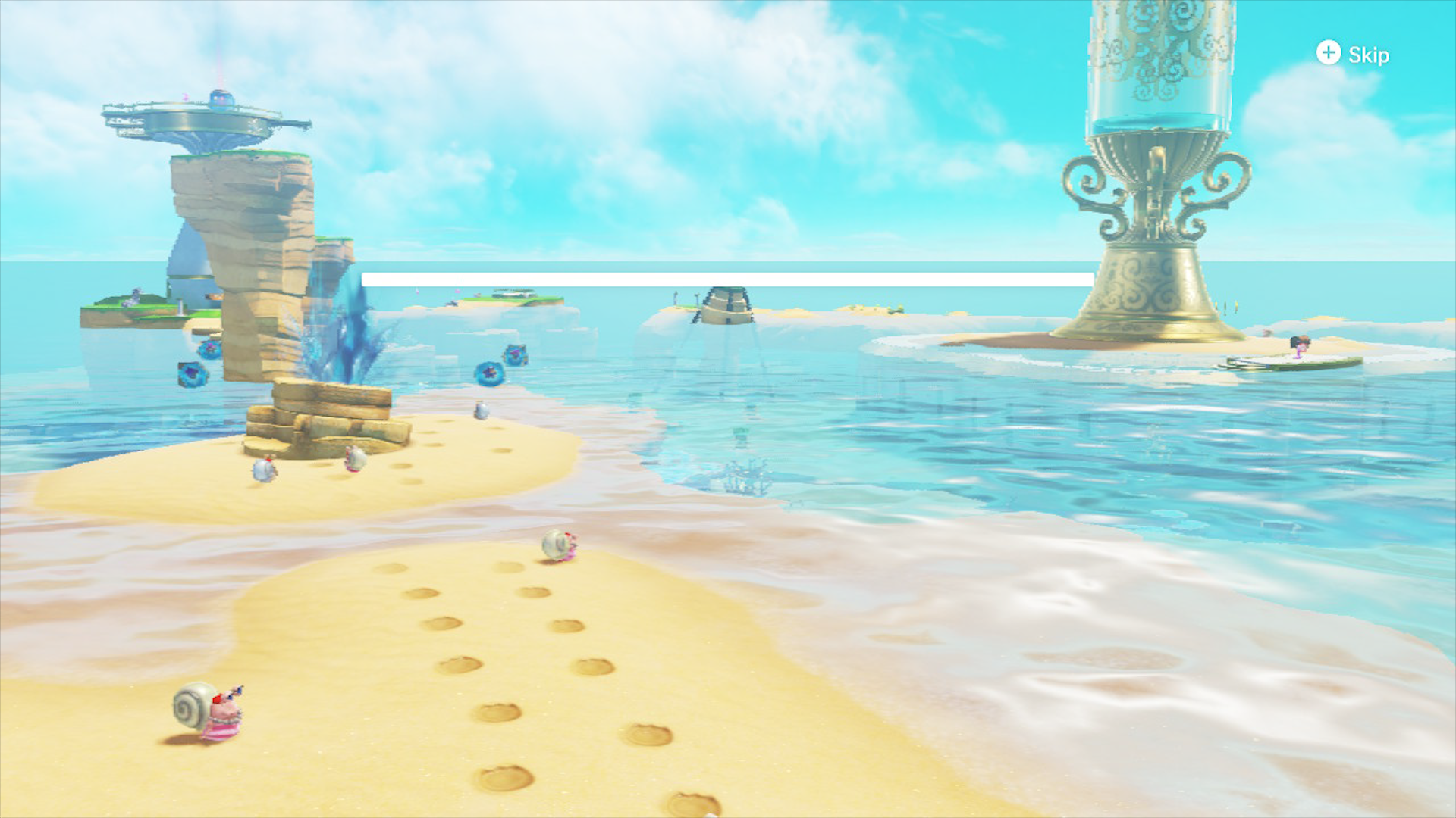
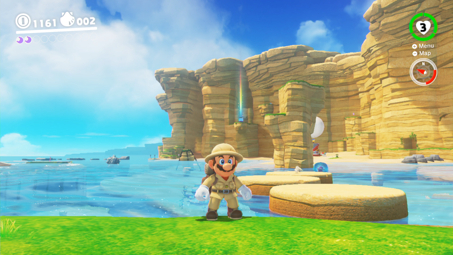
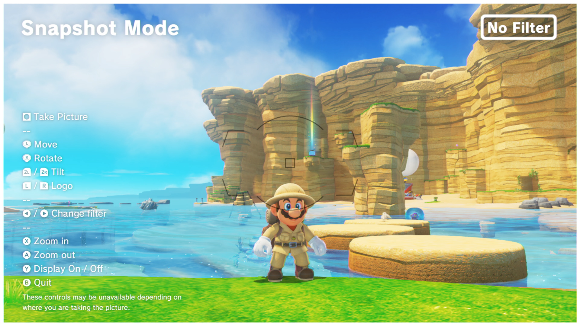
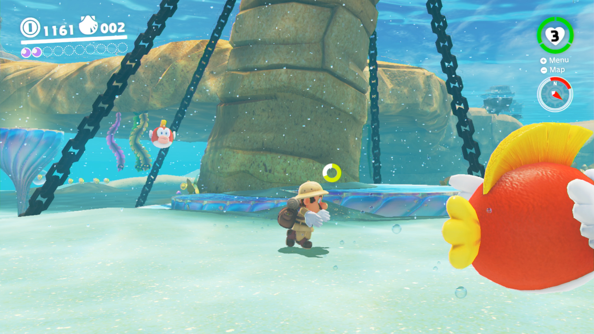
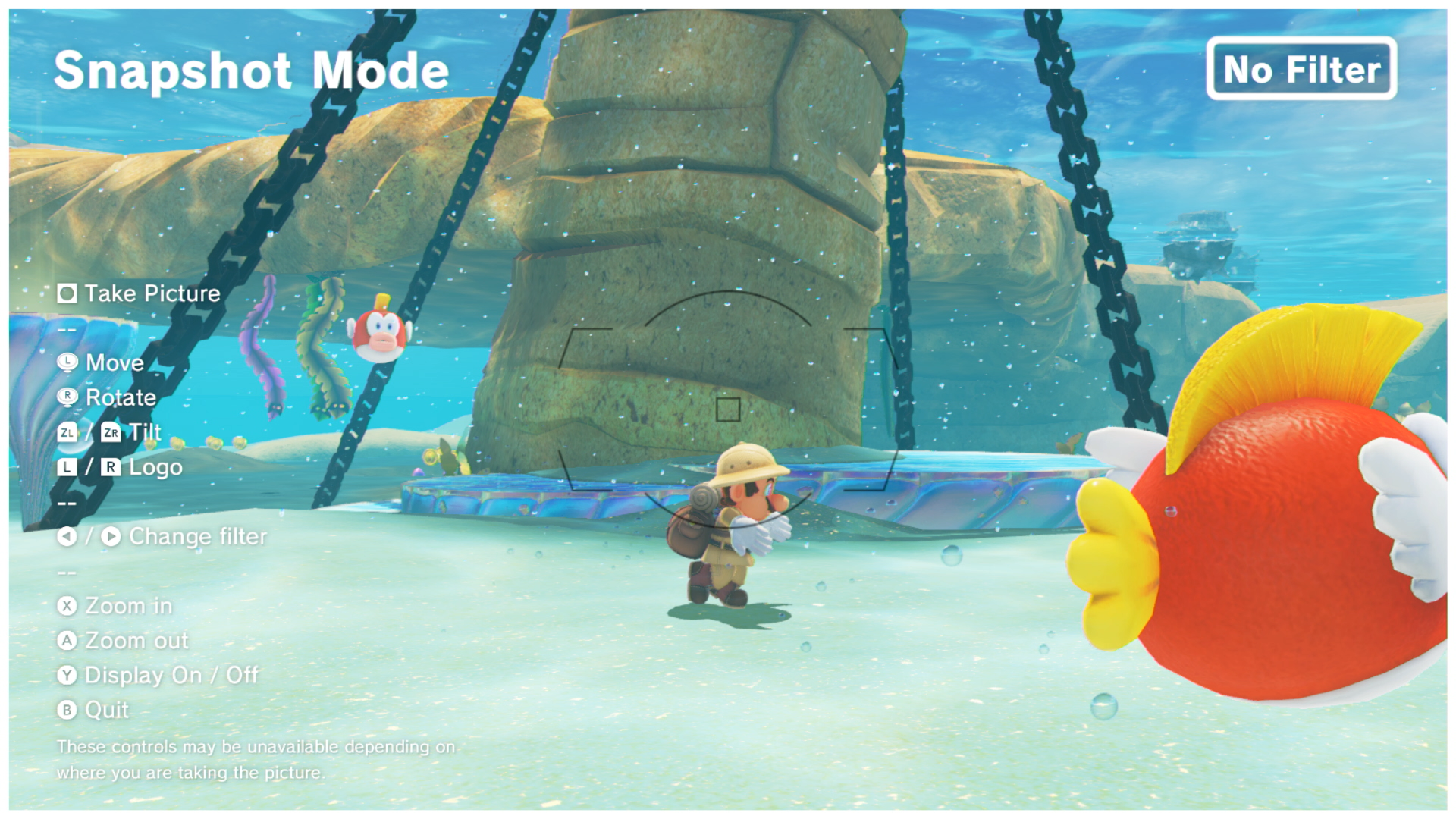
The third and final graphics setting to take a hit is draw distance. Describing it is a 'hit' is possibly a little unfair actually: it's a subtle change, and largely masked by Switch's resolution drop to 720p, but objects use a lower polygon mesh the further you look. Still, pruning back geometric detail, shadow resolution and lighting quality does give Switch some overhead in maintaining 60fps while on the go. And the good news is that in the demo levels we played, performance is looking solid, even with the docked mode's resolution boost. Everything from the volumetric fog effect in the Cappy Kingdom to the Splatoon-style ink shaders used for the Luncheon Kingdom run without a hitch. Mario lives and dies by its 60fps feedback, and Switch delivers a near-faultless delivery. Of course, there are outliers to that result; you can expect one-off stutters around the open area levels just as the tutorial prompt pops up. Are you going to notice though? Not really - and it's to Nintendo's credit that optimisation is this strong at 900p and 60fps already.
There's more to come in terms of analysing Mario Odyssey's portable mode but the turnout so far though is absolutely where it needs to be for docked play. The controls feel tight thanks to the fast level of response, and anything less than 60fps in a 3D Mario would feel odd. And as it happens, there's a way to prove that. Mario Odyssey includes a new snapshot mode, letting you freeze the action by pressing the d-pad button, and freely moving the camera around Mario. What's unique here, is that the snapshot view runs at 30fps, creating a sense of judder you just don't expect from a Mario game. It's a sign of just how stark the difference is, and how much you miss the pure 60fps throughput once it's stripped out. For the sake of the snapshot mode it works just fine, but the extra judder sticks out like a sore thumb compared to regular gameplay. The benefit is that level of detail can be pushed out further while anti-aliasing and improved texture filtering are added to ensure optimal quality on your screenshots.
In conclusion, we're deeply excited about this game and the way that Nintendo has managed to make such a beautiful title scale well across both handheld and HDTV modes. Every Nintendo console is defined by a leading Mario title and on Switch, Mario Odyssey experiments with 3D space more than any game in the series before it, expanding on its visual flair in exciting ways. The world scale, lighting on Cappy, and use of volumetrics immediately stand out. It's a game that feels built for Switch hardware - rather than necessarily a port or conversion of an existing Wii U project - and to an extent, that's makes it feel like more of an event. Mario Odyssey gives Nintendo a chance to show off what its new console can do, and the progress we're seeing between each build is a great reason to be excited for the final release.
