Tech Evolution: Forza Motorsport 3
Forza old vs. Forza new vs. Gran Turismo.
Digital Foundry has already taken a look at core aspects of the technology powering Forza Motorsport 3 in the initial demo tech breakdown, but in this feature we're expanding our analysis of the game to cover both its past and its potential future.
It's particularly apt for a racing game that Turn 10's franchise has been built in the spirit of fierce competition. In terms of gameplay features, the Forza team works tirelessly in bringing the best of its racing rivals into its game along with innovations of its own, but in terms of the rendering technology - the sort of stuff we get excited about - it's clear that Gran Turismo is the standard to which the developer aspires. There's a sizeable gulf in terms of image quality between Forza 2 and its sequel, and it's clear that the gold standard set in rendering tech by Polyphony Digital is one of the key motivators the team had in making Forza 3 look as good as it does.
First things first. At the core, the Forza and Gran Turismo games are a celebration of the automobile, and since the GT franchise migrated onto the PS2, Polyphony Digital has taken great delight in producing visually astonishing representations of each and every car it models, from the econo-box you have parked in the drive all the way up to the most ultra-expensive of hypercars.
The inherent beauty of the car itself is tied in closely with the presentation of the game. Polyphony gets this, but Turn 10 didn't quite make the grade in Forza 2 with a bog-standard, some might even say rather unattractive front end. Things have changed in the sequel with a much more beautiful, stylised menu system that boasts some wonderful modelling work on the cars themselves. The game itself allows us to compare and contrast the advances in the models via their respective photo modes.
You can pause either Forza title at any point in-game and take a shot for your collection. In this mode, you're getting to see the highest detail car models available in the game, higher even than what you see in the replay mode.
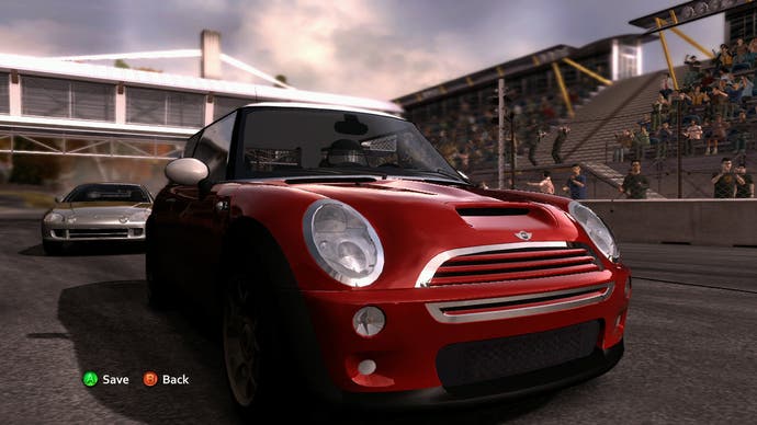
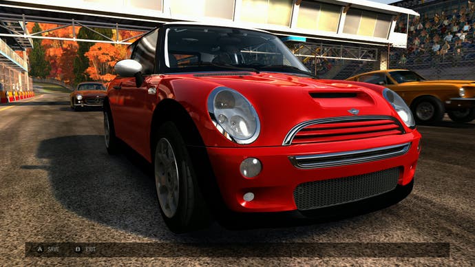

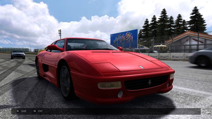
You don't get to see these actual models in-game - the versions you see there will be lower level-of-detail (LOD) models - but the chances are that they will all be derived from these base assets and it's clear to see that, rather than just re-using the old assets from Forza 2 with new lighting effects, Turn 10 has gone the extra mile and produced brand new geometry meshes boasting a lot more detail. Edges are more rounded and realistic-looking, incidental details are a lot more closely defined.
Speaking of which, during our first analysis of the demo, we pointed out that the initial intro views of the player-car appear to be using a higher LOD model than the replays - something we thought was rather odd, and maybe even a bug. It's far more likely to be a practical issue. In those introductory fly-bys, Turn 10 has complete control over the camera and the zoomed-in view effectively limits the chance to see much of the other cars. In short, the intro car shots are most likely using the highest LOD photo-level modes, simply because the engine has the budget to use them without compromising the solid 30FPS frame-rate used in these sections.
So, Turn 10 is on the record as saying that big chunks of the rendering pipeline were re-worked and re-tweaked for the sequel, so in terms of basic brass tacks, what has the team done? Checking out the improvements on a superficial level is relatively straightforward as nigh-on all of the content found in Forza Motorsport 2 has been retained for the sequel. Similar to the ethos of Polyphony Digital, the team appears to be producing a bank of accomplished content it can come back to and improve for any potential sequel.
We ran laps of five circuits common to both Forza 2 and the new game, and found that the improvements are striking. Here's a short video edit, and we'll go into specifics shortly after.
Perhaps the biggest, most impactful upgrade in Forza 3 is a massive improvement in terms of the overall lighting scheme. The game's predecessor looks almost completely flat in comparison, and the issues with the lighting are a mixture of a lack of realism combined with some poor artistic choices.

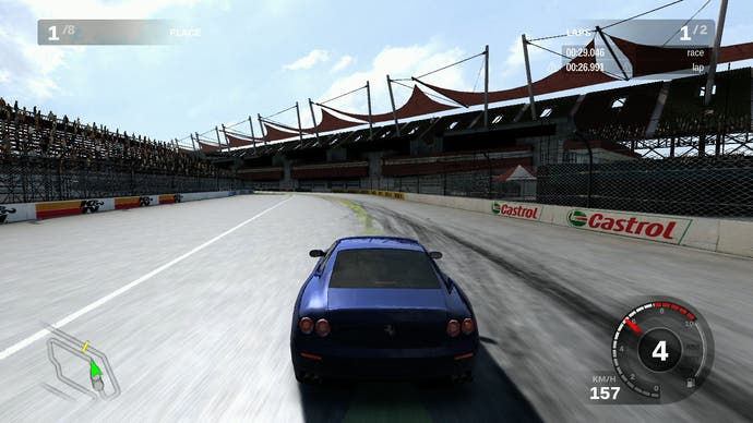
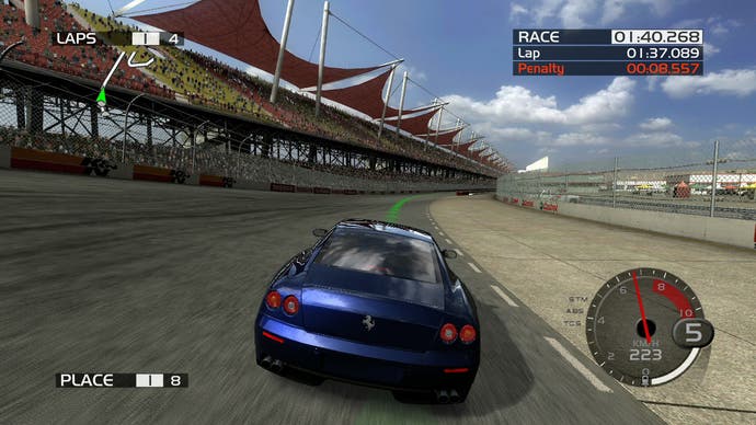

There's an almost night-and-day difference between the two games here. Starting with the cars on-screen, you can see an almost mirror-like finish to the automobiles in Forza 2. Indeed, practically all of the lighting on the cars is based on a notion of perfect reflection that you'd never see in reality. For the sequel, Turn 10 has used two different techniques to add a bit of sheen to the metal: a specular map has been deployed, and the white-level on the reflection map has been clamped so as to make the effect a touch more realistic. At the same time, specular aliasing on the cars themselves is less apparent. The addition of a specular component has also been extended to the roads too - a subtle, but very important addition in improving lighting.
The global illumination component has been similarly improved, with indirect lighting on the rear of the blue Ferrari and more detail retained in the shadowed area. Looking at this comparison of a single image, it's fairly clear that the new sequel has improved on its predecessor in almost every respect. However, it is noteworthy that the crowd level has been significantly dialled back - this is saving on fill-rate and overdraw (overlaid textures) and it's a theme we'll be returning to a bit later in this piece. Since each member of the crowd is also a 3D model, we can also assume that there's a geometry saving in there too.

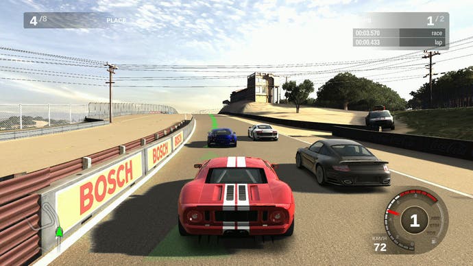
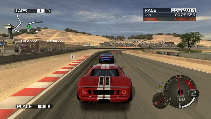
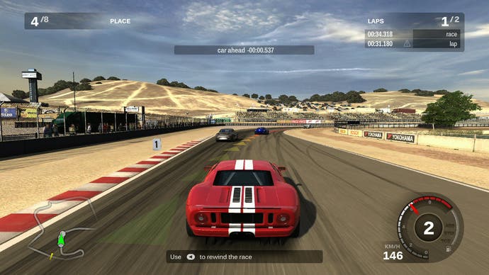
The world-famous Laguna Seca race course is another common element between the two Xbox 360 Forza titles. Once again, we have the same car and the same circuit, and once more, a range of improvements become apparent between the two games.

