LittleBigPlanet 2 Engine Face-Off
How LBP1 levels are improved in LBP2.
Media Molecule's commitment to its community of level designers is impressive. With LittleBigPlanet 2, not only is the developer promising backwards compatibility with the full range of user-generated content out there, but the stages themselves automatically get a visual boost thanks to the radical enhancements made to the game's rendering engine.
For this blog post, which acts as a precursor to an extensive tech analysis tomorrow, LittleBigPlanet level design enthusiast David Coombes has put together a range of small levels designed to explicitly showcase some of the improvements made to the engine, and to test out some of the improvements discussed by Media Molecule's Alex Evans in Digital Foundry's pre-E3 tech interview.
One of the classic tests for lighting accuracy is the Cornell Box, which can be very accurately recreated with the content creation tools in the LittleBigPlanet, and then easily imported into the sequel's beta code.
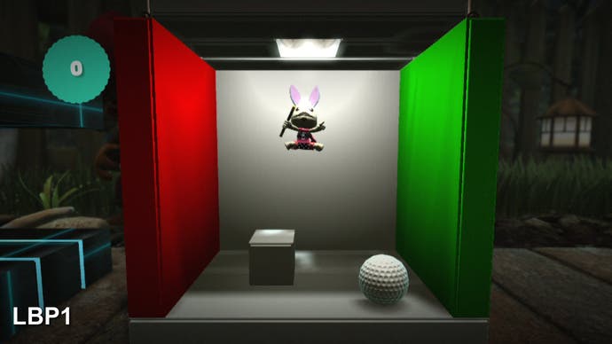
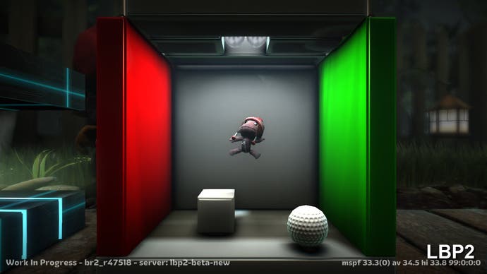
With total environment darkness and just the ceiling light you can see the lighting is based on volume sampling as there's no direct illumination of the floor, which is actually fairly dark where it ought to be the brightest surface. You also get light bleeding in the back corners that produces a rim of shadow - you'll note that this effect is nowhere near as realistic in the original LBP.
Tweaking camera angles brings about some artifacts that confirm that Media Molecule is using volumetric lighting as opposed to full-blown real-time global illumination. However, turn on daylight and tweak the lighting and the results are the closest we've yet seen - the improvements made to the overall lighting in the game are quite phenomenal. The contact shadows make a huge difference to the game's believability, as does the ambient occlusion. The overall effect is a little bit 'dirty' and high contrast, but it definitely works as an aesthetic.
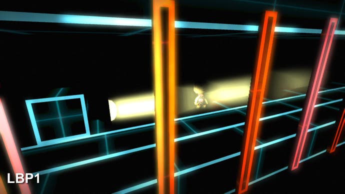
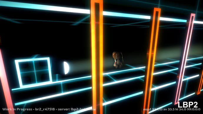
This simple fog demo also illustrates the volumetric lighting model in LittleBigPlanet 2. LBP1 has a "fogginess" variable you can attach to a light source - it's effectively a hack and while the results are pleasing, they are not exactly accurate. In the sequel, it's a completely different ballgame. Standing in the beam of light, Sackboy is more realistically lit and he's also stopping the light from being cast immediately behind him. Shadows from the uprights are being cast in the LBP1 shot when there's no real reason for them to do so, and this is also resolved properly in the new game.
These screenshots also serve to highlight how well Sony's implementation of MLAA (morphological anti-aliasing) works out in LittleBigPlanet 2 - jaggies are effectively eliminated, producing a much smoother, realistic look.
Now let's move on to our third custom level. It's still pretty simplistic stuff but it highlights how changes to specific effects can have a radical effect on the overall look of the level. In this stage we've chosen to concentrate on fog, fire and explosions.
The 2D fog and smoke effects of LittleBigPlanet is gone in favour of puffy clouds that actually have a real sense of 3D volume. Not only that, but you'll note that the clouds themselves are also capable of casting shadows on both Sackboy and the environment. Not so good, however, is the fact that the draw distance of the clouds is reduced compared to LittleBigPlanet and this is where our concerns about the whole backwards compability angle begin to emerge. Level creators got the most out of the tech by acquainting themselves with the absolute limits of each effect and component. Changing them up like this could potentially break a lot of the levels out there: we'll be looking at this in more depth in our full LBP2 beta tech analysis tomorrow.
There's no denying that many of the changes are very worthwhile though. Fire is enormously improved not just in the sense of the flames themselves but also in terms of the fiery embers and even the lighting - you can see that the effect of the fire extends into the background whereas the impact is far more limited in LBP1. The lighting changes we highlighted earlier can also be seen having a dramatic effect on the overall look of the level.
The video also showcases one of the many new additions made to the content creation tool. Whereas in LBP1 creatures could only be disposed of with one visual effect, in the sequel there are actually seven different methods of killing off an entity - the splat method in particular looks superb.
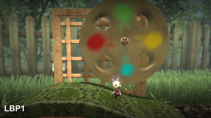
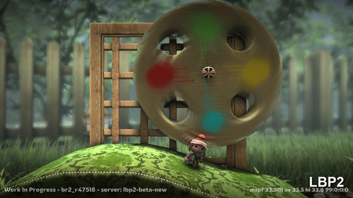
While the vast majority of the changes are hugely beneficial, we did notice that the superb object-based motion blur of the first game appears to have been pared down in favour of a more simplistic model. You can see it in the shots above on the spinning wheel: there's proper motion blur on the LBP1 shot, while the sequel appears to simply blur the surface of the texture only within the confines of the object itself.
It's fair to say that we've spent plenty of time with the LBP2 beta and overall, we're hugely impressed with both the improvements to the engine and the new options available to creators. In tomorrow's Digital Foundry feature we'll be dissecting the beta code, discussing its strengths and weaknesses, putting the tech through performance analysis and highlighting the sheer creative potential the new game offers to the LBP community. Look out for it.
