Digital Foundry vs. PlayStation Vita
In-depth technical analysis of Sony's latest, greatest handheld.
Sony's PlayStation Portable redefined the state of the art for mobile gaming technology back in 2004 with its luxurious 480x272 colour screen and custom architecture that powered graphically immense titles like God of War, Ridge Racer, Gran Turismo, LittleBigPlanet and Metal Gear Solid among many others. While many argued that portable versions of home console games were not the way forward, with PlayStation Vita we find that Sony continues to beg to differ.
The support for the PlayStation Suite initiative suggests that Sony is willing to embrace the bite-sized gaming concept to some degree, but this is very much a PSP successor in form, function and ethos - reminiscent of the older machine in look and feel and launching with a range of games that would not look so out of place on a current home console. A brand new Uncharted adventure arrives with the machine on day one, and with titles like WipEout 2048 we'll actually see the exact same game launch on both PS3 and Vita, with the ability to sync progress between both consoles.
After an extended hands-on period with two Vita units, this Digital Foundry hardware review dissects Sony's new offering, our aim being to answer all the questions you may have about the new machine: how does it look, how does it feel, what can it do and how do the games play? And with Vita priced at £230 - more expensive than the PlayStation 3 or Xbox 360 but a relative snip compared to the iPad - does the package offer enough to justify the asking price?
We'll be taking Vita to task on a range of aspects across a substantial review, covering off the following topics:
- PlayStation Vita: The Design
- Screen Quality, Performance and Battery Life
- Games Analysis: A True Next-Gen Experience?
- Investigating Vita's OS and Apps, Media Playback and the Browser
- Backwards Compatibility, PSN Account Switching and the Digital Foundry Verdict
PlayStation Vita: The Design
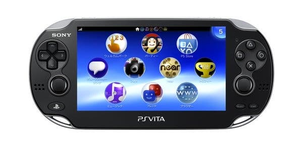
First impressions on unboxing the Vita are extremely positive. Placing it in our hands for the first time, it's apparent the console has a distinctly premium feel to it, reminding us of the original PSP's solid, weighty build, or even the first wave of PS3 models with their chrome finish. No compromises have been made to quality here, with the whole unit being reinforced by an oval framework with a metallic finish that gives off no creaks under firm pressure from the palms. It probably could take a fair few knocks, although obviously we'd refrain from putting this to the test.
The weight of the unit does seem to add to the sensation of material quality which was missing in the PSP's Slim and Lite range, largely as a result of the cheaper plastics it used. That said, the heft to it isn't so much that it could put strain on the wrists over long periods of play, and the two grips on the back help to keep it lodged firmly in your hands.
The overall increase in the size of the unit, measuring in at approximately 7.3 inches long, 3.3 high, and 0.7 deep, lends itself to the ergonomics of the device. The difference in grip makes it much easier to pivot the base of your thumbs into a comfortable position before landing on the d-pad or four face buttons. The positioning of the two analogue sticks also comes across as carefully measured, being deliberately pushed closer towards the screen to prevent users hooking their thumbs to meet it. As it's designed, this feels very familiar to Sony's Dual Shock controllers. Meanwhile, the index fingers wrap naturally around its form to land on the two shoulder buttons.
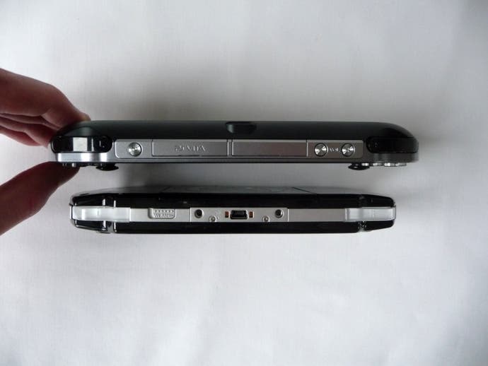
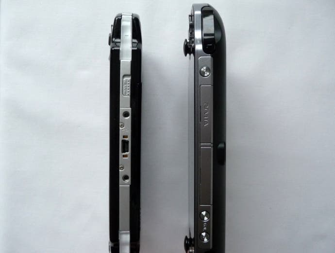
Actually, the Vita is a remarkably thin device, and discounting the protrusion of the analogue sticks it is marginally leaner than the PSP-2000. This is no doubt aided by the use of the thin OLED screen, and the omission of its predecessor's spacious UMD tray, but it's still impressive.
Perhaps one of the most anticipated additions to the design is the second analogue stick, which has huge ramifications regarding the kinds of games that will end up being produced on the Vita. These sticks are symmetrically placed, and feel quite sensitive, in that even the slightest touch shifts them from their default position. Much like the 3DS's implementation, we can see this lack of friction as something that might take a tiny bit of adapting to, and some may prefer a little more resistance to metre out finer movements in first person shooters. But again, they are very well designed overall, and certainly a huge leap ahead of the PSP's textured nub.
The d-pad used on the Vita is perhaps the most comfortable Sony has ever produced. Each cardinal direction rolls on the pivot very cleanly and precisely, with a light click that offers a satisfying sense of feedback when input has been made. We find sliding motions in 2D fighters such as Ultimate Marvel vs. Capcom to be much easier on the thumb than with any previous handheld device, helped partly by the minimisation of gaps between each button. On the right hand side, the four micro-switched face buttons are exactly as you'd expect, although surprisingly smaller than on other Sony portables - a point which is accentuated by the up-sizing of practically everything else.
"First impressions on unboxing the Vita are extremely positive. Placing it in our hands for the first time, it's apparent the console has a distinctly premium feel to it, reminding us of the original PSP's solid, weighty build."
If we were to start nitpicking here, there is an argument to be made that the distance between the face buttons and the right analogue is less than optimal. They're perhaps a tad too close for our liking, and tapping the X button often leads us to drag the right stick down with it - although again this may involve some adapting to. Less excusable is the fact that the stereo speakers are placed on our thumbs' route to the d-pad and face buttons, resulting in the speaker holes being obscured during much of the run of play, leading to a general muffling of the sound. This isn't ideal, and although the 3.5mm headphone slot at the bottom is an option, we hope it will be addressed in a future revision.
Next up, the family of menu buttons beneath the original PSP's screen have all gone their separate ways, and for good reason. The Home (now dubbed 'PlayStation'), Select and Start buttons are positioned beneath the analogue sticks, recessed into the console's front to avoid accidental pressure, while the metallic power and volume buttons protrude by a millimetre from the top side of the bezel. The contour of the unit matches your hand-size in such a way that these top buttons are easy to reach with the index fingers - only a short stretch away from the shoulder buttons.
The excised display and sound mode buttons that once cluttered the original PSP's menu bar aren't missed at all. The Wi-Fi switch is also no more, with the Vita instead offering you the option to tweak all brightness, equaliser, and wireless connectivity settings straight from the OS menu. The choice to take this route is mitigated by the Vita's ability to pause gameplay on the fly and adjust any settings accordingly before switching straight back to the action. By replacing these physical switches and buttons with software-based alternatives, Sony has removed a lot of the clutter that the PSP has held on to for years, paving the way for a very simplified, more elegant look.
Moving on, the game cart port is located beneath a cover at the top and can be opened by dipping your fingernail underneath and pulling outwards - not the most accessible solution, but it does help avoid dust getting into the unit.
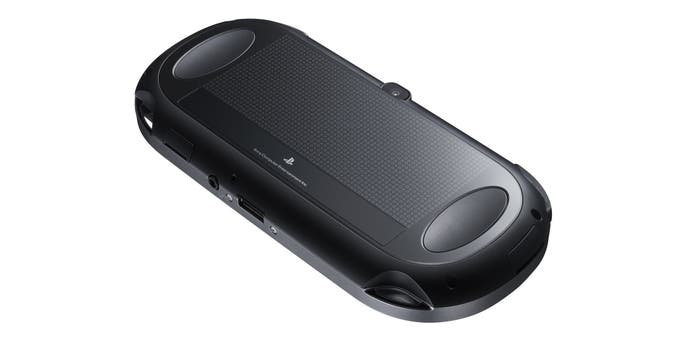
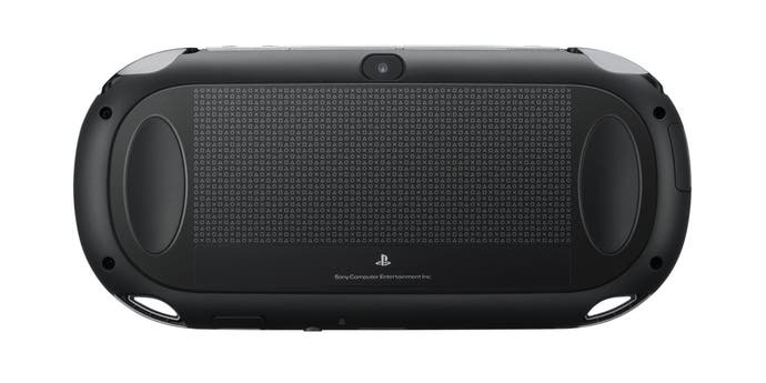
Besides this, there are no other official points of entry to the Vita - not even a battery hatch. This reluctance to give users an option to replace the battery is a disappointment. While we're actually quite happy with the Vita's battery life, the ability to carry around a spare battery "just in case" was always quite useful for the original PSP - especially so for scenarios like gaming during long haul flights. As it is, the fact that the rear-touch panel encompasses much of the unit's posterior means that there's little room for any kind of battery access anyway.
Easily one of the more innovative additions, the multi-touch rear panel is entirely coated in a smooth glossy finish, and works as an inverse to the front screen. In some ways, this could be seen as Sony's response to the 3D charge on Nintendo's side, as while the gameplay remains strictly in 2D, the interplay between the two touch panels invites play styles which involve manipulation of depth in-game. Put into practice with titles like Little Deviants and ModNation Racers (where you can raise or lower terrain in its track editor), it's difficult to know exactly where your fingers are without referring to the edges. However, this remains an enticing addition that we can't wait to see utilised properly.

