Caesar IV
Subservient.
It's hard to take a game asking you if you want to install a MySQL ODBC Connector as a sign of good times ahead. Especially when the game then tells you it won't actually work without this superhappyfuntime-sounding application, thus making the previously offered choice entirely futile. Why bother you with something that a) will probably bewilder and alarm you and b) you clearly don't even need to know about anyway? Do they really think you might have some deep-seated prejudice against MySQL, so overwhelming that its presence has to be flagged up separately from the inevitably gigantic and tedious EULA you already agreed to when you started installing the game?
It's a sign, is what it is. A sign that though an awful lot of work has gone into making the mechanics of Caesar IV as exact as possible, perhaps less consideration has gone into what it feels like to be a player of this city management sequel, released eight years on from its last, and hugely popular, iteration. Everything necessary - that is, everything from Caesar III and then some - lurks within, but it's not always presented in suitably 2006, rather than 1998, fashion.
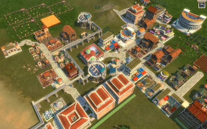
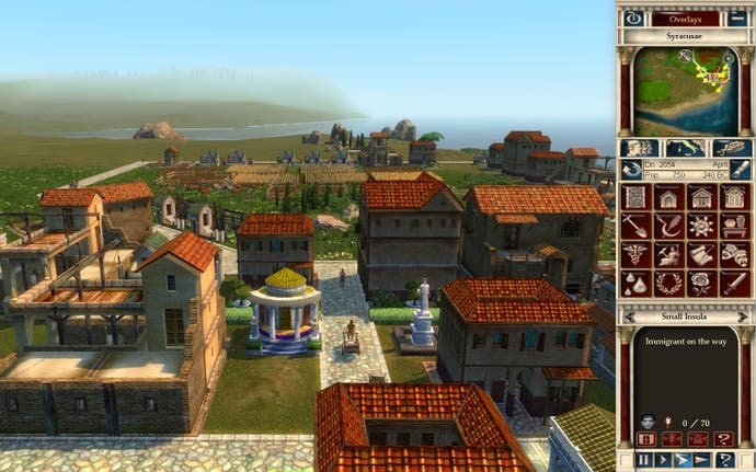
Graphically, there's no problem. Folk with a silly-money graphics card may gently lament that Caesar won't quite squeeze every last drop of pixel juice from their system, but it's plenty pretty. Cities bustle, water shimmers, light diffuses - good work, job done. There's certainly a decent sense of life to a large city, wheelcart-toting Plebs (and the occasional confused escapee from the sheep pen) haring along intricate road systems to collect, process, sell and export multifarious goods like so many poorly-washed ants. As with Caesar III, flow is everything. If a nightmarishly illogical road layout or a Malaria-induced worker shortage is delaying the passage between produce and cash, the economy will grow more slowly, your citizens will whine and up sticks, and you'll lose favour with Rome. No matter how many caged lions you desperately gift to Caesar in tribute (his use for the poor, angry beasts isn't specified, and is perhaps best left a mystery), if your new arm of the Empire is consistently losing money, he'll send the lads around to sort you out.

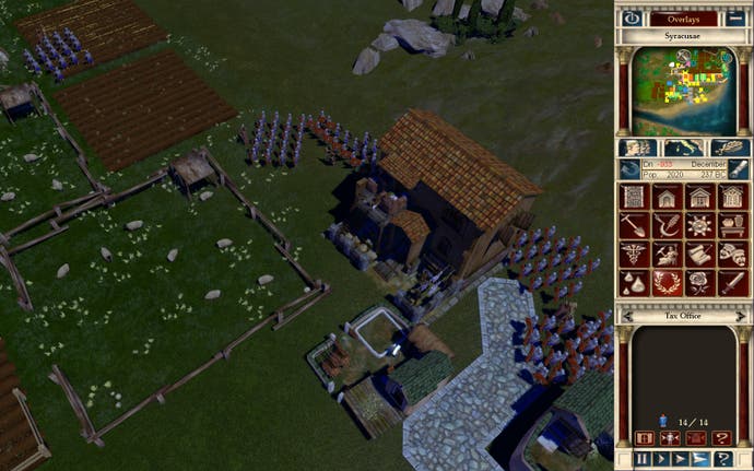
All pretty reasonable, but complicated stuff - there's a hell of a lot to manage simultaneously. Almost any given building is dependent on at least three other buildings before it's even vaguely effective, and in turn each of those buildings' employees/residents rely on a baker's dozen of balms for mind, body and soul to keep them happy. But depth is why we're here, right? In theory, such micromanagement is pleasing, and certainly this is true of the early stages of a given scenario. It's hugely satisfying to watch your new city start to emerge, to see the flow of people to resource to money to people and round and round and round working properly. The trouble is keeping a handle on all ever-growing depth, and that's where the archaic interface violently strips Caesar IV of any claims to greatness it might otherwise have legitimately made. Even placing a structure can be utmost misery, abysmally-designed build menus spilling across almost half the screen, and sometimes requiring millimetre increment-shifting of the camera to try and find a suitable spot not obscured by swathes of nasty giant text. It's like graffiti over a vital road sign, but really boring graffiti about aqueducts and olive groves. It's made even worse by a baffling bug that means selecting an option often takes two or three mouse-clicks before the game notices that you're trying to do something.

Also infuriating is the lack of shortcuts to jump directly to certain structures. No matter how many shiny shader effects are pumped into the game, the reasonably unimaginative art style means a grain farm looks really quite a lot like a vegetable farm, so checking on a certain building can require an ungodly amount of cheerless panning and zooming across several dozen similarly-shaped edifices until you manually find the one you're after. If developer Tilted Mill had gone for a suitably modern, tooltipped icon approach, rather than all that horrible 1990s-hangover giant text, they'd both have saved on fugly screen clutter and been able to include something sensible like right-clicking on the wine icon to jump to the nearest wine factory. Again, the depth and mechanics are unquestionably there, the sympathy to the player less so.
It's far from being the same game, but Civilization IV becomes a natural comparison. Though not without its own problems, it did a spectacular job of making an old and largely unchanged play dynamic fresh and contemporary. Caesar IV is the same core game as always, but, beyond a superficial move to glossy 3D, its surface hasn't moved with the times. You could argue that the fact your in-game advisors rarely let you know about a problem, unless you specifically go to the advice screen and wade through the torrent of text and statistic presented there, is a deliberate design decision to ensure the game is challenging. Caesar old-hands would, after all, sniff at any hint of hand-holding Or, you could argue that the scarcity of contextual pop-up alerts, something Civ 4 largely does very well, is a huge oversight that makes keeping tabs on your city far more difficult and frustrating than it needs to be. Plus, presumably you're paying these crotchety buggers out of your hard-earned Denarii (they don't actually affect your budget, but hey, I'm role-playing here) - they should come and tell you what's going on, not sit around waiting for you to find a moment in your busy temple-building schedule to come and get moaned at by them.

Still, despite these apparent attempts to be no fun, once you're on a roll, successfully balancing growing coffers with the needs of your citizens and the petulant demands of Rome (why can't it grow its own grain instead of nicking all of mine?), Caesar IV will make you feel pretty good about yourself. There's real pleasure to be had from mastering the complex economy in the face of constant adversity. It's a relief, too, to have a choice early on in the single-player campaign as to whether you pursue peaceful or militaristic missions, the latter always and still feeling slightly out of keeping with how the rest of the game works. The soldier AI is rubbish and the fights weird and clunky - combat just shouldn't be in here, so thank Jupiter you only have to do a minimal amount of it if you so wish.
So, I come here not to praise Caesar or to bury it. It's just doing pretty much the same generally reliable job it always has done, putting in its hours and going home again - if anything, it's getting sloppier with age. If it really wanted to be great, it really could have been. But even after an eight-year gap, it still manages to feel like a churned out sequel rather than a careful study of what did and didn't work last time around. Times have changed since the last Caesar reigned; there's only enough spit and polish here to delay, rather than prevent, the fall of this particular empire.

