Die Hard Vendetta
Kristan wears a dirty vest to work
If you take the Nintendo first party games out of the equation, the GameCube's list of exclusive titles is a painfully short one. But one that has just hit the shelves - and belatedly, our desk - is Bits' Die Hard Vendetta, a first person shooter loosely based on the movie trilogy. Normally we'd treat movie tie-in fodder with more than a little suspicion, but given that it's exclusive to the platform, we assumed this would be a cut above the standard all formats fare.
The subject matter certainly lends itself nicely to the FPS genre, with plenty of characterisation, wise cracks from John McClane, and the all important selection of weaponry. And according to the press release blurb, the game features a control system designed from the ground up for console users, as well as "unprecedented character interaction", "superbly rich environments" and "amazing in-game cinematics".

Welcome to the party, pal
Well, maybe that was the intention, but the results are a million miles away from the PR guff. There are so many problems with Die Hard Vendetta, it's hard to know where to start.
Firstly the control system is totally unwieldy thanks to Bits deciding that the cursor should move dramatically, even if you only nudge the analogue stick a tiny bit. There are various options to alter sensitivity, turn off auto centre and motion, but none of these corrects what is a fundamental error. The controls are saved from complete disaster by having an auto target option, but this removes any element of skill from playing the game, as it quickly degenerates into a question of how fast you can hit the fire button, with the cursor instantly locking onto any target you face. Why Bits didn't stick with the tried and trusted standard is anyone's guess.
Elsewhere, the controls intention to be helpful end up being merely irritating, with the prime example being the auto jump, which makes you jump off an edge if you're running at the time. Also, the system of selecting the weapons and inventory with D pad isn't as user friendly or intuitive as it could be. All round, they made a right pig's ear of it, and it ruins any chance you have of getting into the game from the off.

A shocking state of affairs
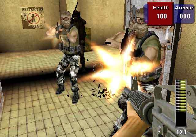
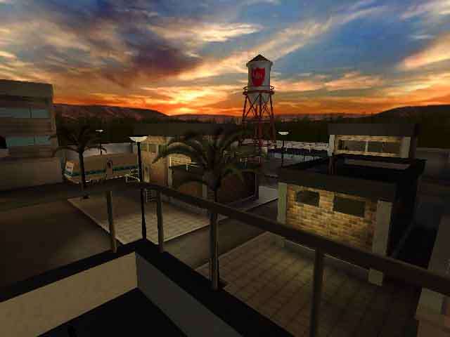
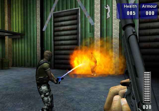
And all that's before you're 'treated' to the visual element of the game. Somehow managing to make Half Life look up to date by comparison, it's actually a shock to see a next gen console game this bland - especially the show off genre of the first person shooter.
We're not aware of the engine used, but it looks like a stripped down version of Monolith's Lithtech engine, and as such the colours are garish, while the general texturing and architecture looks extremely lacklustre stood next to any number of competing games.
The character models look extremely primitive by today's standards too, and basic clipping problems mean that often when you walk up to them, you can see right inside their bodies, which is something we haven't witnessed this century! It's harsh to judge a game based on how it looks, but everywhere you look there's something to make you gasp at how a product such as this could have ever been given the green light.

Yippee Kay Ay muddyfunksters
In our quest for objectivity, we played on dutifully to find out what other charms lay within Die Hard Vendetta. The opening level is as good as any to pick on: you're faced with a few shell-shocked witnesses to a hostage incident, and cops taking notes. Walking up to then and clicking the action button elicits some astonishingly badly scripted and acted voices from said badly rendered characters, and eventually you become aware that you've got to go and rescue someone.
Except the man busy blow-torching the door open won't get out of the way, and eventually you're forced to click around on everyone to find out the 'required' info before the cop gets out of your way. Fantastically irritating, not a good start, but pretty typical of what to expect. It feels like an botched attempt to marry the Half Life narrative system with a Die Hard setting, garnished with a bit of Max Payne bullet time (or 'Hero time' for the purposes of the game) to get you through those tricky sections (albeit without any of the tension, the moves or the wow factor of Remedy's title). Another complete lift from Max Payne is the use of slow motion when you kill key baddies, which was pretty annoying first time around - although at least Max Payne had decent graphics to show off. Here, it's used too often and just becomes annoying after about the second time you see it.
If you're wise enough to switch on auto targeting, then clearing the early levels shouldn't prove too much of a challenge; just face vaguely in the right direction of your assailant, and POW, down they go - even if they're pointing a loaded gun in the face of a hostage. Handy eh? The A.I is pretty non existent, and makes Halo look like a genuine work of genius by comparison. The challenge is raised somewhat as you progress, with more involved stealth based hostage rescue, more interesting weapons and so on, but the basic flaws are inherent throughout.
It was pretty clear from the very first bullet that Die Hard Vendetta is not a game that even the most, ahem, die hard FPS or movie fan would want to shell out forty nicker on. If you want a game that does the franchise justice, you can probably pick up the fantastically entertaining Die Hard Trilogy on PSone for about one eighth of the cost of this. We know the graphics have aged somewhat on that one, but at least it's fun. Die Hard Vendetta feels exactly like a vendetta - against your patience, good taste and your wallet. Do yourself a favour and avoid.
Die Hard Vendetta screenshots

