Star Wars: Jedi Knight - Jedi Academy
A good port of a flawed game.
There were two reasons we were curious to take a look at this quick-fire port. Firstly it's a game which arguably has controls that lend themselves better to an Xbox pad than a finger-stretching PC keyboard configuration, and secondly it's being ported by Vicarious Visions - the team tasked with the Doom III port, of all things.
The PC version was one of those FPSs chock full of ideas that probably sounded good in the design doc, but when it came to putting them into practice Raven slipped up. The whole game centres on the concept that you're a fresher. A newbie student who hopes to one day become a fully-fledged Jedi, and has enrolled at the Academy under the watchful eye of Luke Skywalker and your 'master' Kyle Katarn, who regulars will recall starred in previous Jedi Knight adventures.
Create-a-Jedi
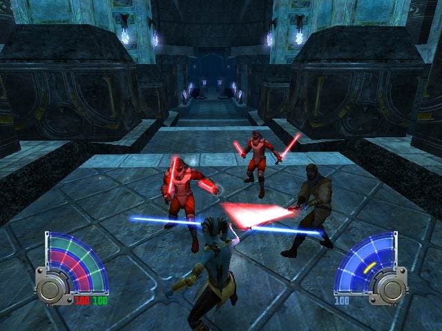
Functionally the game is identical to the PC version, with four levels of difficulty, and the ability to create your own Jedi from a selection of species, heads, clothes and lightsaber styles. Unlike the similarly flawed Jedi Outcast, you actually get to wield the lightsaber right from the off, and the game gives you the chance to do just that when your ship crash-lands on route to the Academy. The opening level is a tad contrived to say the least, with a shoehorned sense of linearity as you carve trees down to make 'bridges' and in truth it takes several hours before the game becomes truly engaging as it takes you first through a basic refresher course on your Jedi powers, then through a handful of dreadfully uninspired levels.
The first tier of missions are effectively five levels that you can attempt in any order, and the game progresses on that basis thereafter, gradually ramping up the challenge and allowing you upon completion to assign yourself new Force Powers or upgrade existing ones to level three. Some powers are granted automatically, while a selection of light and dark powers can be activated at your choosing, presenting you with the potentially interesting conundrum of becoming entirely evil. Predictably, the more powerful and amusing powers are on the dark side, with the likes of Force Lightning, Drain and Grip a lot more fun than the light side's Force Heal or Absorb, although the Jedi Mind Trick has plenty of comedy value when you're sending foes falling to their doom.
However, during the majority of the game you can get by pretty well just either using the standard run and gun FPS mechanics, or panning out into third person mode and wielding your lightsaber at everyone you come across. Not only does the lightsaber act as an effective block to enemy fire, it slices them up good. Occasionally you'll find an opponent that can only be defeated via a lightsaber attack (yes, apparently able to block missiles too), and as the game goes on you'll find yourself having to use this more and more - to the point where use of the numerous Force powers becomes a necessity rather than an option.
Shortcut to nowhere
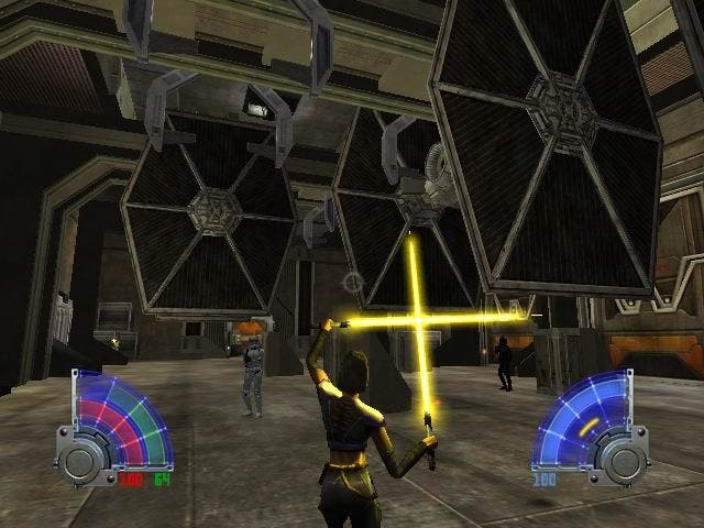
On the PC version, we found ourselves struggling to cope with the need to cycle through the various force powers then select them (or reaching the distant shortcut keys). In the heat of a battle it was far too easy to select the wrong one and find yourself sliced up. Imagine playing a beat-'em-up that uses mouse control for the camera, and forces you to select your combos from a cyclical menu and you get some idea of how clumsy this feels. On the Xbox the D-pad houses both the weapons and Force powers menus - left/right cycles through the former, up/down the latter, with the ability to assign that power or weapon to the X button by holding it down for three seconds - readying it for instant recall during gameplay. Other than that, clicking down the left stick activates your currently selected power, which - as we suspected - feels a whole lot more natural than the keyboard Olympics the PC version demands from you, but in practise still isn't the most natural feeling combat system we've ever encountered.
In common with the PC version, you still find yourself going into battle and fumbling furiously through cyclical menus while numerous baddies are busy blasting seven shades out of you. Assigning the power to X is useful, but only once you've realised which power you need to get you out of your current mess. You'll doubtlessly be involved in a fair bit of trial and error before you get to that stage.
And what of the rank AI of the PC version? Well, it's still here in all its stationary glory, with big lines of doofus Stormtroopers standing around waiting patiently for their turn to die. In lightsaber battles things are very different, but basic firefights can often be laughable spectacles as they refuse to shift from their location. And even when you do take some damage, the ridiculous Force Heal power means you can just wander off and give yourself full health at any time. What you end up with is a game that just turns into a slog - some levels are tricky thanks to the weight of numbers, but it's no more skilful than just picking off one bad guy after another until you finally locate the end of the level. And that's not as straightforward as it sounds either, with some exceptionally poor signposting often resulting in you backtracking around empty levels until you find some arbitrary location that you've overlooked.
Graphics whores need not apply
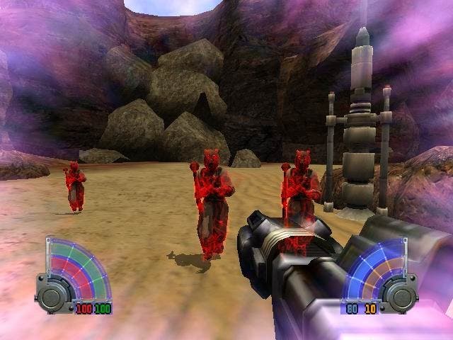
The Quake III-era graphics have been noticeably optimised for the Xbox, with none of the curious scenery pop-up that blighted the PC original (despite being turned up to full detail on our more than capable rig), but it's still a fairly uninspiring looking game with a consistently garish colour scheme, drab, unconvincing texturing and a horribly dated feel to it. It's not exactly what you'd call ugly - that would be unfair - but check out the character animation next to something like Prince of Persia and you'll see where we're coming from. Not only does it look wrong, but in third-person mode your creation simply lacks any kind of real physical presence, with a particularly awkward jumping mechanic which is prone to getting caught on the scenery and appears lightweight and feeble. Putting first-person games in third-person is always a risk, and here's why - but it needn't be this way, and you only have to check out the splendidly fluid Max Payne 2 to work out why this feels horrible.
One area in its favour is the multiplayer functionality, which not only adds bot matches for a warm up, but two-player split-screen (why not four for gawd's sake?), System Link (2-10 players), and of course Xbox Live. As with the PC there are 23 arenas and a bunch of Deathmatch and CTF modes, as well as Siege (multiple objectives - attack or defend) and Power Duel (two on one lightsaber battles). It's interesting to get some lightsaber battles going over Live, which is as seamless and hassle free as ever, and Siege is great fun, but it's hard to recommend a purchase on these modes alone.
Outcast
It seems odd to come back to a game and find it much less enjoyable the second time around when it's quite obviously a decent port. But several months on we've not only played much better games, but we're even less inclined to accept the messy control system, the often dreadful AI, the questionable animation, the less than stellar visuals, the fact that following the dark side makes no real difference to the game, and the overall feeling that it's just not that exciting. It's good to see Live make the package this time around, but we're disappointed that after all these years LucasArts is still scratching around abusing the Star Wars brand in this way. There are some good ideas here that haven't been realised, and we're once again left waiting for the definitive Star Wars FPS to appear.


