Tom Clancy's Splinter Cell
Can the PS2 handle the Xbox classic?
Despite its all consuming dominance, coaxing technologically impressive results out of the PlayStation 2 has eluded all but a handful of elite developers. With this in mind, it was hardly surprising that no one expected Ubi Soft to be able to port such a visually demanding title as Splinter Cell. With easily the most stunning lighting effects ever seen in a videogame, fantastic use of shadows, stunningly detailed texturing, and a long list of other impressive visual delights, even the most hardened Sony fanboys would have feared for the conversion; after all, the game wasn't even designed for the PS2.
But then Ubi Soft blew all of our preconceptions away with a triumphant demo session earlier this year, stunning onlookers with what seemed like an uncannily spot on conversion. Sure, some compromises had been made, but it was infinitely better than we'd all imagined it would be. Even then, we still knew that the only way to be sure was to put it though its paces at home, and compare the PS2 and Xbox versions side by side.
The concept should be thoroughly familiar to you all by now: you play Sam Fisher, an unnervingly George Clooney-esque field operative of a hush-hush black-ops agency called Third Echelon. Assigned to track down two missing CIA agents in Georgia, Fisher must use all of his stealthy manoeuvres at his disposal to put a stop to the evil doers.

Splinter Solid
The gameplay bears more than a passing resemblance to Metal Gear Solid, but improves on that revered series thanks to the use of light and sound as a gaming mechanic. Careful observation and use of the surroundings is all important, and creates a credible environment that convinces more than almost any game ever created. As has been the topic of discussion for many months now, this approach isn't everyone's cup of tea; hide and seek is not everyone's idea of a cutting edge gaming experience, it seems. Be under no illusion that Splinter Cell is an exacting game, which often demands a level of dedication, repetition and iron will bordering on obsession. When it's fun, there's barely a game as satisfying ever made, but when it's annoying, you'll be in the mood to smash your joypad into the nearest inanimate object.
Ubi Soft Montreal realised that in order to tap into the mass market, it had to stop busting gamers' balls quite so much. A pretty stealth title's no fun if you're just bashed over the head every five seconds, which was often the case with the Xbox version. Thus, with five month extra dev time, Ubi has pruned the potential cash cow PS2 version; smoothed off the rough edges, toned down some of the more ridiculously difficult sections, and generally improved it as an all-round package.
One of the areas that failed to grab us at all on the Xbox was the narrative. Pretty much thrown into the adventure, you neither knew nor cared for who Sam Fisher was, or why he was there, and every cut scene thereafter made even less sense. This time around, however, Ubi has bothered to explain properly why Fisher is being asked to risk his life. The all new opening cut scene sets the tone perfectly, and suddenly it all fits into place as to why you're storming through a burning building in the opening level.
Ch ch ch ch changes
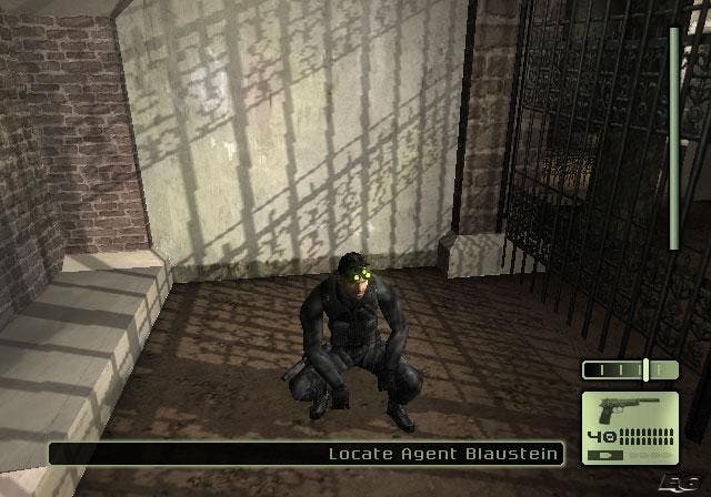
Talking of which, the Police Station level is as good a place to offer up comparisons that hold true throughout. We fired up the Xbox and flicked between channels to see for ourselves exactly how they compared, and it was perhaps more pronounced than we initially thought. To the untrained eye both versions look more or less the same, but our game of spot the difference threw up a whole host of changes - some for the better, some definitely for the worse.
Top of the list of changes is the slightly different layouts employed. Some rooms have been blocked off, exits are different, and furniture has been rearranged. For example on the first level alone, there's no longer a kitchen or bathroom in the apartment, you no longer have to jump between balconies, the stair case isn't blocked by fire…the list goes on. The changes don't really make a huge impact on the game, but they appear to have been made to stop gamers from being tripped up at every turn, which is a noble aim.
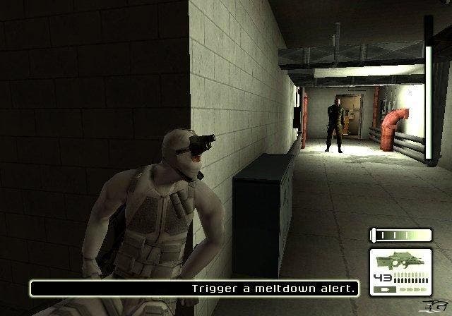
Visually, the changes are just as apparent; the lighting in the Xbox original screamed out at you, almost as if it was showing off. In the PS2 version, it's still there, but has simply been toned down a touch, but is no less impressive for it - just a little less in your face. The texturing and detail level is almost as remarkable as it is in the original, although some of the shading in the darker areas is disappointing, with a nasty banding very apparent. Shadowing has been toned down too, although not all the time. Sometimes the shadow casting is very good, sometimes it seems to be absent for no good reason, but all the while the frame rate holds up remarkably well considering how many textures are being thrown around, although its easy to see that the turn/rotation rate has been slowed down noticeably, possibly to compensate.
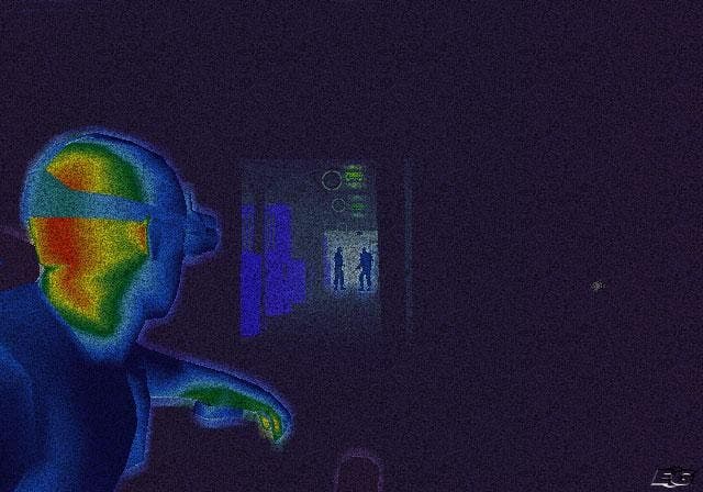
The character animation and modelling are, happily, well up to scratch, being barely any different to our eyes, while the particle and night vision effects look just as stunning. Overall, the look of the game is as good as you could possibly hope it to be, (but where's the 16:9 mode Ubi, eh?) and while it's true the Xbox version still gets the nod, there are an array of areas where Ubi Soft has improved the game.
Easier to control, more playable: we like
Most obviously, the control system on the PS2 is far more intuitive and user friendly than the comparatively clunky original that suffered from a hateful inventory management system. Most of the basic controls are intact, but the addition of context-sensitive controls to save you endless menu manipulation is a massive bonus. Being able to walk up to a locked door and be offered the choice of looking through the keyhole or lock-picking is one such added bonus. The additional shoulder buttons allow for far more intuitive combat, too; hitting R2 to draw your weapon and R1 to fire makes much more sense. The whole process of learning the controls just feels more natural from the off, and as given how tough the game is, this is a massive plus.
The addition of an extra level is obviously a bonus, although we can't help feeling that this is a tactic to haul in a few extra sales from the real hardcore fans who want to get the 'complete' game. It has been categorically promised that this level will remain PS2 exclusive, but pardon us for a moment for refusing to believe this, like the cynical old hacks that we are.
If you're even vaguely intrigued by the prospect of the best stealth game the world has ever seen, then our advice is to buy this immediately. It's challenging, well paced, satisfying and features some of the best visual trickery the PS2 has pulled off to date. It may be too frustrating for some tastes, but to pass it by would be to deny yourself one of the best games around. It may have taken an 80-strong Chinese code (sweat) shop to convert, but it's been worth the effort. Ubi Soft deserves massive credit for this, and a massive hit to boot. Enjoy.
