Syberia
Kristan goes on a sleepy adventure
The point and click adventure genre once provided some of the most richly entertaining gaming experiences of all time, and it's impossible not to feel enormous pangs of nostalgia for the years when LucasArts ruled supreme with an unbroken string of unfeasibly entertaining (and legendarily hilarious) titles that rank alongside the best games ever made.

Farewell glory days
How could this important and revered genre have been discarded with such irrational disregard for its audience? Well, for a start, LucasArts lost the plot (how ironic) and felt compelled to churn out 400 (mostly) piss poor Star Wars titles, and other publishers decided en-masse that splicing action and adventure was the way forward, and began churning out endless Tomb Raider clones instead.
A few hardcore developers stuck with the old school adventure principles of rich narrative, character development and some fiendish puzzle elements, but the glory days are clearly long gone - and the consistently poor sales figures certainly reflect this.
But when Syberia appeared in the Eurogamer Reader Chart for 2002 at No.29, we were forced to reconsider our view that the genre was dead. With a PS2 port now on the shelves, we finally had the excuse we needed to plough headlong into what we hoped would spark off an adventure revival. But hang on; it's published by Microids; legendary for bringing out some of the worst games in recent memory.
The game kicks off in slightly oddball fashion, with lawyer Kate Walker arriving in the obscure village of Valadilene on a mission to complete negotiations over the acquisition of the Universal Toy Company from its 86-year-old owner Anna Voralberg. Upon arrival at the local hotel it resembles a scene from Camberwick Green, with an odd assortment of clockwork automatons hobbling around going about their daily business. Rather annoyingly for Ms. Walker, the old woman she's come to visit has just died, thus throwing a spanner in the works for the deal.

Hans' so low
Thereafter, the basic idea of the game is to track down Anna Voralberg's enigmatic younger brother Hans, who has become the heir to the Toy Company. The problem is, this talented toy designer has been assumed dead for the past sixty odd years, and tracking him down is something of a paper trail in the manner of the Resident Evil series, and so the game has you steering the hapless Walker around poking her nose into every conceivable corner, collecting obscure items, talking to everyone you meet and reading verbose diary entries that gradually reveal the mysteries of this epic journey.
Like all adventure games, Syberia is heavy on the puzzles. If there's something to pick up, the chances are it will have some relevance to furthering your quest, and the only way to progress in Syberia is to be as nosy as possible; poke around, pull levers, open drawers, or on one baffling occasion open a drawer and pull a lever. A crucial element of any game of this type is to make sure the puzzles have some kind of relevance to the plot, but immediately Syberia throws up a series of unconnected barriers that rely on a heavy amount of trial and error in order to allow you to progress. Right from the off the game places you in a limited number of locations, with progress barred until you make the seemingly random association with an item in your inventory.
The main problem we had with Syberia was its linearity. Unlike all the classic adventure games down the years, the player is rarely given several things to do at once, so if you're stuck, the game shuts its doors in your face and refuses to budge until you chance upon the (often wilfully obscure) solution. On several notable occasions, the problem arises purely as a result of the design of the location, which makes it a lottery to determine where your exits are. Mostly it's patently obvious where they are, but it's not unusual to find yourself chancing upon them, which is fundamentally poor design. Given that icons pop up to tell you whether you can interact with the environment, failing to make the player aware whenever he or she is approaching something as basic as an exit seems like a glaring oversight.

Irritating, infuriating, arbitrary
Part of the problem here is the control system, and the camera angles which make Resident Evil seem positively forward looking. Moving Kate around is straightforward enough, with the directional pad or left stick allowing for direct control in relation to the camera angle, and circle allowing her to run. But thanks to the repeated reversal of the viewpoint between locations, you'll stride out of a room, only to immediately end up back in the one you started in because you're now heading in the opposite direction. If that wasn't irritating enough, the areas of the screen that the game allows you to walk to are often infuriatingly limited, with large empty chunks of the play area arbitrarily unreachable - and hence you're often 'funnelled' through limited parts of the screen, and end up missing where an exit is located.
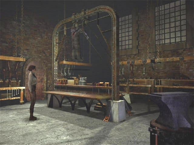
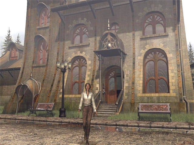
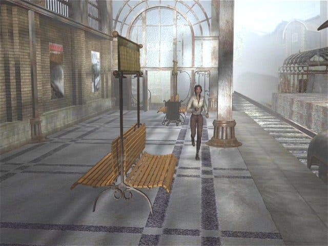
And what of the much vaunted visuals? Once upon a long ago these pre-rendered static locations would have had us drooling like frenzied lust puppies starved of porn biscuits, but these days our appetite for tasty treats knows no bounds. The last two Resident Evil titles on GameCube show what can be achieved with clever use of pre-rendered locations, but in comparison Syberia fails to deliver anywhere near comparable levels of impressiveness. On the PC the locations featured incidental background animation, and a much higher resolution. Somewhere along the line, the efforts to port to the PS2 have degraded the visuals to the point where they no longer make the game feel alive, and Syberia suffers because of it.
As is always the case with adventure games, it'll last you a long time. Divided up into four main sections en route to Russia, there's easily 20 hours-plus of gameplay, depending on your capacity for unconnected lateral puzzle consumption. The dialogue, however, is lamentable, with the English translation the kind of sub-amateur dramatic sludge that blights low budget games the world over. This is a shame, as the story itself is well above the standard cobbled-together gaming fare.
Oh, go back to sleep
Taken on its own merits, Syberia offers hardcore adventurers with endless reserves of patience a decent challenge, but newcomers to the scene will find the game totally inaccessible, with obscure puzzles, ropey dialogue and uninspiring sub-survival horror visuals.
Far from being the awakening of the adventure gaming genre, the PS2 port of Syberia reminds us why games of this type ended up in their own sleepy cul-de-sac. With neither the clever dialogue, the beautiful visuals nor the fabulously constructed puzzles of LucasArts adventure games of yore, Syberia merely leaves us wondering why the adventure diehards got so excited about it. Come on LucasArts; show them how it's done.

