2016 was all about the little details
Clutterpunk dystopia.
2015 for me was dominated by a single game - The Witcher 3. Nothing came remotely close to CD Projekt's dark fantasy masterpiece. It was everything I hoped it would be and so much more. This year, it's been far harder for me to pick a favourite. I agonised over my best games list for a silly amount of time, and even now I'm not entirely happy with it.
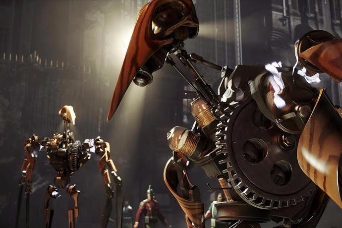
Part of the problem is, when I look back upon 2016, I don't really think about specific games at all. Instead, my mind conjures little moments and individual scenes from about half a dozen titles. I think about the mesmerising gears of Dishonored 2's clockwork mansion. I think about wandering the detritus-strewn streets of Mankind Divided's Golem City. I think about the little puff of confetti that accompanies the opening of any ride on Planet Coaster. I think about how I killed a man in Hitman by moving some pencils around on his desk. I think about Trico's feathers.
2016 for me, was all about the little details. And I don't think this is accidental. This year has seen a marked shift in the priorities of developers.
For many years that priority has been size, certainly in the mainstream. The dominant genre in the last five years has been the open-world game, with each new title offering a larger playground and ever more stuff to do in them. This reached particularly absurd levels in the icon-crammed maps of games like Assassin's Creed: Unity. Recently, even worlds haven't been enough, with games like Elite Dangerous and No Man's Sky offering entire galaxies at player's fingertips.
The problem with producing ever-larger games is that you can only go so big before the notion of size starts to lose its meaning. In those galaxy-spanning space games, their playgrounds are so mind-bogglingly massive that it can often feel like you're not really getting anywhere. Meanwhile, hoovering up the burgeoning number of activities in open-world games like Assassin's Creed and Grand Theft Auto starts to feel less like an adventure and more like busywork.
So what do you do when you can't feasibly use size as the main selling point of your game?
Apparently the answer is when you can't expand outwards, you start expanding downwards. I first noticed a shift in how developers were talking about their games with Mankind Divided. In the run-up to the game's release, considerable emphasis was placed on the amount of detail the team had crammed into the world, how every individual location was packed with painstakingly rendered objects, from office desks strewn with clutter, to streets lined with rubbish. It isn't just Mankind Divided that adopts this "clutterpunk" aesthetic either, Dishonored II and Hitman both do the same thing. Where once the game developer's catchphrase was "See those mountains? You can go there!" This year it's been "See that binbag? Each crushed aluminium can is individually rendered!"
Importantly though, this isn't just a visual motif. Each of these games backs up this theme of detail in their systems and level design. Indeed, in some ways 2016 has been about the return of the immersive sim - the genre that brought us games like Thief, System Shock and Deus Ex. These games present the player with complex, intricate 3D spaces and encourage creative exploration within them. Mankind Divided, Hitman and Dishonored 2 are all very much within that tradition, but also elevate those core concepts to unprecedented new heights. Take Sapienza, arguably the standout mission from Hitman, which applies the notion of focussed and layered geometric design to an entire Italian village, offering dozens of ways to approach the two targets lurking somewhere within.
Dishonored 2, meanwhile offers two of the most ingenious 3D levels ever devised. One is the aforementioned Clockwork Mansion, which takes the standard formula for an immersive-sim level and adds in the fact that the layout can change completely at the pull of a lever. But my favourite of Dishonored 2's missions is Aramis Stilton's manor, a crumbling, dilapidated ruin which, with the aid of the Outsider's mysterious Timepiece, you can explore in its pristine grandeur by instantly travelling three years into the past.
Moreover, depending on your actions within the manor's past, you can change the layout in the present in several ways. It's a superb effect that relies upon pure graft from Arkane as a studio. To create this illusion, the developers needed to design the same level three or four times over and layer them together. Some of these layers may never be seen at all by some players of the game. Detail has always been an important component in immersive sims, that's part of what makes them immersive. But this year has seen that design philosophy extend beyond this illustrious genre. Titanfall 2's singleplayer has two missions which employ similar ideas to my favourite missions in Dishonored. Blood & Rust sees players fighting along a giant assembly line, where the level layout is constantly shifting beneath their feet, while Effect & Cause sees you exploring the same environment in two different time-periods. Indeed, Titanfall 2 crams more ideas and mechanics into its five-hour campaign than most FPS' do in twice that length.
This wasn't just a mainstream phenomenon either, the indie sector had its fair share of astonishingly detailed game design. Campo Santo's Firewatch offered a brilliantly told story of mystery and companionship in a stunningly designed chunk of Wyoming Wilderness. Playdead's Inside offered a stark, meticulously drawn dystopia unflinching in its depictions of cruelty and control. Abzu wowed with its underwater wonderland, presenting us with a beautifully choreographed ballet of aquatic life. Each of these games focusses on a very specific idea, and dedicates its resources to evoking that idea in the most powerful way possible.
I think, in the end, all of this comes down to a recognition of the importance of craft. For years we've been promised games that offer dozens, hundreds of hours of content to explore, thousands of square miles, millions of spherical worlds. But games like Dishonored, and Titanfall, and Firewatch, highlight that procedural algorithms and cookie-cutter activities are no match for good old fashioned human craft, for levels that have been painstakingly built by hand, for mechanics that have been thought about and prototyped and tested to the nanometre.


