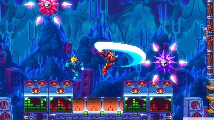
30XX is already lovely
Case of the X
I missed 20XX when it came out, which was clearly a mistake because it looks brilliant. But it was also a pleasant accident, because now 30XX is here the whole thing is so fresh and wonderful. Just loading into it this morning made me happy.
This series takes Mega Man X, with its dashing, jumping, blasting platform play, and spins it into a roguelite. Bosses still give you an extra power, but the levels and all that jazz are procedurally scrambled.
The controls are beautiful - movement has a lovely sense of weight, and there's a bit of Capcom mastery in stuff like the dash-jump that can get you across long gaps. Throw in level gadgets like blocks that move in a certain direction before exploding and platforms that only exist for a few seconds after you hit the switch and there's plenty to think about.
Actually, that last point has been very interesting. I am early on in 30XX and there is lots I haven't seen yet - I haven't played co-op or toyed much with the level editor, which in the current Early Access build seems sort of awkward and opens in a separate window. I haven't tinkered with fusion moves or really gotten to grips with the way the structure works. But!
But the way that the levels are designed is already beautiful. I am sure that a lot of this has to come from chunking - using bigger pieces, with their own bespoke challenges - when cobbling levels together. Yet beyond that, 30XX has just created really simple, elegant puzzle elements that lead to set-pieces that feel authored when you scramble them together. Platforms are great, but what if you have to get off before they ram you into spikes? These clouds are good for jumping on, but what if you have to wall-jump from them to reach certain areas before they evaporate? In one level, laser beams scrolled back and forth, combine perfectly with vanishing platforms - two things that demand timing, clipping together. This will not get old.
It helps that it's beautiful. From what I can tell, 30XX ditches 20XX's slightly stylised art for something more aggressively pixely. What makes it stand out, for me, is a rich colour palette. Sci-fi cityscapes are tinged with oranges and purples that invoke the glory of Megadrive games like Quackshot and Gunstar Heroes. Plants in one level have leaves of a sort of early-PC-monitor-green. We are perfectly within that sweet spot of the past, but the future of the past.
So yes, I am still getting to grips with the structure of the game, the upgrades and the in-game shop and all that, but each run so far has felt distinct and challenging in its own way. (Enemy design is really wonderful too - I particularly love the shooty spheres that have a visible radar area around them which will trigger them to attack you.) The sense I have is of a game that perfectly balances nostalgia and invention. A treat!


