We asked a landscape designer to analyse The Witcher 3, Mass Effect and Dishonored
Garden warfare.
Whether you're traversing an expansive open world, climbing crumbling ruins or sneaking between shadowy city corners, the landscapes and environments we see in games have never been better. Gone are the days of miracle-growing trees popping up at certain draw distances. Instead, we have places and environments deliberately and carefully designed, and landscapes so realistic we can relate to them, be astonished by them, even yearn for them. Naturally, ever-improving graphical capabilities have a lot to do with this, because as environments get more realistic, we increasingly experience them as 'real', but there can be, and often is, so much more to it than just the technical ability to crank up the aesthetics.
As a landscape designer, I find myself, particularly in recent years, both impressed and intrigued at how the virtual landscapes of games include practices and elements of real world landscape design, sometimes even down to the actual design of gardens and the selection of plants. It gives the environments much more depth intrinsically linked to games' narratives, themes, stories and settings, ultimately making for better, more accurate and game-complementing virtual spaces for us to explore, experience and gallivant around in.
Landscapes are no longer just outdoor spaces where stuff happens, but instead cool places that offer different atmospheres and interesting characteristics - places, in fact, that are intentionally designed for a purpose. Place making like this is difficult enough to master in real life locations, let alone virtual places you can't physically visit, but there are some games that manage it very well.
The first game to catch my qualified eye was Dishonored. The example of landscape design cropped up, predictably in hindsight, in the better-off areas of Dunwall and its environs. Most notably at the Boyle Estate and Brigmore Manor, where we see the gardens of the rich and formerly rich. This recalls a time gone by when having an impressive garden was a status symbol and an overt statement of wealth. The gardens here are Victorian-esque, in-keeping with the time period and locations that inspired Dunwall, formal and very designed; it was important to show that the hand of man was in command of nature then.
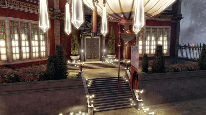
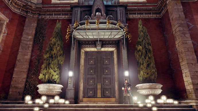
The smaller, front garden of the Boyle Manor set up, relatively simply, the grandeur of the Boyles, the house and the extravagant occasion. Symmetrical planting beds either side of the entrance steps provide the frontage for the Manor's front doors, topped off by two large containers housing upright plants as rigid as the upper classes' stiff upper lip. This isn't mind-blowingly impressive in itself, a bit conservative and predictable maybe, but it has its roots in the real-world practice of framing entrances to give them drama and a sense of arrival. It also reinforces the idea of wealthy garden owners slowly cranking up the sense of theatre on guests from the moment they arrive.
The back courtyard is where the main design action happens though. The garden here is clearly designed for function as well as show and displays some lush and pompous planting dotted with bright colour, all arranged with order in mind, while large trees frame the main access point. The element of function is made clear through the areas of hardstanding for furniture, outdoor entertaining and, of course, the traditional duelling area. This is all contained in a formal arrangement, with strong, nearly perfect symmetry stemming from a central axis dominating the layout, demonstrated by the sets up steps, the trees and the neat alignment of the plants.
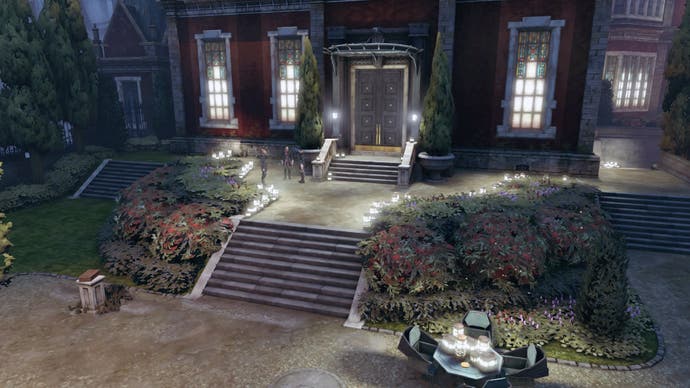
Designing this garden to show off also makes sense at it is overlooked by neighbours. This gives the Boyles an opportunity to make their grandest visitors speechless while at the same time being perfectly visible to their less well-off neighbours. Being overlooked like this would usually be considered a downside to a garden and you'd screen it off to ensure privacy, but here the Boyle's can entertain lavishly, show off to their guests and, probably more importantly, their uninvited neighbours, making them jealous and stroking their own socialite egos at the same time.
While also mirroring that very real historical trend of using gardens as a sign of status and money, the Boyle Manor highlights Dishonored's own in-game theme of the difference between the haves and the have nots - the wealthy being able to throw posh shindigs in their manicured gardens while the rest of the population have to slum it in their grey and cramped conditions, with barely a trace of green.
Despite its relative dilapidation, there is a great deal to see at Brigmore Manor. Even though time has had its say on the landscape, the bones of the garden that remain paint a vivid image of intentional design and grandiose ideas about the Manor's grounds. Straight from the off, there is a distinct sense of designed grandeur with an imposing gated entrance and a gated boundary surrounding the front garden. Inside that, even in its degraded state, it is still obvious that the area was designed: there are clear remnants of order and symmetry with trees planted at regular intervals; harder, structural elements such as a platform and plinths that lined the path to the front door are still visible; and flashy architectural features like the glasshouse protruding (enabling exotic and rare species to be ostentatiously displayed to guests) and the ornamental tower on the gate shout wealth and status. Once, this manor's front garden and structures would have been very striking.
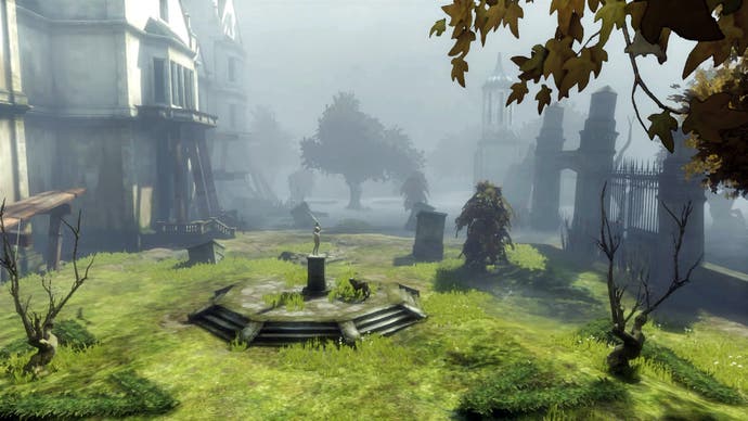
The manor has larger gardens more typical of a country residence, and its wider setting in the countryside helps to employ a contrast between nature and man. Nearer the Manor there are the more designed areas, with symmetry, geometric water features, planters at regular intervals, a formal courtyard and the massive glasshouse. However, these melt away into the more natural the farther you get from the Manor, fading into what looks, and feels, like an authentically natural setting with a waterfall, woods and wilder plantings.
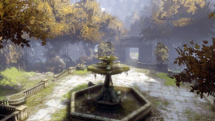
The contrast highlights the design technique of demonstrating man's taming of nature nearer the house and blending this into the wilder, more natural areas further away, but all in the same designed garden. The inclusion of a manmade temple-structure placed in the natural, wooded area is a successful miniaturisation of a detail of this historical landscape design technique for the garden scale, where these were built in the distance of a country residence's grounds to create a focal point for a landscape vista.
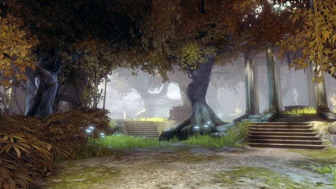
This area is a great example of being more than just an outdoor environment to explore: the landscape design features are important to the game in its setting and background of being a once-wealthy family's country manor, and the story's climax, illustrating and exaggerating Delilah's affiliation with nature.
Brigmore's representation of good design is encapsulated in a bit of lore found in the level - a book describing all that is deemed as fine garden design in the Dishonored universe can be found in an attic. Overlooked as just another collectible by most I'm sure, but this seems to lay out the thinking behind the Manor's garden, and almost does the analysis for us. The guys at Arkane are known to be thorough in their research and design and garden design is clearly no exception; it is intelligently employed to reinforce themes of the game, the context of the particular level, and makes an exceptionally apt setting for the game's finale.
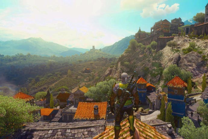
The recent undisputed master of landscapes in games is the quite breathtaking The Witcher 3: Wild Hunt. It demonstrates a tremendous proficiency in the art of virtual landscape design I hadn't seen before. The landscapes are so good (like everything in that game), that I am rather disappointed I can't see and explore them for the first time again. Its massiveness gave it a lot of space to play with but it manages to include everything from manmade formal gardens and agricultural landscapes, to mountainous and coastal landscapes forged by nature alone. And it is the details in every context and typology where the excellence is fully demonstrated and can be appreciated.
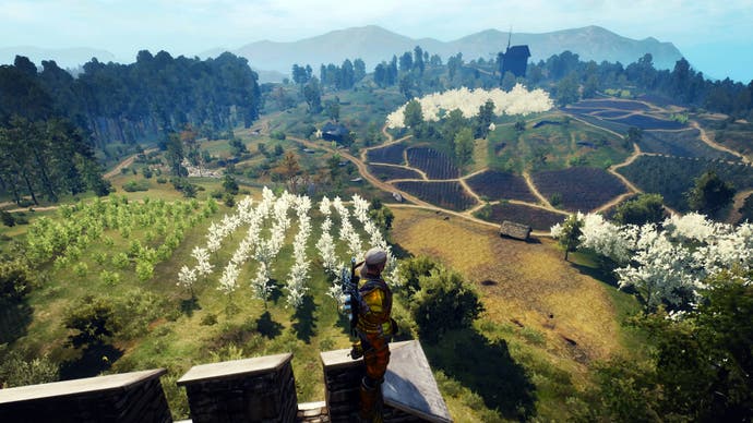
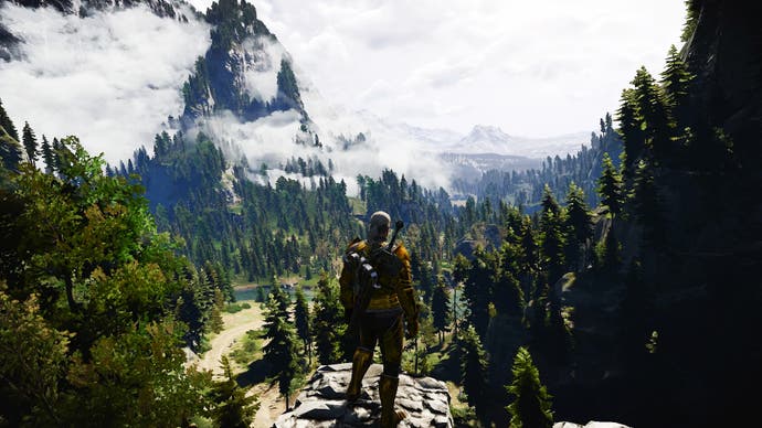
The Witcher 3's recreation and representation of a range of Northern Hemisphere, European natural landscapes through their design is one of the game's finest accomplishments. Not only do the mountains look genuinely geologically convincing, the woods naturally dense, and the fields rolling, but everything down to the smallest details of the design give them an extra quality - they become believable landscapes and places. Our aesthetically-aimed eye will look at the game and instantly recognise that, of course, that mountain on the horizon looks mountainous in shape and that river bends absolutely naturally enough, but in each of the landscapes and environments created, there are elements of landscape design that would feature in the real world when re-creating a believable naturalistic look and feel.
For example, in all the wooded areas of the North, from the Skellige Isles through to Velen and White Orchard, we see a typical forest of Northern Europe represented with an accurate mix of pines and deciduous trees, underplanted faithfully with a grassy forest floor featuring low-growing, shade-tolerant plants such as ferns, and, where the light allows, more colourful herbaceous plants such as hellebores - a great example of one plant growing exactly where, and how, it should do.
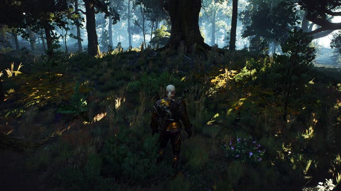
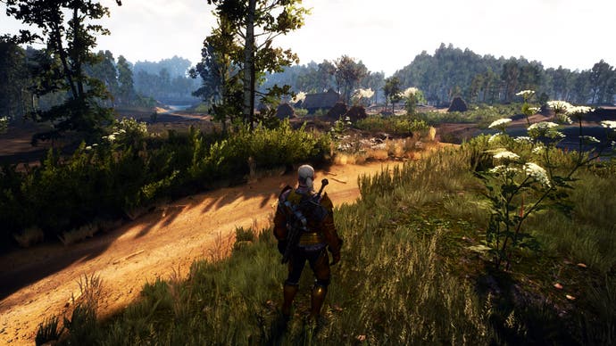
To further highlight this level of accuracy, after a quick rifle through the inventory, I also found other plants growing in their real-world natural locations, planted in the right place, growing with the correct habit. Celandine, with its spreading habit, was growing next to streams, upright wolfsbane plants in meadows, and ribleaf (what we would call English plantain) and fool's parsley growing freely near cultivated fields and paths. It shows that the effort to get things right in the landscape didn't stop at the aesthetic, and plants are situated exactly where we would expect to see them, not just dropped into the environment randomly.
This horticultural precision represents a very pleasing coming together of The Witcher's fictional world and our real-world. By using plants we know and recognise, The Witcher 3 helps us relate. And even though we know it is a fictional place, seeing similarities to our own world and identifying features from our landscapes makes the connection to this kind of virtual place a curiously strong one.
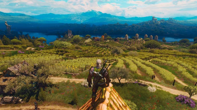
The accuracy continues when there are depictions of designed landscapes, best represented by the inclusion of orchards of fruit trees, fields for agriculture and the vineyards of Toussaint. These areas are a breathtakingly accurate and beautiful representation of a Mediterranean landscape, down to the alignment and habit of the grape vines, the upright trees that line the approaches to villas, the olive trees in the courtyards of the villas, and their natural, wildflower-heavy underplanting. These are truly spectacular and immediately, though virtually, transported me to the Med. Yet another truly memorable and immersive landscape.
Now, if we consider landscape architecture as representing, broadly speaking, the largest end of the landscape design scale, there is a video game that not only shows the ambitions of modern day design but also combines architecture with use. The Citadel of the Mass Effect games is a triumph of cool game design and a place you can imagine admiring and relaxing in - despite that fact you're inside a floating, actually-part-of-a-massive-weapon spaceship.

Just looking at the parts available for exploration and for viewing in Mass Effect makes for interesting examination and appreciation. It is a combination of function and beauty; it not only looks cool, but seems to successfully serve the millions of inhabitants on board, providing a backdrop for retail, business and leisure but also a pleasant, relaxing area of landscape to escape to in an otherwise metal metropolis.
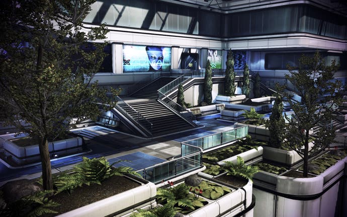
Working with the clean, 'modern' architecture of the Citadel, the tiered areas we explore intimately are planted in such a way as to create a grandiose, Hanging Gardens of Babylon-feel as the design spills down the terraces. The plants here soften edges and improve spaces, spaces that must be functional while also being pleasant. Plants near seating areas appeal to the senses, mask hard materials and break up spaces, creating stopping points as well as encasing meeting areas.
It has been found that in our real, human-world, putting plants in and around your shop or café can increase revenue, so The Citadel's combination of landscape and architecture in areas of retail makes total, accurate, sense. At least from a human point of view. I can't speak as a Krogan, Asari or Salarian.

Combine this design with that on display slightly farther afield, and a wider picture is painted and a greater landscape created. The large swathes of green spaces, lakes and water features seen in the areas in between the inhabited or functioning areas of The Citadel provide an incredible backdrop and, assuming they can be interacted with, landscape and space as big as any park to be enjoyed. This is function and beauty incorporated on an enormous scale. It creates a cohesive design and aesthetic - something all landscape designers strive to achieve.
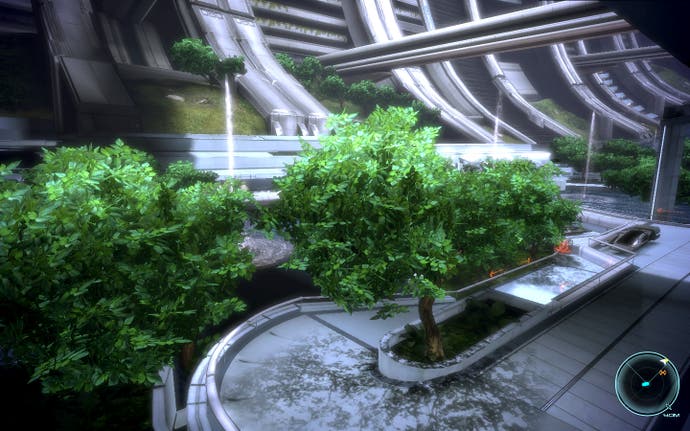
Other landscape design techniques such as the use of plants of different heights to emphasise and frame entrances and doorways, and of different textures and habits to provide visual interest also feature. And when combined with grander features such as near-palatial water fountains and sweeping, serpentine lakes an overall aesthetic is created that seamlessly combines the landscape design with the architecture and integrates them into the game.
It is this effect that is important because, as unbelievable as the concept of The Citadel may be to us, the contemporary nature of the design of its landscape elements, in conjunction with the architecture, helps us relate to it. As we see, explore and experience it, it becomes more believable.
Video games now have cool landscape design - that much is clear. And this is very much a good thing. Video games landscapes can be so much more than just an aesthetically-pleasing environments. They can add a layer of depth to a game's design, reinforce themes and enhance our experience. We are amid the golden age of virtual landscapes and environments. I can't wait to experience more.
