Activision details improvements for Call of Duty's awful user interface coming with Season 2
Eyes on.

Call of Duty Modern Warfare 2 and Warzone 2.0 launched with a user interface that was widely panned by players. With the launch of Season 2 on 15th February, Activision hopes that sentiment will change.
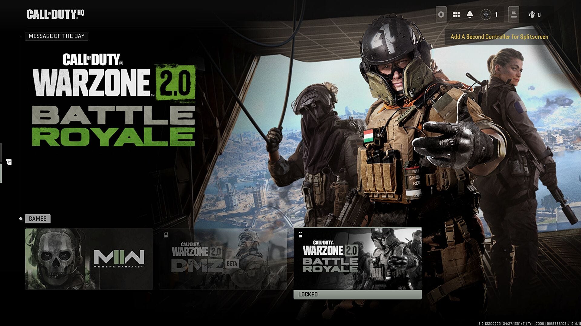
The interface used to navigate between Modern Warfare 2, Warzone 2.0 and DMZ is a tile interface some have compared to Netflix or Hulu.
Perhaps worse than that is the in-game menu system, which makes it difficult to work out where you are or where you're meant to go to get to what you want.

In a blog post, the company outlined planned changes to the game's UI "to improve overall flow of in-game menus".
Digging into the detail, Activision said Call of Duty's heavily-criticised camo menu will be improved, as will the gunsmith.
Here's the list of changes:
- Improved navigation and organisation of camo menu
- More polished social tab, including improved channel swapping and player muting
- New "My Bundles" screen
- Quick equip items from Battlepass, My Bundles, and Store
- Reticle previews in Store and Gunsmith
- Improved clarity of attachment blocking logic in Gunsmith
- And many more bug fixes
Activision pointed out it recently added a fix that restored instance speed of recent players in-menu, and status refresh of friends.
Fingers crossed Call of Duty's UI will come out of Season 2 looking and feeling a lot better.