Gooey
Microsoft unveil the Xbox graphical user interface
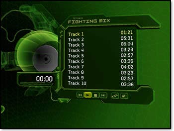
One of the things people were looking out for at E3 was the Xbox's graphical user interface. Although a number of sites mentioned it, few if any managed to capture it on film. Luckily, Microsoft's official Xbox.com website has been doing a good job of keeping people up to date, and the latest update there concerns the GUI. "I wish my car's dashboard was this cool," the item begins. The moody green Xbox Dashboard interface is reminiscent of the Xbox.com website itself, and features options for tweaking more or less every part of the system, including save game management, options for changing the language and of course the visual and audio outputs. Parents will also be able to tune various parts of the Xbox to limit the violence and mature content in general. According to Xbox.com, one thing that players will be able to do using the GUI is create and manipulate custom soundtracks for the games they play, by copying music from CDs to the built-in hard disk. The interface for this resembles audio player Sonique, but there's probably nothing to that. Since Microsoft want to keep the music industry onside, the word "MP3" probably won't rear its head, and given the machine's broadband-readiness, one supposes that the legitimate music download systems the big recording industry players are working on will be put to use here also. The green is something of a hallmark for the Xbox system now, although we're still not sure it's that great. Perhaps Microsoft's newfound love of skinning (as seen in Windows XP) will mean we get to choose how our Xbox looks and behaves, perhaps with the option to download more GUIs or customize them using our PCs. But then again, perhaps not. You can see some actual screenshots of the interface at Xbox.com. Related Feature - Out-boxed?


