How Dishonored 2 hides its best details in the periphery
The Arkane arts.
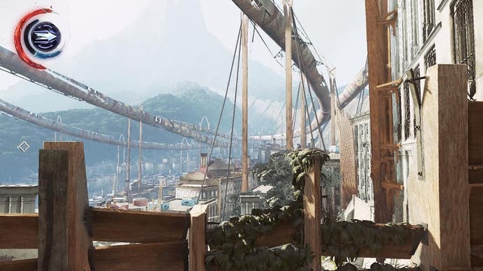
Dishonored 2 begins by throwing you in a locked office against your will, trapped and unarmed. An open window across the room teases the possibility of escape, so - once you're done rifling through the room, reading discarded notes and idly spinning a globe - you climb onto the ledge outside. There, you are teased with a vista of smokestacks and gothic spires. You can taste freedom, but a huge pipe blocks your path. You head back inside, and it's only then that you realise there's another window, closed, just across the room. Open it up and slip outside, and that promise of freedom is fulfilled.
"Most [players] struggle for a while," says level design director Christophe Carrier. "When they find that these windows can be opened, they often react like 'Of course, how didn't I think of it before? For them, it became some kind of unconscious guideline for the entire game that is: 'I should try things that I assumed were not possible'."
The resulting freedom can be discombobulating; today, players are hardwired to seek out alternate routes solely for collectibles, rather than to move through a level in an unexpected way. Dishonored 2's trick is no more than a modern variant on old school side-scrolling platformers would reward you for moving left along the screen at the beginning of a level before venturing right.
In an age of complex 3D environments, though, it's now all about looking up. "Players new to our games are not used to being able to climb everywhere on everything," explains Carrier. "I think it has to do with some sort of unconscious conditioning. In the first [Dishonored], some players were not climbing at all because they assumed that, if it was climbable, there would have been a UI prompt, so we had to add a prompt every time the system was detecting a possible climb. But we didn't do it for Dishonored 2, probably because we assumed that, nowadays, climbing and verticality were more common, with the Deus Ex, Assassin's Creed or Batman series being very popular."
Still, one of my favourite secrets in Dishonored 2 has gone unnoticed by so many players. Even if you haven't played developer Arkane's immersive sim, you'll probably be familiar with the Clockwork Mansion level. Filled with switches and pulleys that transform the construction around you, it's home to unhinged inventor Kirin Jindosh. In thrall to his own brilliance, he refers to his mechanical mansion "a testament to engineering itself". It's ironic, then, that the mansion's real creator, Arkane, presents this shifting maze to its players with no hint of self-importance. If players just glance up as they enter, they will see a skylight - they only need to shoot out the glass and use spectral powers Blink or Far Reach to teleport up into the rafters. From there, they are free to creep through the mansion's inner workings, ignoring the splendour of much of this reshuffling residence, never pulling a single lever to make the clockwork gears whir.
"I remember the expression on people's faces when I proposed the idea [of the Clockwork Mansion]," remembers Carrier, "but [co-creative director] Harvey [Smith] liked it. It was a perfect match for its owner Kirin Jindosh, so we decided to give it a try. The design was a lot crazier at the beginning but, at some point, it was decided to reduce it to its minimum when people realised that it was more difficult to make than a 'regular' level. I was a bit disappointed at the time because it wasn't close, even remotely, from what's in the game at the moment. Then, Blur, who was briefed earlier on the idea, made the trailer, and it was exactly what I had in mind. After that, it was difficult to do less.
"The level design in such a environment is about making sure that, each time a room is transformed, it has all the level design elements that we have elsewhere in the game - cover, patrols, hiding spots, verticality, etc. It's like designing several maps within the same space and it requires [you] to be very careful about each room combination working well together. It's also a technical challenge regarding AI, lighting and animation. One of the really cool things about the [level] is that you can go behind the scenes, and see the mechanisms in action. But we had to be very careful to avoid that the players go through the entire house behind the scenes and bypass huge parts of gameplay. Usually, we try as much as possible to have a stealth route that goes through the same areas as the combat route, so that players can switch from one to the other without noticing the design behind each of them. It was particularly tricky in the case of the mansion, so we had to design a few bottlenecks."
At a time when so many games are desperate to show you each and every expensive set-piece, there's a refreshing ambivalence to Dishonored 2's approach. Arkane's ethos of giving zero shits whether you see everything or not is probably most visible in Crack in the Slab, another level set in an ostentatious residence. Only this time, instead of coping with the logistics of a building crossed with a rubik's cube, here you have a device that allows you to shift between the past and the present. In the present, the mansion is dilapidated and barren, save for the odd bloodfly nest and reanimated corpse. In the past, the mansion is resplendent, filled with guards, guests, and maids. Each timeline has its own art, NPCs, and other quirks, so Arkane essentially created two levels in one. Only they didn't. It's three levels, and most people will never even know.
If you knock out the mansion's owner, Aramis Stilton, in the past, the timeline of the present completely changes. He never attends a fateful meeting, and therefore he never loses his mind, saving the mansion from ruin. Suddenly, the mansion in the present is populated with renovation workers, maids, and all-new details, from paintings to giant statues. Not only that, but the Dust District you pass through on the way to the mansion has also undergone a transformation, as has one of your allies back at your hideout, The Dreadful Wale.
"I always had a soft-spot for time travel stories and especially the ones where the main protagonist does something in the past that changes the present," says Carrier. "Being able to change the course of events is one of the most exciting parts of time travel but can also lead to paradoxical situations. Thus, in Crack in the Slab, we decided to limit the number of 'big changes' to the strict minimum, but make them significant. At first, the plan was to have four different maps. One for the past, one for the regular present, and two alternate present timelines. One of them was an abandoned version of the mansion, but not wrecked as in the original present timeline, where Stilton was killed. In the end, for production reasons, we decided to use the same map for when Stilton was killed and when he was put unconscious.
"So in fact, the fourth timeline is already in the game, but it is the same map as the third, only with different storytelling - notes, conversations, etc - where someone has bought Stilton's mansion after his death. The most crazy idea we had was to have an alternate version of the entire Dust District where Stilton's influence prevented the gang war and the falling apart of the district, but it was too crazy, so we only did it for the first part of the map."
It was difficult to pull off for Arkane, requiring the three levels to all exist at the same time. In fact, the 'past' is another mansion that physically sits above the present-day mansion - using the device to jump between timelines just teleports you between the two.
"The past version is above the other two [by] 600m, and the two present timelines are on the exact same position, which caused us of lot of lighting problems during the development," Crack in the Slab's level architect Sylvain Fanget tells me. "The trick was to use the chaos system to separate them, so when the player starts the mission, he is in the low chaos level, and if he kills or chokes Aramis Stilton, it switches to the high chaos level, the alternative present. To be able to change the timeline, we just teleport the player with an offset, in this case +600m or -600m. The tricky part, performance wise, was the preview of the other level in the timepiece device, which use the same teleport but with a different resolution.
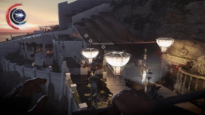
"It was hard working on this level, and it required rigor since the three timelines had to be maintained simultaneously. I might have missed something, but I really took the time to make the different places believable. Of course I've deleted some assets between the timelines, but mainly to add a vegetation layer in the present. [With] the third timeline, I just kept the layout and changed the entire set dressing and lighting. I have to admit that this one took me some time because I had to build this map for the third time. I didn't ask for new assets since we already hit the content lock by this time, I've just updated the grounds previously exported in the engine for this purpose. Same thing goes for the NPCs - we only used servants and workers instead of guards and dogs, reinforcing the idea that the mansion has been or is being refurbished."
Arkane's level architects spent an ungodly amount of time dressing up Dishonored 2, but the portion of players who actually see things such as the third timeline is a closely-guarded secret, perhaps for the sake of these architects' sanity. So, why go through the effort of adding in entire levels that can be missed if a good portion of your audience will never even see them?
"Because when they do, it's even more satisfying," explains Carrier. "And after all, we're living in an age of constant communication where people will talk about these little things, so eventually, they'll get noticed somehow. From my point of view, I love when the world responds to something I'm trying to do, even if it doesn't have any gameplay consequence. It shows that the world is alive and working, that it's not only a movie set."
Arkane understands the importance of the little details: when you throw one of those sticky grenades, it makes a 'cling' as it leaves your hand - at that exact moment, its spikes fold out of its body before it embeds into a surface; limbs hit by a sleep dart will get numbed first before an NPC falls unconscious and if you zoom in, you will notice the syringe is now empty, the plunger pushed in; you run slightly slower upstairs than you do downstairs, and footstep sounds and frequency change as you run or sprint up and down staircases, too. The game is full of neat touches like these. Hell, you can even flush away any mess you find in a toilet. "It's deceptive," says co-creative director Harvey Smith. "The more you play, the more you see. We probably overdid it, in terms of layering..."
I'm not sure they did. Dishonored 2's best details reside in the periphery; all you need to do is remember to look up from time to time and it will reveal itself to be much more than you originally believed. There's a lot lurking out of sight in Dishonored 2, and it's a game that's always inviting you to tug at the handle of every closed window.
