When level design goes awry
Exploring Dusk and the thrill of the surreal.
Years ago, I interviewed a level designer who had originally trained as an architect, which these days is not an uncommon career trajectory. I asked him about the benefits his skillset brought to 3D level design. He talked about how it helped with approaching scale and structural integrity and creating a rational space.
Then I asked him about what the personal benefits of creating virtual building were. "If you design a building in a game and it falls down," came his simple response, "it cannot kill anyone, and you don't go to prison."
It was a pragmatic reply from a pragmatic person. But underneath it is another meaning - you can build anything you want. In virtual 3D space, the laws of physics don't apply unless you tell them to, and that means you can design any structure that you like.
This thought has always stuck with because games, especially big-budget games, generally don't do this. Instead, they use all that white space to create believable worlds. Rolling mountain ranges, grid-based cities, sun-dappled forests, quaint English villages. They've become incredibly good at this - I don't want to trivialise the remarkable talent of today's visual artists and designers. But a side-effect of this constant push to make games spatially believable is that they struggle when it comes to representing the unbelievable.

If you want an example of this, you need look no further than the Floating Islands phenomenon. It's as if there's been a tacit agreement amongst level designers that any psychedelic, hallucinogenic, or otherwise surreal experience in a video-game is best represented by jumping between some floating islands. I've played almost identical sequences in multiple games, ranging from the Scarecrow scenes in Batman to the encounter with Scorpion in Spider-Man, from the Outsider sections of Dishonored to most of The Evil Within 2.
Every time I see this trope, I wonder why the designer in question opted for this approach. Level designers rarely have a blank canvas to work with, so when they do, why do I keep seeing variations of these almost identical themes? I don't think it's laziness, because the idea of a lazy game developer is something of an oxymoron. No, I think it's because modern level designers are so used to thinking in rigid structural forms that it's difficult to suddenly change that way of thinking when those forms no longer apply.
As a result, they latch onto the most immediate metaphor. What clearer way to represent a character's fragmenting reality than to literally break up the ground beneath their feet? This undoubtedly gets the point across, but it does so in the dullest vessel imaginable. They're tedious to look at and to navigate - a forward facing platform sequence that would struggle to qualify as a puzzle. Moreover, it's just deflating.

There are better ways to represent this stuff, and one game that demonstrates how is Dusk. Oh boy, let me talk about Dusk. Released as 2018 was dying like a gut-shot demon, Dusk is first-person shooter inspired by early-3D 90s examples of the form - particularly Quake, but also games like Hexen, Half-Life and (yes I know it's not a shooter) Thief.
Dusk features all the things you'd expect a 90s shooter to have: pacey movement, splattery giblets, and character models that look like they've been beaten into shape with a ball-peen hammer. Indeed, Dusk deliberately imitates the look of Quake-era shooters, stripping back decades of visual sheen to reveal the raw, aliased geometry beneath, and building its world out of simple, abstract shapes.
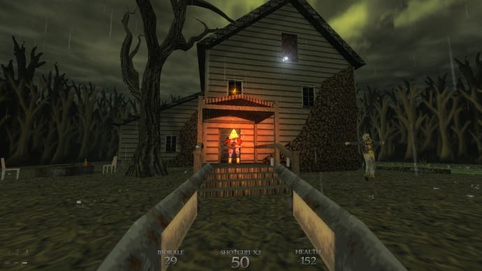
In itself, this is nothing special. But Dusk then takes these basic building blocks and runs wild with them. The first of Dusk's three episodes is designed to set the tone, which is inspired by backwoods American horror movies like The Hills Have Eyes and the Texas Chainsaw Massacre. It's a spooky, atmospheric nostalgia trip that plays all the classic hits, from "Secret Door That Looks Like a Wall." to "Spinning Key That Triggers Enemy Spawn".
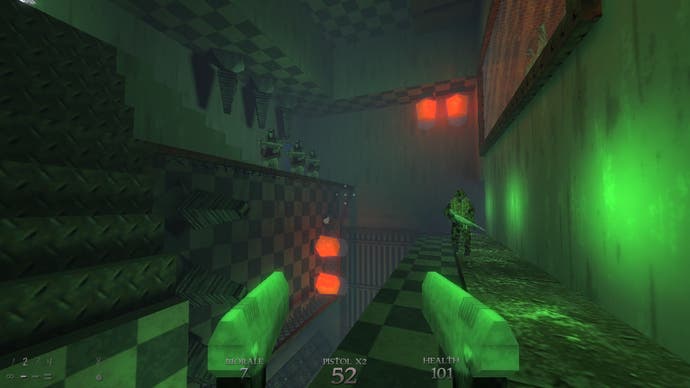
What you don't know at this point is that Dusk has barely started. From the second episode onward, Dusk gradually unspools its own spatial logic, ceasing to imitate the conventions established in the nineties, and beginning to evolve beyond them. Take Escher Labs, the name of which alone should give you some idea of what lies ahead. It starts off as a nod to Half-Life's Black Mesa, with sensibly tiled corridors leading to various scientific labs. But as you explore the level layout shifts and warps. Walls becomes floors and floors become ceilings, while entire rooms are laid on their side and stacked end on end, connected by webs of staircases.
Escher Labs is admittedly playing off another majestic example of virtual surrealism, Thief: The Dark Project's mission The Sword. But this isn't a simple homage; it uses this dual tribute as a jumping off point to go in an entirely different direction. Indeed, the combination of influences is highly symbolic, pushing away the logical layouts of Half-Life in favour of the extraordinary strangeness of Thief.
From this point onward, Dusk begins to play a whole new set of tunes, such as "What Happened to the Floor?" "Why is Gravity Backwards?" and my personal favourite "Where the Fuck is Up?" The second episode takes you from deep inside the belly of an infernal meat-grinder up to the rusting, skybound facilities of Neobabel, which are connected to Earth via a stratosphere-piercing lift on the roof of a giant, arena-like reactor room.

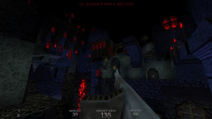
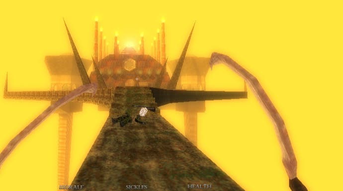
The third episode, meanwhile, descends into outright cosmic horror, transporting you to a Hexen-like medieval realm. Highlights here include the City of Shadows, an impossible gothic townscape where the buildings seem to tumble over one another like an urban magma flow, while the vertical maze of Fire and Ice has as an almost biblical sense of scale to it, a shooting range designed by Dante. Toward the end of the game, the level design folds in on itself entirely, returning to earlier concepts and ideas, but twisting and merging them together into nightmarish corruptions of what you've previously witnessed. It's astonishingly good.
It's easy to dismiss this as simply an "old-skool" approach to level design, where the emphasis was on creating a space that was interesting to navigate rather than convincing to look at. But it's important to remember that those games were themselves pushing the cutting edge of 3D graphics technology. Dusk, on the other hand, makes a deliberate effort to advance a style that those games created out of necessity.
This is why I think it's important as a modern game, not merely a throwback. It imagines an alternate timeline where the industry prioritised spatial design over visual design, where instead of making games like Half Life and Call of Duty and post-DMA Grand Theft Auto, which increasingly codified virtual worlds in a realistic visual language, it made games like Dusk which sought not to immerse players in a virtual place, but to challenge them with it. It's a world world that doesn't blow mind because it looked so real, but because it defies everything you intuit about how the world works.


