The creepy corridors of video games
Horrordors of power.
We pass through passages and hallways everyday without pause. They're boring, empty, uneventful dead-spaces unworthy of consideration - not so much architecture to stop and appreciate, as infrastructure to quickly pass through. All they do is channel things around buildings, moving us from one room to the next. But while we so often take these in-between areas for granted, rushing down them in order to reach places of real importance, they can also be incredibly evocative.
Corridors are anxious, uneasy places, and horror has a history of using them to put us on edge. They're rarely the site of explicit terror or violence, but they lead us there. Zones of anticipatory fear, the corridor is conducive to horror through its ability to heighten suspense and gesture to the unknown. What lies around the corner, or beyond that door? Every hallway is a world of undetermined possibility.
Roger Luckhurst, a professor at the University of London and expert in all things horror, recently penned a book about corridors. He's quick to mention the Resident Evil series and the various facilities of the Umbrella Corporation, where horror is sometimes confined and squeezed into a particularly pure form. On many occasions the video game corridor is a gauntlet (in the Resident Evil spinoffs for example). In these corridor shooters, the constrictive form of the horror hallway becomes a condenser for an adrenaline-fuelled onslaught where you're forced to hack or blast your way through a narrow, zombie-infested space.
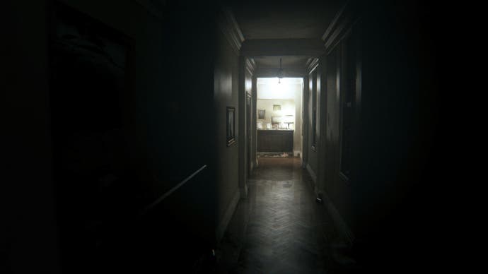
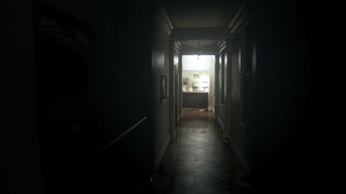
On the more cognitive end of the scale we have the dreaded corridors of P.T. Kojima and Del Toro's scrubbed-from-history playable teaser is the very definition of a contained space. The short game offers players a minimalist loop: a single domestic corridor split up by a 90 degree angle, out of which seems to arise infinite opportunities. Gareth Damian Martin, in his article on P.T.'s duplicating corridor and corner, identifies the source of architectural horror in this bend. It's the player's inability to ever see the end of the hallway, and the uncertainty that simmers in this absence, that makes the game such an anxious experience.
The corner isn't the only way corridors can build tension, tease the unknown, or create shocks and twists. Take an endlessly horizontal corridor for example, one that seems to lack a vanishing point - it simply stretches on until you can no longer see what lies ahead. Luckhurst also points to the "dread of anticipation that comes with every door the player passes". If the corridor simply takes us from one room or event to the next, then each gateway and threshold passed is an opportunity for a terrifying encounter. It's often stated that horror is most effective when the true source is obscured.
The majority of Luckhurst's book charts the long history of the corridor from utopian beginnings to its modern dystopian associations. While I think the spatial structure of the corridor is important, it's the historical context of this much-maligned architectural form that really allows the dread to ferment. Out of the associations leaps the ominous corridor-mood we're all so familiar with.
In the ancient world, temple complexes possessed what Luckhurst calls "imposing corridor structures" - passages to anticipate an approaching godly encounter. From the very beginning corridors seemed to be inherently anticipatory and revelatory. They're also imbued with the "mythic resonances of the labyrinth", alluding to ideas of lost souls and wandering monsters. In the same way, games use corridors to isolate, disorientate and - occasionally - assault.
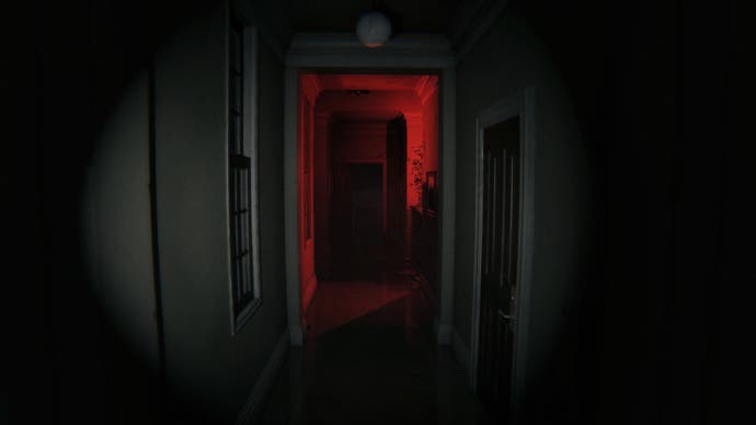
The word "corridor" can be traced back to the latin for "run", a verb all players will be accustomed to. The original corridors, as Luckhurst explores, were city perimeters made for couriers to sprint through in times of crisis. Long before the corridor became the archetypal place for horror chase scenes they were purpose-built to be run down.
In the 18th century the architect John Vanbrugh built Blenheim Palace, one of the first buildings to use internal hallways to connect each and every room. The baroque palace, with its organised, symmetrical layout, was built for the Duke and Duchess of Marlborough. These names will be familiar to those who've seen 2018's film The Favourite, which depicts the feud between a Duchess and her younger cousin, both of whom desire to become the Queen's court favourite. While the film isn't set or filmed in Blenheim Palace, its long darkened galleries and secret passageways seem to be imbued with the same qualities as the modern corridor. "In the shadows... amoral anonymity, illicit plots and sexual corruption" appear to flourish, writes Luckhurst.
As the wealthy implemented the corridor in their grand houses and palaces in order to distinguish between their own private space and servant areas, the corridor also became a state tool for rational organisation. In the 18th century, in newly designed prisons, hospitals and asylums, the corridor reigned supreme. They became a way of logically distributing space, and beyond this, reformers even began to believe they could "refashion subjectivity itself". In asylums "taxonomies of insanity" were "ascribed in architecture", as burgeoning states began to recognise the psychic power of brick and mortar.
While the corridor began as part of a utopian project to improve the health of society, corridors of power and discipline were increasingly met with suspicion. Luckhurst explains places like the asylum began to be "seen as an environment that induces lunacy rather than cures it".
"The limitless, faceless corridor is one of the foundational images of envisioning a totalitarian condition, the individual swallowed up by the larger structures of the state."
These stark, dehumanising corridors are a potent source of dread. There's something perceptibly eerie about the emptied halls of a school after dark or wandering down endless, antiseptic hospital wards, but it's the "mental asylum" that appears again and again in horror fiction. Outright horror titles like Outlast and The Evil Within use the locale, but there are also stealth and action games like Thief: Deadly Shadows and Batman: Arkham Asylum that thrive in the oppressive atmospheres asylum corridors naturally conjure.
Moving into the 20th century we began to distrust, if not outright despise, these bureaucratic labyrinths. The monotonous and austere corridor was a "Kafkaesque annihilation of the self" - architecture that coldly categorised and turned us into instruments to be moved about and manipulated. It's this historical context that creates the uneasiness we feel when we walk down a corridor - even when we might know there's no monster waiting ahead. We look at corridors suspiciously, traverse them nervously, distrust those we meet there, and fumble every doorknob with a deep apprehension.
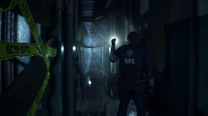
Resident Evil 2, recently remade and re-released, does a great job at building stress through its claustrophobic hallways, but it's the specific context of its setting that makes it interesting. The original Resident Evil's Spencer Mansion, as well as Resident Evil 7's Baker family residence, are homely spaces that delve into the realm of the uncanny. While those buildings made the familiar strange, lingering on the psychological drama of family life, Resident Evil 2 takes place in a cold, calculative municipal building. The Raccoon Police Station is a bureaucratic maze in the same way as a 19th century prison or hospital.
Based on the Osaka City Central Public Hall built in 1918, Resident Evil 2's station is a grand public building meant to highlight the power of the state and overwhelm the individual. This is why when walking the station's halls something doesn't sit right. We never feel at ease within its inhuman corridors. Unlike the haunted returns and repeated temporality seen in the original game's basements and attics, the sequel's corridors represent a bland and superficial modernity. This is the difference between the traditional haunted house, with its metaphors for the conscious and unconscious mind, and something like the dreaded hallways of the Overlook Hotel in Stanley Kubrick's The Shining.
According to Luckhurst, the Overlook Hotel's corridor plan is "an uninterrupted, unfolding space that... limits the action but multiplies the threats of menace from off-screen". The "anonymous and unhistoried" hotel corridor perfectly captures our existential dread. It's an utterly alienating space where all "individual lives are standardised" and identical doors, bland wallpaper and patterned carpets stretch off into infinity. It's no wonder we feel so anxious in these transient places.
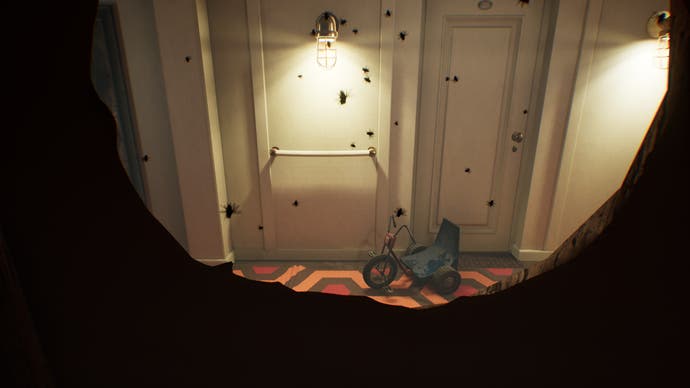
Polish game studio Bloober Team recreated these dreaded corridors in detail with its most recent game, Layers of Fear 2. Heavily inspired by film history, the game sees you play an actor in an unhinged director's bizarre new production. The events take place on an Ocean Liner - essentially a floating hotel. The developers bend and loop their corridors in the same manner as P.T., although in much longer combinations. Here are a thousand different variations on the creepy, angst-ridden hotel corridor! It's bewildering, twisted stuff, but to my mind it's Bloober's earlier game, Observer, that crafts the more focussed corridorscape.
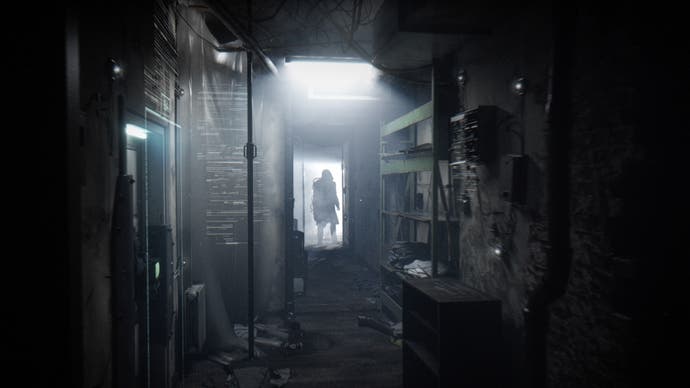
Observer, as much a sci-fi game as a horror one, is set in a large apartment complex in future Kraków, Poland. According to Roger Luckhurst, we now live in an "anti-corridic" world. In the last few decades we've shunned corridors, turning instead to open-plan living, large glass atriums and office cubicle work spaces. This isn't just a turn against overbearing institutional spaces like asylums, but also public housing. In other words: it's political.
Past Prime Minister and all-round bozo David Cameron once described "brutal high-rise towers and dark alleyways" as being "a gift to criminals and drug dealers". This perception isn't new. The architect Oscar Newman described high-rises in his 1970s survey as a "nether world of fear and crime". Instead of being an indictment of poor city planning or rising poverty, the developing horrors were blamed on social and community living, and even the architectural design of the corridor itself.
Like in Kubrick's A Clockwork Orange, where the new brutalist Southmere Estate in Thamesmead acts as the dystopian backdrop for Alex and his rampaging street gang, Observer's Krakow housing unit is a decrepit concretetopia filled with illicit criminal activity. A mutated serial-killer wanders the hallways, and the corridors themselves become a vacant anti-social no-man's-land.
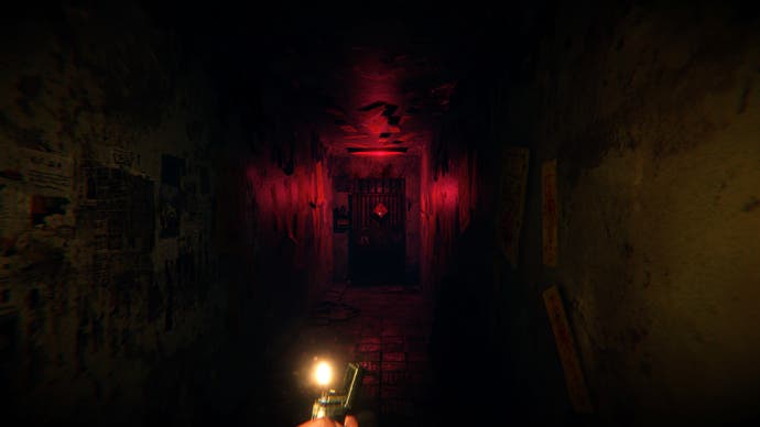
Another recent release to delve into the unnerving interiors of the public housing block is Red Candle Games' Devotion. Set in 1980s Taiwan, the game sees you not only explore the cramped confines of your old household, with an L-corridor straight out of P.T., but also the longer, twisting corridors of the apartment complex itself. Again and again you approach "home" from outside, from the stairwell and from the dreaded, anonymous lobby corridor that seems to shift around you.
Devotion's housing complex is dark, dingy and derelict, but it's also the historical context of oppressive state control, the classifying and compartmentalising of human life on a mass scale, that makes us so restless when we traverse its corridors. Red Candle Games now faces a different kind of suppression, its game removed from storefronts in a state-sanctioned scrubbing, and its business license revoked.
It's in the institutional failures of the corridor and its slide from utopian to dystopian we find the architecture's dreaded source. Game developers can do wonders with the narrow, binding structure of the hallway, but it's the long history of the corridor that makes these spaces so deeply unsettling. Scratch beneath the surface of the bare walls and abstractly decorated carpets and you'll reveal something dark and nasty.
