Remedy's Control is built on concrete foundations
Brut is stranger than fiction.
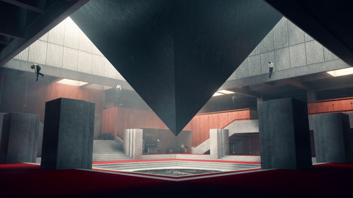
Control takes place within the confines of the Oldest House, a vast government building being invaded by a paranatural entity known as the Hiss. This malevolent force isn't the only thing to resonate within the concrete walls of the House. The environments of Control are founded on real-world architectural history. Like the Hiss, this history quietly seethes in the background ensuring a threatening noise and texture to the happenings that occur there.
Everyone has an opinion on brutalism. It's fair to say the architectural style elicits strong emotional reactions - a fact that's handy for games where designers often want their environments to cleverly echo and intensify the actions and events on-screen. With Control, Remedy has designed an entire virtual space around brutalism, with its varied forms and contexts.
Brutalist structures are made of raw concrete (or Béton brut in French). Built between the 1950s and 1970s, the style is often linked to large public works, social housing and government buildings. While the origins of the style are quite utopian, and there are plenty of progressive examples, these aspects tend to be overpowered by the negative - colossal concrete buildings are simply seen as oppressive, even dystopian.
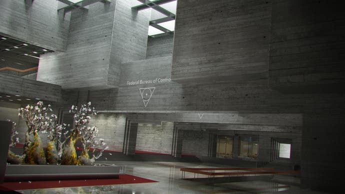
Art Director Janne Pulkkinen is responsible for Control's fine details, like the impressive lighting and visual effects, as well as the overall artistic end-vision, while Stuart Macdonald works on the architectural side of things. Macdonald's job title - World Design Director - sounds pretty ostentatious, but he tells me he's essentially a "production designer... thinking up how the world functions in terms of the lore and mythology".
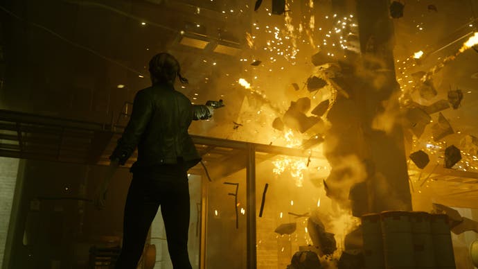
Remedy has attempted to make good use of brutalism's chunky, physical nature. "We're using telekinesis, so there's a lot of destruction," Macdonald says. Concrete is an uncomplicated material, and so "the mundanity of the space is important, because 10 seconds later everything's going to be trashed, and there's going to be chaos... we play on that contrast". The team has ensured it's almost impossible not to be in a position where you can telekinetically grab a mass of concrete from a pillar, balcony or step. We all have that repressed urge to toss chunks of concrete around the office. "Who doesn't want to trash a cubicle every now and then?" Pulkkinen adds.
Concrete is also an immensely photographable material. Perhaps one of the reasons for the surge of interest in the post-war style is how good it looks when well-lit. "From a technical standpoint I would say it's something we've only been able to properly pull off recently," Macdonald explains. "To have these sculptural spaces takes really good lighting. You look at architectural photography, it's all about how the light washes over surfaces. That's what makes it interesting. Before, what would happen is you would end up [placing] loads of marks, water stains, cables and pipes all over the walls... any way of adding visual interest. But because of what we can do with our technology... we now have this freedom. We can be brave and have [bare] wall surfaces, and trust the lighting artists to give it all life. It was actually really interesting, trying to convince environmental artists to leave wall surfaces alone."
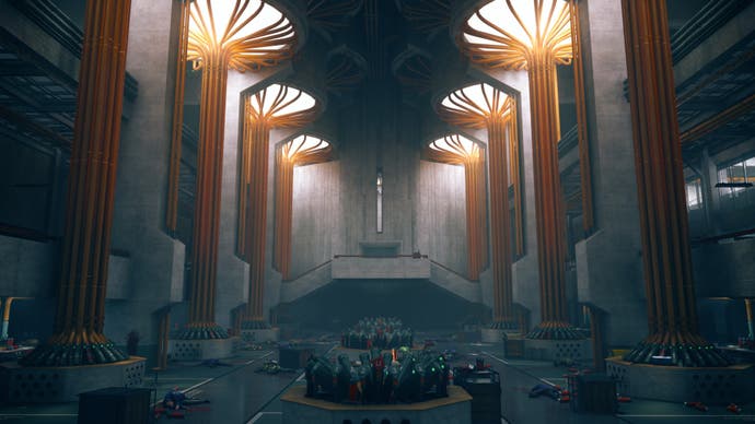
Outside of raw aesthetic appeal, brutalism comes with a ton of cultural and historical baggage. The forms and shapes alone offer plenty of spectacle, but the style communicates a great deal more. "We had this narrative concept of it being a government bureau," Macdonald says. "Brutalism is one of these architectural styles that's been adopted by the American government. That worked really well for us. It gave up this idea of the Bureau as a place of control and order, solidity and position. That set us off on a quest to find good references for brutalism."
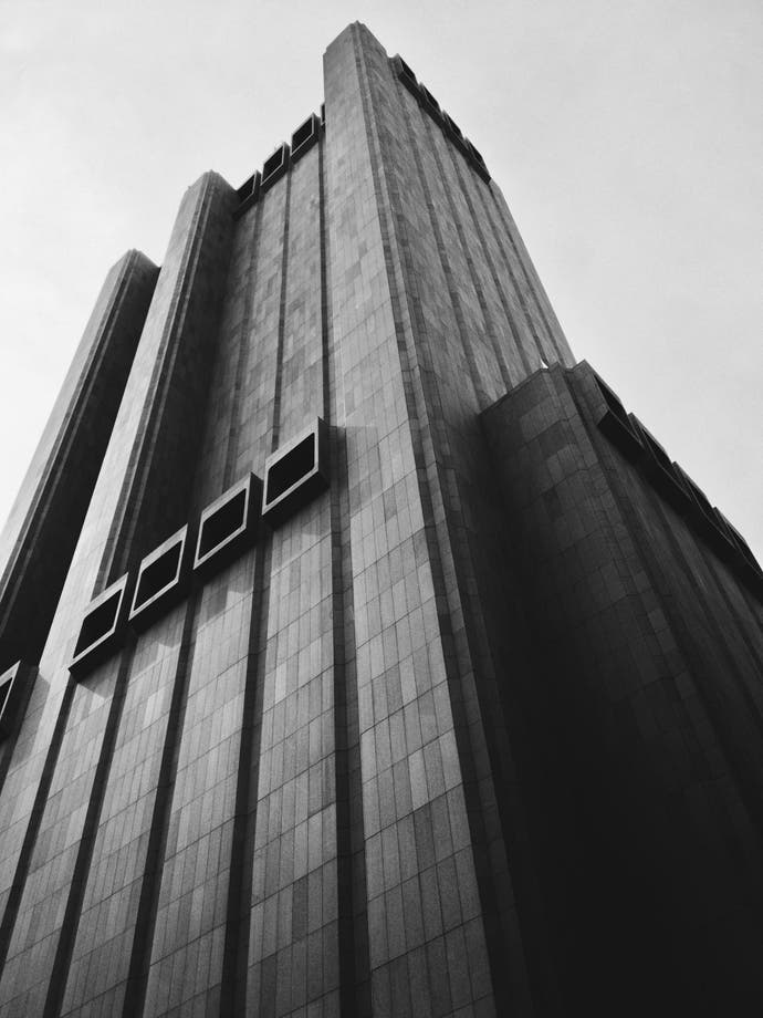
It didn't take long for Remedy to start finding real buildings to help construct its concrete fantasy. The developers sized up government facilities, civic centres and even universities.
"While there's a lot of history with brutalism, we're taking more of a cultural snapshot of where the style is right now. How it's considered and perceived by the modern consciousness." Macdonald goes on to mention Long Lines, originally AT&T's headquarters. "It's this windowless skyscraper in the middle of Manhattan. That became one of our origin points, to have the Bureau HQ in the centre of New York and be this bizarre, brutalist monolith."
From there the team looked to other inspirational, world-class examples such as the Boston City Hall, the Andrews Building at the University of Toronto Scarborough, as well as the interior of the Met Breuer.
The Oldest House is a place of power, not just in Remedy's fiction, but in the sense there are all kinds of interesting historical energies radiating from its architectural forms. We feel brutalism, as it connects to both real world examples we pass by daily, and to a myriad of science fiction books and films we've all read and watched. In terms of concrete influences, Remedy approached the project by casting the net wide. Films such as A Clockwork Orange and The Shape of Water, both of which depict oppressive government agencies that trade in corruption and conspiracy, were used as reference.

For Pulkkinen there's an "occult bureaucracy" at work within the world of Control, not unlike the rigid rules and rituals found in spy thriller Tinker, Tailor, Soldier Spy. Ritualism is a key concept for the team. These ideas of routine and repetition also find expression in the architecture. "Carlo Scarpa used this stepped concrete style in some of his buildings, so I used a lot of references from him to get those very ritualistic ascending entranceways, and the way the stairs turn up into wall spaces and columns," says Macdonald. The team also looked to churches and processions when lighting the Oldest House. Pulkkinen tells me "even though it's a mundane office you can approach it as if it was a church, with a clear centre, an altar or plinth".
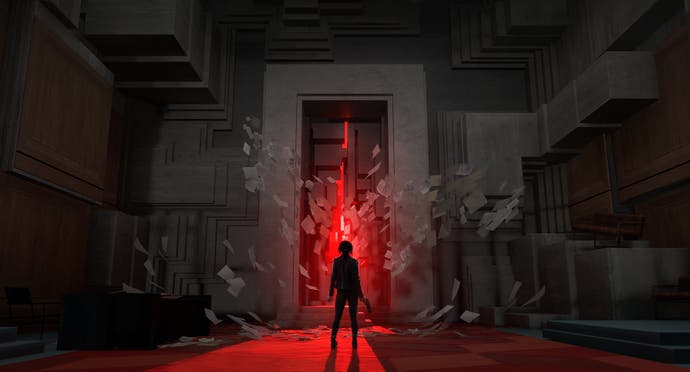
The last few years has seen an explosion of interest in brutalist architecture, and the fact Remedy has chosen to set its new game entirely within a monumental concrete building is in some ways a culmination of the trend. Of course other games have flirted with the style (Macdonald mentions both Deus Ex and Dishonored as games that use realistic architectural forms), but this is one of the first examples of a major big-budget game that's really gone all out on grey and austere concrete environments.
"Brutalism feels very sci-fi. I guess in the 50s it would've been glass towers and flying cars, but for us it's these huge edifices of concrete," says Macdonald. "It also has this sense of power, weight, strength and stability to it... the building itself is a prison for the weird, because of the strange, magical objects that are held there. But also, when we have the building shift, it makes for a really good contrast with the impossible architecture."
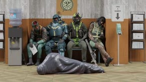
Rigid hulks of concrete are used to try and contain the chaos and entropy represented by the enigmatic Hiss, but as events progress it becomes clear brutalism's stifling forms, and the mid-century work wrapped-up within, are no match for mystery and the unknown. "We're using the scale and heaviness that comes from the idea of government bureaus and repetitive office life. There's that feeling everything's safe if you can stick a label on it," Macdonald says. "There's this human need to try to explain things, but the problem is that in this game you face a lot of things that are strange and unexplainable... there's an interesting futility there."
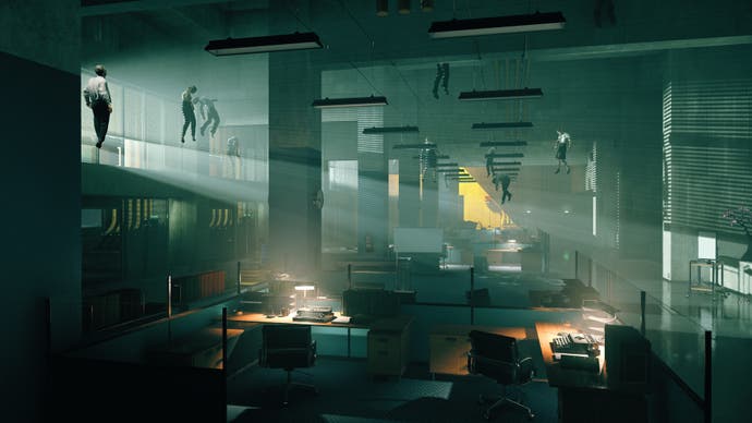
Remedy has put a lot of thought and care into the environments of Control, thinking specifically about what brutalism symbolises and how its strong, sturdy forms contrast with the mutating absurdity of the Hiss - concrete in thought, concrete in action. It's a fitting style to house a confrontation between the mundane and the weird.
Macdonald ends by saying he hopes Control helps inspire others. "It's good to see people taking more of an interest in architecture. I used to be an architect, and I moved into video games because of the potential. It's the ultimate architect's dream, because you have the power and control to shape worlds."
