We should talk about how Halo Infinite looks
Brute force.
Okay, so, let's get this out of the way: I didn't think Halo Infinite looked fantastic. I don't think I'm alone in feeling that way. But I think it's interesting to dig into what's going on with this game, an Xbox Series X launch title but also a kind of cross-gen butter. I'll explain that in a bit.
Halo Infinite looks better in motion than it does in screenshots. Of that there is no doubt. In motion it looks quite fun in an old-school Halo kind of way. It looks super smooth, it sounds great (the weapons really pop), and it looks like it will feel very Halo. Halo Combat Evolved, that is. Master Chief bounces around with that low gravity leap of his, hip-firing an assault rifle and gun-bucking Elites, as he should. A plasma grenade here, a shotgun to the face there, the targeting reticle resting naturally between the eyes of a Grunt; that so satisfying centre screen headshot Bungie brought to console with the launch of the original Xbox.
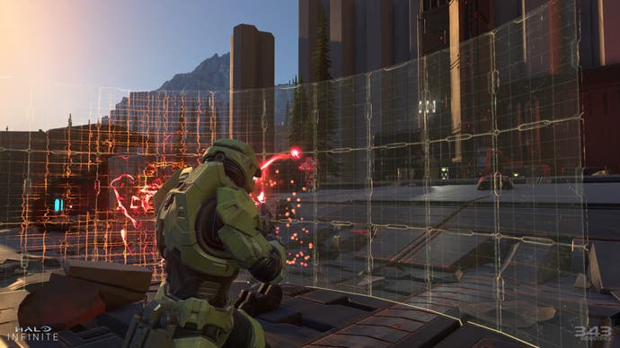
The demo was very much about rekindling memories of that wonderful Halo level in which you landed on the ring for the first time - a level full of mystery, scale and, crucially, a Warthog. Last night we saw mystery, scale and, crucially, a Warthog - and I was delighted by that. I don't even mind the grappling hook, which presented in 2020 as a fancy new first-person shooter mechanic is a bit silly when you consider how many shooters already have them. Master Chief can deploy a shield now. But honestly, the most exciting new sandbox mechanic I noticed was Brutes can chuck Grunts at you. Now that's what I call 2020!
Still, throughout all the sandbox fun, something troubles me. Halo Infinite just doesn't look right. In motion, it looks fine. It doesn't scream next-gen to me, but I'll leave that kind of analysis to Digital Foundry. What I mean to say is Halo Infinite looks off. And I've spent the night trying to work out exactly why.
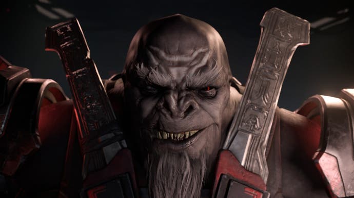
I think the answer lies in the art style. Halo Infinite looks like the fake plastic trees version of Halo, like a video game designed with Mega Bloks in mind. It pops in all the wrong places. The Brutes and their silly faces seem almost plonked down onto the battlefield like a child would arrange toys to bash about in their bedroom. It doesn't feel grounded. It doesn't feel like it has depth. It feels, well, surface level, smooth and uninteresting.
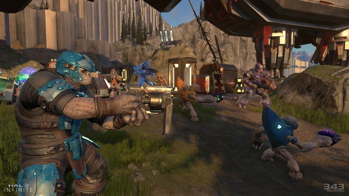
The Giant's Causeway hexagon rocks have been highlighted by many already and I have to admit they look like they were sculpted in Roblox or something. The ending speech by the new baddie is one of those supposed to be rousing, flashy graphics moments, but I couldn't help but laugh. Where's the blood spatter? Where is the atmosphere?
Halo Infinite looks even worse in screenshots - and I'm astonished at some of the official screenshots Microsoft approved for release alongside last night's reveal. They do the game no favours at all. Again, Halo Infinite looks much better in motion. But freeze frame it and you've got a potential viral meme on your hands. Looking at social media this morning, I think Microsoft is already facing this headache.
I think 343 has the right goals with Halo Infinite: make it approachable for newcomers to the series, even lapsed fans who thought 4 and 5 were nonsensical; make it different by going sort of open world (I approve of this approach, even though it means sacrifices will have to be made to Halo's traditional mission structure); and for the love of god make the hardcore happy by tapping into nostalgia for Halo 1. I think 343 will be successful in achieving these goals - for good and for bad.
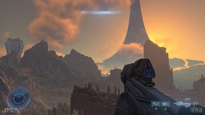
And the bad is apparent in the gameplay demo. In so desperately showing how Halo 1 Halo Infinite is, we saw a game that could be driving too far into the past for inspiration. What you end up with is a game that looks like a mod made by Halo fans desperate to revisit the past. Look up and you see that old-school Halo 1 vista, which is a Halo ring, a sun and some sky. But look up in Destiny, which when you think about it is Halo Infinite by the creators of Halo, and you see the wonders of the universe. Halo Infinite looks too much like Halo 1, which is quite the thing to believe.
Halo is an OG Xbox Game, so its designs come from a time when you couldn't adequately represent the human body and faces and details - Master Chief's whole design is a response to the fact you can't make people look anything else but blocky. It's why he wears armour that makes him look like luggage. The problem is, when 343 take designs from this era and render them with the fidelity possible on modern hardware, you get an art style that's weird and theme-parkish. It's like characters from Halo dressing in Halo-themed monkey suits.
I'm going to explain that butter bit at the top. Remember in The Lord of the Rings when Bilbo Baggins says: "I feel thin, sort of stretched, like butter scraped over too much bread." That's Halo Infinite, a game that must look okay on an OG Xbox One (ugh), PCs up and down the specifications list, an ultra powerful Xbox Series X, and when streamed on a phone. No matter how much I want it to be, Halo Infinite is not about selling Xbox Series X. It's about selling Xbox Game Pass. And its art style is just fine for that.
But it's not fine for me.





.jpg?width=291&height=164&fit=crop&quality=80&format=jpg&auto=webp)
