Blade Runner: Enhanced Edition comparison video makes me prefer the original
Older models were best.
Like a replicant during a Voight-Kampff test, there's something a little off about the Blade Runner: Enhanced Edition. That's how I felt after watching this official comparison video, anyway.
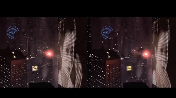
The video, released by developer Nightdive Studios overnight, compares footage of the original - and superb - 1997 point-and-click adventure game set in the Blade Runner universe, with footage of the same cinematic from the currently in development Enhanced Edition. According to the video, the original on the left is running at 15 frames per second in 640 x 480 resolution. The Enhanced Edition on the right is 60 frames per second in 4K.
For me - and I'm no technical whizz - there's something weird about the "cleaned up" right version. It looks upscaled, sure, but something is lost in the upscaling, whether it's a sense of the game presenting a "lived in" virtual world or something else, it's hard to put my finger on it. Perhaps I need to run it past a Baseline!
What I do know for sure is the Enhanced Edition looks outdated, whereas the original, at least going by the footage in the video, has aged well (Blade Runner always did look fantastic at the time it came out). It retains that grainy cinematic feel Blade Runner should have, even after over 20 years. It just feels more detailed than the footage on the right, more textured, despite the new footage being higher resolution.
So yeah, while I'm delighted work is being done to improve upon Westwood's classic, I think I'd rather play the original. Thankfully the brilliant ScummVM dev community is on it.


