Eight months later, I barely use any of PS5's new user interface features
For the snoozers.
A month before the release of the PlayStation 5, Sony released a video showcasing the new "user experience" for the console. It was, as you might expect, slick and well crafted. Dozens of new features and changes were designed to "be completely centred around you".
New user interfaces are an odd aspect of a new console's release. They don't make or break its success - that's primarily down to the games, raw horsepower, price and where your friends are playing.
But nonetheless, they are an essential component to every console. It's a persistent part of the experience of gaming. You have to look at it every time you boot your console up. While we tend to ignore that it's there when it works well, a bad interface can ruin a gaming session. The PlayStation 3 user interface, for example, became insufferably slow by the end of its life. You still have to wait a good two minutes for the PlayStation Store to load there.
Microsoft took the unusual step of not developing a bespoke user interface for its new generation of consoles, instead opting to develop a cross-generation interface that builds on the Xbox One interface. That only leaves the PS5 with a completely new interface for this generation.
It's been over eight months since the release of the PS5, which has been enough time for Sony to iron out the creases in the operating system, and for players to get adjusted to the new experience.
So, I think it's also the perfect time to assess just how useful the advertised features have been.
Look and feel
The PlayStation 4's interface was already quite fast, but slowed down when a game was running, likely because the mechanical hard-drive was fully utilised. With its super-fast SSD, PS5 has no such problem. Everything loads in a snap, even when a game is running in the background.
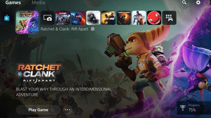
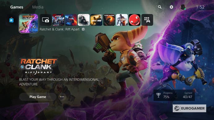
The UI design has been flattened with rounded corners, as is the current trend. Icons are smaller to scale better with high resolution 4K displays and give off a minimalist and premium aesthetic. Game artwork takes a bigger share of screen space, which I think is a nice touch. Where developers have embedded an audio clip, usually the theme tune, into the game's files, it plays as you scroll through the game menu. This also works for PS4 games, where audio would only play when you scrolled down to the game's details.
The only things I do miss are themes. They were an integral part of both the PS3 and PS4 user interface, and it's a shame it hasn't been brought forward to the current generation. Currently we are all stuck with the same bland grey interface and menu music. Sure, themes are a little tacky, but they are one of the few ways users can personalise an otherwise generic console.
Media Apps
As someone who uses their games console as a media hub, the number of missing streaming apps at PS5's launch was extremely frustrating. All the key UK media apps - BBC iPlayer, ITV Hub, All 4 and My 5 - were unavailable. Eight months later, BBC iPlayer and My 5 are still unavailable. It can't be a matter of developing native PS5 apps, since both All 4 and Disney+ are PS4 apps running under backwards compatibility like any PS4 game.

Eurogamer asked both the BBC and Sony for comment. The BBC responded saying it had nothing to add at the moment. Sony did not not respond at the time of publication.
Control Centre
The control centre replaced the quick menu from the PS4, which was accessed by holding down the PlayStation button. As the control centre is accessible with a tap of the PS button, it's impossible to avoid.

The decision to remap the home screen to holding down the PS button infuriates me. Nine out of 10 times the reason I am interacting with the UI is to change from one game to another. On PS4, it was a simple tap away to the home screen where I can see my entire game library. Not so on PS5. One tap to the control centre where the best I have is the app switcher, which shows two of your recent games and media apps respectively. When I first discovered the switcher, I thought it functioned like Xbox's Quick Resume, letting me have multiple games open simultaneously. What a let down the realisation was when my game closed to open another. The switcher should either have a more comprehensive list or make my PS button take me to the home screen.
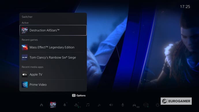
Pressing the options button also allows you to customise your control centre, although it's currently quite limited. The good news is the upcoming firmware will let you rearrange and hide options.
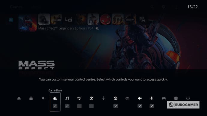
Hopefully, this will rectify one of my other bugbears: shutting down the PS5. I have to open the Control Centre, scroll all the way to the end of the menu to access the power options, where I then have the option to shut down, suspend, or restart. In contrast, on PS4, I just have to open the quick menu, select power options and shutdown from there. It may sound like the same number of steps, but it feels faster on PS4.
Cards
Cards are designed to provide contextual information based on what game or app you have opened. Cards show a number of suggested activities for the player to choose from which would act as a shortcut button straight to said activity in the game. Some games also show active progression in particular activities, like how far you are along in a main quest.
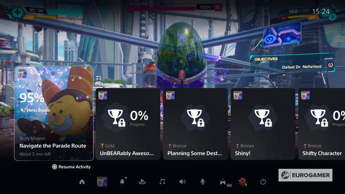
It's a neat idea in theory, but I can't recall ever organically using Cards to choose something to do in a game. Most of the time I completely forget they exist until I'm ready to close the app from the Control Centre.
But more fundamentally, cards simply aren't faster than using a game's built-in menu most of the time. Let's take the example of Call of Duty Black Ops Cold War. It's not faster to select your preferred game mode from within cards since the game needs to connect to Activision's servers regardless. The multiplayer menu is also far more intuitive than scrolling through a bunch of cards to find the mode you want.
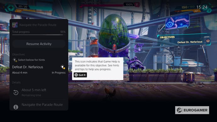
Finally, if you have PlayStation Plus, some games provide "official help" when you're stuck. The idea is you can avoid having to whip out your phone or laptop and head to a long and overwhelming guide or YouTube video. But the key word here is some games. You can be confident first-party games will almost certainly have guide videos, but such guidance in third-party games is sparse. The onus is on developers to create videos, which multi-platform developers just won't prioritise.
Picture-in-Picture
Picture-in-Picture lets you view a help clip, or a livestream of a friend using screen share, and pin it to any corner of your screen while you are playing your own game.
The problem is it lacks third-party app support. You can't pin a YouTube video while playing a game, but then again, I'm not sure why you'd want to. I tend to put my full attention on a game when I'm playing, it's not like sitting on your desk with a laptop watching Netflix while browsing through emails.
I also couldn't get a screenshot of picture-in-picture in action, because none of my friends were available to share their screen, which I guess goes to show how often that feature is used.
Explore/Official News
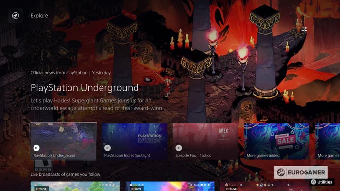
The Explore tab (or official news) uses your games library to give you curated news about updates to the games you play and from PlayStation. You can also manually customise which games you want news about. It works quite well, if it wasn't for the fact news arrives in Explore days if not weeks after the news was published. I'm not entirely sure how news is sourced, but I think it's up to games publishers to post the news. Any player who regularly keeps up with gaming news from sites like Eurogamer will find Explore effectively redundant.
Game Base
Game Base has arguably been the biggest change to the PlayStation user experience. Instead of creating temporary party chats as you did on PS4, Game Base lets you create a persistent party of up to 100 players. You can use it to send text messages, share media like recorded gameplay, and hop into a voice chat. It's similar in functionality to a Discord server in this respect. Sony also ensured there's interoperability with PlayStation 4 users, which remains essential as friends slowly transition to the new console.
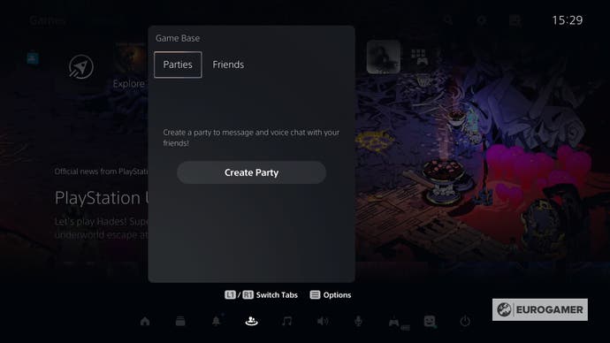
I really like Game Base. It is an objective improvement to the older social interface that makes me feel better connected to groups of friends without having to switch to a third-party service. There were minor nit-picks like getting constant notifications from larger groups that I couldn't turn off, or that I had to get through more menus to start a voice chat with a friend that I did on PS4. But both of those things have been resolved with an update in April which allowed me to customise notifications and join parties more quickly.
My only major gripe is the name. Game Base? Surely something like "Social Base" makes more sense? I'm connecting with friends, not launching games. When I first got my PS5 I was genuinely quite confused about where to communicate with people because of the name.
Conclusion
Of course, it's still early on in this new generation and so there's room for improvement. Sony recently released new beta firmware that made additional important changes to the interface. There are still many anticipated features that have yet to be introduced, including support for Variable Refresh Rate (VRR) displays (which the Xbox Series consoles already do) and 8K support (since it is advertised on the box).
But aside from whether or not these features are actually useful, a fundamental issue is that of discoverability. Sure, most reading this article will be aware of the PS5's quirks and hidden features. But will a novice? Asking some of my family members who are casual gamers what they thought of all the PS5's features, they couldn't recall most of them even existing. My sister, who just started Ratchet and Clank: Rift Apart, had no idea she could get hints from the cards menu when she got stuck (which as a novice, she did a lot). So who exactly are these features for?
Sony could go a long way to make a lot of the new features more easily discoverable. Many of them are hidden under confusing icons that no one wants to press. There should be more visual cues, like notifications to educate users on features. It is a balancing act - too many popups and players will feel overwhelmed and annoyed. But the current model doesn't work.
Finally, Sony needs to make a lot of these features more useful. I should be able to pin custom cards that act as a shortcut to a particular part of the game, and do that without having to open the game first. The Explore tab should be opened up to other media publications to make it a central hub for gaming news. Most importantly for those of us in Blighty, we need BBC iPlayer as soon as possible.
