How well does Skyrim on Switch compare to PS4?
Plus: docked vs mobile testing, performance analysis - and more.
Recently, we dissected Bethesda's intriguing conversion of Doom for Switch, dubbing it the 'impossible port' - a full-on triple-A engine somehow cut-back, massaged and finagled onto Nintendo's hybrid console. The Skyrim conversion may not be quite so impressive in terms of its sheer ambition, but it's clearly far more successful from an execution standpoint. Yes, there are compromises when the title is stacked up against its PlayStation 4 counterpart, but it delivers where it matters - and where Switch offers a unique experience - in handheld play - it is simply excellent.
First unveiled in Nintendo's very own reveal video for the Switch hardware, Skyrim was clearly included as a statement of intent from the platform holder - to show that third party support would be strong, and that top-tier titles were in the offing. That initial footage certainly looked compelling, and the final product delivers on the promise. This is a feature-complete version of the game, making extensive use of the Creation Engine's many quality sliders to squeeze the title onto Nvidia's mobile chipset.
Let's kick off by talking about resolution. While docked, Skyrim operates at a native 1600x900, while playing in mobile mode shows us the first sign of compromise. When we looked at the Switch port at Gamescom, everything indicated a native 720p resolution, but the final code reveals more: a fairly basic form of resolution scaling designed to sustain smooth performance. Under load, resolution drops back suddenly to 896x720 - 70 per cent of the native pixel-count.
Skyrim swaps instantly between native and the dropped back res, which can cause an odd flickering effect when the scaler can't quite figure out which pixel count to use. In a foliage heavy scene, looking to the sky then panning down slowly shows the flickering in effect. It's the one noticeable blemish on what is otherwise a faultless handheld game. And this ability to play Skyrim wherever you want is a brilliant unique selling point for the game, and by far the most compelling aspect of this port.
In terms of other compromises in the drop from docked to handheld, we hazard a guess that you'll find it really difficult to tell any difference at all. Level of detail settings in the mid to far distance are tweaked, so there is the odd loss of a few trees or other incidental detail, but otherwise, the game is identical. Similar to Doom, Skyrim holds up best in handheld mode - the inevitable broader scale cutbacks and compromises are far more difficult to pick up on when playing on a six-inch 720p screen.
And certainly in performance terms - crucial to a game like this, far more so than incidental detail - Skyrim delivers. You may lose the odd frame due to streaming, but across six hours of gameplay, the title delivered a solid 30 frames per second throughout. The sheer consistency here is worth commenting on - it's on par here with the PlayStation 4 and Xbox One versions of the game and it just feels right. Similar to Doom, the analogue nubs on the Joycons aren't the best interface for the game, but the experience holds up well overall.
But of course, the Switch version can also be played docked, which locks you to 900p resolution, adds a tiny amount of extra detail and invites comparisons with the existing versions of the game, where we chose PlayStation 4 as our target. It's here where you can see the various cutbacks necessary in bringing the game across from the Microsoft and Sony platforms. Resolution aside, the most taxing graphical effects are downgraded or removed altogether, and more substantial tweaks are made to the level of detail settings.
The existing Special Editions brought across the impressive volumetric lighting from Fallout 4, which is pared back or missing altogether in some cases on Switch. Shadow quality is necessarily shifted to a lower resolution (though edge filtering is fine, making the drop hard to pick up on) while ambient occlusion also seems to have taken a hit. Texture resolution is also visibly pared back in some areas, but by and large, this is only noticeable up-close - further back, Switch compares favourably. In terms of intelligent, well-chosen compromises to make, all of these changes are perfectly understandable and while the Switch version starts to lose some of the more subtle, pleasing effects of the full-fat current-gen console versions, the game still manages to impress - and the impact is even less of an issue when playing in handheld mode.
The key to bringing Skyrim to Switch is all about managing level of detail. Again, well-chosen cuts have been made here. Up-close, aside from changes to debris settings, the port retains the majority of object detail - geometry settings are, by and large, a match. Long distance detail also looks very similar indeed. It's in the mid-distance where the developers have made the most noticeable compromises. The PC version has a range of distance sliders for optimising performance, and the developers have made full use of this engine functionality for transporting Switch onto the Tegra mobile chipset.
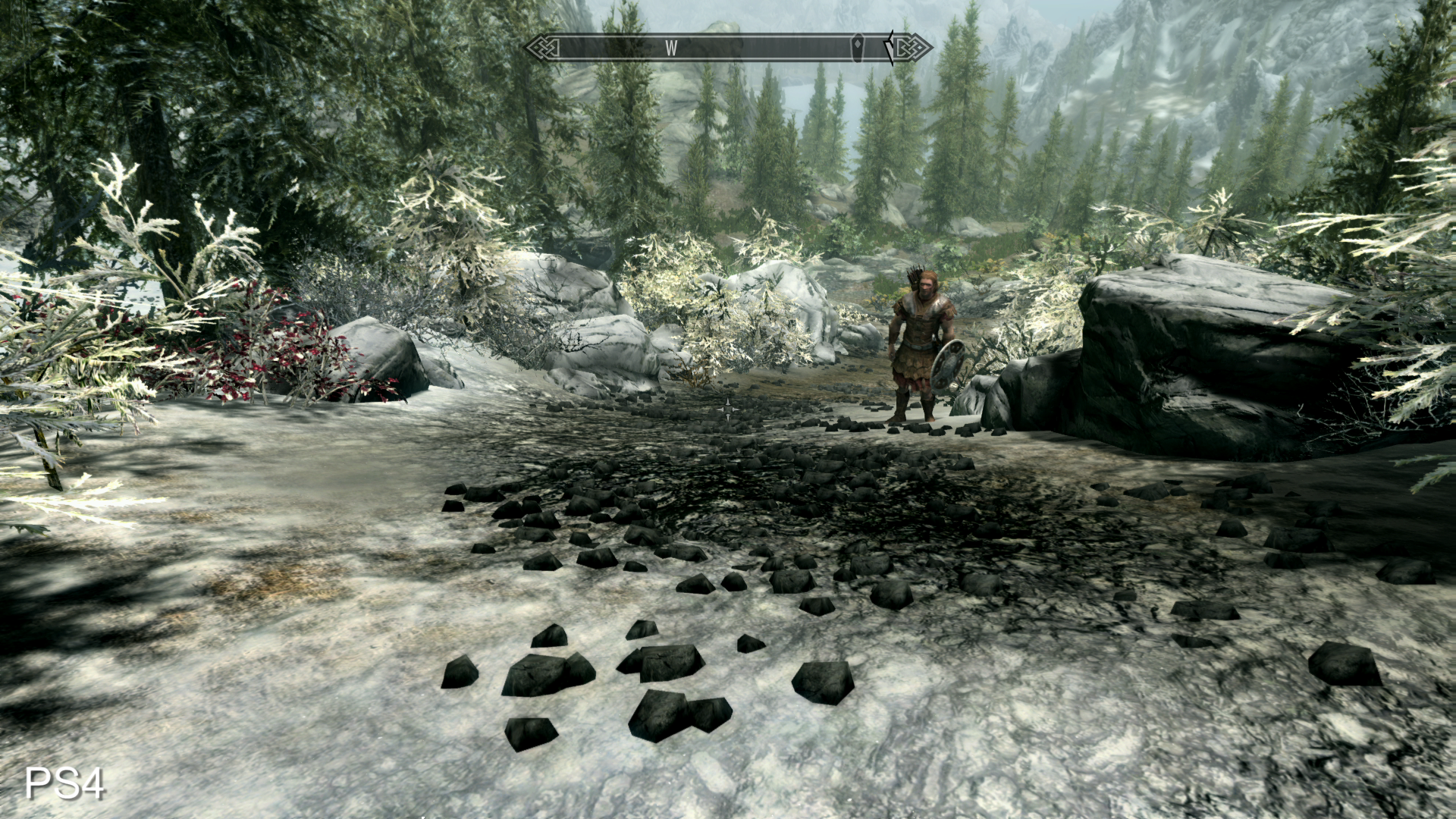
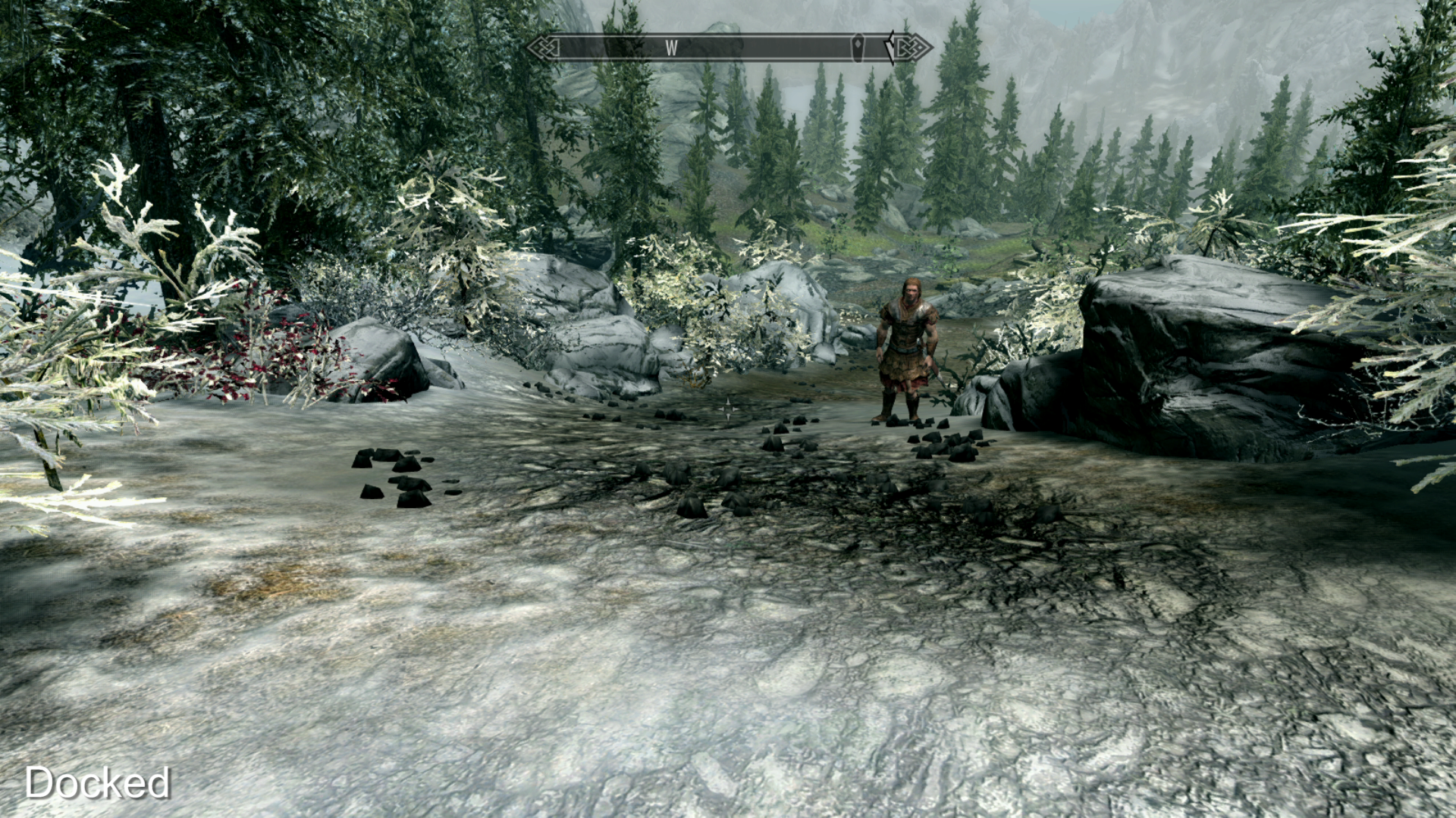
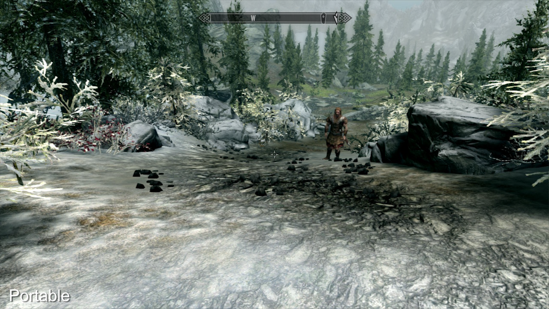
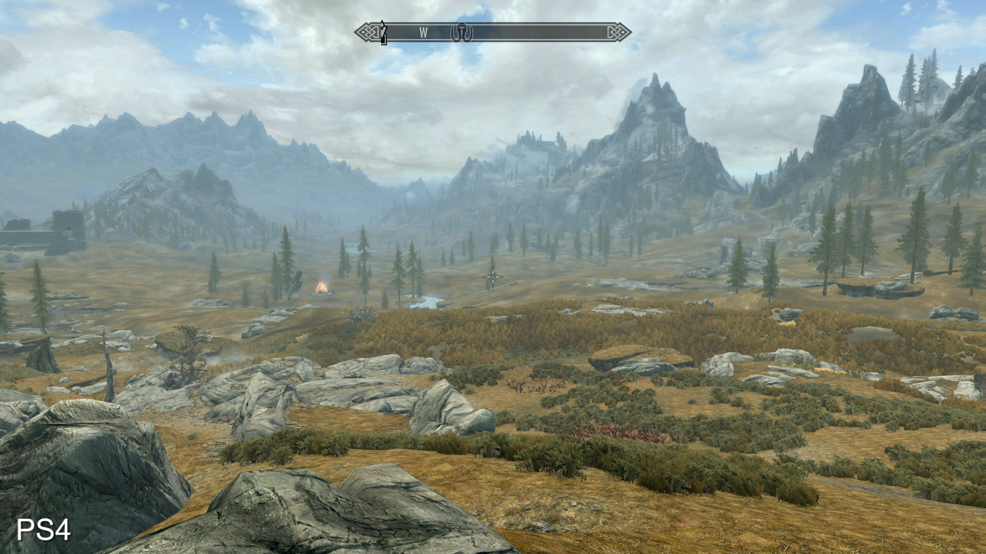
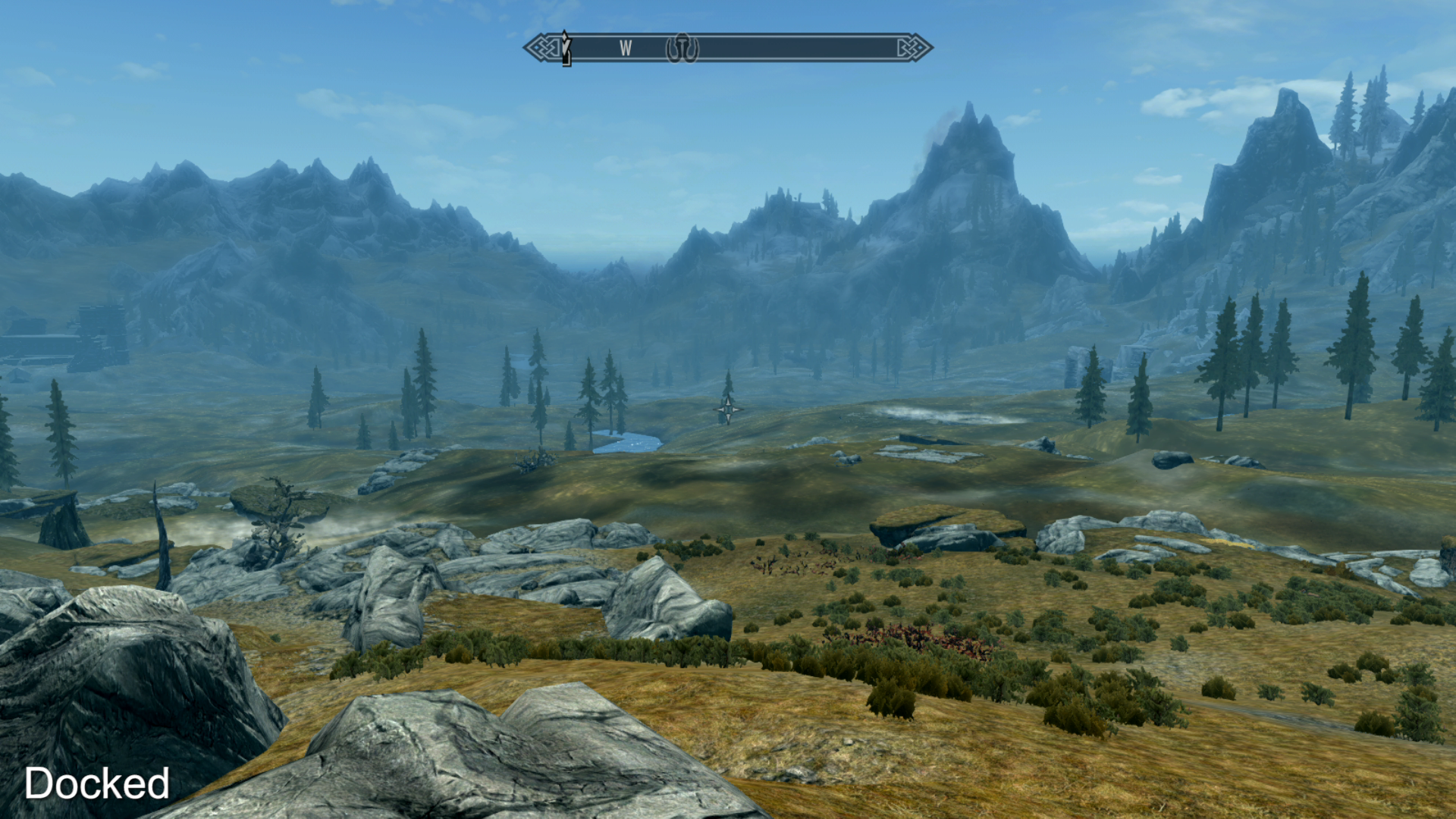

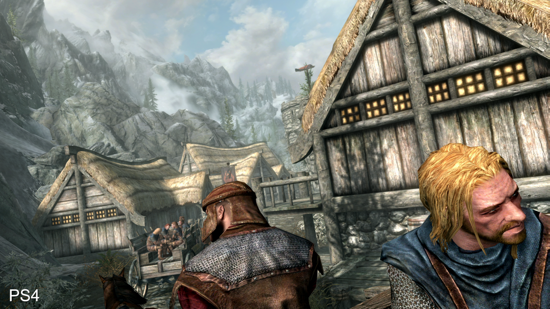
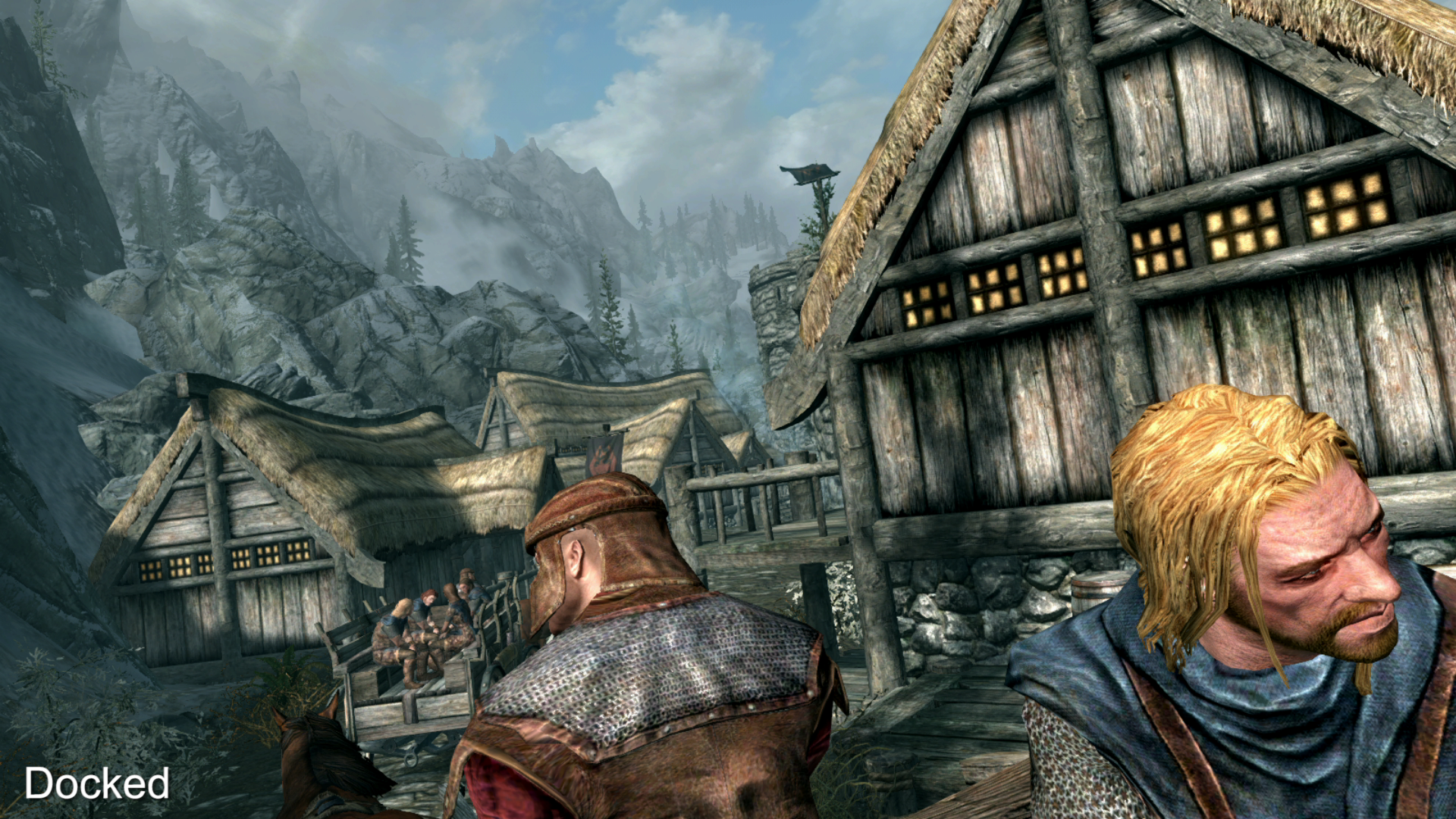
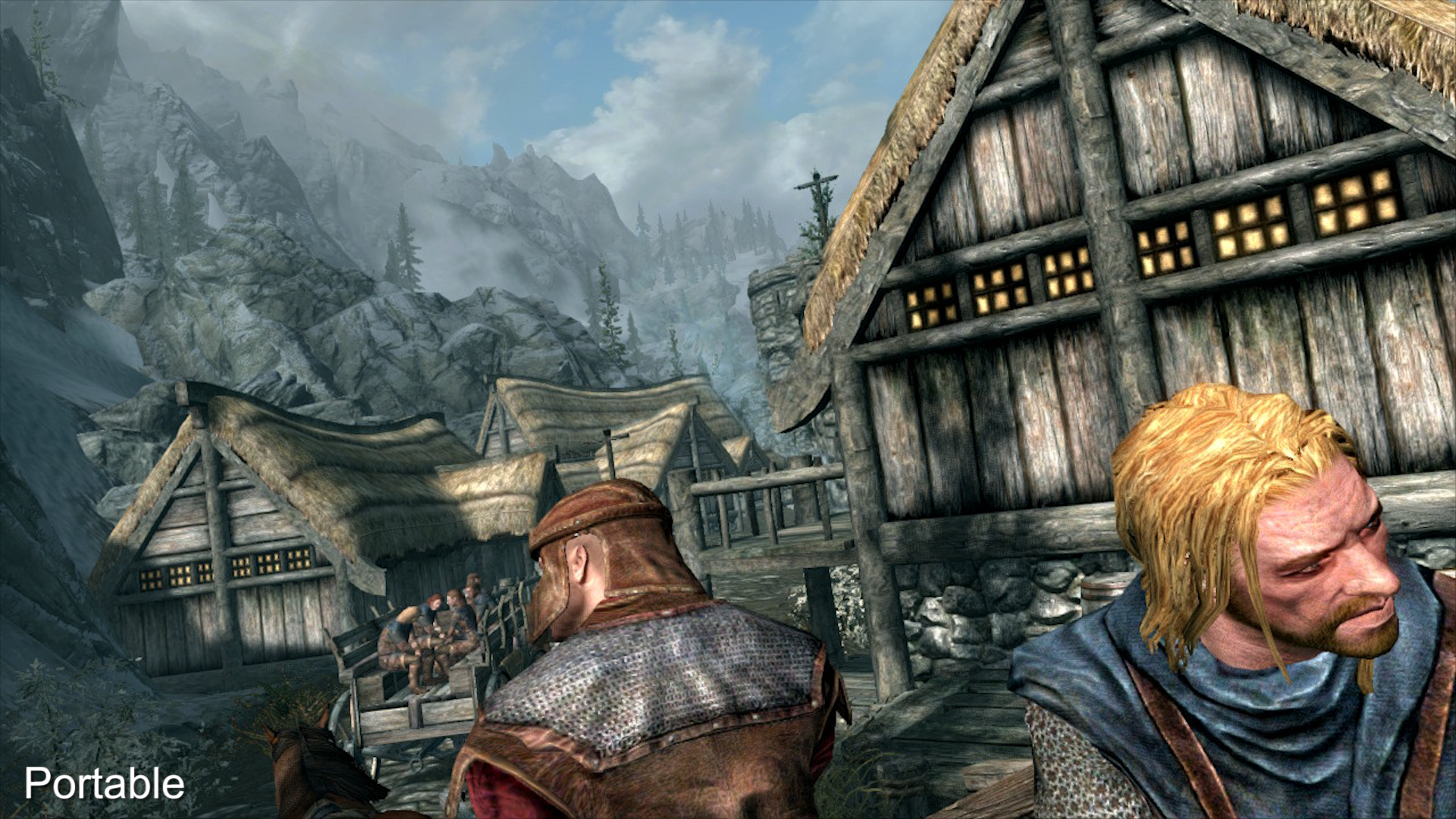
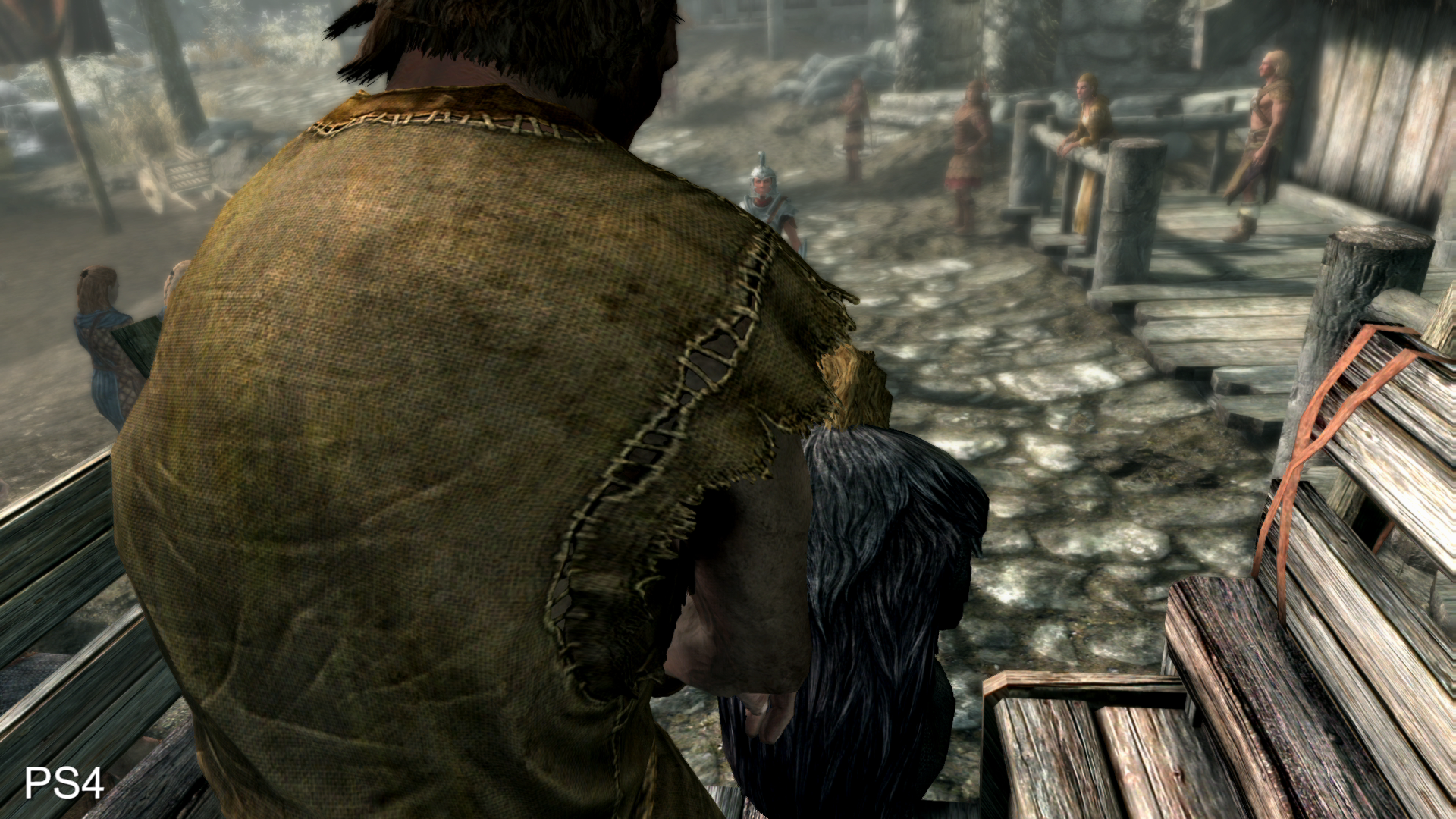
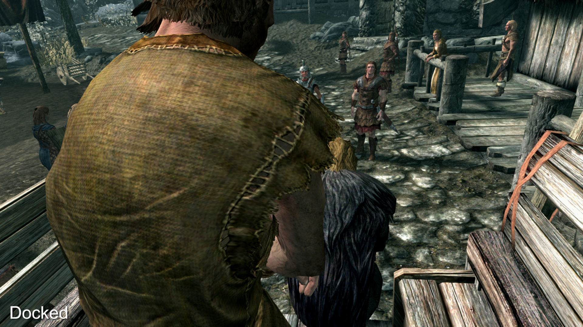
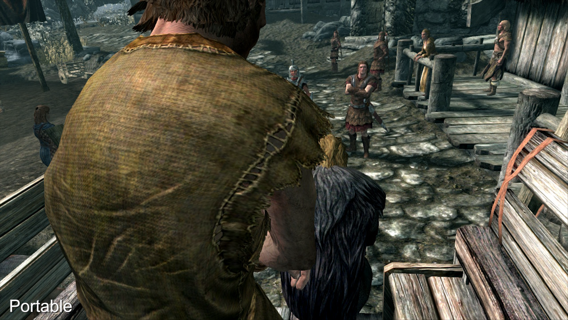
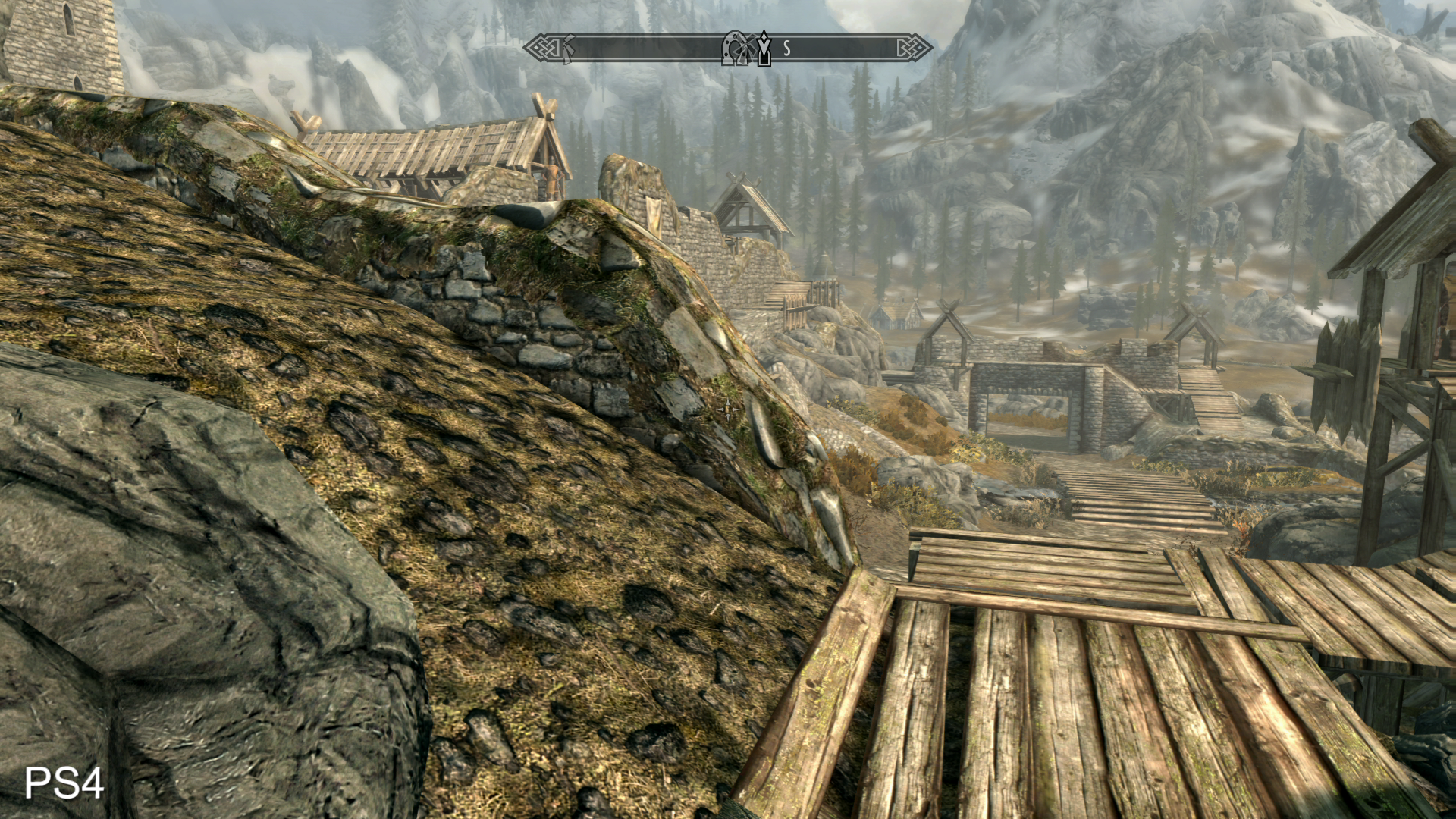
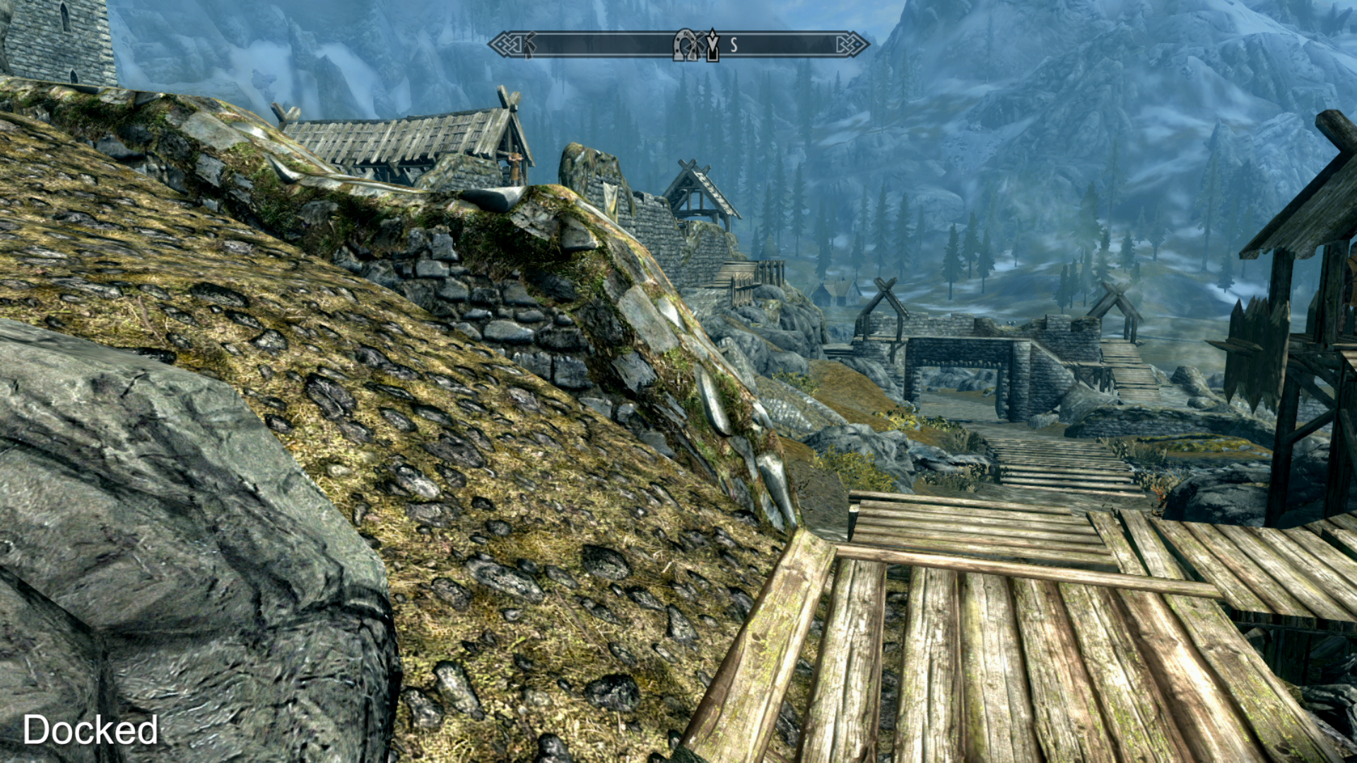
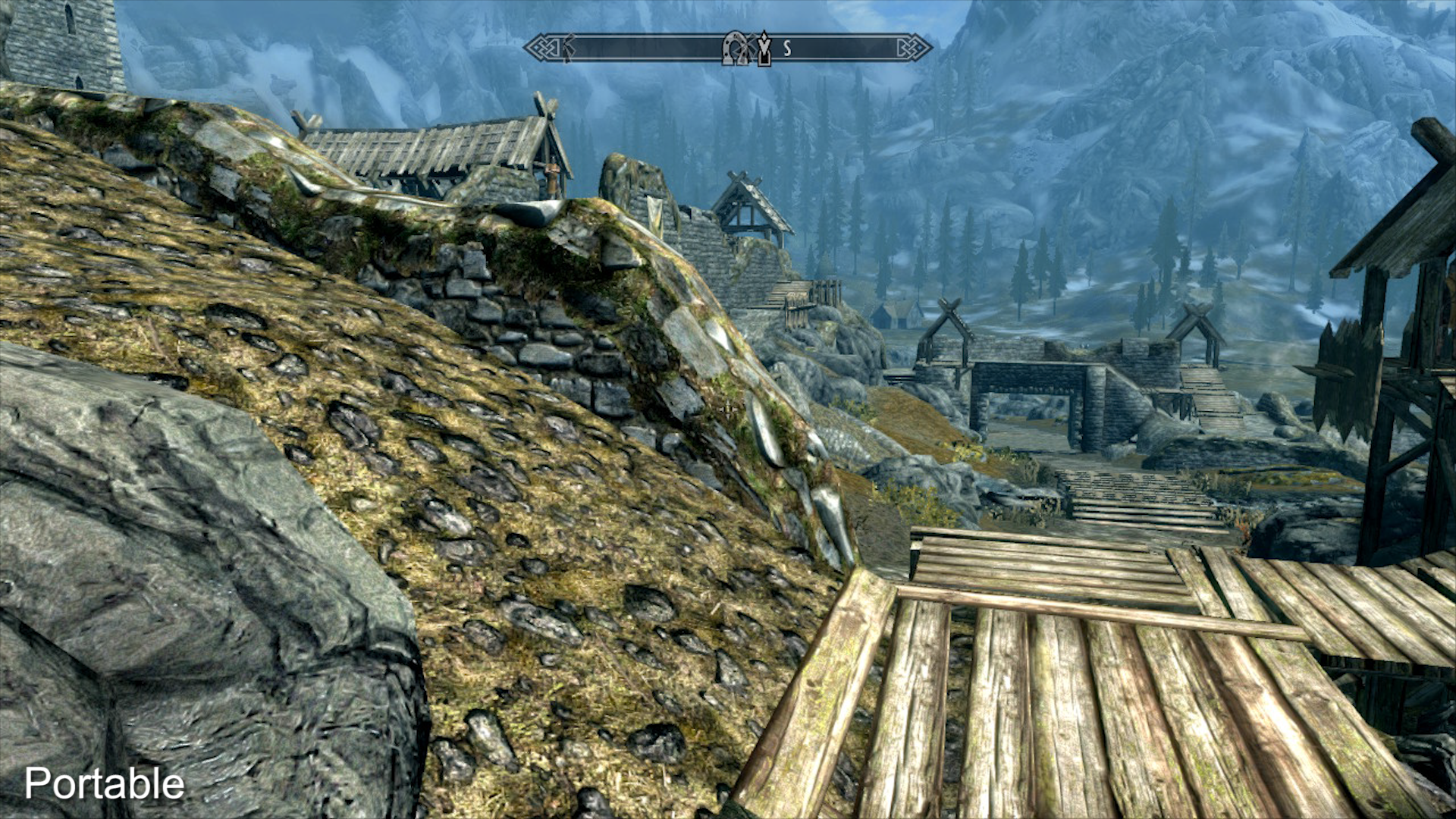
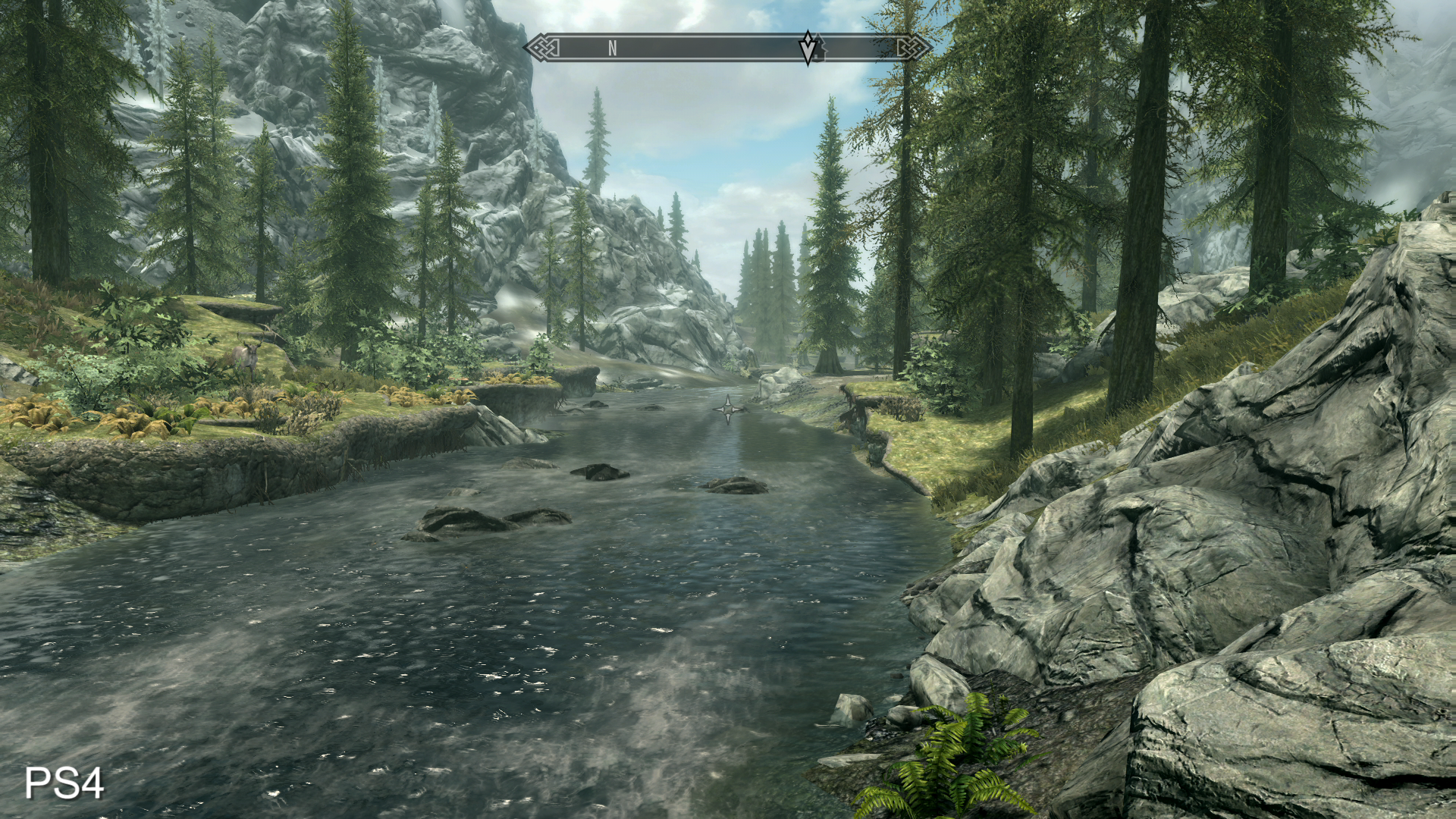
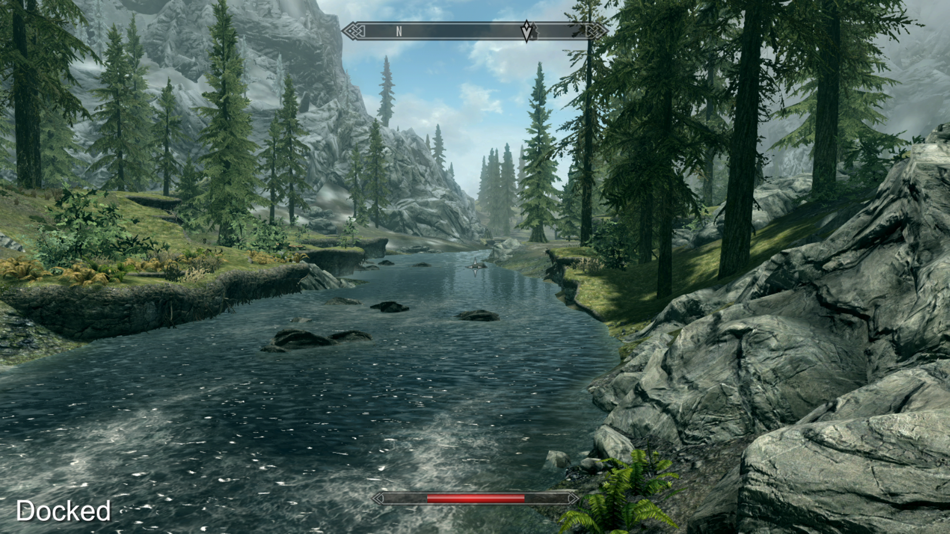
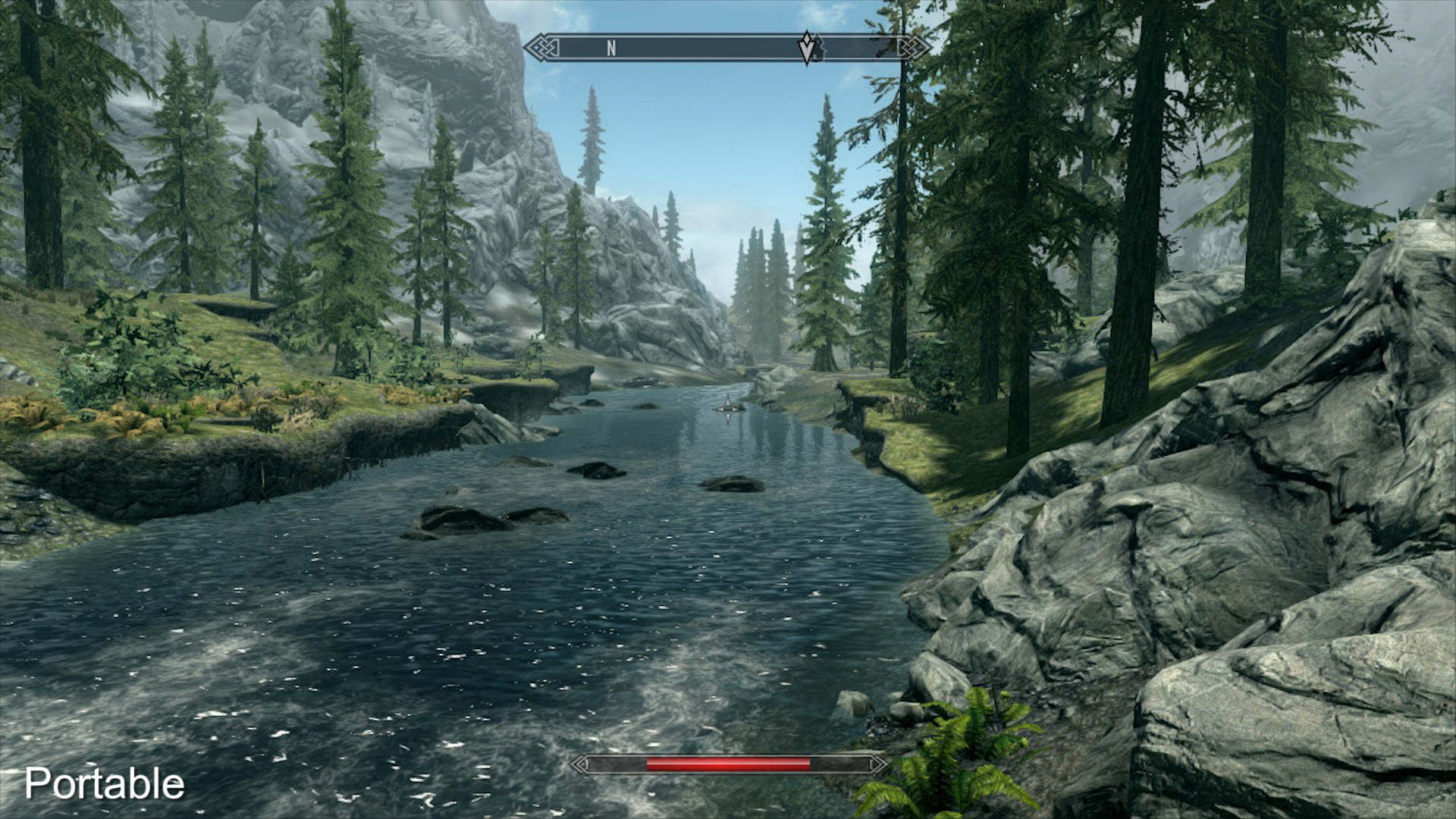
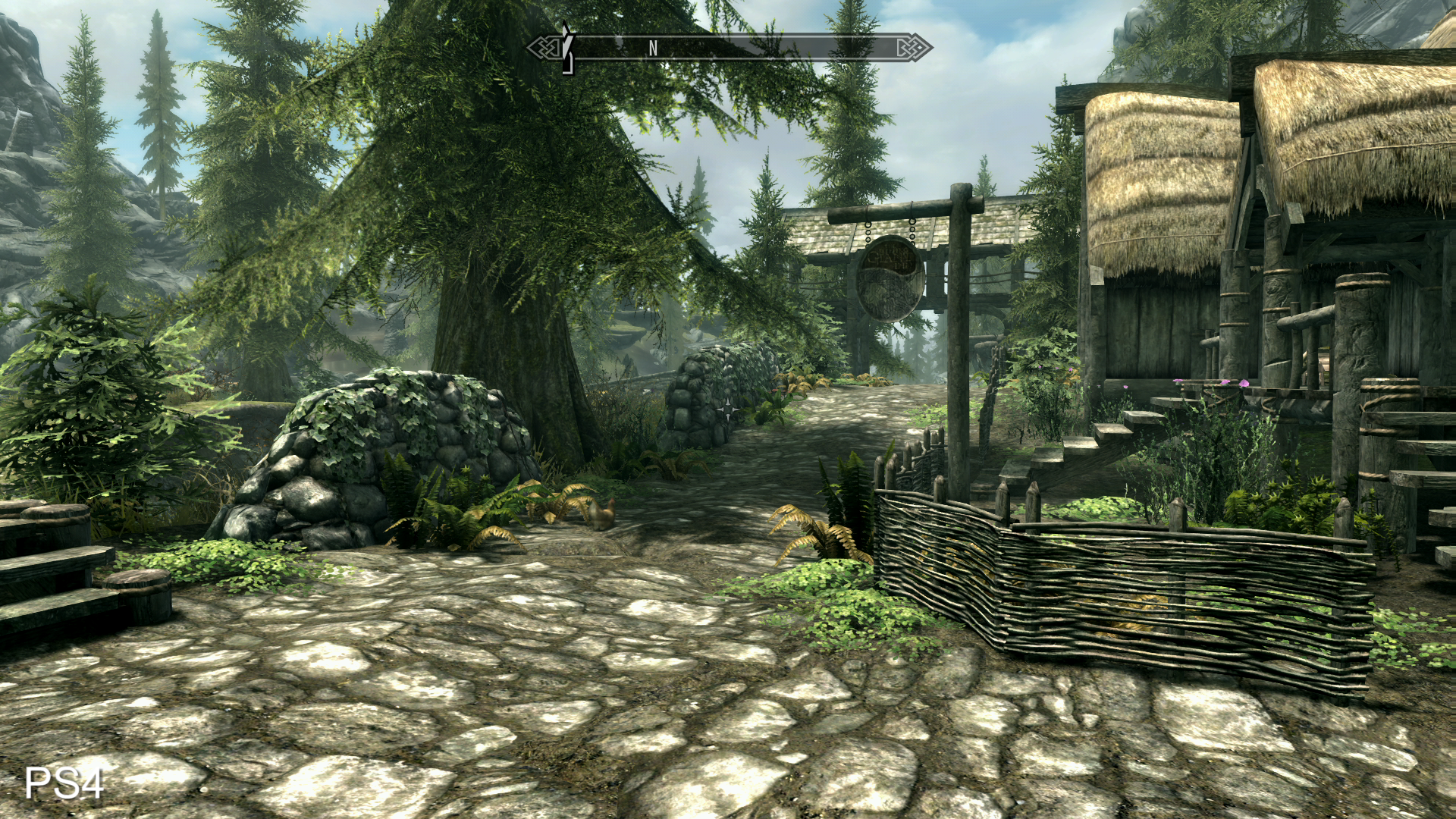

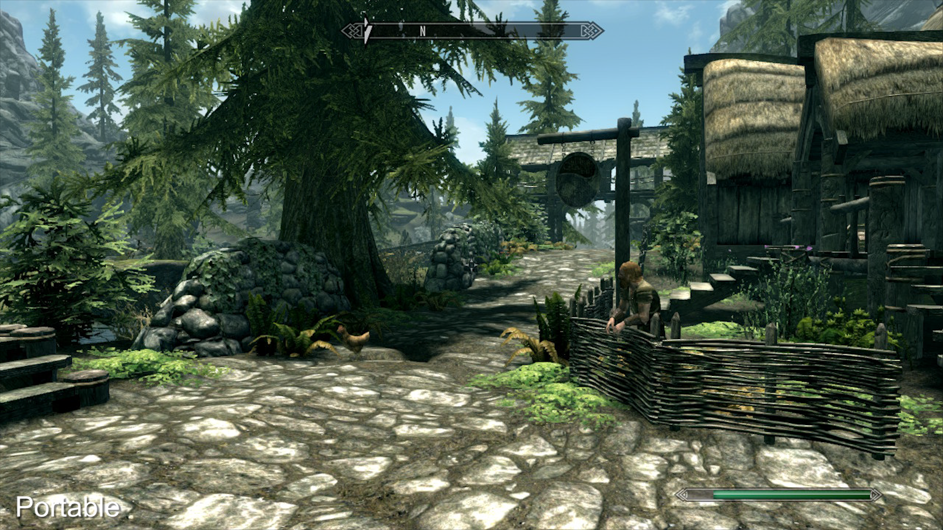
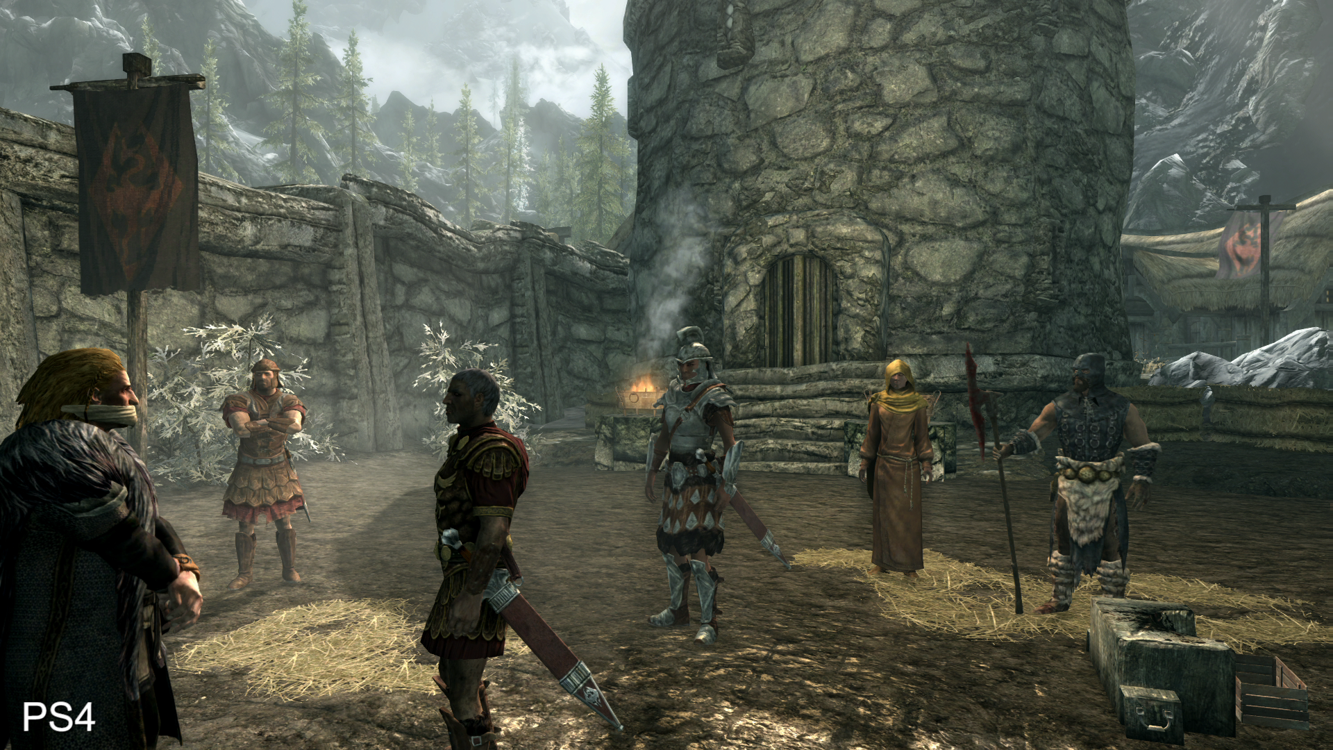
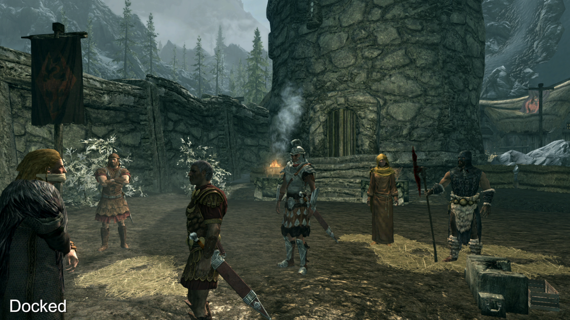

For starters, foliage is significantly cutback - thick and heavy on PS4, Xbox One and PC, this aspect of the game gets the most savage compromises, leaving the mid-distance looking a little bare by comparison. Similarly, object draw distance is pulled in significantly too, resulting in obvious pop-in on Switch that is much harder to pick up on with other systems. The end result varies dramatically - village scenes with lots of close-up detail look very, very close on Switch, while Skyrim's far-off vistas can look somewhat bare by comparison.
Again, it's interesting to note the difference between docked and mobile play. The game is still obviously and recognisably Skyrim when playing hooked up to your flat panel, but the compromises in visual quality do stand out. Meanwhile, the handheld mode manages to make all of this seem like a trivial or more likely a non-existent issue. This is the first fully mobile Skyrim experience we've seen on anything other than fringe hardware (like the old Razer Edge) and it's just fantastic to revisit a classic game like this that plays so well and so smoothly on the go.
And that's the key difference between Skyrim and last week's Doom port. Bringing id Tech 6 to Switch resulted in a conversion that was both awe-inspiring and a touch disappointing at the same time - the hardware was pushed beyond its limits, producing scenarios that could compromise gameplay. Skyrim is a better fit for the Nintendo hardware because of the sheer consistency here - while we can't vouch for performance 60 hours in (where bad things happened owing to lack of RAM on PS3), everything we've played so far is slick, polished and effectively locked to the target 30fps. And with several gigs of RAM at hand in the Switch hardware, we're hopeful that the game will hold up for the entire duration.
In short, the changes made to the Skyrim experience ensure a comfortable fit for the Switch hardware, and while we're not massive fans of the optional waggle controls, the fact they're there shows Bethesda attempting to leverage more of the system's unique features. Whether you've played Skyrim or not in the past, the ability to play on the go really is the game-changer here. We had a lot of fun with this one, and can highly recommend it.
You can support Digital Foundry's work and gain access to our entire archive of 1080p and 4K video by backing us on Patreon for just $5 a month.
