Luigi's Mansion 3DS: GameCube port or full mobile remake?
Nintendo's veteran handheld continue to impress.
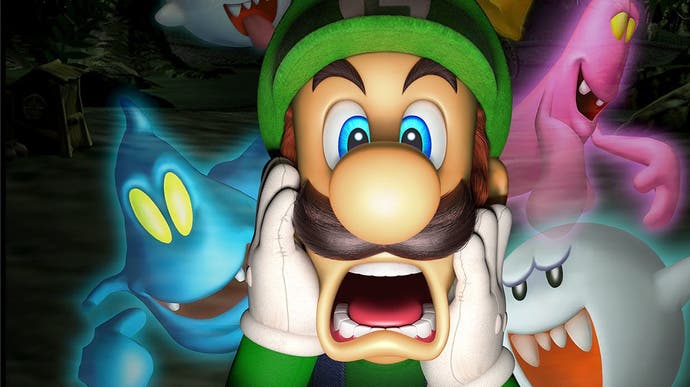
Seventeen years ago, Nintendo upended expectations by launching its state-of-the-art GameCube console without a Mario game. At the time it seemed crazy - after all, Mario titles were key to the success of its prior console launches - but this time, there was something else awaiting early adopters instead. Luigi's Mansion was - and is - rather an unusual game. Combining Nintendo's charming character design and fun gameplay mechanics with a horror-themed mansion certainly isn't something anyone expected at the time, but since its release, the series has become somewhat of a fan favourite. And now, the original game has relaunched on Nintendo 3DS in one of the most interesting conversions we've seen in some time.
As a GameCube launch title, Luigi's Mansion remains an interesting piece of work. In many ways, the visual stylings of modern Nintendo games can be traced back to this release. With an ample polygon budget and new rendering techniques, Nintendo started down its path towards matching its renders of Mario and friends using real-time in-game graphics. As such, in its original form, Luigi's Mansion still holds up from a visual perspective.
This week, a launch GameCube title arrives on Nintendo 3DS in its twilight years, with Nintendo employing the expertise of Grezzo - the studio responsible for the 3DS ports of Ocarina of Time and Majora's Mask. First impressions are certainly positive. Whether you've played the original or not, this new conversion is instantly appealing. Character models are smoothly rendered, texture work is all-new and beautiful and there are a lot of great touches strewn about the environment. The way coins and money jump about the screen, the cloth physics that appear when using your vacuum, not to mention the reflections in mirrors, they all look superb. The flashlight beam is also a juxtaposition of what seems to be a per-pixel light drawn across the environment combined with a transparent cone and lens flare effect. It's all very cohesive and at first glance, you might not even realise that the game's visuals have been completely revamped.
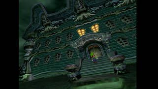
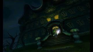
But they have been, to the point where Grezzo has effectively remade the game to suit strengths of the 3DS. While this release shares some elements with the original, most of the art is entirely new, lending the game a very different look. For starters, the new 3DS version has a noticeable change in mood, presenting as a darker, more sinister game, while our first look at the mansion itself at the beginning of the game reveals improved lightning effects and higher resolution textures. Moving on, I feel there's just more nuance in the shading and lighting displayed by the 3DS game, even though it plays out on a much smaller screen at a lower resolution. We have to remember that Luigi's Mansion was one of Nintendo's first ever GameCube productions, so the developers were still learning - so the bottom line is that perhaps there is room for improvement. The end result is that the 3DS version appears more refined outdoors, I feel.
As Luigi cracks open the front door, however, I noted that the GameCube seems to feature a slightly increased level of geometric and texture detail. I also prefer the appearance of the flashlight cone shining into the camera but that's more an artistic change than anything else. What I did notice though was that GameCube transitions immediately to the indoors with no loading, while the 3DS features loading between areas like this - possibly due to additional compression required to fit the game onto a cartridge.
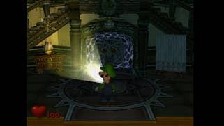
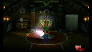
Once in the gameplay proper, the differences become more evident. The texture work on 3DS appears more refined, while lighting and shadows are handled differently - on GameCube, Luigi's flashlight casts shadows, while this doesn't happen on the 3DS. It seems that the shadows generated in Luigi's Mansion rely on the GameCube's EFB or 'embedded framebuffer'. Games can render useful elements to this secondary framebuffer and then simply combine them with the main framebuffer before presenting the final image. Somehow the game renders out a secondary image of objects which receive projected shadows and utilises this information to present what we see in the game.
The 3DS works in a different way and this trick really wouldn't make sense there so instead, the developers have taken two approaches. The first involves casting shadows in a different way but only for select objects.The second seems to involve pre-calculated shadows which almost appear to rely on vertex painting or another old-school technique. The bottom line though? Fewer shadows are cast on 3DS.
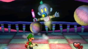
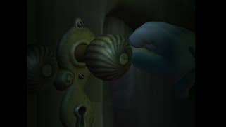
There are other changes - notably to geometry and even to the way door knobs are rendered in transitions - but also some interesting parallels, such as object pop-in presenting on 3DS in exactly the same way as GameCube. Other updates are more overt - such as the more modern taller, leaner iteration of the Luigi model. Then there are the ghosts - these are rendered quite differently. On GameCube, the EFB is used again. The ghost is rendered to a separate buffer from the main scene then overlaid back in. This approach allows the team to manipulate the way the ghost is rendered in the main scene giving it a more transparent, spooky appearance - to this day, the effect holds up beautifully. On 3DS, this is clearly handled in a different fashion and so ghosts appears slightly more opaque and less ethereal.
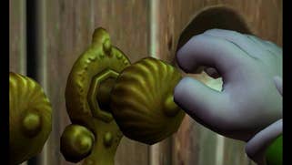
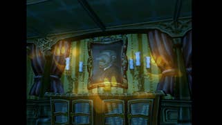
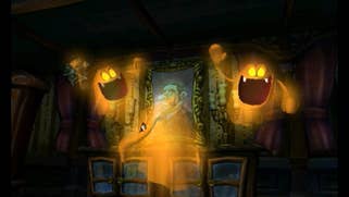
Performance-wise, Luigi's Mansion targets 30 frames per second across both GameCube and 3DS but the results aren't always perfect on the handheld. Using a New 3DS console, certain cutscenes drop all the way down to 20fps and stay there. However, normal gameplay seems to play just fine at a solid 30 frames per second at least on the New 3DS. I also tested Luigi's Mansion on a 2DS which shares the same performance profile as the original 3DS and here performance is slightly less stable - I noticed additional drops during normal play that weren't present on the New 3DS. Curiously, the GameCube original itself also exhibits some issues with a slight jerkiness popping up during certain scenarios. It's not quite as polished as other Nintendo games which would follow.
Overall, there are a lot of changes to this port - lighting and shadows are handled differently, geometry is slightly reduced, and performance isn't perfect but at the same time, it almost feels like a full-on remake in some ways. All of the textures are completely new, the art direction differs, and everything has been remodelled. I think it's clear that 3DS and GameCube each have their own unique advantages then. Visual features that relied heavily on GameCube's unique hardware features needed to be stripped out and modified to work on 3DS in a different way - and it works. Compared to the various other Wii-to-3DS ports, however, I feel this does a much better job.
Grezzo has done a tremendous job in adapting the game to Nintendo's aging portable system and in the end, has produced one of the best-looking games on the system. The controls are also well implemented. If you're playing on a New 3DS, you get to use the nub just like the right stick on GameCube but this time, it can actually be inverted. You can also use the gyro feature to aim your vacuum up and down across all versions of 3DS hardware.
So, if you haven't played Luigi's Mansion or it's been a while since you've played it this is a fantastic way to jump in. It's a strange little conversion that almost feels like a side-make rather than a port - a game which makes changes to fit the hardware that often wind up looking better than the original even if it falls short in certain areas. If you're still playing on 3DS, I'd recommend checking this one out - a lot of care and attention has gone into the game and it's beautifully executed overall.
