Wolfenstein 2 on Switch: can mobile hardware really run a cutting-edge shooter?
Yes it can - but how?
When Bethesda revealed that it was working on a port of Doom 2016 for Nintendo Switch, it was hard to believe that a worthwhile conversion was possible - until we went hands-on. Panic Button had somehow produced an impossible port, flawed in several ways, but definitely playable - and from a technological perspective, it was quite unlike anything we'd seen on Switch before. Naturally, when a conversion of the more demanding Wolfenstein 2 was announced, we were once again sceptical about the game's chances, especially considering Doom's frame-rate issues. But the proof of the pudding is once again in the tasting, and as a technological achievement, Wolfenstein 2 on Switch is even more miraculous than its predecessor.
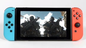
I really hope that somewhere in Nvidia's R&D labs, the architects of the Tegra X1 have seen this game - to see just how much fidelity has been extracted from what is fundamentally a mobile processor. Like the Doom 2016 port, it's clearly not the best version of the game, but playing it in handheld form on a three-year-old Tegra, using a GPU running at a max clock of 384MHz, sipping around seven watts of power, the visual return is staggering. Of course, there are compromises, but by and large, the full Wolfenstein 2 experience is here and if you were put off by the Doom port's wobbly performance, you'll be pleased to know that Panic Button has actually improved overall frame-rate stability on what is a more complex game. And in doing so, there's the strong possibility that Panic Button may have utilised techniques and technologies derived from PlayStation 4 Pro and Xbox One X development to get the job done - possibly another first for Switch.
In many ways, Wolfenstein 2 is an interesting study in the choices made when porting a game to less powerful hardware. The goal with any conversion is usually to deliver an experience as close to the original source material as possible by making the right choices during development. Switch's FIFA Soccer saw EA opt for an entirely different game engine with a focus on performance and resolution - an upgraded last-gen engine rather than a downgraded Frostbite. Or how about Fortnite? From Xbox One X to mobile phones, the Switch and beyond, each version of the game is focused on delivering the full experience on each target device no matter what visual sacrifices are necessary to get there. Even if you're playing on an iPhone 6S, it's still the same basic game.
With Wolfenstein 2, Panic Button instead focuses on delivering an experience that is as close as possible to the original release in terms of visual makeup and basic design. Removing things like volumetric lighting, ambient occlusion, per-object motion blur and dynamic lighting could have increased performance, but it would come at the expense of its visual identity, while chopping up stages into smaller chunks could have destroyed the pacing. Thankfully, design wise, the development team has managed to successfully translate every single map to the Switch version. That's right: Wolf 2 retains every stage, every major feature and a majority of id Tech 6's visuals, albeit repurposed for Switch's mobile-orientated GPU.
That's not to say that some noticeable tweaks and adjustments haven't been made along the way, however. An early example is an area at the beginning of the New York mission, featuring a nice view of the wreckage from which you've emerged in the original release of the game. On Switch, a new wall has been erected in this spot instead, presumably to reduce load when looking back towards this area of the stage.It's a trick we've seen for generations - one even employed by the legendary Quake port on Sega Saturn. Adding the wall occludes a portion of the view, meaning it doesn't have to be rendered, saving on performance.
The game itself is intact but achieving this on Switch has required a particular philosophy - specifically, the prioritisation of rendering features over resolution. The end result is a game that is remarkably close to the existing versions, but it's also the blurriest game of the generation thus far - but the how and why is worth exploring. For starters, like Doom, Wolfenstein 2 utilises an adaptive resolution feature that adjusts pixel count based on load. We pixel counted a wide variety of shots from the docked mode, and came up with a whole host of results. Everything ranging from a top end of 720p to 1216x684 to 540p and 432p all the way down to 640x360. When played in portable mode, 768x432 and 640x360 are common pixel counts, but it can increase from there depending on load. In general, it's comparable to the Switch version of Doom but seems to scale towards the low-end more often. There's no getting around it - this really is a very blurry game.
But unlike Doom, there seems to move to it than that - and this is where the potential PS4 Pro and Xbox One X connection is discovered. Looking closely at our video feeds, it's possible to make out stippling and other visual artefacts typically associated with the reconstruction methods used by the enhanced consoles to provide improved 4K video outputs. Without confirmation from the developer, we can't say that this is the case for sure, but these artefacts are not present in the console or PC versions of the game - and neither are they present in Panic Button's own Doom 2016 Switch port. Perhaps this is the key to Panic Button extracting even more from Switch than they did with the Doom port.
So, how does this look while playing? When using docked mode on a 55-inch 4K TV, I found the game to be exceptionally blurry. Just like Doom before it, the strong temporal anti-aliasing and post-heavy effects pipeline eliminates the majority of the stair-step jaggies associated with low resolutions. Instead, you get a highly indistinct image that almost looks as if a depth of field effect is always active. This is one game that benefits from playing on a lower resolution, smaller display - which is why handheld mode is pretty convincing. While it still appears soft, the small size and lower pixel resolution allow for a more attractive image overall. It's perhaps the best looking handheld shooter I've played to date, which says a lot.
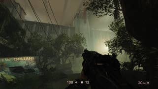
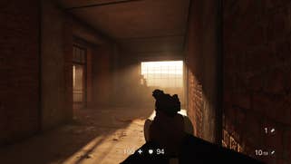
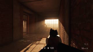
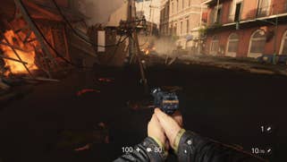
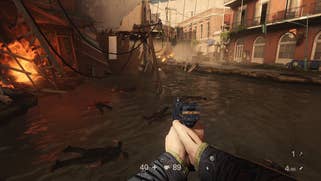
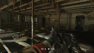
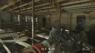
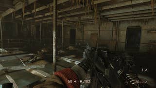
Ultimately, image quality wise, Panic Button seems to be pulling out every trick in the book. There have been a lot of innovations in terms of image treatment this generation and Wolfenstein 2 puts many of these to use in such a way that works - but there's so much more to discuss here than just image quality. The port offers most of the visual features present in the original release but each of them has been optimised to work best on the Switch. For starters, when installed to your console, Wolfenstein 2 requires just 21GB of storage space. In comparison, the original console release is closer to 50GB. There's a huge saving here and part of it comes from downgrading the quality of the pre-rendered video sequences - which accounts for 7.72GB of data in the original game.
Savings are also made in texture quality. Wolfenstein 2 is a memory-hungry game, and this is due in part to its efficient handling of asset streaming. On PC, you can increase or decrease the available memory the game can access for this function via the image streaming option. On Switch, however, where memory and processing power are more limited, Panic Button has seen fit to reduce overall texture quality across the board while also employing a generally lower level of texture filtering. What this means for the player is simple - texture detail is pared back significantly from other versions of the game.
It's most distracting when focusing on near-field objects such as the visible weapon and arm model. These are on-screen throughout most of the game and the reduction in quality is certainly obvious. That said, while it's true that overall detail is greatly reduced, the variety of textures remains the same and during normal gameplay, it still manages to appear comparable to the original vision. You'll notice a loss in detail when viewing objects up-close but, at a distance, the lower overall screen resolution helps side-step the issue. Again, it really helps to be playing in handheld mode here, as this makes the reduction in quality less impactful than it is on a living room flat panel.
On the flipside, while texture detail has taken a noticeable hit, geometry remains very similar across the board. Wolf 2 is extremely heavy on geometry with some of the most richly detailed environments I've seen this generation. Aside from the addition of things like the New York wall, I also noticed smaller details that decrease load - like closed windows rather than open ones. Again, tricks like this reduce the amount of visible geometry in a scene without greatly impacting overall visual quality. Smart changes like this are used throughout to subtly modify elements of the game and it works well.
By and large, even when exploring large open city environments, you're still seeing the same rich geometry as the original release. The only noticeable change in this area stems from more aggressive LODs - geometry can pop in and out in closer proximity to the camera but it's generally not overly distracting and it's a good way to save on performance. So, in terms of overall scene complexity then we're looking at roughly the same base geometry with more aggressive LOD management, a reduction in texture quality and some tweaks made to the world design.
Then there are other elements in the rendering pipeline that have been adjusted for Switch. Ambient occlusion appears to use a lower bit-depth exhibiting noticeable artefacts in the form of stippling and vertical lines. It still gets the job done but produces an overall dirtier image. Shadow quality is also pared back significantly in scenes thanks to a decrease in resolution, while both dynamic and fixed shadows appear blurry and lacking detail. Per-object motion blur is also included, though it doesn't always pair nicely with the rendering method chosen by the developer.
The last key feature included in the Switch version is the volumetric lighting, where volume lights are used throughout the game to help build atmosphere. The appearance of sunlight filtering through a window into a dusty room is perfectly executed and this effect is present across each version of the game. On Switch, the resolution of the voxel grid appears to have been reduced which results in minor artefacting, but the overall effect is retained.
So, in terms of overall visual makeup, the main rendering features offered by id Tech 6 are present and accounted for. The same lighting solution is used across all versions, particles and effects are retained, volumetric lighting is in and direct and indirect shadowing is present. It may be soft, but this is the complete Wolfenstein 2 experience running on portable hardware.
As you might have guessed though, not every visual feature has made the cut. For one thing, Wolfenstein 2 makes use of water in several areas - something that wasn't a part of Doom 2016. Bodies of water make use of a real 3D mesh which interacts with the player, in addition to proper water caustics and sometimes a depth fog, helping to give it that murky appearance. It looks phenomenal. On Switch, the 3D water mesh is maintained but the quality of the rendering has been reduced, while caustics and screen-space reflections are completely absent. When combining these elements, you're left with something that no longer sits naturally within the environment. It's not bad, but it's certainly a step back.
Screen-space reflections are absent across the board. Cube maps are still included and active in both docked and handheld mode, but real-time SSR from the surrounding environment gets the axe, just as we saw in Panic Button's Doom port. Those are the main features missing from the Switch version, which isn't a huge issue in most scenes, thankfully. But essentially, what we're looking for now is the pay-off - the increase in performance from Doom required to get a balanced, playable experience. Of course, the 60fps of the PS4 and Xbox One versions is reduced to 30fps - just as it was in Doom - but locking more consistently to that frame-rate target is a must - and remarkably, Panic Button has pulled off a bit of a miracle here.
Throughout most of the game, Wolfenstein 2 does a great job at maintaining the target 30fps and most of the time, it maintains even frame-pacing as well - which wasn't properly implemented in Doom. When combined with the excellent per-pixel motion blur, the game manages to look reasonably fluid during gameplay. More importantly, the frame-rate really is steadier than Doom across the run of play. Most scenes successfully maintain 30 frames per second with moderately heavy battles exhibiting minor frame-rate and frame-time inconsistencies - but nothing too untoward. During the first half of the game, it's remarkably stable.
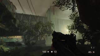
That doesn't mean there aren't some problem areas, however. Once you reach New Orleans, things start to take a dive. This is one of the most visually complex areas in the game and on Switch, the resolution dips very low and stays there throughout this section. The long draw distance and detailed environments become exceptionally blurry and performance begins to drop. This battle outside on the streets, for instance, exhibits drops reminiscent of the worst parts of Doom. It never becomes unplayable per se, but the combination of low image quality and an unsteady frame-rate make for a rather unpleasant time.
Of course, this is the worst-case scenario here and certainly does not represent the overall experience. For most of the game, I'd say we're looking at a mostly locked 30fps with a few wobbles here and there. It's only during a couple of larger battles that frame-rate issues begin to crop up. When in portable mode, the results are less stable but it's still quite playable. The average resolution remains lower than docked mode and the performance is less fluid but thanks to the small size of the screen, it still manages to look and feel satisfying.
Targeting 30fps does work then, but there is an unfortunate side-effect we hope to see Panic Button fix in a future patch. Hidden within the central hub is an arcade machine with a version of Wolfenstein 3D. It's a neat way to experience the original game and on the other versions of Wolfenstein 2, it works beautifully. On Switch, however, it seems that cutting the frame-rate in half has the unintended effect of running the action run at half-speed. Of course, it's just a bonus game - an Easter Egg if you like - but I'd like to see it working correctly. As a curious aside - the pixel art graphics also highlight what appear to be similar reconstruction artefacts to those found elsewhere in the game. And again, they're not present on any other version.
Ultimately, Wolfenstein 2 may not be anything like the best version of the game, but that doesn't mean it's not worthwhile. It's content complete and it still looks great in most scenes, even if it is rather blurry. In common with a fair few Switch titles, the experience doesn't fully hold up when playing docked on a living room TV, but this is by far and away the most impressive handheld first-person shooter we've seen. Panic Button has doubled down on some of the controversial decisions it made with the Doom 2016 port and taken a fair few gambles here, but the final product works and exceeds expectations. Especially when played on the go, there's a constant feeling of delight - the sense that what we're witnessing just shouldn't be possible. But there it is - Wolfenstein 2 on a handheld, an entirely unique way of playing one of last year's best, most technologically advanced releases. It shouldn't work but somehow it does and we highly recommend checking it out.
