Dragon Quest 11 on Switch: a beautifully executed, smart conversion
The port is exceptional - and there are brand new features too.
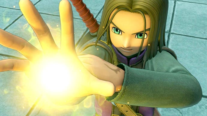
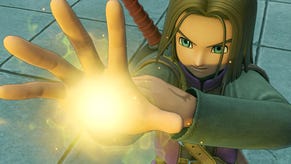
It's been an absolute joy to check out Square-Enix's Switch port of Dragon Quest 11, a game highlighted by our audience as a title we really needed to take a look at in the wake of its September release. It's a highly successful conversion of Unreal Engine 4-powered game that even challenged the GPU power of the PlayStation 4, and yet somehow, the Switch conversion is very, very similar - and in some ways, actually better.
This is as a result of content changes, updates and improvements along with a very smart approach to paring back the visual feature set in order to sit more comfortably on Nintendo's console hybrid. And it's the care and attention to the conversion process that the developer deserves kudos for. Yes, side-by-side, there are clear graphics compromises between Switch and PS4, but the way that Square-Enix has gone about packing this huge, sprawling game into a handheld is absolutely fascinating.
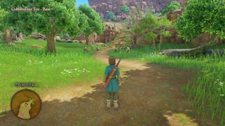
When DQ11 first launched on PS4, I was impressed, but also noted that achieving its vision required a lot of horsepower. This resulted in a 900p game on the base PS4 system, rising to 3072x1728 on PS4 Pro using checkerboard rendering. On Switch, however, the team has opted for dynamic resolution scaling, resulting in variable pixel counts. Docked I've seen 720p and 792p up to 810p, but it could go higher or lower in more extreme cases, but these values are common. In handheld mode, the average resolution is 20 to 25 per cent lower on average with results around 540p - sometimes a tad lower, sometimes higher.
There's no doubt that the results are rather soft and a tad blurry at times but it's a far sight better than many other Unreal Engine games on Switch and even first party titles such as Xenoblade Chronicles 2 - which runs at a much lower resolution overall, but the changes made to Dragon Quest 11 go way beyond pixel count alone. Based on developer presentations, the changes are widespread, beginning with the use of Simplygon and hand-tooling to reduce geometric detail across the board from characters to environments, reducing mesh complexity to better fit with performance and data size targets.
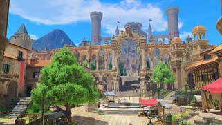
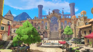
To better aid with loading times, and to reduce an original 30GB PlayStation 4 game to a more manageable 14GB, the Switch version also features pared back texture assets. Owing to the style of the game (it's not exactly striving for realism), both the geometry and texture cutbacks look absolutely fine - especially when playing in handheld mode. The same goes for the shadow detail, which is lessened on Switch, with character self-shadows all but gone. The same also applies to ambient occlusion (reduced) and screen-space reflections (gone). The point is that the game still holds together beautifully, and it's only when stacked up side-by-side with PS4 do you notice how the game has changed.
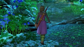
Dragon Quest 11 also has a lot of work to do in bringing the game's signature large-scale world across to Switch effectively, and it's here that you start to see a bit more creativity. Trees, for instance, rely heavily on billboards - or flat objects designed to represent trees. As you get closer to a tree, it noticeably transitions into the more detailed model. This technique is used heavily in the overworld area to reduce overall scene complexity, along with reducing grass in terms of its density and draw distance. This also applies to objects and characters which appears within closer proximity to the player compared to PS4. I found that this is slightly distracting on the world map, but most areas are acceptable enough. In actual fact, the PS4 version has plenty of pop-in as well.
Lighting is another interesting point of discussion - a lot of the subtle lighting, especially on characters, appears to be absent or modified on Switch in the conversion. I was also fascinated to learn that the team had desired to make the jump to Enlighten for its global illumination solution on Switch but were unable to do so. The Switch version sticks with Unreal's built-in Lightmass GI which requires you to bake your lighting before checking the results, while Enlighten allows real-time lighting preview via the editor.
On the face of it, there are a lot of changes here and certainly a loss in quality - but what makes this an impressive conversion lies in how this was implemented. All these nips and tucks are expertly executed in a way as to avoid major distraction. It still very much looks like Dragon Quest 11 and doesn't make as many sacrifices as some other conversions and it's this balance that really works in its favour to deliver something that looks very impressive.
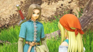
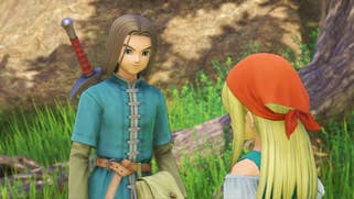
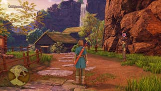
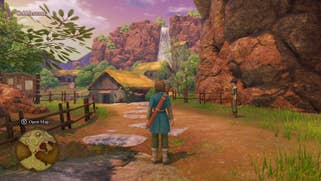
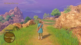
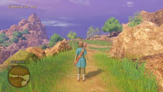
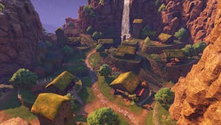
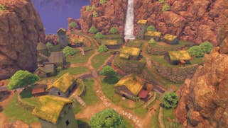
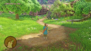
The Switch version also gains a number of features. Both English and Japanese voice acting are included, but the most obvious change of all is a huge overhaul to the game's soundtrack, with a full orchestral arrangement added for the Switch version. Not every track gets this deluxe treatment, but most of the game plays out with a much more pleasing arrangement.
Beyond the music, however, the Switch version includes the 2D graphics featured in the 3DS version of the game as a secondary mode - essentially you can play DQ11 entirely using pixel art graphics, transitioning between modes at churches. This is an interesting idea- the game displays at 60 frames per second while in this mode just as you'd expect, though cutscenes update at half-rate, while the 2D version also features random battles and modified map layouts. It feels entirely different yet familiar in a way that is surprisingly fun. My only complaint here centres on the text boxes and HUD which are rendered using the same higher resolution fonts and graphics as the 3D version - it feels like a mismatch in style. I would have preferred a lower resolution pixel font that matches the 16-bit visuals but it's still a very nice little bonus.
So, at this point, we've established that the Switch version is in a great place, with lots of features and extra options combined with visuals comparable to the PS4 original. It's a great version of the game all around, but what about performance? There's good news here too. You'll spend most of the time exploring the world in full 3D and it's here where the game seems to hold steady most of the time. It really is mostly a locked 30 frames per second with the rare dip here or there due to storage access.
The bottom line is that Square-Enix managed to match the original release in terms of overall performance which is impressive indeed. That said, there are some things I noticed - distant characters I spotted in the cities update at half-rate, which no doubt helps keep the frame-rate up. There are also very, very minor inconsistencies in performance in most battles too, but it's subtle enough that you may not notice at all. The same is true of handheld mode which exhibits the same issues when engaged in battle but remains perfectly smooth in the overworld, just like docked play.
Overall, Dragon Quest 11 on Switch is a highly impressive port and I'm glad that the Digital Foundry audience continued to remind us to look into this one. I'd say that it's up there with other high-end Switch ports and in some ways, goes even further as it compares more favourably to the original release and adds in further features. The game itself has its limitations and flaws but it's a great Dragon Quest game that is very well suited to a portable platform like the Switch. And yes, if you step back and look at each individual component, the drop in quality is evident - but the highest compliment I can give to DQ11 is that as a port, I think it works better than the likes of The Witcher 3 or Wolfenstein 2.
