Shenmue 3: an Unreal take on a classic Dreamcast experience
The sequel that never was - seen through the lens of today's technology.
The announcement of Shenmue 3 several years ago is one of those moments I never expected - something which seemed like an impossibility became reality. Over 18 years after the release of Shenmue 2, the story of Ryo Huzuki would continue on modern day hardware with PlayStation 4 and PC versions confirmed. The game is set for release on November 19th but a select tier of original Kickstarter backers received access to a playable demo earlier in the week. It's our first proper taste of the game - and I'm excited by what I've played.
Going into this one, there were bound to be concerns. The original Shenmue was one of the most expensive games ever made at the time of its release, developed by an industry-leading studio at the top of its game. By contrast, Shenmue 3 is crowd-funded, lower budget project put together by a much smaller team. How could it ever hope to compare?
For starters, I feel the power of modern middleware plays a large role - the flexibility of Unreal Engine 4 empowers developers to more efficiently build new experiences such as this in a way that wasn't possible 20 years ago. Many key features already exist within the engine itself, allowing the team to experiment and utilise these features more rapidly than in the past. However, it's the vision of what a new Shenmue game should be that I find most interesting. Yu Suzuki and his team have chosen to stick closely to the original design template rather than attempting to mimic modern open world design.
In this sense, despite the use of of a cutting-edge engine, art direction and game design are more of an evolution of AM2's achievements back in the day, as opposed to dragging the concept kicking and screaming into the modern era. It also means that Shenmue 3 focuses on smaller but more densely packed areas rather than presenting a massive open world.
I feel this element is key to the design of the game - the smaller scale and scope helps strengthen the bond between the player and the world. As you play, you become familiar with the location, its people and the choices available to you in a way that usually doesn't work in a typical massive open world game. This intimacy between the player and the world played a huge role in defining the original games and it seems that the team has decided to continue this tradition - which I feel is a smart decision.
That doesn't mean improvements to the formula haven't been integrated. Technically speaking, the original games were broken up into small chunks divided by loading screens owing to the limited memory of the console. While the demo only consists of one area, the map itself is reasonably large. Buildings can be entered without cutting to a loading screen and everything feels rather seamless now.
Even better, the small details you expect from Shenmue remain present - at least in part. Walk into a store, for instance, and you can open just about every drawer or cabinet in the shop and examine most of the objects. There's no real gameplay benefit for doing this - it's completely optional - but it's part of what makes Shenmue special. It encourages you to slow down and appreciate the minutiae. Shenmue 3 also allows for slightly more freedom of exploration - it's still constrained by today's standards, but it's now possible to walk out into the surrounding fields or behind buildings, expanding the sense of freedom.
Although present in prior titles, the clock plays a more prominent role with a proper time of day system this time around, with actual shadow maps adjusting according to the sun's position. It's a visual upgrade only, as even with original Shenmue defined a schedule for the various people within the game world based on time of day. Just like the older games, if you stop and watch, characters go about their lives according to their programmed schedule. We'll need to play the final game to judge their flexibility but at the very least, most characters seem to follow some sort of day-to-day routine.
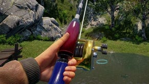
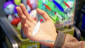
Another call back to the original games comes from the mini-games. You have the option to train in battle or work on your horse stance but there are other crazy pastimes to indulge in, like some turtle racing, or log-chopping, for example. Then, of course, there are the random conversations you can indulge in. The dialogue system works almost exactly as it did in the earlier games, so it feels very familiar. The dialogue itself feels just as awkward at times, which is a good or bad thing depending on your preference.
The demo is small in terms of real estate, but there are a surprising number of things to do and I'll be curious to see how this is extended going into the full game. For now, all the evidence points to a very Dreamcast-like game design... with one exception. The battle system seems to lack features (like throws) and generally feels somewhat more 'button mashy' but it still works well enough.
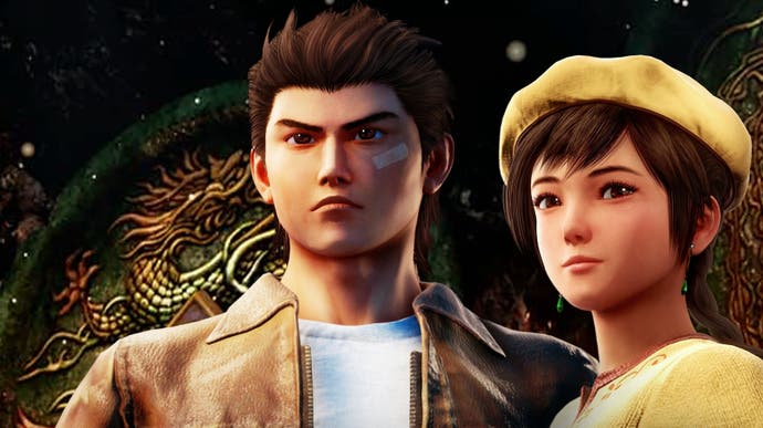
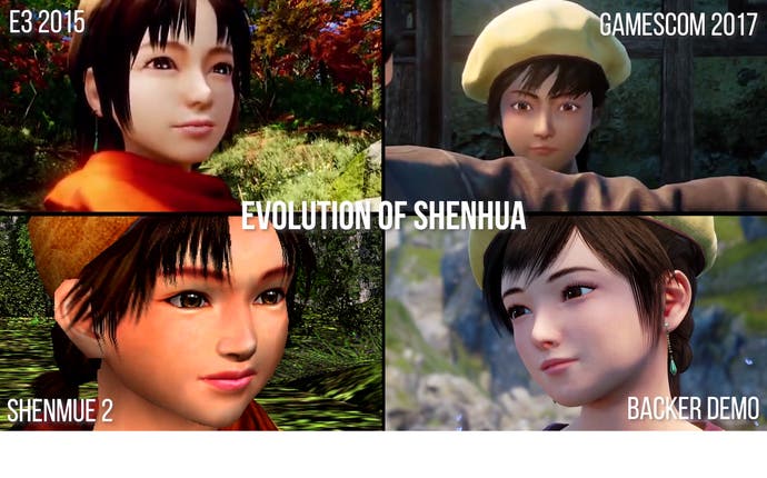
Graphically speaking, Shenmue 3 is fascinating in how it compares to the original titles. Character design has seemingly proven challenging for the team with various changes appearing in released media leading up to the arrival of this demo. In the end, I feel that the facial modelling is generally quite good but the stylised design almost clashes with the more realistic setting and more accurate lighting.
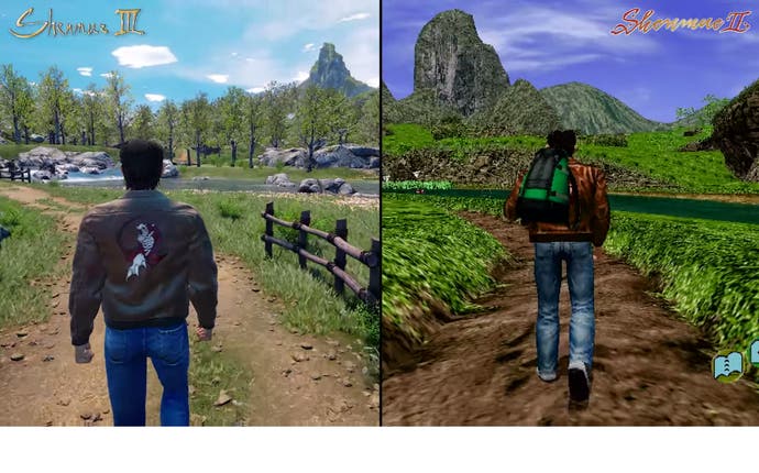
That said, I'm happy with the NPC quality as well - the original games had a very small polygon budget for these characters and, as a result, they're almost universally blocky. What we've seen in Shenmue 3 so far looks like a substantial upgrade. There's still the sense that some of the modelling is a little odd. For example, Ryo's physique does look somewhat strange in the new game. It's as if his coat has been inflated like a balloon resulting in a slightly awkward gait. You do get used to it eventually, but it is strange initially nonetheless.
Environment rendering, however, is impressive - lush with detail in both interior and exterior scenes, backed with beautiful lighting. Modern rendering staples slot into the pseudo-retro aesthetic just fine. For example, the Dreamcast existed in a time when games lacked significant foliage and the developers had to rely on visual tricks instead. These techniques were effective at the time, even if they appear quaint these days. By contrast, Shenmue 3 features complex tree and foliage rendering that simply wasn't possible back in the day.
It's also worth noting that the audio side of the equation is also shaping up nicely. The soundtrack is a great match, with at least one of the original composers working on this project. Meanwhile, unlike prior games, the audio compression for voicework is also of a very high quality - and for series veterans, it's great to hear Corey Marshall (voicing Ryo) picking up right where he left off.
Based on the quality of the demo sampler, I'm feeling good about Shenmue 3's prospects. There are certainly some rough edges here and there but from my perspective, the team has managed to capture the essence of the original games. The work of Yu Suzuki and his team may not please all Shenmue fans, but let's be honest - that's a nigh-on impossible task. I'm certainly pleased with what I've seen so far and can't wait to play the full game.
