Zelda: Link's Awakening tech analysis: a simply stunning Switch remake
Performance drops are noticeable - but the overall experience is unmissable.
First released in 1993, The Legend of Zelda: Link's Awakening is an iconic release for the original Game Boy. At a time when the Zelda formula was still being defined and with developers still finding their feet on portable hardware, Nintendo managed to deliver an ageless classic. The new Switch remake delivers brand new visuals, a stunning soundtrack, quality of life improvements and more refined gameplay - but the fact is that it's the same game at the core, mostly untouched. 26 years later, the magic of Link's Awakening is undiminished - it's an essential purchase.
Essential - but not quite perfect. There are some lingering technical issues that need resolving, but even as is, I was really impressed by the work delivered by developer Grezzo. And let's be clear here, despite its portable origins, this is very much a fully realised and fleshed out Zelda adventure: you get a large, detailed overworld with richly shaded tiles and sprites taking full advantage of the system, along with eight sizeable dungeons and a brilliant soundtrack.
Yes, the original release is a game of its time, with eight-bit limitations presenting in the form of limited animation, screen by screen scrolling and a lack of slopes but it stood as one of the most ambitious portable games ever made at time of release. Years later, a DX version was released for Game Boy Color with full compatibility for the original system. A new dungeon, the Color Dungeon, was included and accessible only on Game Boy Color hardware. This version stood as the definitive release for decades.
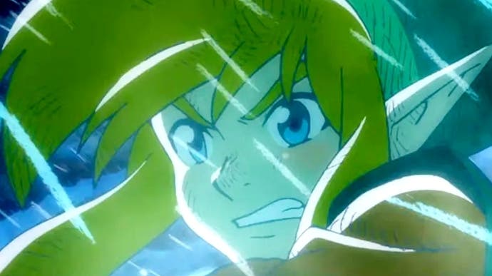
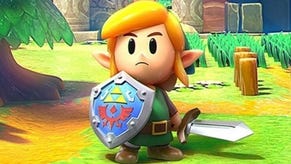
But now, we have something better. Link's Awakening on Switch makes the jump to fully 3D visuals presented from an overhead perspective, rendered with a wealth of modern visual techniques that lend the world a tilt-shifted, miniaturised appearance. It's a beautiful realisation of the original aesthetic that feels fresh yet authentic.
At the technical nuts and bolts level, Link's Awakening uses a dynamic resolution system. It's a smart choice but, in practice, it has little impact on the overall presentation. For all intents and purposes, there are two real resolution points where the game tends to settle: while docked, a dynamic resolution range between 720p to 1080p is in effect, but typically we're looking at the lower bounds used in the overworld, with 972p used for interiors. It's similar in portable mode where the game tends to run at 720p indoors while dropping to 576p in busier conditions. It may go lower than this, but I didn't find an example during testing.
Image quality is a tad soft but it works well enough and the overhead view minimizes distant pixel shimmering. So, in that sense, it works - it's certainly sharper than Yoshi's Crafted World. However, pixel counts are just a small part of the overall presentation - what's important here is the artistry and the way in which Grezzo is clearly devoted to the original release - its mood, its colouring, its overall ton - while still delivering a beautifully modern rendition.
With the Game Boy Color DX version as its inspiration, the strong contrast between colours is key to the visual design in Link's Awakening - the Game Boy Color was limited in terms of how many colours per title and per screen, after all. While the artists working on the remake had no such constraints, the game retains this signature approach to design.
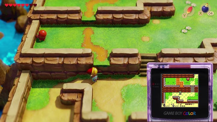
To make this work without producing repetitive patterns or overly harsh colour combinations, however, the development team focused on material types and the usage of shadow and light. Specular highlights play a big role in the visual design here and lend the scenery a more three-dimensional appearance. The material choices are also interesting - the world has a rather glossy appearance lending the game an almost toy-like aesthetic as if things were built from plastic. More diffuse materials, such as the sandy beach, do exist but the gloss is ramped up in many scenes. This isn't usually a desirable look in modern 3D games, but I feel it works well here due to the very specific visual design.
What I also like is the emphasis on authenticity. The new version sets out to prove that the original game was almost perfect in design terms and follows it very closely. Grezzo retains the tile-based design of the map - each fence post, bush or clump of grass occupies the same space within the map. Basically, the world shares the same structure as the original tile map which is key to its design, but the artists poured effort into minimising the tiled look through smart modelling and texturing.
An element I love about the remake is the increase in field of view. The camera is raised and tilted while the game's aspect ratio is now 16:9. I found that this gives you a better lie of the land, so to speak. When standing in different parts of the map, you can see more of the world around you, making it easier to fully understand the layout and position of objects. Screen-by-screen scrolling is gone, but Grezzo still has echoes of it in the new design with a delayed bounding box system in place. Link remains at the centre but as you continue walking in one direction, the camera slowly reveals more of the scene pushing Link further to the opposite side of the image. This always ensures that you have a wide view of the area in the direction of travel.
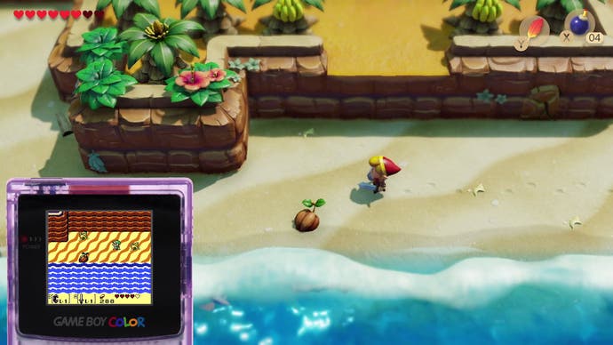
The camera work in general is something that works extremely well - dungeons are often broken up into individual screens, like on Game Boy, but larger areas now feature free scrolling like the overworld. This also applies to the strange side-scrolling segments that appear in many dungeons - these now scroll freely. The art is also faithfully translated - the off-model Goombas from the original with their weird little smirk are fully recreated on Switch.
Across the board, I feel that the presentation here is brilliant, but there are some aspects that don't feel quite right. One of the complaints with the presentation stems from character movement - the team decided to use stark, eight-way movement without transitional animation and this means that when you change direction, Link changes position immediately. This appears somewhat jarring at first but at the same time, it results in a more responsive game more in line with the original. That said, the lack of d-pad support is an issue and I hope this is addressed in the future.
Still, despite these minor issues, I feel the quality of life improvements and other new features help make up for any shortcomings. Take item management, for example. In the original, every item is unique and can be assigned to a button. This makes sense when you only have two action buttons but annoyingly, the Game Boy version requires you to constantly switch items around. If you want to pick-up a heavy item, you need to equip the bracelet. Want to jump? You need to equip the feather. As you progress, you'll need to swap items around on a constant basis.
In the remake, however, things work differently. Certain items, such as the feather or bombs, can be equipped to the X or Y button but other actions are permanently mapped. The shield is always on the right trigger, running is always on the left, your sword is always assigned to the B button and items like the power bracelet are always active, so hoisting large objects once you've obtained it is never an issue.
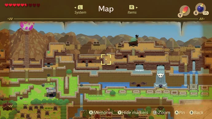
In addition, the map system has been refined - the resolution of the map image itself is now high enough that you can comfortably make out every area in the game from this view. Then there's the soundtrack - the original tunes are retained but new tracks were created for the game with more of an orchestral flair and I absolutely love them.
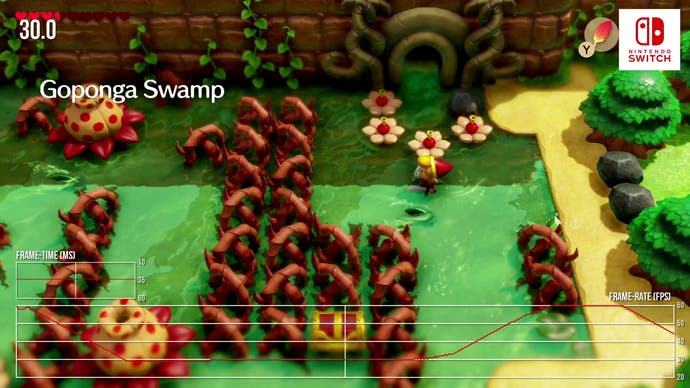
I deeply enjoyed playing this game: it looks beautiful, sounds great and plays well but yes, there are some performance problems. The good news is that we're looking at a night and day improvement over the E3 build, where outdoor areas mostly ran at just 30fps. Frame-rates are much, much higher and more consistent generally, but the improvement doesn't extend to the perfect 60fps you'd typically associate with a Nintendo release. Let's be clear here - the vast majority of the game does play out at 60fps, but perhaps because of that, when you do encounter frame-rate issues, they feel much more pronounced - especially as you can witness sporadic drops from 60fps down to 30fps.
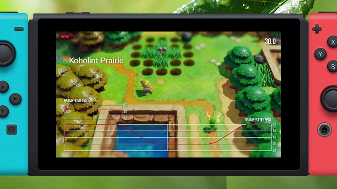
So what's going on? Well, while there are a few typical situations where slowdown can occur and most of it seems to happen when transitioning between areas. That means both entering and exiting buildings, caves and dungeons or just moving from, say, the village to the plains causes issues. My suspicion is that we're looking at a CPU bottleneck here while streaming in new data including, perhaps, the lighting data. That would explain why these slowdowns occur then disappear within the same scene no matter what it happening on screen.
In addition, there are plenty of minor skips and hiccups along the way as well so when you take everything together, it just doesn't feel as fluid as a Nintendo game should be - and that's a real shame. It's most noticeable while exploring the overworld but it can occur anywhere, which is why it's a problem. I was still able to have a great time despite this but it is distracting and I hope it can be solved. Portable performance is much the same - the frame-rate drops in the same manner as it does in docked mode and is equally distracting.
As CPU clocks are identical between between mobile and docked play, and with DRS to even the load on the GPU, this does look like a CPU limitation. So that's a big problem, I'd say - it's not game breaking but it's definitely unexpected, especial, so for a Nintendo game. But what I do want to emphasise is that looking back at the whole game, there's no doubt at all that this is an excellent remake. Frame-rate issues and minor gripes aside, this release is supremely well designed and highly enjoyable to play. For me, this game feels more constrained than a typical, modern adventure - but I mean that in a good way.
So many games these days are built around the idea of everything being bigger - you can go to that mountain, you can traverse that massive desert for 20 minutes. Link's Awakening is much smaller by comparison, everything is more compact - but it's still a dense, interesting and fun world to explore and re-explore once you have the items and weapons required to progress. And then there's the superbly designed dungeons and puzzles too - it's brilliant stuff.
It's been years since I last played Link's Awakening but this project gave me the chance to replay the game - not just on Switch but in its original Game Boy formats as well - and it's been a blast. For me, the Game Boy was the very first console that I purchased with my own money. I know it sounds silly now but this game means a lot to me, having spent countless hours exploring every inch of the island searching for every last secret in the game.
I'll be honest here - I initially approached this remake with both excitement and trepidation. You always wonder if something you enjoyed so much in the past still holds up in the present - especially when re-interpreted for new technology - but I'm happy to say that I felt the magic of Link's Awakening once again, not just when playing on Switch but on original hardware too.
Whether you grew up playing this game like I did or whether this is your first journey to Koholint Island, Zelda: Link's Awakening is a journey well worth taking however you choose to play it. Whether as a retro experience or via the spruced-up remake, this is still an unmissable experience - and over a quarter-century after its initial release, recommendations don't get much stronger than that.
