The Outer Worlds on Switch: an ambitious effort, but the compromises cut too deep
Pared back to the bare bones.
As a platform, the Switch has managed to delight us on numerous occasions with ports that seemingly outstrip the capabilities of the console - to the point where maybe we were starting to believe that anything was possible. Can developer Virtuos pull off another miracle port with The Outer Worlds? "Off the back of our work on Starlink: Battle for Atlas, Dark Souls: Remastered, The Outer Worlds and the coming XCOM2, we now have no doubt that Switch adaptations can be worked for games on any of the current generation of console," senior product Zhang Chengwei told Nintendo Life. After checking out The Outer Worlds, we'll have to agree to disagree.
Technically, what the studio is saying is correct. When you load up The Outer Worlds for Switch, you are getting the complete game package in content terms. Indeed, Virtuos itself has a good track record in delivering decent Switch ports, but there's the sense that the team bit off more than they could chew with this one - there are genuine problems that simply can't be ignored. We're used to accepting a certain degree of compromise on these conversions, the pay-off generally being the ability to play triple-A titles on a portable device. However, The Outer Worlds is the game where the cumulative downgrades are just too impactful to the experience, and where the promise of mobile play doesn't deliver enough to make the exercise worthwhile.
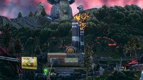
On the positive side, there's little doubt that what has been accomplished here is impressive in terms of ambition - Virtuos has managed to transplant a high-end Unreal Engine 4 RPG to a portable machine. That it works at all is a remarkable feat, but once you dig in, the problems start to stack up. It kicks off with image quality. On the surface, the pixel-count numbers are reasonable but not quite in line with promises from the publisher. Based on pre-launch PR, The Outer Worlds was mooted as running at 1080p while docked and 720p in mobile mode. However, our findings suggest a typical 720p resolution while connected to your screen, with dynamic resolution dropping this lower on occasion. Meanwhile, 540p is typical and 384p seems to be the low point for portable play. There is none of the clarity and crispness you'd expect from the native resolution metrics suggested pre-launch, that's for sure.
Our pixel count results aren't uncommon on Switch ports from current-gen console titles, but it's certainly problematic in this case - especially in portable mode where it becomes difficult in some places to visually process what's going on. Part of the problem concerns the temporal anti-aliasing solution: The Outer Worlds features large open worlds with a vast draw distance and your eyes are naturally drawn to this, yet the lower resolution ensures that it's difficult to see any distant detail. What detail that is resolved is massively reduced from the current-gen versions of the game: Model complexity, texture resolution and overall density is radically altered.
Textures are the first thing you'll notice - the original PBR (physically-based rendering) materials from the initial release are gorgeous, with a lot of micro-detail evident throughout, lending the game a pseudo-realistic appearance despite the fantasy setting. The Switch port attempts to retain the basic look but asset resolution is dropped to work within the limitations of the Switch's reduced memory allocation. I think this is a case where the sheer volume and resolution of the assets is just beyond the scope of what can be done on this platform, certainly without a profound revamp. And this is an issue - the assets weren't designed artistically to be viewed in this way and as a result, the game winds up looking uglier than comparable games on Xbox 360 and PlayStation 3.
Walk up to any surface and it's clear that much is lost in terms of texture detail, and this is something that you'll see throughout the game. It technically works but it's just not attractive, and I suspect that solving this problem would require a more significant change in the art design to accommodate for the lower spec hardware. Simply reducing asset quality this much doesn't work well visually. The same is often true of the underlying geometry as well, which is radically simplified. From rock formations to pieces of your ship, to buildings and beyond, it feels as if the entire game is effectively using low or lowest quality level of detail settings compared to the other consoles.
These issues apply to character models as well, which see reductions in both geometry and texture detail. This results in more angular bodies with weird clipping artefacts in some cases and generally 'smeary' looking outfits. This isn't as egregious a change as the environment detail, but it's still noticeable. Meanwhile, the lack of depth of field on character close-ups produces ugly, awkward results in the background - especially when texture assets fail to load.
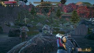
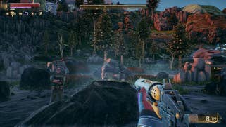
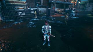
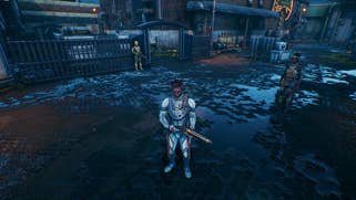

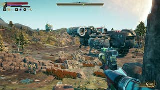
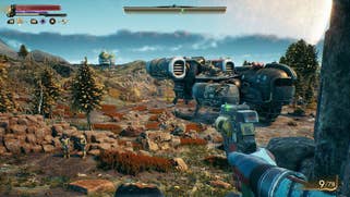
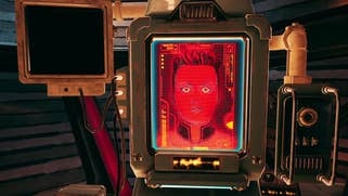
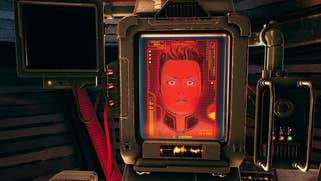
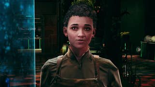
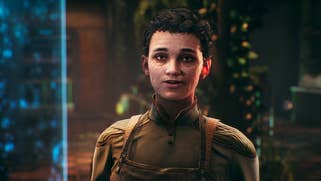
This brings us to our next problem - pop-in. It's severe and it's constant. Textures and models alike are often slow to pop into existence to the point where it can take upwards of 10 seconds or more at points. When in its low detail state, it almost feels like you're running around Google Earth in Street View with partially loaded map detail. I also noticed instances where the entire game would pause to load, where the streaming system seemingly can't keep up.
Here's the thing, though. When you first boot up the game, these issues aren't too severe. At a cursory glance, initial play seems OK. However, the longer you play, the more you dig in, the worse it gets. It reminds me of the classic Rimlag issue on the PlayStation 3 version of Skyrim - the difference being it manifests a lot sooner. To ensure that this wasn't a hardware issue on my part, I tested the game on all four of my Switch consoles - using both SD card and internal NAND (which is typically a touch faster). The game behaved identically in all cases, so I'd expect the same experience elsewhere.
So, when it comes to detail and loading, the game has issues but there are plenty of other changes as well. While objects that are rendered often exhibit less detail than the original console versions, many objects are skipped altogether. This is a fair trade-off, but it's noticeable, and perhaps cuts too deep. Rocks, trees and grass will often be skipped on Switch while fields of foliage can now appear as empty, blurry textured spaces. The Outer Worlds' attractive skyboxes are also downgraded too: volumetric clouds were absent throughout my experience. Ambient occlusion is all but removed, leading to less shadowing in the nooks and crannies across the world, delivering a much flatter presentation.
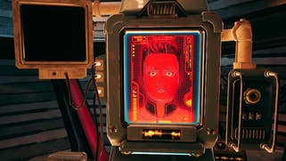
That said, not everything has been stripped back to the bare bones. When speaking with characters, the developers place a light behind the head of the character to help light the scene, showcasing the sub-surface scattering used on the characters, allowing light to penetrate skin realistically. This effect remains on Switch, which is surprising, though it doesn't look quite as nice due to lower texture detail. Screen-space reflections and shadows also make their way across to Switch too.
Really though, the point is that sacrifices had to be made and made they have been - in abundance. The overall visual quality takes a significant hit compared to every other version of the game to the point where a great-looking game is simply not attractive in this state. Our recommendation here? Watch the video above. If you're OK with the cuts, perhaps the game will work for you. After all, the underlying game is still fantastic and it is playable. For me, the atmosphere of the world is critical to enjoying a game like this so the myriad downgrades really hurt the overall experience, but maybe it'll be different for you.
However, on top of the cuts, you do need to be prepared for dodgy performance. The game targets 30 frames per second, just like the other console versions, and while performance seems solid enough at first, the more you play, the more it falls apart. Basic traversal seems generally fine, as long as there isn't anything overly complex on-screen. However, combat - and especially combat in detailed environments - sees frame-rates drop to the low 20s or even to sub-20fps levels. This leads to basic playability problems and a general level of dissatisfaction with the experience. Only in the game's 'dungeon' style environments does performance hold up. Portable mode plays out much the same as docked, perhaps suggesting that The Outer Worlds has profound CPU-based limitations.
I could more easily accept the compromised visuals if the frame-rate had been steady but unfortunately, that's not the case, meaning that the port not only looks poor, but feels bad to play too and overall, the compromises cut too deeply into the quality of the experience. So, to address the Virtuos quote at the beginning of this piece: yes, this port exists - the studio responsible for its conversion did its job. The problem is that when you say you can port everything, there needs to be some kind of qualifier on the quality of the final experience. In this case, it's not good enough. It's The Outer Worlds on Switch but it's nowhere near the quality of any other version and in this case, portability isn't enough to save the day. I recognise the huge challenges facing the team on this one and I respect the effort put it into it, but the end result doesn't hold up and I can't recommend it.
