Brilliantly tactile, Game of Thrones: Tale of Crows feels like a new genre of game-as-interface
Novel.
The setup is this: you're playing through the history of the Night's Watch, set thousands of years before the events of George R.R. Martin's books and HBO's TV show, around the era of Bran the Builder, original Papa Stark. First, you choose a character to be Lord Commander for a while - this changes, with new Commanders and new stories for them generated indefinitely - then you make a few decisions, you send a few people on some errands, and then you wait. Just chill out for a bit. Watch little symbols slowly burrow their way into the wild forests of the north and gaze at the lovely artwork or just go for a walk, read an article, do something else entirely.
This is the essence of proper idle games, but in Game of Thrones: Tale of Crows that essence feels distilled to its purest, and there's a kind of clarity of design that comes from it. What you're doing, as with most idlers like it, is sort of inconsequential: some more minor, barely registering decisions might arise, and you might decide to send some builders to I don't know, build something, with a waft of your begloved Lord Commander's hand, and then word comes back by raven from a scouting mission and there's another minor thing to do - then something more major, a crumb of lore or sprinkle of typically cloak-and-dagger intrigue to break it up - and back to the break. But the way you do it is sublime. Tale of Crows' magic is its interface.

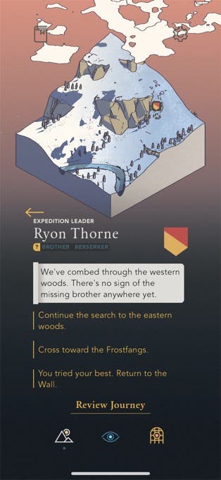
In fact the game really just is interface. It's laid out in a triptych of isometric settings: Castle Black, with its perpetually moving elevator to the top of the wall; the wild forests to the north, where the banners of your captains slowly worm across a map in that sparse and scratchy hand-drawn style; and the watch, which lets you scan the landscape along the length of the wall itself, the occasional prompt appearing now and then for something you might investigate, in time, if the mood finds you. Everything is tactile, a little knuckle rap buzz of haptic feedback when you make a decision, itself made by holding down on a choice, as opposed to just tapping it - which makes you feel a little like your parents with their first smartphone, pushing and prodding with their index finger at everything on the screen a little too hard and for a little too long, but is also just wonderfully satisfying. Yes, I am doubling the guard tonight. Each little thumb hold and feedback wobble a sort of resounding slap on the table. Done.
The other half of Tale of Crows' gameplay is made from atmosphere - gameplay conjured out of mere vibe - and it, too, is wonderful. Paperwork by way of messenger and crow, poetic, passive voice dilemmas in just a handful of snowy little dioramas, in front of starry nights, pelting rain, passionfruit sunrise. Everything so desperately pinchable, everything in ever-so-slight, barely noticeable motion, when you look closely at a particular cube of land - a sort of living, wedding cake slice of world. I love it, but I also love stepping away from it - I look forward to the little message, the north will wait, that tells me to leave the game for a bit as much as I do a new conversation or crow, the lack of pressure to crack on, to maximise or economise or spend, leaving the game to morph, almost, into a wellness app, a kind of pocket ice bath: you rest in Tale of Crows and then you rest from it.
Jake Hollands, who heads up the tiny team behind the game at That Silly Studio, emphasised how much of that really is the point. "I really am trying to make healthy games that are good for you - and good for life, and not getting hopelessly addicted," he told me. It's about "how these games fit into a person's life," with the lofty principles coming first and the Game of Thrones license just happening to line up. Everything just "translated really well into the universe," he said, "with the ravens, and exploring the north, and all the things like that."

The "healthiness" is important - very important - and was undoubtedly helped by the model of Apple Arcade, too. But what feels even more pertinent, really, is the thought Holland and his team have put into the way the game feels. It's a sensory, tactile thing, borne from a conscious effort to think about the platform and how it works. "I kind of considered how I use my phone every day," Holland said, "to read my email or to text people, things like that, and wanted to look at how games can work in that same way, so you can just hop in once every couple of hours, spend a couple minutes doing some kind of micromanagement or something, and then pop back out - and then know that whatever you've done is somewhere in the world doing something and it's gonna come back soon, so you take a little break - I wanted to kind of turn that into a game. That's what it's meant to do: it takes the normal way of using your phone and turns it into a game." It works, and while it might come from using your phone in the way you always have, it feels remarkably new.


