COP: The Recruit
Not much.
Driving is obviously crucial, and it's horrible. The car handling is either leaden or erratic, thankfully conducted entirely on the face buttons, but never giving you a sense of being in control. Switching over to GTA Chinatown Wars for a quick comparison is so telling. There the cars have weight, they feel attached to the roads. Here they float or thud irritatingly. Eventually you learn to compensate for its skittish nature, but being able to just about manage a driving section isn't something worth celebrating. Unfortunately the game doesn't appear to have any awareness of this, revelling in driving themes. Characters boast of how amazing their awful cars are, with much of the story focused on racing. It's rarely a pleasure.
Once you're on foot (controlled with the d-pad) there's a mediocre camera to deal with. You're in the middle of the screen, viewed from behind, but mysteriously the view is always a few moments behind your character's turning. You can manually rotate the camera, but for some reason this causes Miles to stop dead in his tracks.
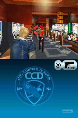
Pull a gun out and the controls do improve slightly. Now zooming in over your guy's shoulder it shares interaction between the d-pad and the touchscreen, Metroid Prime-style, letting you strafe and charge much more easily. Except you can't adjust the sensitivity, meaning you're stuck in the slow turns that force you to scratch frantically at the screen to spin toward an enemy behind you. Despite there being no consequence for running around with your gun out in public (nor indeed shooting at the invulnerable NPCs - sigh) this mode doesn't offer a satisfactory alternative to the regular on-foot mode, since it doesn't let you sprint.

The shooting is far more laughable. Enemies take an arbitrary number of bullets, not reacting to being hit until you reach that secret number when, in a nostalgic moment, they flash a couple of times and vanish. (Similarly cars you smash into on the roads will proffer an orange explosion and then wink out of existence.) Some will fall with one bullet, others literally dozens.
Then there's so many other ways it goes out of its way to be annoying. Dialogue, tutorial tips, mission info, narration, all ticker onto the screen but only remain for a few seconds and then disappear without your pressing anything, gone forever. Dare to look away and you'll miss confusing explanations. To find out the location of your next mission you must open your silly C3 computer which occupies the bottom screen, select and read the mission details in one screen, then go to another where you scan through a list of dozens of locations, double-tap on the correct one, which then opens the larger map screen and sets it as a location, and then go back to the GPS screen to head there.
It's not exactly GTA's system, despite attempting to ape it. It also has this idea that there's some sort of police-work-like thrill in entering special codes. Need to call an ambulance? Go through the same long list of locations to find the nearest hospital, pick its code, then go to the code entering page and laboriously write it on the screen. Rather than, you know, clicking on it?
