Tech Analysis: The Order: 1886
Digital Foundry dissects PS4's most impressive visual showcase.
Famous for pushing the boundaries of Sony's PSP platform, The Order: 1886 demonstrates what developer Ready at Dawn is truly capable of from a technological standpoint when working with more powerful, modern hardware. While interactivity, run-time and replayability have dominated the headlines this week, what shouldn't be forgotten is just how much of a technological leap the game represents. Indeed, by focusing on such a tight, focused experience, Ready at Dawn is given the freedom to push visual boundaries in new and exciting ways, without the issues faced by larger open world experiences.
The Order: 1886 is based on an in-house tile-based forward renderer - or forward+ as it's often designated - designed from the ground up for PlayStation 4 with full multi-threading and physically-based rendering as key foundation points. It's a highly flexible renderer with easy to use support for multiple BRDFs (bidirectional reflectance distribution functions) allowing for a highly flexible materials pipeline. This approach allows developers to quickly create and place objects within the game world that look and behave realistically. Physically-based rendering has become increasingly popular in modern engines but there's still an art to its implementation - and it's here where Ready at Dawn has really delivered.
Clean image quality is a key factor in delivering a strong filmic look and The Order: 1886 turns in a solid performance here. One of the first controversies surrounding the game is its 2.40:1 aspect ratio which renders fewer pixels while maintaining 1:1 pixel mapping on native 1080p displays. With its accompanying, rather heavy post-processing pipeline, there are compelling arguments that this approach doesn't produce results substantially better than sub-native titles like Ryse at 900p but, in motion, finer details are visible and fewer subpixel artefacts interfere with the image. The image is predominately soft, but more subtle sharp details still manage to shine through, creating a nice contrast. It may not be to everyone's taste but The Order: 1886 features some of the best image quality you'll find on console at the moment.
Ready at Dawn has previously noted that it is using 4x multi-sampling anti-aliasing (MSAA) which, at 1920x800, is more demanding on the GPU than a full HD framebuffer using post-process AA. We've expressed some doubts as to whether the final game is using MSAA and having combed through our captures of the full game, the jury's still out. While extremely clean for the most part, we noticed some particularly fine details exhibiting minor sub-pixel breakup that seems uncharacteristic of MSAA. Certain thin objects, such as guard rails on the zeppelin stage, also showcase artefacts potentially related to the temporal component of their AA solution. It's difficult to argue with the results, however.
Texture filtering is another key point in delivering excellent image quality and it is here that The Order: 1886 stumbles. Despite the realistic depiction of materials, surfaces are sometimes tarnished by noticeable blurring at oblique angles. Secondary objects, such as wooden tables or push carts, showcase these artefacts quite noticeably and detract from game's sense of realism. On the other hand, primary surfaces, such as the ground textures, are not distractingly blurred from the normal gameplay angle in most cases. As a result, it never feels as if this issue overwhelms the otherwise beautifully detailed scenery but there are a number of occasions where it does stand out. It's possible that a selective implementation has been utilised here with primary surfaces receiving greater attention but, regardless, the overall result is a little lacklustre compared to the rest of the presentation.
What really dazzles the senses are the ways in which The Order: 1886 combines excellent art direction with beautifully executed rendering techniques. 19th century London is a perfect location for capturing the beauty of natural materials and the game's underlying technology certainly does them justice. The earthy stone-work and lack of high intensity artificial lighting helps create a soft, natural environment - it's clear that the team has paid close attention to scene composition. Indeed, there are a great number of individual elements that work in tandem to produce these exceptional results.
Materials and digital actors
The game's renderer is built from the ground up with physically-based rendering in mind and the systems developed for creating assets have produced some of the most realistic results we've experienced to date. The materials pipeline is based on a series of templates and masks where the developer is able to define the base properties of a material, such as stone or wood, and apply various composite layers to give the surface a more unique appearance. For example, the copper skillets or water faucets in the kitchen sequence have upwards of seven or eight individual layers on top of the base material that define its surface properties. The pipeline for asset creation and placement is highly streamlined and efficient with the ability to quickly modify an object's appearance to fit within any given scenario.
Surface textures, such as cobblestone streets or brick walls, function similarly with multiple layers used to create varied, detailed surfaces from a simple base material - layering mortar, mud, and water on top of a basic brick texture allows for greater surface variation. When combined with the process in which light and shadow interact with these materials we're left with a hefty sense of realism. With 19th Century London focused so heavily on these natural elements we were very impressed with how well realised the materials are.
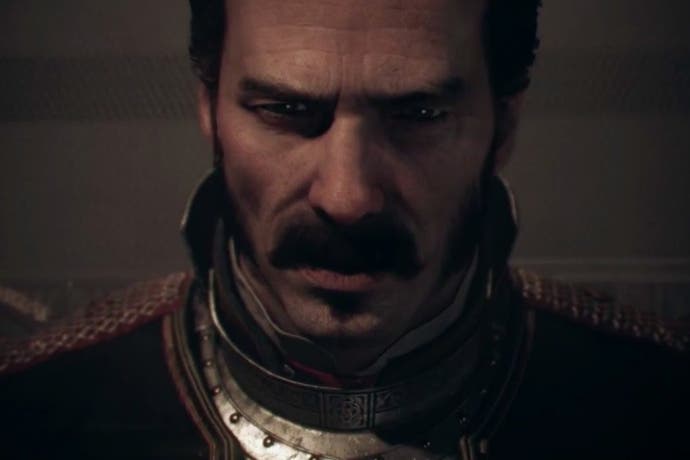
The Order: 1886 is focused heavily on cinematic sequences and, as such, nailing the appearance of the game's digital actors is absolutely critical in realising this goal. The models themselves make excellent use of subsurface scattering with highly realistic shaders used to create a natural skin tone. The game calculates how light is diffused across the character's skin based on the depth values of the pores as well as the angle of light, allowing for some startlingly realistic close-ups. Hair utilises a number of shaders designed to interact realistically with light and wetness values. For example, hair that has been bathed in water reflects light differently than that which is dry - something The Order: 1886 takes into account. Unlike the rest of the model, hair is not physically accurate nor does it make use of a complex simulation a la TressFX but the results are still effective and cohesive. Taken together with the excellent SSS implementation, characters' natural features sit very realistically within the world and help create believable virtual actors.
Equally important is the simulation of cloth applied generously to both the main characters' uniforms and many objects contained within the world itself. The Order: 1886 uses a distribution-based BRDF in order to simulate the specular highlights that appear along the oblique edges of cloth materials as light passes through the fibres. This allows for a more realistic interaction with light sources throughout the world, giving cloth an appropriately soft appearance. The team went so far as to build their own scanning system in order to obtain high-resolution samples of period accurate cloth while building their materials library.
Physics
The appearance of such materials is further enhanced by a cloth physics system that produces believable results as players move quickly through the game world. Galahad's coat seems to rest as a separate entity on his character model and is impacted both by movement and the wind simulation. Flags, curtains, and other cloth materials also behave differently depending on selected environmental conditions. There's even a nice shader used along the exterior of a zeppelin that gives the impression of the player's feet leaving a real impression as you rappel down the side. The attention to detail in terms of materials quality and physics interactions delivers effective, natural-looking results.
That said, the physics simulation isn't as robust as we were first lead to believe - as revealed during a presentation at Gamescom 2013, Ready at Dawn targeted a more complex soft body and destruction physics engine at some point, which promised fully destructible environments and materials. The example of a crate splintering realistically as a nearby grenade explodes, for instance, does not appear within the final game. Even more superficial surface damage, as seen in Gears of War 3 or Killzone 2, is absent leaving most of the game's structures completely intact following a large fire-fight.
The physics interactions that are present still feel suitably impressive and add to the games immersion, at least. Aside from the cloth simulation, we also note that foliage reacts to gunfire and collision with surprising accuracy. The game world is mostly urban of course, but various potted plants and trees throughout the game react realistically to these forces. Bottles, cookware, and other decorative objects also react to gun-fire and collision in a way that adds depth to certain sequences. As we slam up against the front side of a bar, for instance, the row of bottles on top shudders and wobbles as the character's weight presses up against the surface. The surrounding gun-fire then proceeds to decimate the individual bottles in a satisfying way, reminiscent of Metal Gear Solid 2's Tanker chapter. Such an old example may seem out of place but the reality is that few games take care to simulate these behaviours this well, and there are moments of brilliance here that really raise the bar on immersion. Overall, while the lack of deformation and environmental destruction is a tad disappointing the end results here are still satisfying and lead to some interesting scenarios.
Light and shadow
Lighting plays a massive role, not just in the depiction of realistic materials but also in the depth of each scene. The game uses a mixture of pre-computed lightmaps for static geometry paired with what appears to be an implementation of spherical harmonics for dynamic elements. For games without a dynamic time of day, it's clear that there are still great advantages to a baked lighting solution as seen here and in other games like Assassin's Creed Unity. The results are startlingly realistic at times.
Contact shadows are handled using both a pre-calculated directional hemispherical basis solution for both static geometry and rigid bodies while field AO capsules are used for more dynamic elements. The method is similar to the approach seen in Naughty Dog's The Last of Us and allows for softer, more realistic shadows in low light conditions as opposed to unsightly silhouettes we often see with alternative SSAO solutions. Reflection occlusion is also taken into account, used to eliminate unnatural reflection points along shiny surfaces, such as the underside of a weapon.
Shadows are also cast by dynamic light sources and can be cast by multiple simultaneous lights. This is particularly noticeable during an underground section where the player and their partner are both given torch lamps, which can be independently shone around the environment. This results in beautiful crisscrossing shadows across the entire scene, on top of shadows projected by dimmer world lights such as candles and electric bulbs.
Volumetric lighting and fog are both used liberally to establish mood. We're uncertain how the team has tackled this problem but its implementation resembles the ray marching solution implemented in Lords of the Fallen. The Order: 1886 does not resort to a screen-space effect for light shafts that remain visible even when the source is occluded from view. This allows for more dramatic, larger volumetric effects that more realistically fill the environment.
This is complemented by reflections used liberally throughout many scenes in the game. The Order: 1886 uses image-based lighting to create cube-maps, which are calculated and assigned to relevant objects with the appropriate lighting characteristics, leading to some very realistic looking reflections at a glance. Screens-space reflections are avoided completely and would not have been well suited to reflections in the game's many glass surfaces, it's safe to say. The effect breaks down a bit under close analysis, but during gameplay, it's very convincing.
Post-processing and animation
Another important visual element to the game's design is its heavy focus on post-processing effects such as motion blur and depth of field. These are used liberally throughout and operate at relatively high precision. Earlier builds of the game appeared to operate at a lower precision but the final product delivers a very high quality implementation. Even shallow depth of field mixed with high intensity lights fails to produce the typical artefacts associated with low resolution depth of field. Motion blur also plays a huge role in the presentation, with a strong effect applied to all objects in the scene as well as camera movement. These two elements produce an image that some may find overly soft but it looks excellent in motion and combined with the selected AA method, all but eliminates sub-pixel shimmering and artefacts. Aside from high quality super sampling, this feels like the next best way to attack temporal artefacts and definitely goes a long way towards giving the game an almost pre-rendered look.
Animation is another high point that deserves a mention. The way Galahad interacts with the game's scenery and situations is rather impressive, creating a very smooth looking experience. Take cover behind a wall and Galahad engages in natural and grounded animations, backed up by the excellent motion blur implementation. The Order: 1886 looks superb in still shots, but it's in a different league in motion.
As noted in our performance analysis, what's impressive about Ready at Dawn's work is that all of this advanced rendering work does not come at the expense of performance. The Order: 1886 manages to maintain a near-perfect 30fps throughout the experience with only the smallest of dips. The consistency in the quality of the effects work is matched by the frame-rate, further enhancing the title's filmic credentials.
We can't finish without mentioning the exceptionally quick loading times. For a game with such detailed assets, the method used for streaming and loading new data is remarkably quick. From the chapter selection screen, we're looking at eight to ten seconds from button press to gameplay. More impressively, quitting the game and selecting to continue from the main menu reduces this further to just three or four seconds. As the game is entirely real-time and unable to hide loading behind video clips, this is an important point and something that should be commended.
The Order: 1886 - the Digital Foundry verdict
Coming from humble handheld origins, Ready at Dawn's first foray onto more powerful console hardware is a curious mixture of extremes. What can't be ignored are the fundamental flaws in the pacing, the over-reliance on cut-scenes and a basic lack of content. And yet, at the same time, from a technical perspective what we're looking at here is a game with an extreme level of care, attention - and accomplishment. The narrow approach to game design has at least allowed the team to unleash perhaps the most impressive example of real-time graphics on a console to date. The quality of the lighting and materials really helps build a beautifully realistic, almost tangible world for the player to experience.
The presentation also calls to mind our thoughts on Ryse when it was released in late 2013 - with a different approach to rendering that is more film-like in nature. The Order: 1886 moves away from the sharp edges one typically associates with real-time visuals by focusing more on a soft, temporally stabile display. It's clear that pushing visuals of this quality on a console with super-sampling would be impossible leading us to believe that this is the best possible choice given the situation. In our first look at Ryse, we quoted a Hollywood CG professional on image quality and, reading it again in 2015, it feels completely relevant to the approach Ready at Dawn has taken:
"We do what is essentially MSAA. Then we do a lens distortion that makes the image incredibly soft (amongst other blooms/blurs/etc). Softness/noise/grain is part of film and something we often embrace. Jaggies we avoid like the plague and thus we anti-alias the crap out of our images," said Pixar's Chris Horne. "In the end it's still the same conclusion: games oversample vs film. I've always thought that film res was more than enough res. I don't know how you will get gamers to embrace a film aesthetic, but it shouldn't be impossible."
It seems pretty clear that Ready at Dawn has emulated this filmic approach and in that sense, we feel they've really nailed it. The upscaling artefacts in Ryse, minimal as they were, are eliminated here and the selected anti-aliasing and post-processing techniques really succeed in delivering the type of image one might find when examining a still frame on a Blu-ray film.
We're extremely eager to see where this approach goes and hope to discover new examples in the future. It's interesting to note Tim Moss and Christer Ericson are credited as directors of technology on this project - while Mr Ericson has moved on to work for Activision, Tim Moss remains with Sony Santa Monica Studio. Perhaps this connection will filter back into future Santa Monica projects or even other Sony internal titles in development? Either way, what's clear is that current-gen hardware is opening the door to new rendering paradigms that have the scope to revolutionise the way that games are presented - and in future, hopefully we'll see the same kind of innovative spirit applied to the gameplay too.
