Doom's 'impossible' Switch port analysed in depth
A remarkable technical achievement, but are the cutbacks too much?
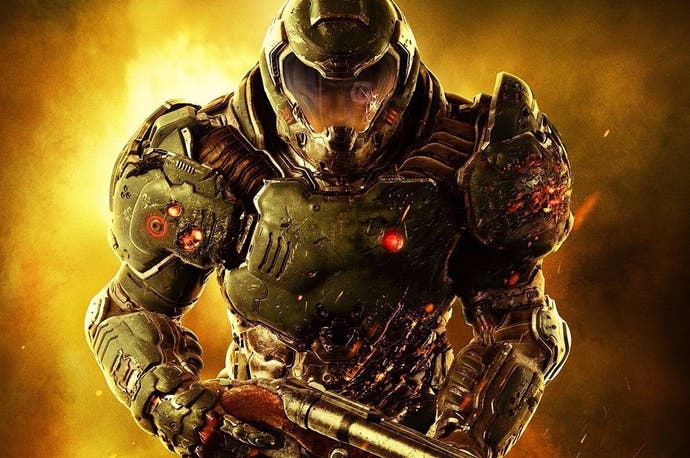
One of the most celebrated FPS franchise giants has finally returned to the House of Mario. Going back more than two decades, Nintendo hardware has always had a unique relationship with the series. Doom for the Super NES, sluggish though it may be, was a technical showpiece for Nintendo's 16-bit machine while the Game Boy Advance conversion felt like holding the future in your hands. There are echoes of this in Bethesda's Switch port of the Doom 2016 reboot. This is mobile technology pushed kicking and screaming to its absolute limits.
Against all odds, developer Panic Button has succeeded in bringing the entirety of the Doom experience to Nintendo's latest machine and it mostly works, though the brutal nature of many of the compromises may well be too much for series purists. In assessing this port, a little perspective is required. The fact it exists at all is somewhat miraculous, and we can't go in expecting a pixel-for-pixel match with the PS4 and Xbox One versions.
Let's start with the good news. This port is content complete, and every level from the original release is present and correct. There was concern that stages would need to be divided up to fit into memory but that's not the case at all. Encounters play out just as they did on the more powerful console platforms, and every stage is presented as a complete experience. Every enemy, weapon and feature is present and accounted for and that's an important thing to consider. After all, Doom 3 for the original Xbox, a comparable port in terms of accomplishment, featured levels which were reduced in size and complexity to work within the constraints of the system. That's not the case here.
Of course, while the game may be content complete, it doesn't take long for the cutbacks, compromises and sacrifices to make themselves known. Unsurprisingly, image quality has taken a massive hit. Contrary to pre-release expectations, Doom does not run at 720p on the Switch - though the resolution may scale to those heights in less complex scenes. As with the original, the Switch version makes use of an adaptive resolution and the typical results observed during gameplay tend to hover around the 600p mark when docked.
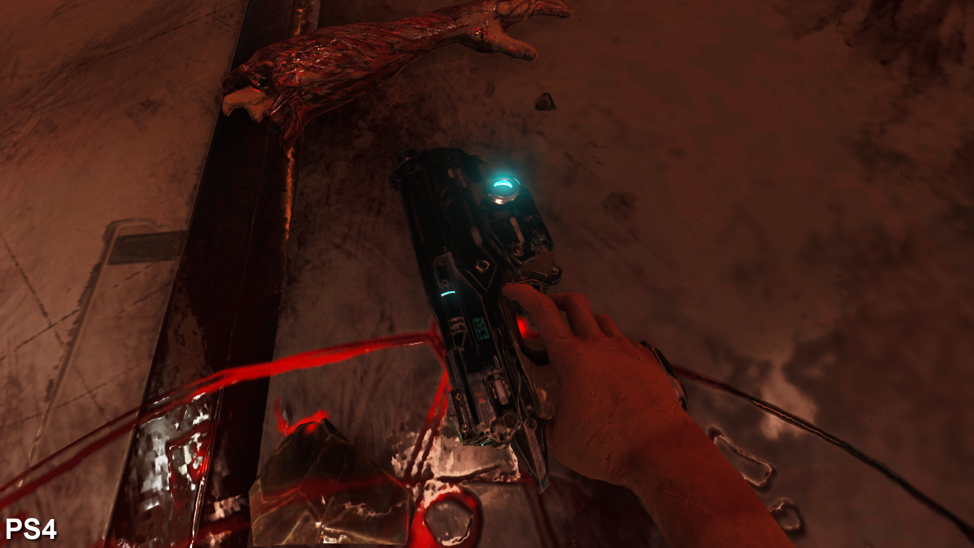
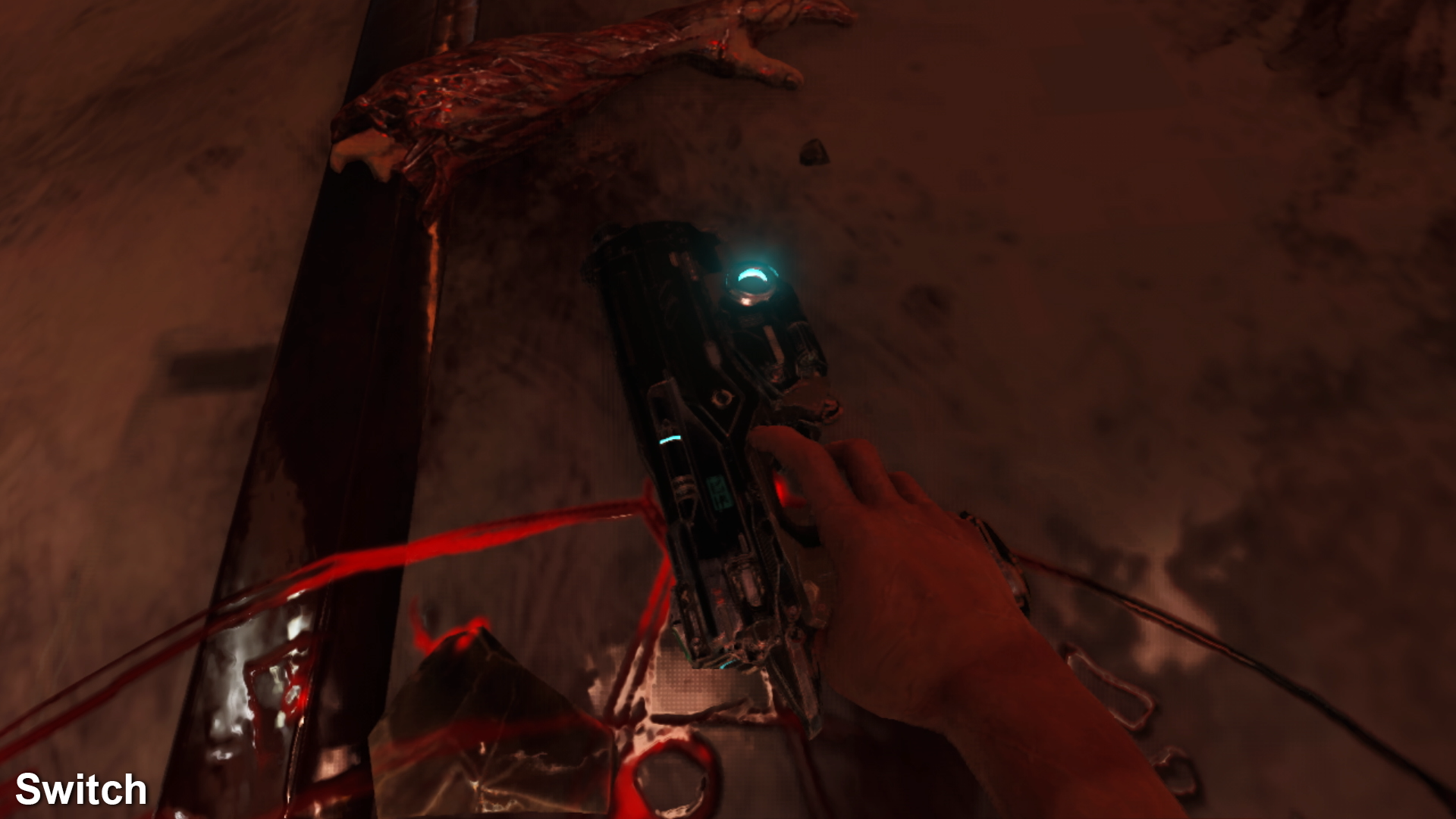
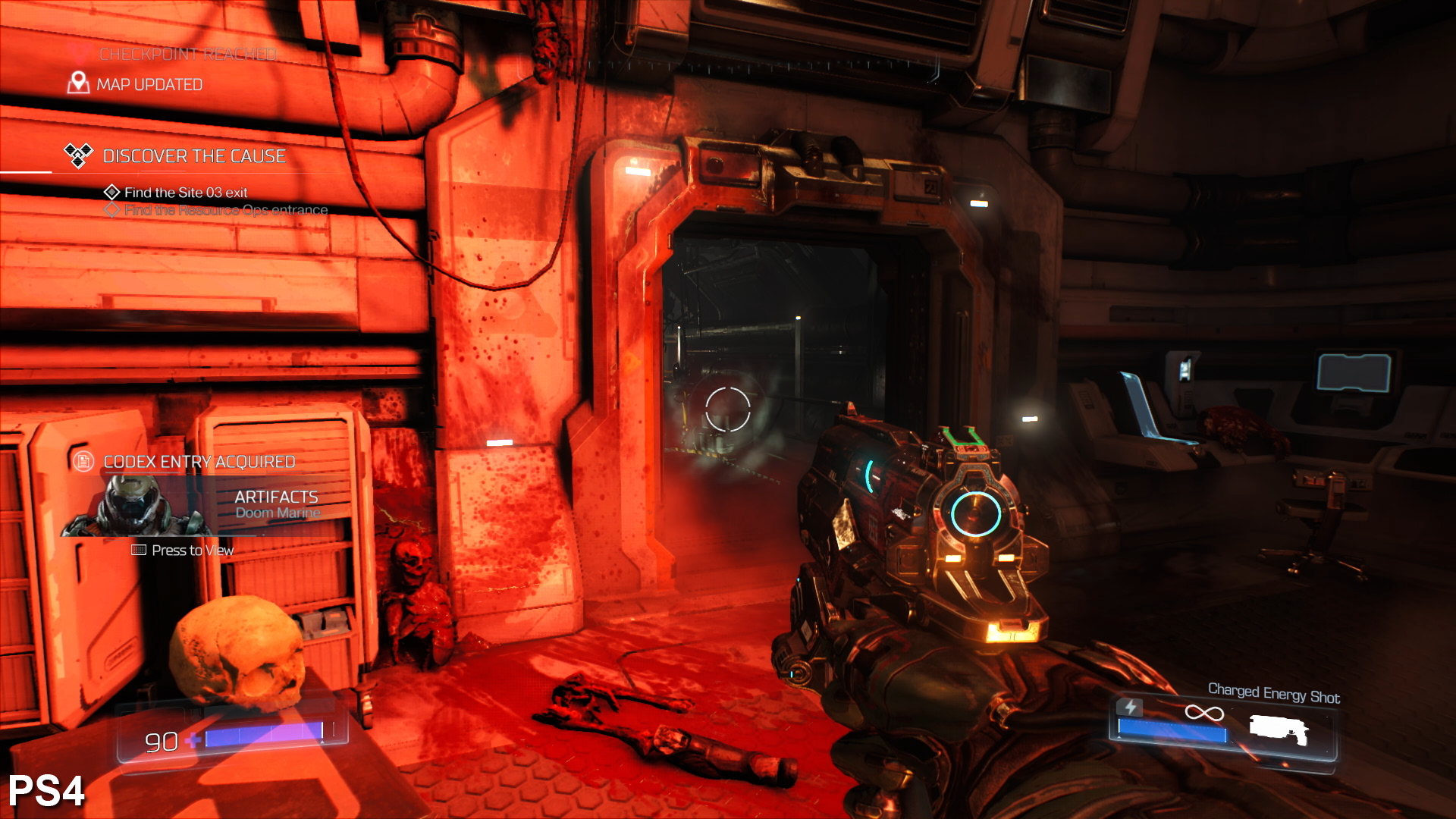
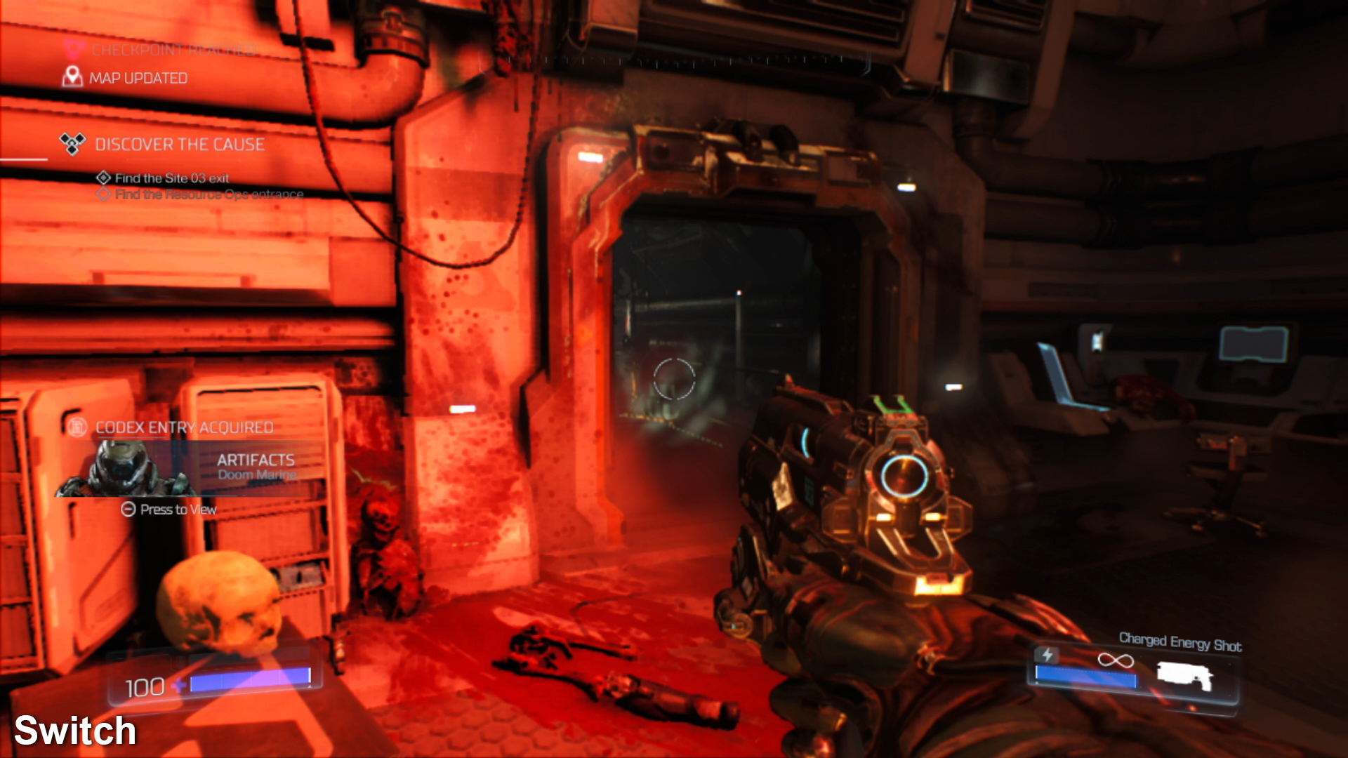
It's difficult to get an exact figure due to the super-aggressive temporal anti-aliasing but we've commonly observed results in the 1088x612 range while connected to an HDTV. In select scenes, the resolution does jump up, but typically only when nothing is happening. Beyond that, the depth of field buffer and alpha effects all appear to be rendered at quarter resolution, which can give a 360p-like presentation in some respects. This is topped off with Doom's excellent temporal aliasing, only in this case, the resolution is so low that the TAA ultimately results in a very blurry-looking game. The presentation holds up on the Switch's six-inch tablet-style screen - though resolution drops to around 576p here - but blow it up on your HDTV and it starts to break down into a soupy mess.
Regardless of how you play it though, Doom still features the excellent motion blur present in all other versions of the game and if you don't like it, it can even be disabled from the menu. We found the effect to work well, and to our eyes, it's invaluable in hiding the port's much lower frame-rate. The Switch version also offers the option to disable chromatic aberration if you choose, but unlike the other versions, you cannot increase the field of view - it's locked at 90 degrees on Switch.
OK, so the resolution is low and the image quality can be very blurry, but if you can get past that, it still manages to resemble the other console versions of the game. Based on the testing we did with a low-spec PC downclocked to give ballpark Switch GPU and CPU performance, it's amazing that the game manages to reach any resolution beyond 540p. This is a case where seemingly unimpressive results are seemingly miraculous when taking the relatively meagre capabilities of the hardware into consideration.
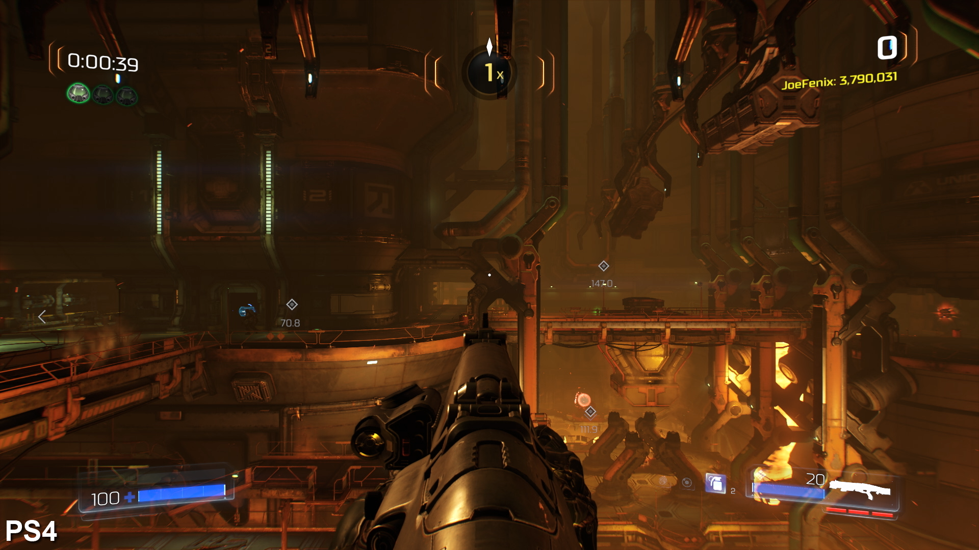
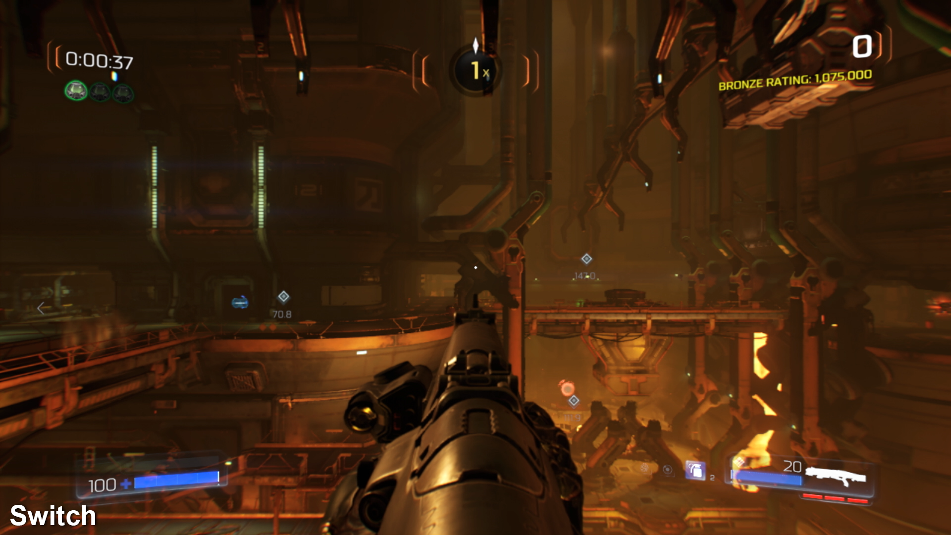
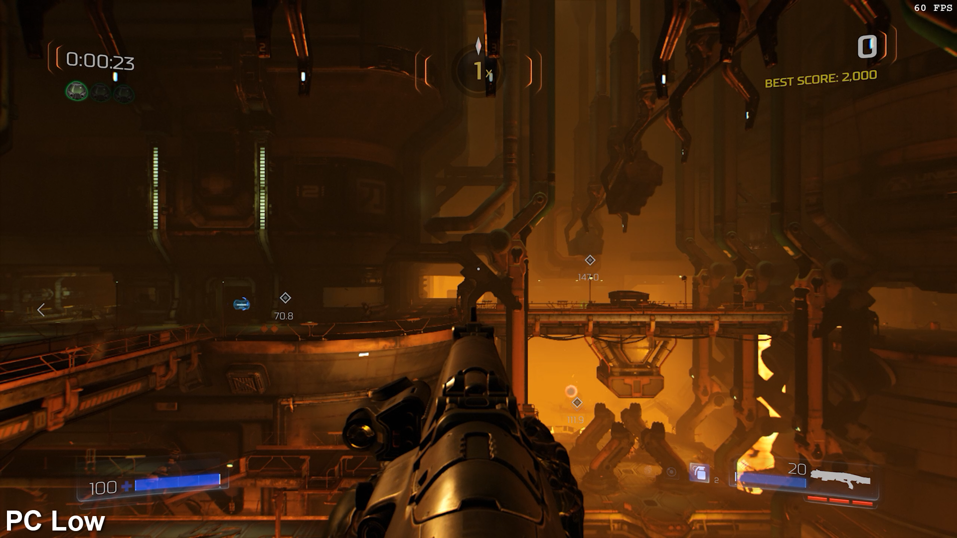
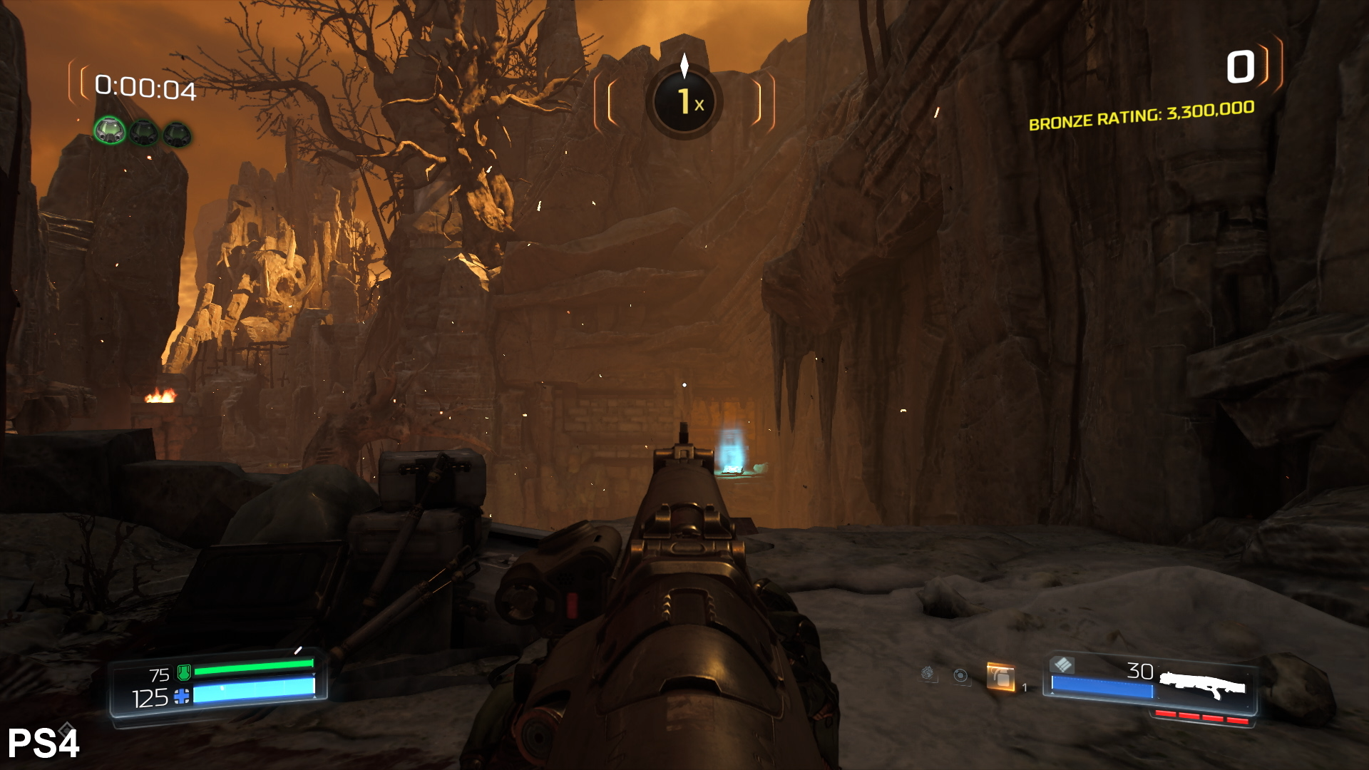
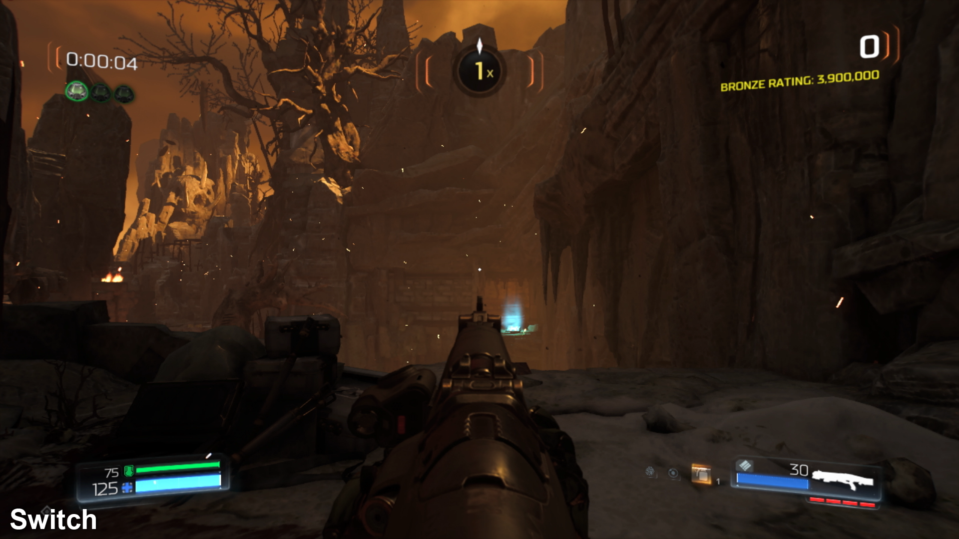
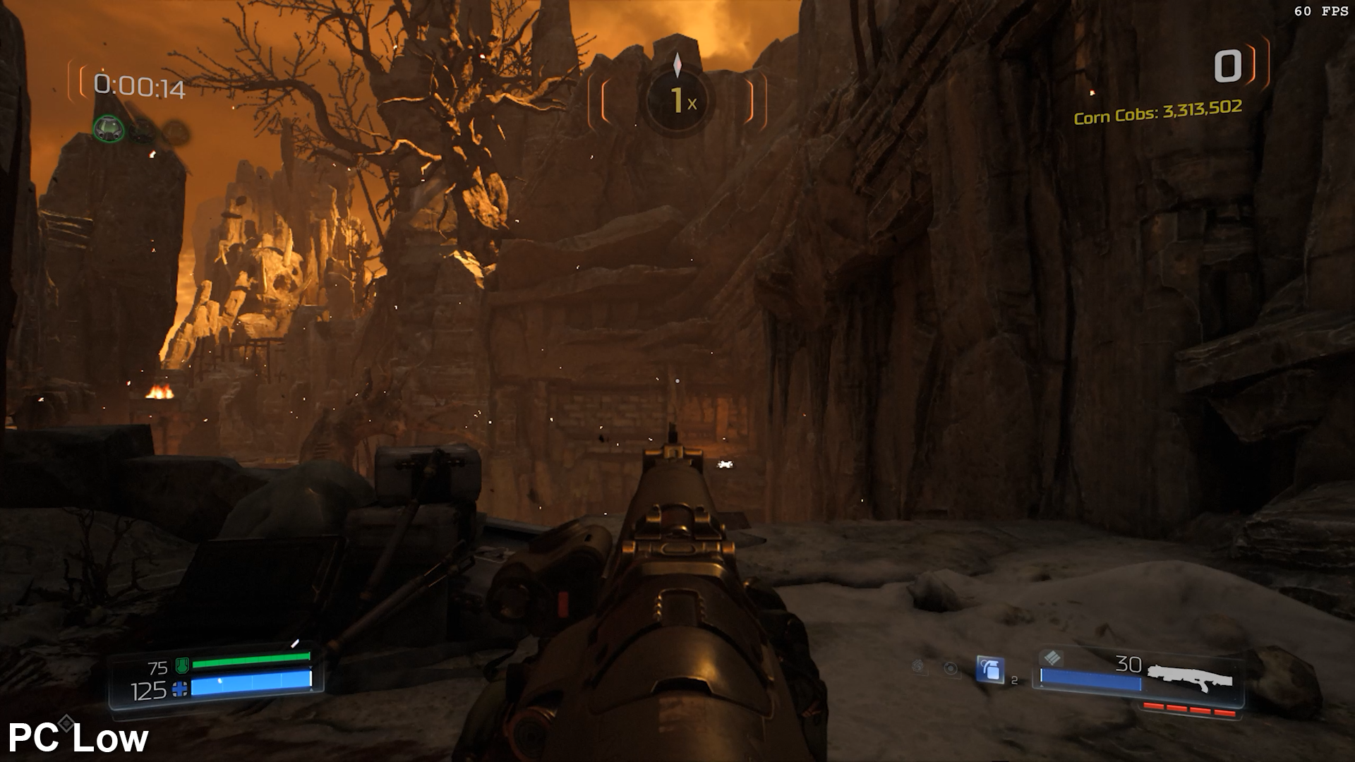
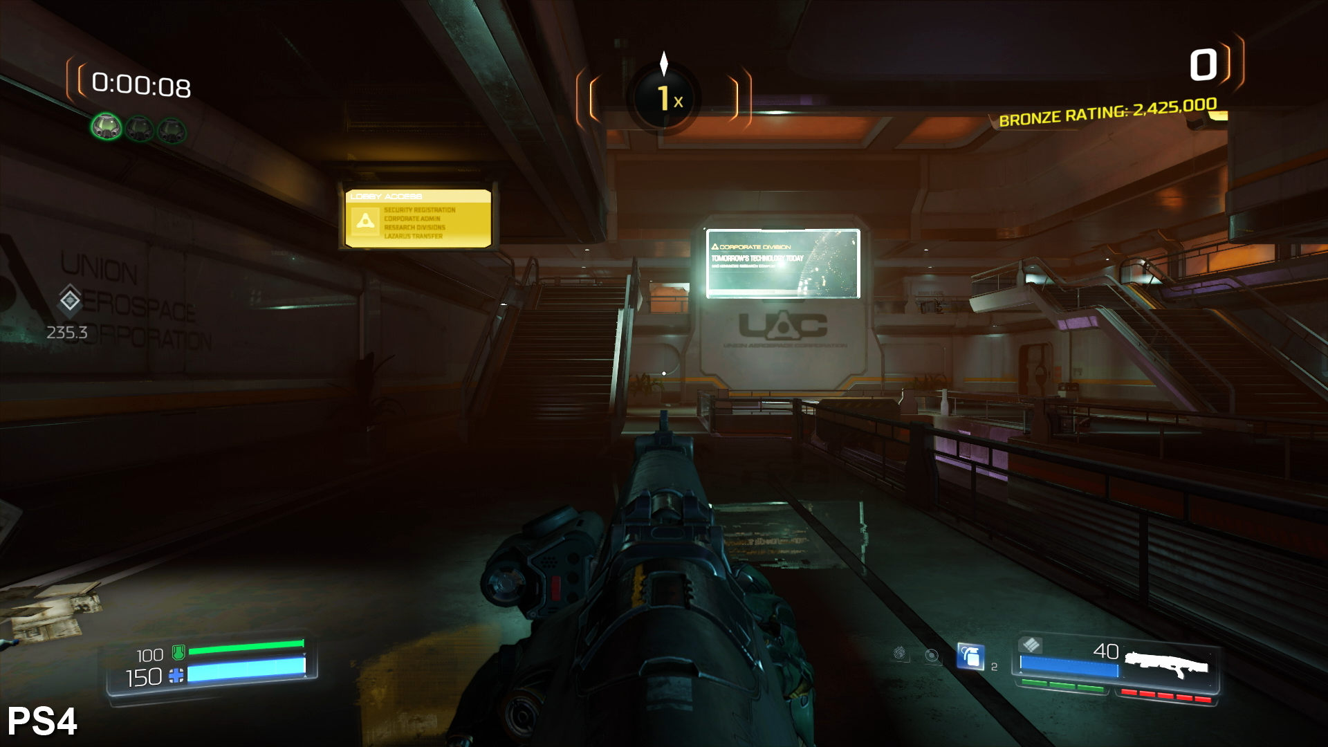
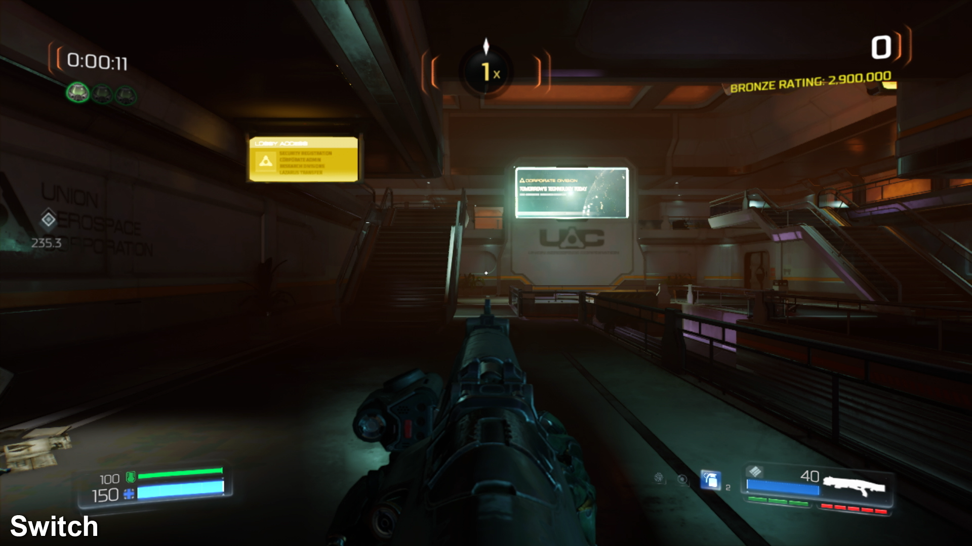
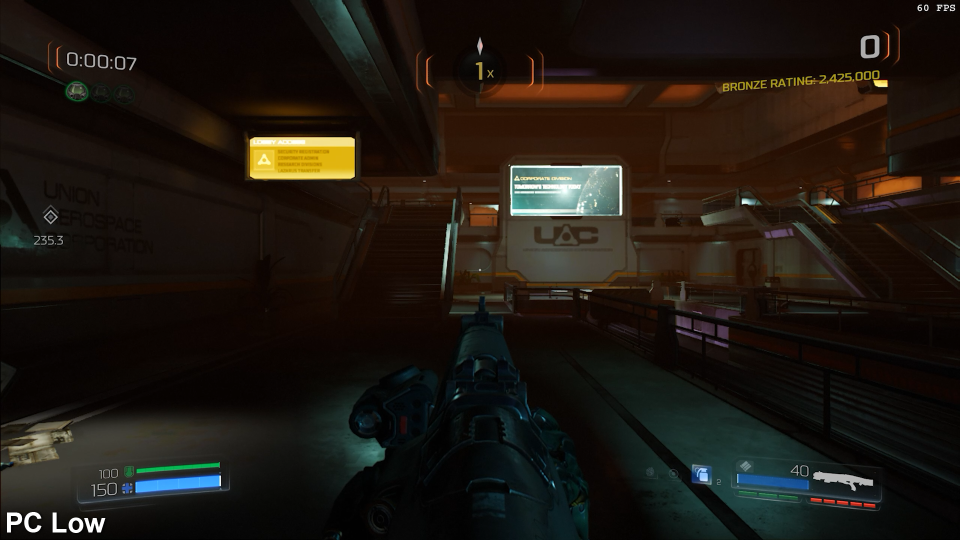
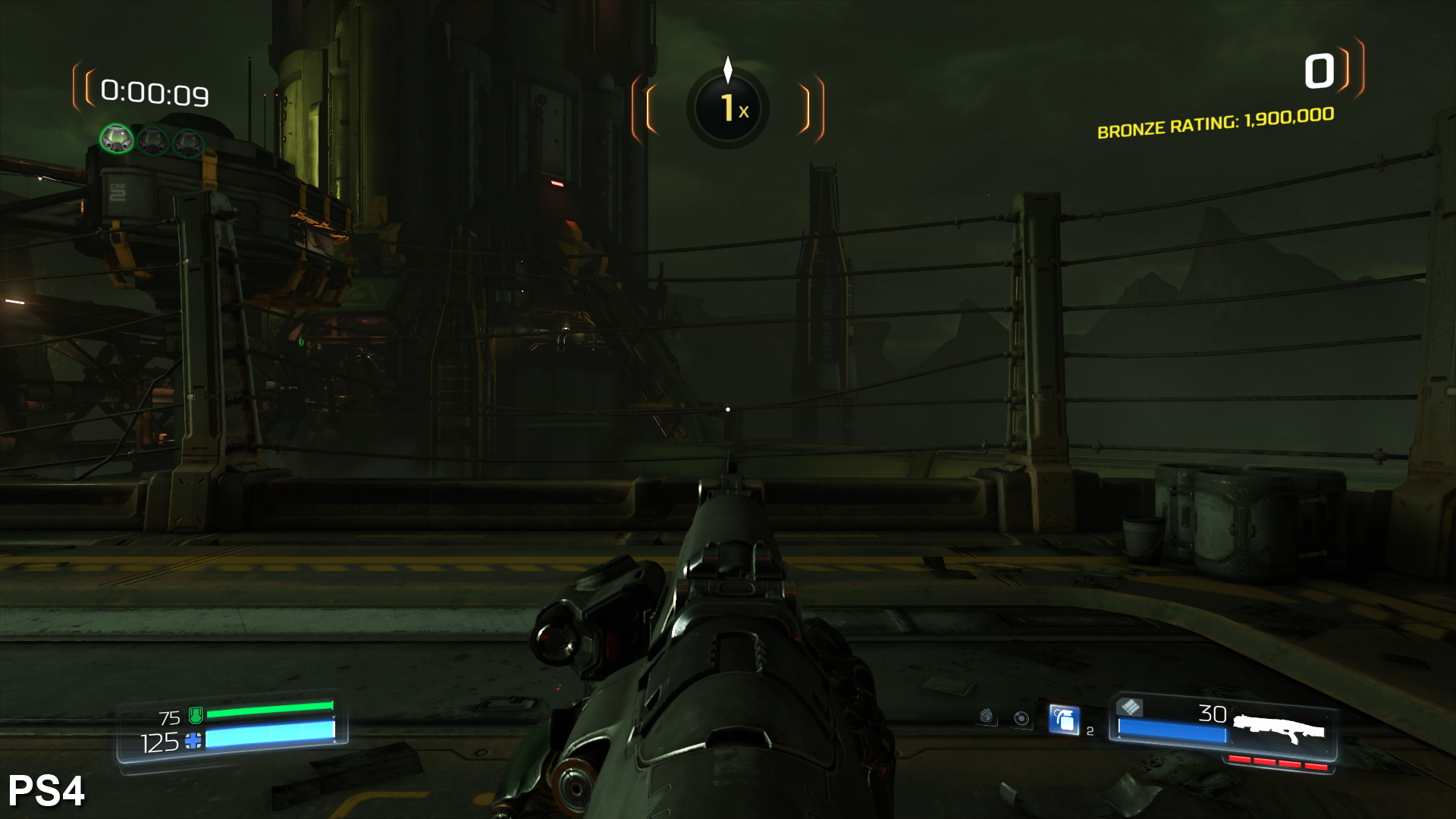
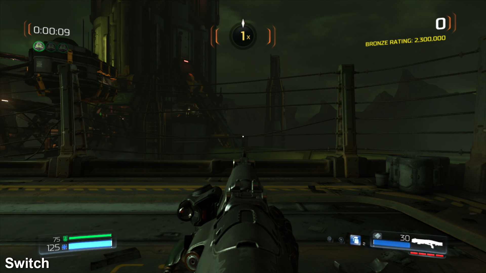
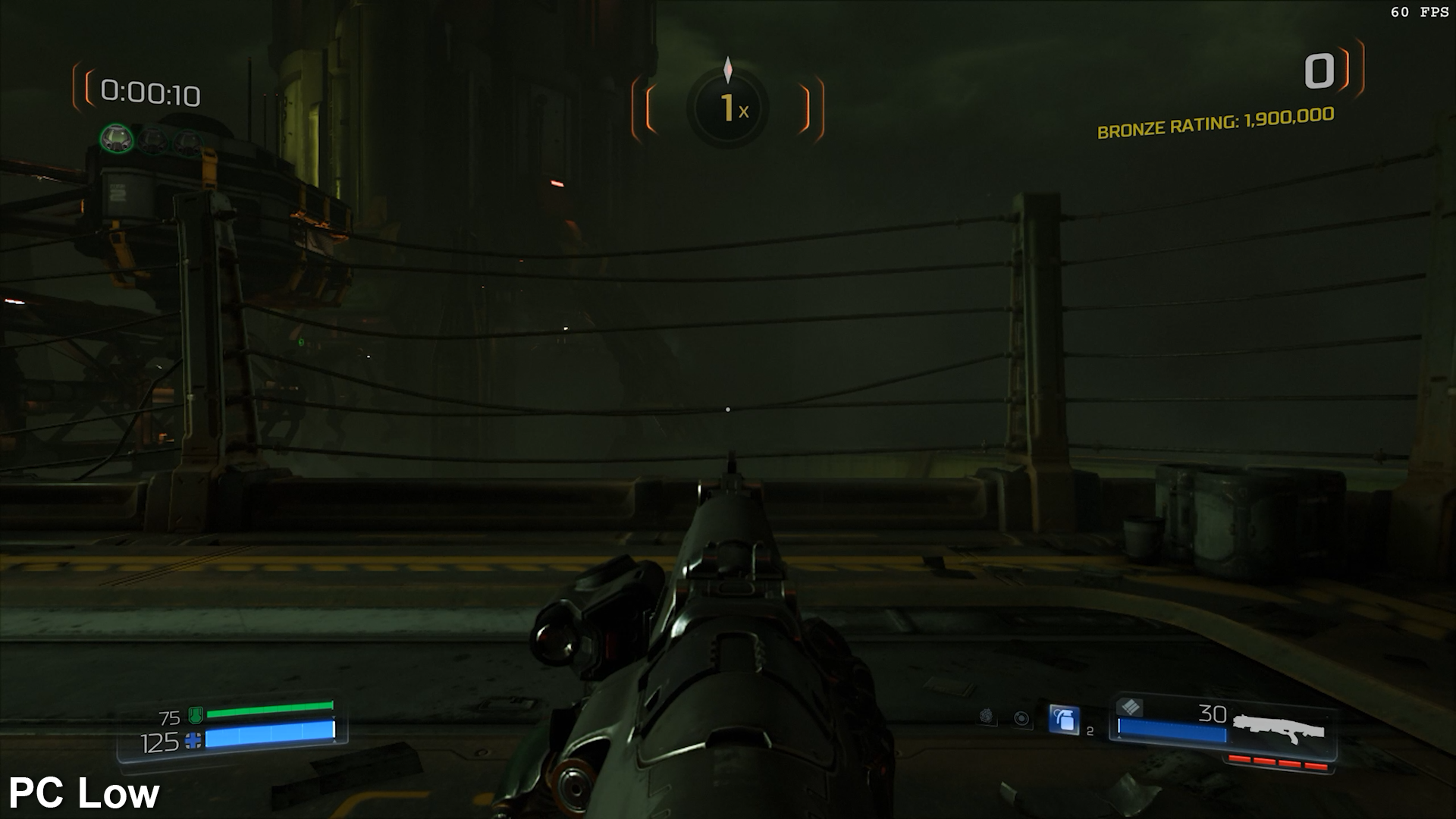
Our earlier PC testing was carried out at low settings at 540p, but while the Switch game ups the resolution, quality settings are actually lower than they can be pushed on the original version. It's comparable at a glance, but texture quality is pared back further and those low-res alpha and depth of field effects clearly stick out. What's more surprising here is how good Doom looks even when running at lower than low settings - no matter how much you hack and slash at game's visual make-up, it's still recognisably Doom.
It's even more remarkable bearing in mind that it's not just the texture quality that gets cut down. Lights are pulled further in on Switch, for example. On PS4 and Xbox One, this setting was already reduced but on Switch, large areas are all but devoid of these lights. Screen-space reflections are also absent on Switch. These received a lot of use previously, so the loss is noticeable. There is also a lot of visible banding on Switch. Colour gradients and the lower quality ambient occlusion really stick out as a result. At times, on a large TV, it looks as if you're playing an interactive compressed video rather than a real-time game. This isn't helped by a HUD and menu system that isn't rendered at native resolution. Perhaps the memory just wasn't there to pull off a 1080p HUD but the results aren't great either way.
Still, despite the drop in quality across the board, Doom for the Switch still manages to look attractive, which says a lot about the excellent art direction in the original game. With its low resolution though, this is a case where everything looks better when playing in portable mode. In fact, Doom might just be the single-most impressive looking mobile first-person shooter ever made. Killzone Mercenary on the Vita has finally met its match.
Having established that Doom Switch sacrifices much but still manages to hold up, we need to address a further cutback that has a more profound impact on how well the game plays: frame-rate. We correctly pegged a 30fps performance level during the preview phase, compared to the 60fps target of the original. Again, considering the hardware, this makes perfect sense and it's difficult to fault this choice.
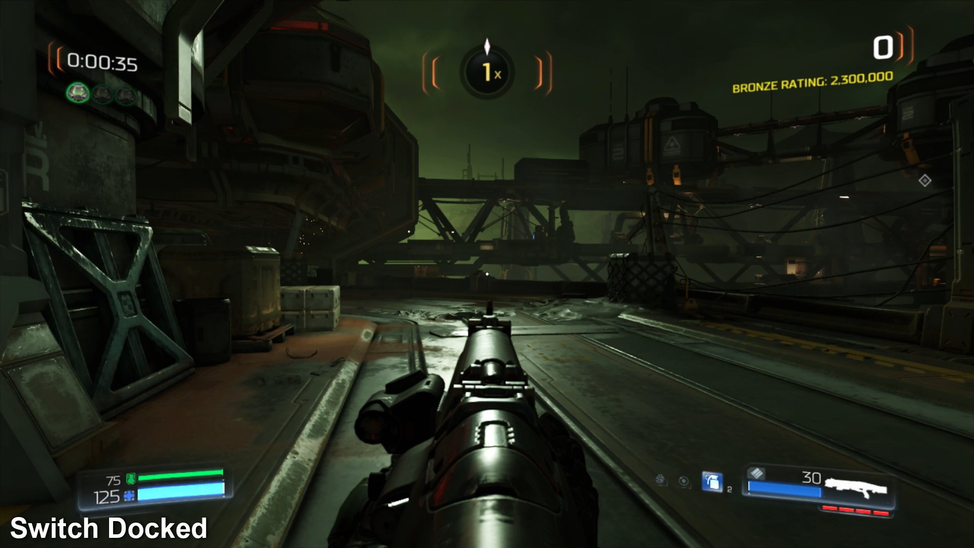

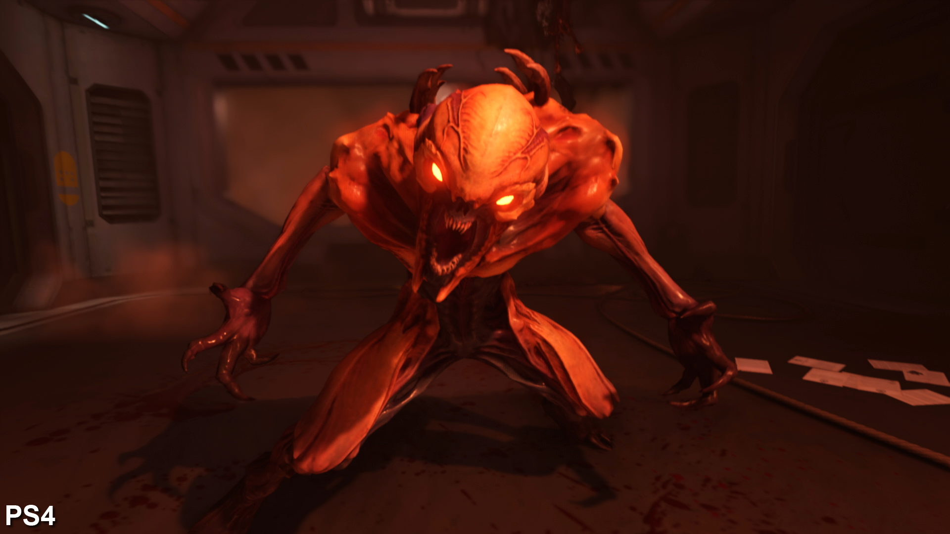
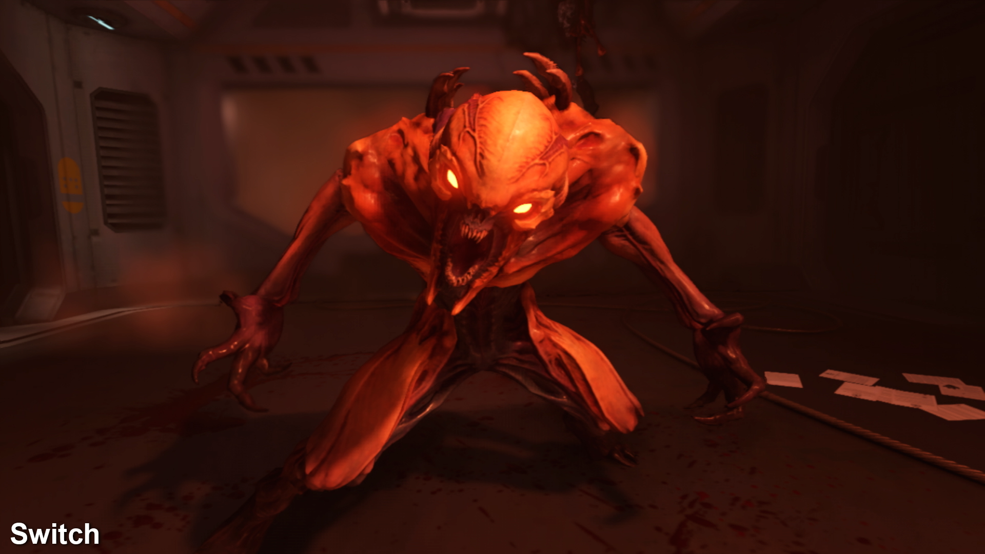
And if Doom delivered a rock solid 30 frames per second on Switch, it would be difficult to complain - but unfortunately this is not the case. There are basically two issues to address and the first one could potentially be corrected with a patch. Bad frame-pacing essentially makes the game look jerkier than it should, delivering new frames at 16ms, 33ms and 50ms intervals when running at 30fps. Correctly implemented frame-pacing would lock this to a locked 33ms per-frame persistence, giving a more solid, consistent experience.
Fortunately, this is something we've seen addressed and fixed in many games over the years and we're hopeful that developer Panic Button can correct the issue with a patch going forward. The other issue, however, is less likely to be corrected - genuine drops in performance. During any major fire fight, performance starts to drop below the 30fps line leading to a prolonged loss in fluidity. When this happens, the game speed itself seems to be impacted by it, leading to an almost slow-motion effect at times.
There are ways to mitigate this, however, but you may not like them. For example, playing the normal campaign and selecting an easier setting helps matters significantly. The reduction in enemy numbers helps the frame-rate remain closer to 30fps. Having played the campaign before though, we're big fans of arcade mode and playing on the Ultra Violence setting, results in a significant amount of slowdown. The poor Switch really struggles during these combat sequences.
Ultimately, yes, 30fps on its own is easy enough to get used to, especially with the excellent motion blur, but the double whammy of bad frame-pacing and large drops in performance during hectic battles detracts from the experience. More than anything else, this is where the port falls short. If the bad frame-pacing can be corrected, however, the overall fluidity of the experience should at least improve significantly.
As for portable performance, well, this isn't easy to measure due to the variable frame persistence and the way cameras work - we can't film and test it as we've done with other 60fps Switch titles. Still, performance in portable mode is comparable to docked and sometimes even smoother, it seems. Of course, when playing in handheld mode, the small Joycon thumbsticks and tiny triggers can feel awkward for Doom so it's unlikely you'll want to crank up the difficulty on the go.
In the final analysis, the Doom Switch conversion remains a remarkable release - we dubbed it 'the impossible port' and while we now have a firmer understanding of how this thankless task was achieved, we have mixed feelings about the end result. It's equally impressive and subpar at the same time. It looks and runs worse than any other version but on the other hand, it's a huge accomplishment for the Switch hardware itself and still manages to look pretty nice in the process.
And having the option to play a game as visually sophisticated as this in portable mode is really quite something. We can't stress enough how impressive this looks as a mobile shooter - there's just nothing else that even comes close. The big question for us then is Wolfenstein 2 - if Doom is already having these issues, it will be interesting to see how the far more demanding Wolfenstein sequel fares on Switch and can be done to bring the port to the same level (if not better) than this one. Hopefully we won't have to wait too long to find out.
