Introducing Digital Foundry's new PC benchmarking system
Welcome to the next level.
Change is good! As part of the Eurogamer redesign, I'm delighted to reveal something pretty special we've been working on for quite some time - a complete revamp of the way we showcase our benchmarks of PC games and hardware, giving you unprecedented access to the entirety of the data we put together for our reviews.
So what's the big deal? Well, it's really simple. The new Eurogamer benchmarking system gives you as much - or as little - performance data as you want. The new widget we've put together is aimed at readers using the desktop version of the site (by necessity, mobile users get a simpler table-based rendition of the data). For the purposes of showing the new tech in action, we've run benchmarks for the Nvidia GeForce GTX 1060 and AMD Radeon RX 580 (specifically the MSI Gaming X varieties) using Far Cry 5, captured at 1080p, 1440p and 4K resolutions.
The YouTube video embed shows the content we're analysing, and beneath that are two graphs, showing frame-rate on the left and frame-time on the right - this should be recognisable if you've seen our YouTube benchmarking videos. The former offers a more general overview of performance, while the latter offers a per-frame look at how the content renders - the smoother the line, the less stutter there is in the experience. You get to see how that plays out synchronised with the video, a set-up which reveals what content may be causing performance problems.
Additionally, what's new and cool here is that you can choose the data you want to compare - up to a maximum of four entries from the available selection. To the right of the video, you'll see the available benchmark data points - just tick what you want to see. GTX 1060 vs RX 580 at 1080p? No problem. Adding 1440p data for both cards on the fly? Go for it. Or maybe you just want to see how one of the cards scales across 1080p, 1440p and 4K? Just tick the appropriate entries and you're good to go. You can even skip around the YouTube video and the graphs will adjust accordingly. Everything can be chopped and changed in real-time, as the video plays.
Previously, we've used the per-frame data we have and burned it into the videos, embedding them in our CPU and GPU reviews. However, the new system is far more useful in that you get to choose what data points and comparisons you want to see. Now, adding in new data can sometimes result in the graph range not encompassing everything you've selected - this is not a problem, you can click on the reset button and the ranges change accordingly. I'll let you play with this example - press the YouTube play button to begin - before moving on to explain our new bar chart system below.
Far Cry 5 GTX 1060 vs RX 580: Ultra Settings
Admittedly, the graphing system is pretty in-depth, hardcore stuff, so what if you just want the numbers? Well, that's where our accompanying bar chart system, directly above this text, comes into play. Hover over the mid-point of any of the entries and that'll bring up the average frame-rates across the board. Click on your mouse or trackpad and those numbers transform into percentage differentials that change as you 'mouse over' each entry. Click again and you're back to the frame-rates.
But there's more. Hover over the various parts of each entry and you'll bring up data that groups together the best and the worst performance from the benchmark. On the far left is arguably the most useful worst one per cent data point. This groups together the bottom-end frame-time readings throughout the clip, and averages them, converting the final result back into frame-rate. This kind of data is useful in that average frame-rates don't tell you everything you need to know about how the benchmark played out, and by its very nature an overall average is only minimally affected by stutter. The worst one per cent and five per cent data effectively rounds up the worst areas of performance from across the clip - the nearer those numbers are to the average, the better. [UPDATE: Many thanks to AMD's Scott Wasson for putting us right on percentiles! We've updated the article accordingly].
Overall then, it's a big upgrade over the simple average frame-rate tables we've been using for years now and it allows us to share with you the entirety of the exhaustive data we collect for all of our reviews - tests results that previously we could only use in video and even then, only using a small selection per video. For those interested, the per-frame data we collect is all captured via FCAT - a system developed by Nvidia and specialist hardware sites, The Tech Report and PC Perspective (its full deep-dive is here), though we've added some flourishes of our own over the years for smoother workflow. We consider it the gold standard of benchmarking as it's based on data taken from the actual output of the video card, a natural evolution of the way we've been evaluating console performance for the best part of nine years now.










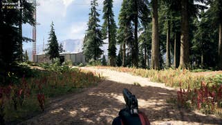


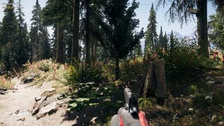
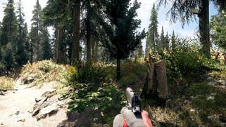

And speaking of consoles, while this feature rolled out a couple of weeks back with the site redesign, I'd very much like to talk a little about our new screenshot comparison tool (internally known as the 'zoomer'), with some example shots above, based on the four console variants of Far Cry 5.
As we moved into the 4K era, it quickly became evident that our existing comparison tool showed too little of each shot, making it difficult in many cases to pick up on the differences. We also wanted to address the fact that some head-to-heads just work better with a clickable A to B comparison - differences such as changes to ambient occlusion or lighting were often difficult to pick up on in the original zoomer, whereas they showed up as clear as night and day using our internal tools.
By default, all versions appear side-by-side, just like the old zoomer. However, now we have much more screen real estate for each shot. Simply click and drag to move around the shot, as per normal - there's even a zoomer variant for mobile devices too. On top of that, the desktop version also has controls for dedicating the viewing area to one version only, with the user able to swap between each individual version, covering off the requirement for A to B comparisons.
Going into the Eurogamer redesign phase, the tech team asked me what new features I wanted to see that really could benefit Digital Foundry - and that all came down to being able to share more of the assets and data we source for our work. And I have to admit, when I suggested real-time FCAT graphing, multiple comparisons and bar chart generation sourced entirely from our video capture data, I thought I was pushing my luck somewhat. To illustrate just how much work is going on behind the scenes here, an FCAT capture looks like this - a coloured border marks up each frame. Our tools scan videos like this, logging border positions and individual 'frames within frames' and then condensing those multi-gig video files into much smaller .txt files - here's the GTX 1060 full HD cache. So everything in the benchmark widget is all dynamically generated from that kind of data - it's quite an achievement, so I'd like to extend a personal 'thank you' to the tech team for taking on the challenge. Roll on second-gen CPU and GPU reviews - we'll be ready.

