Link's Awakening on Switch: can a Game Boy title hold up 26 years later?
Our first look at a fascinating remake.
Can a Switch remake of a 1993 Game Boy actually work? Based on the E3 showfloor demo I experienced, the answer is an emphatic 'yes' - and it's partly down to just how good the original design was. A combination of smart overworld design, challenging dungeons and Game Boy-pushing visuals ensured that the original was a genuine classic. While still very much an 8-bit experience, this portable outing managed to deliver a Zelda game that stands toe to toe with its bigger brother on Super NES - and the new Switch version looks quite beautiful.
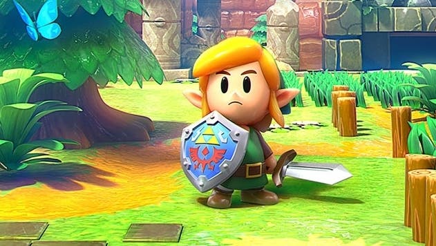
Once again, Nintendo has teamed up with Grezzo - the studio responsible for the two N64 remakes on 3DS - and what immediately strikes me is just how faithful the new Switch game is to the Game Boy original. When you first fire up Link's Awakening, you're greeted with a beautifully animated introduction - a video sequence very closely based on the original Game Boy's intro. Eventually, the animation comes to an end and the game cuts to in-engine graphics showcasing a beautiful scene on the beach with soft focus depth of field and water lapping up on the sand. And again, it recreates the content of the original scene almost perfectly.
The stage is set then: we get modern 3D graphics rendering but really - this is Link's Awakening. The design and placement of items, roads, grass and characters is all consistent between Game Boy and Switch. Some of the details I really like include the flowers - which are drawn in pairs of two just like on Game Boy. Meanwhile, the trees retain the stacked appearance with the same design for the truck. The original version added butterflies in places to add some life to the blocky scenes and these too are replicated. Later on, you'll find the beach, which includes a sand texture that recalls the original Game Boy presentation as well.
The most significant presentation change lies in the addition of proper scrolling as opposed to the screen by screen approach of the Game Boy game which is more reminiscent of the original NES game. But beyond that, there's the sense that Grezzo and Nintendo have managed to capture both authenticity and charm in its 3D version of the original 2D world.
When creating a game like this, developers sometimes channel the feeling of the original while drastically changing the design, but here, Grezzo has slavishly stuck to the original - which is interesting as the original has some limitations to consider: the screen by screen nature of the Game Boy game obviously dictated the level design, and everything was broken up into a grid. I was surprised at how well it plays with smooth scrolling, but the close similarities to the source material means that the grid-like design remains. The larger fields and areas in A Link to the Past won't make an appearance here, I'd imagine.
There are also aspects like the limited tile sets to consider - on Game Boy, all world tiles are presented using 90 degree angles, likely due to both memory constraints and the screen by screen design. There are no angled walls, everything is straight. This is in direct contrast to A Link to the Past which relies on angles to enhance level design. In the end, I do feel the team has made the right choice. Those limitations resulted in some very interesting designs that still holds up today and making sweeping changes could have thrown everything off balance.
What changes there are beyond the move from 2D to 3D do seem to pay off handsomely. I'm a big fan of the camera work - the slight tilt on the camera and subtle use of depth of field lend the game a miniaturised tilt-shift appearance that looks beautiful. It really gives the impression of running around an actual model of the world. Control-wise, the game feels rather different - but in a good way. Movement is less restricted and sword-play more fluid. It plays more like A Link Between Worlds as opposed to the original Link's Awakening - which is a good thing.
I do feel there is room for improvement though, based on what I've played so far. Interior areas run at 60 frames per second, but once we enter the overworld, the demo has obvious performance issues. Link's Awakening uses a double buffer v-sync setup which means that when the game fails to reach its frame-rate target, performance is cut in half. As such, the game bounces between 30fps and 60fps while exploring the overworld.
When previewing games like this, however, it's important to keep in mind that we're looking at incomplete code. Nintendo games have a strong track record when it comes to performance so I have high hopes that this can be corrected by launch, but it's certainly an issue right now. This will be an interesting test case then - will the developers reach their 60fps target or will the game simply be capped at 30? We'll find out when it releases later this year, I suppose.
Speaking of technical details, I only played Link's Awakening in docked mode and it appears to be running at roughly 1404x792. Image quality is consistent with your average Switch game, I'd say, and if the developers hit the 60fps target, it should be adequate but it's certainly not a strong point. The aesthetic definitely trumps the pixel count, but there are still some rough edges that require attention before release.
There's great potential here then - Link's Awakening is one of my favourite installments in the series and I'm pleased by the approachon display here. The visuals are beautiful, the upgrade to audio is particularly pleasing and it's fascinating to see a game coming out for the Switch that's so deeply routed to the set-up of a title first released over a quarter of a century ago - and yet still retaining its appeal and charm. We'll definitely be taking a closer look at this one closer to launch.


