Ori and the Will of the Wisps: inside an 'impossible' Switch port
A stunning game runs at 60fps on a handheld - but how?
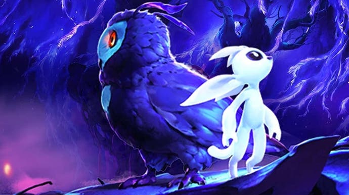
Moon Studios' Ori and the Will of the Wisps received critical acclaim when it released earlier this year and for good reason - its tight platforming action, gorgeous environments and evocative musical score serve as the foundation for one of the best 2D action games of the generation. It's a phenomenal follow-up to an already tremendous original game, and now, remarkably, that experience has transferred seamlessly to Nintendo Switch with few visual compromises. You can stack the game up against Xbox One X and it still looks great - and unlike many of these Switch miracle ports, it still runs at its original 60 frames per second.
Quite how developers are able to extract so much from Nintendo's hybrid has always been a matter of mystery and wonder for us, but this time we're able to offer an insight into how this technological achievement was delivered. I had the chance to speak extensively with Gennadiy Korol - the game's lead engineer and studio co-founder - who shared insights into the creation of Ori and the Will of the Wisps along with the techniques used to deliver what is surely one of Switch's greatest ports.
When first looking at Ori, you might be forgiven for thinking it's a simple 2D game - one that would run with ease on any modern platform - but this couldn't be further from the truth. The fact is, modern graphics engines are typically designed to accelerate 3D graphics. Z-buffering, early occlusion, order independent transparency, draw call batching and more are all tools developers can use to improve performance in modern 3D games. With a 2D game like Ori, most of this isn't applicable.
Dozens of high-quality layers scroll in every direction delivering a convincing parallax effect, the speed of the game and size of the levels means constantly streaming assets in and out of memory as you play while physics, post-processing and special effects tax the GPU. At its core, Will of the Wisps is built on Unity... to a certain extent. With full access to the source code for the engine, the team has essentially crafted their own highly tuned fork nicknamed 'Moonity' which offers the performance and features necessary to built a game like this.
In building this sequel, the team wanted to push the visuals and artistry to the next level by introducing features such as more advanced physics interactions on a wide range of objects, gorgeous dynamic lighting, god rays, complex skinned models with lots of secondary animation, richer backgrounds and more. It paid off on Xbox and PC and the current version of the game, post patch, runs great - an impressive achievement since Oli and the Will of the Wisps launched on Xbox One with some performance issues. A basic Switch port was not easy - and initial worked saw the conversion running at just 20fps, even with the Xbox One optimisations factored in. The obvious solution would be to cut losses, to aim for a target 30fps on Switch - but Gennadiy Korol felt that 60fps was essential and could be achieved with the right approach.
The team built a custom rendering pipeline specifically for this style of game. The game world uses up to six bespoke layers known as 'slices' for displaying its hand-painted artwork while compositing this with a seventh 3D layer used for elements such as the characters. It works almost like layers in Photoshop but functions entirely in real-time. These layers are drawn back to front using a painter's algorithm and can be combined using multiple blending modes to deliver the intended effect. The problem is that blending all these layers together can be expensive: there's no order independent transparency and no effective way to batch-up draw calls so, the Switch hardware struggled.
Part of the solution is to target rendering detail to where the eye focuses - typically, towards the centre of the screen in the area immediately around the character. In a title like Ori, there's a certain elasticity in resolution depending on the slices - and that's a key area for optimisation. Technically, the game targets 720p in handheld mode and 900p in docked, but it's not that simple - resolution is adjusted on a per slice basis. This is combined with the high-quality depth of field, which remains intact on Switch. This means that layers in the background and near foreground, usually bathed in depth of field blur, can be rendered at lower overall resolution without the player noticing most of the time. Of course, there are limits. The 3D layer, for instance, will only drop as low as 80 per cent of the maximum resolution while the background artwork can drop to 60 per cent but, in general, the key areas of the image remain close to full resolution in most cases, giving the impression of a higher resolution all around. It's a very clever trick.
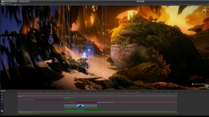
So, basically, this dynamic multi-res solution to managing performance is one key in the process but there's more - and that's where Ori and the Will of the Wisps' beautiful lighting comes into play. There are two lighting engines, primarily: first there is the static lighting - instead of simply calculating the light offline, artists can directly paint onto the assets using a separate global illumination layer. This low frequency detail layer directly influences the look of the environment, but it's the dynamic lights that are most striking.
These lights play a huge role in bringing the world to life but the technique in creating them is unconventional. Using traditional normal maps produces results that appear too 'plasticky', ruining the painterly style. Instead, the artists go in and directly paint lighting on an object. They paint six sides to account for where the light might be shining - such as the left or right side - and compress the results into an RGBA texture. Six directions for each pixel are then tested to figure out the position of the light, while blending between the six light masks. The result is smooth lighting across objects that avoids sacrificing the hand-painted design of the assets.
This is perhaps the largest improvement to the visuals overall, I feel, as it creates highly dynamic, beautiful scenes to explore. Originally, the team used a deferred approach with unique g-buffers created to figure out pixel depth, computing the correct light value in the process. It was on the slow side so a new tiled light culling system, similar to that featured in Doom 2016, was implemented instead. Lights can be stacked, blended and culled as needed, allowing both excellent visual quality and performance To make this work better on Switch, however, several adjustments had to be made from lower level components such as saving light indices in a texture 2D format instead of a compute buffer, to reducing the resolution of the lighting pass independently.
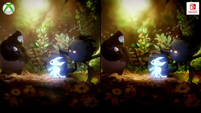
In short, Moon Studios optimised heavily for Switch, but did so with an innovative flair that still delivered very impressive results - but many of the game's visual features made the jump from Xbox One to the Nintendo hybrid with minimal changes. For instance, the soft body physics system and secondary animations all made the cut. This is a huge feature for Ori and the Will of the Wisps, which allows the scenery to bend and move as you run across the stage. It helps give the impression of a more animated world that teems with life - and this system is fully intact on Switch. The tools for creating these interactions are interesting as well - it's a non-destructive process meaning that artists can make adjustments to the structure and design of physics driven elements without needed to export new assets every time.
Water is another key element - pools of water have physical properties, with the upper layer undulating as the player collides with its surface. Water both reflects and reacts and this is fully present on Switch. Animation also ties into all of this: the team developed its own bespoke animation system with a focus on squash and stretch -a technique that allows artists to scale and stretch joints to create exaggerated animation. As Ori leaps into the air his entire body stretches, only to squash as it collides with the ground. The rigs that were created make this possible on every single joint. God rays also made the cut - these use stochastic sampling with a blur that works across multiple frames. Without this blur, it would appear as a bunch of dots but blending it together gives the impression of beams of light slicing through the scenery. The mesh trails are also present on Switch - these vertex-based emissives are basically little strips of meshes that omit light from each vertex. This technique was inspired by Keijiro Takahashi's Skinner - look closely at the trails behind the characters and you can see it in action. The only effect that didn't make it into the Switch conversion is per-pixel motion blur during fast camera pans but, for a side scrolling game, it's not a huge loss.
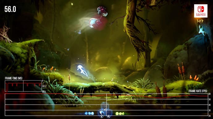
But of course, the ultimate litmus test is the Digital Foundry comparison process, and in this respect the end result is highly impressive. The visual quality is remarkably close to matching the Xbox original, with just some of the original's sharpness lost. The presentation still holds up in docked mode though and the compromises made are even less noticeable when played in handheld mode. Of course, the most important piece of this puzzle is the performance - the promised 60 frames per second. I tested this myself using our tools and found that the team has managed to deliver just that for most of the experience, but it's not quite perfect. During gameplay, you may notice minor dips into the upper 50s from time to time. It uses v-sync so there's no tearing but you will encounter hiccups from time to time. Still, by and large, it's remarkably stable.
Looking at the project in its entirety, it's clear that a lot of smart engineering has been poured into this project. It's an example of what's possible when the porting process is handled so delicately. This could easily have become a 30fps port but because the developers know the game so well, they were able to perfectly fine tune every aspect to shine on a less powerful machine. That's really the key - it's not about stripping features out until you hit your target frame-rate. It's about understanding how the game was built, taking it apart and putting it back together making changes along the way.
From my perspective, it's a complete success. This is the complete Will of the Wisps experience with minimal compromise. It runs like a dream on Switch, while offering nearly the same level of visual fidelity as the other versions of the game. Yes, if you look closely you might spot some lower resolution artwork, extra aliasing or some slowdown but, by and large, it's extremely well made. As I mentioned at the beginning of the piece, this game is right up there as one of the best examples of the genre on any system - the fact that it's essentially the same on Switch is astonishing. I also think it's worth pointing out that the Xbox One version is enormously improved from launch: it's still not quite 100 per cent perfect in performance terms, but any dips in frame-rate won't unduly impact your enjoyment of the game and the HDR implementation is superb. I really recommend revisiting the game, and don't forget, it's also on Game Pass.
Moon Studios isn't done with Ori and the Will of the Wisps either. A patch is planned for the Xbox version adding support for native 4K rendering at 120Hz. For a game with fast, lateral scrolling, this should push its fluidity even further. I can't wait to test this out myself but the scalability the developer delivers in this title is highly impressive: from 4K120 on a 12 teraflop next-gen console to 720p60 on a handheld, it's still the same excellent game and I highly recommend it.
